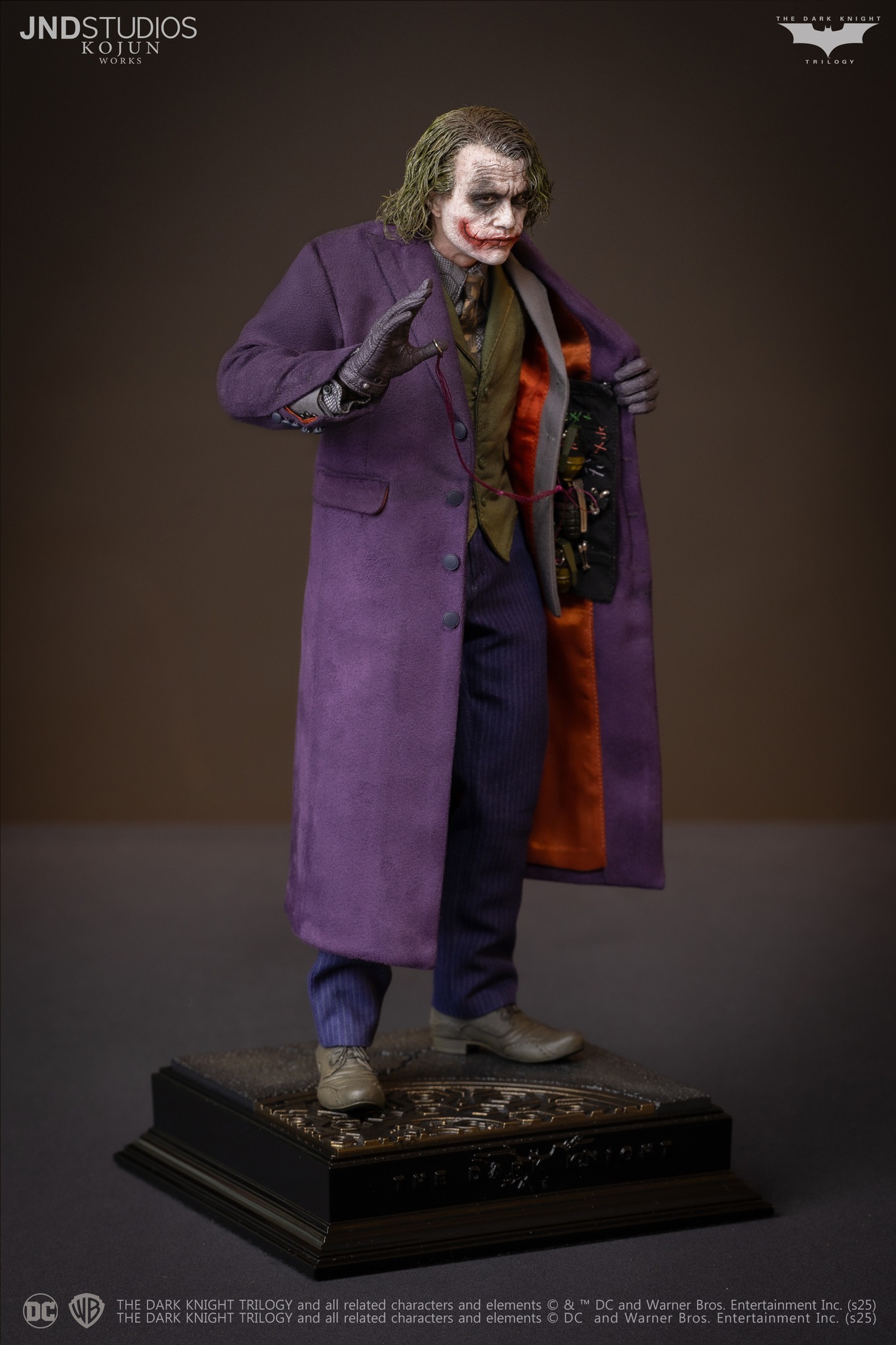
JND Studios 1/6 scale Heath Ledger Joker figure

Collector Freaks Forum

Help Support Collector Freaks Forum:

This site may earn a commission from merchant affiliate links, including eBay, Amazon, and others.
I was just thinking that, it's really weird.

It's especially strange considering that a huge part of their brand is that you're supposed to get a final product that looks closer to the prototype than any other mass-producing company. Except now they're trying to make people think the prototype was worse than it actually was? I don't get why they would contradict their brand messaging when everything else about the headsculpt does at least look like a close match to the prototype...
 
This thing is so bad. “It never was” good in the first place imo

0E048710-50E7-45D9-B8E4-B400242DCA1B.gif
 
I care less about the clothes, only care about the head.

It's sad that the dogs are the only thing that came out well.

472256962_902551465391305_5685987242705095279_n.jpg


The production sculpt looks fumpy... looks old, saggy, and fatter than the prototype, its not as terrible as the JND statue (that thing was super ugly), but yeah he looks more like an older Joker that got pulled out of retirement and had to put the suit on to make a few bucks.

527792-1000010998.jpg


The hair.. i remember the leaked factory photos looked ok.. what happened.. did they lose their balls? That leaked photo looked pretty good ! ! !
 
Look exactly the same, the thing that's throwing it is the eyes need to be darker and matte. CBA to do it, photoshop the left pictures black eyes on the right and it's exactly the same.

Didn't go heavy enough with the paint. The sculpt looks great, this image in particular shows it off very well:

472030005_902551792057939_3438939258401435618_n.jpg
 
Final production pictures dropped !

Here's a few of them :

View attachment 747958
This figure is definitely not for me, but this shot does stand out to me.
I like how with the seamless neck that articulates at both the collarbone and the base of the skull, you can pull off poses like this where he juts his head forward. No other Ledger Joker figure has been able to do this, since the neck is always part of the sculpt.

Yes that’s a great achievement but a pity they screwed up on the main course. It looks like a cosplayer not like ledger

Same deal with their catwoman - the upper chest and shoulders are all wrong thought the likeness on that is excellent
 
None of the gimmicks matter if it looks like this.... you have to be on some heavy copium.

The most annoying thing is why did they change the hair color to this gray green like the 1/3. Their proto was fine. JND trying to gaslight us by saying it's "improved", like wtf we have eyes.

wat.jpg
 
I do think the sculpts would look better with heavier paint, as mentioned at proto stage, but I think the issue is the silicon simply won’t allow it.

I've got a feeling that's the case also. The 1/3 had a similar problem and they had the chance to fix it here.

Will see how it is in-hand with that. Looking forward to getting this in. The tailoring looks fantastic, best looking anatomy also.
 
They all have their specific issues, but is JND...Best of the mass produced bunch?

1735898735651.png
 
JND really do some strange and outlandish things, don't they?

In the comparison Diostar posted it looks to me like they've deliberately restyled the hair on the prototype to look as goofy and bouffy as possible, to make the final product look better by comparison. But the original prototype pictures didn't look like that. Did they think no one would notice? :lol

Compare that to the pictures of the "prototype" on the left below...

It seems that they've just teased the hair out to make their own prototype hair-rooting look like crap, and make the production piece look like an amazing improvement. But it's... er... not exactly subtle, is it? Why are they like this? :lol
You're right here it is side by side with the one you posted

1735899383255.png
 
Last edited:
Back
Top