1/4 Scale Monster Comparison pics...

Collector Freaks Forum

Help Support Collector Freaks Forum:

This site may earn a commission from merchant affiliate links, including eBay, Amazon, and others.

lcummins

Universal MODster
Joined
Sep 9, 2005
Messages
9,169
Reaction score
1
Location
Round Rock, TX
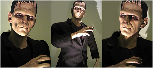
Ok FrankenFan, this is for you! I know it has taken me a long, long time to finally get around to posting these, but I just wasn't happy with the pictures and tried again. Still not happy! These were taken under florescent lighting with flash, so the color is not perfect. I adjusted the white balance somewhat, but just couldn't get it where I wanted it, but I think they show pretty good comparisons still.

Monsters07.jpg


Monsters08.jpg


Monsters09.jpg


Monsters10.jpg


Monsters11.jpg


Monsters12.jpg


Monsters13.jpg


I apologize it took so long guys. I hope they are still helpful to someone out there.

Also, I am working on a web page gallery of all the 1/4 scale Universal monsters and Modern horror monsters in my collection. Again, I'm not happy with the pictures, but they aren't too bad. I will post the link as soon as I work out a few kinks! :D
 
The SSE Drac and Frank look great, although Vampyre seems to suffer a bit in the translation.
 
My thoughts also...

I agree Dave. I think the SSE Dracular and Frankenstein Monster are better than the color versions, but the Vampyre looks surprised, almost frightened.

The differences are very interesting between the SSE and the color versions, especially in the clothing. Dracula is the most nearly the same, but the Frankenstein monster is very different. The boots are flocked on the SSE version and the pants and jacket are a completely different material. There are some silver paint highlights on the wrinkles of the jacket and pants of the SSE version not on the color version. The SSE Vampyre seems thinner than the color version, and I don't think it is just the jacket.

And yes, there is a very slight difference in height between the versions. I think this is due to whether or not the head is bent forward some as well as how the figure sits on the base. I could not get them "even" no matter what I tried.
 
Interesting.I've said here many times that I felt the SILVER SCREEN versions are cheap in comparison to the original versions....but looking at the Dracula's side by side I might actually prefer the latter version.The original's flesh tone is very warm for Dracula and perhaps Lugosi himself,but the other one has a proper undead look. Food for thought if I ever decide to pick him up.
 
I dont understand why the pictures at SS are so different from the real thing. I was going to order the silver screem vamp but after seeing it in person a few months ago, there was no way. And I was very disappointed about the differences in the figure. And I just read the post about the 1/4 sclae Jason which has also been "altered". But with the Vampire the faces dont look the same. The eyes are the 1st giveaway. Its so sad when when you buy a "expensive" collectible and when you open it, its total different.

71011_image01.jpg

________
iolite vaporizer
 
Last edited:
very cool. thanks for posting
i have the SSE Vampyre and while I think he suffers, those pics do look worse than he is in person. gonna take a fine charcoal pencil to his eyes one day to darken them up.
I will say that the SSE Frank is much better than the pics on SS's site seem to be. tempts me a little more now.
 
1/4 Scale Monster Comparison

It is quite strange that my coloured PF Frankenstein has the highlights on the wrinkles of his clothes. Though mine are yellow not silver, so it would suggest a coloured version of the same.
 
SS Vampyre.

I agree that the SS Vampyre's look is a bit surprised, however most people who see him in my house prefer the SS version. over the color one.
 
Sse

I like the SSE vampyre, I think the gray scale is rather detailed and there are gradations making it look realistic, it is spooky with light from underneath. I returned the SSE frank, very disappointed, it looked like an overstuffed doll rather than a collectible. The 1/4 monster line is really great, no other company comes close.
 
Where did the picture of the Vamp on the SS site come from? The Head sculpts are totally different. It makes no sense.
________
synthetic weed
 
Last edited:
Great pix, Lonnie!

With the exception of the Vampyre, the SSE counterparts hold up surprising well next to their color brothers.

I've said this before, and I still agree with me: I think the main problem with the SEE Vampyre is that the tonal range is too flat. The eyebrows and tufts of hair appear to be very close in value to the low-contrast skin tones. The portrait just lacks punch and, frankly, the figure looks more like a decrepit old man than a vile, loathsome, undead thing. Additionally, the coat is so dark in comparison to the other gray values, it detracts from the sculpt and makes the skin tones seem even duller. On the plus side, the peg supports in the base are a definite plus over the color edition's obtrusive support stand.

I've said this before, too: I still maintain the meticulous color detailing of the original PF Dracula really brings this figure to (un)life. As Poelzig observed, the skin tones may be a bit florid but, the stark contrast of the hair and eyebrows against the skin, the hot-red ribbon and the warm, gold tones of the accessories, are all stand-outs and well-accented against the whites, grays, and blacks of the clothing. I like the figure a lot better in your photos than the pix of the prototype but, the color figure is, IMO, unbeatable.

The comparison of the Frankenstein Monsters is the most intriguing to me. The first thing that stuck me is the difference in painting technique between the two. I always felt the sclera of the PF Monster was much too bloodshot for a patchwork corpse and, I could never understand the green irises. The SSE captures Karloff's faraway gaze much better. And, compared to a simple swipe of airbrushed color, the lips are much more defined on the SSE.

Compare this:

https://www.non-sport-cards.com/images/Monsters/Monsters61.jpg

to this:

https://www.non-sport-cards.com/images/Monsters/Monsters57.jpg

It was also interesting to see how much the paint job on your color PF differs from mine. Mine is much cleaner and more precise, with less bold strokes of the airbrush and smoother, more subtle gradations among colors. For example, on mine, the color doesn't bleed out from the scar on his forehead; the lips are more defined; the shading beneath the eyes is more subtle; and the nose on mine isn't as ... um... brown. Overall the paint on yours appears much more heavy-handed and saturated but, that could be a result of the lighting, etc.

You mentioned the difference in fabric, but there appears to also be an improvement in the tailoring and fit of the jacket on the SEE PF. It seems to hang better on the body with less of a flare at the hips. I noticed the addition of the pronounced weathering effect in the QuickTime™ VR turnaround and, I think it's a bit overdone. It's curious to know, from Creecher's post, that there is a color and SEE version of the distressed accents. Now that's attention to detail! I wonder, though, when in the production run of the color PF did this start? Mine has no such markings. My figure is 316/1100.

I think the boots on my color PF have a very slight application of flocking, as there is definitely some texture present. According to the historians, Karloff wore stock, off-the-shelf workmans boots from the period. I doubt that they would have been made of anything but tough leather.

Well, that's way more than my two cents worth. Lonnie, thanks so much for the time and effort you put into these photos. They were more than worth the wait and I learned a lot. You should copy this post over in the Galleries forum under the "Show Your Shelves" thread. Ask Dave to make it a sticky. It's a great resource for those on the board who may be trying to decide which version to buy.

I dont understand why the pictures at SS are so different from the real thing. I was going to order the silver screem vamp but after seeing it in person a few months ago, there was no way. And I was very disappointed about the differences in the figure. And I just read the post about the 1/4 sclae Jason which has also been "altered". But with the Vampire the faces dont look the same. The eyes are the 1st giveaway. Its so sad when when you buy a "expensive" collectible and when you open it, its total different
Monster:

It appears the pic of the SSE Vampire you posted is a grayscale conversion of the original color prototype. Prototypes will always differ somewhat from the final production pieces. This may be abnormal brain thinking on my part, so take this with a pinch of tanna leaves, but I believe the prototypes are meant to represent the best-case scenario of what the final product should be. The protos are lovingly crafted by Sideshow's finest artisans. But once a proto is approved and enters the production process, the inevitable constraints of mass-production can sometimes necessitate a change of design. For the most part, the final product is an accurate representation of the proto but, on occasion, some do disappoint.

bof.jpg
 
I agree...

Kurt, I agree with you on the color Frankenstein; I've said from day one that I wasn't pleased with the face on mine, but I never considered it might be the paint job until I got the SSE version and was able to compare. I did notice when I was taking the pictures, that the mouth of the SSE version looked much better. Also, I think the lighting made everything a bit more pronounced, as it doesn't look quite so "dramatic" in person. Also, my color version doesn't have the yellow highlights either; it is edition number 299.

I also agree about the SSE Vampyre. The coat is just too black; it doesn't look like a B&W version of a brown coat. The tonal range and coloring on the head is kind of strange also. There are lighter "streaks" on top of the head that just don't work very well. But for me, the worst thing is the eyes. They just didn't come across as well in the B&W format as I would have liked.

I think the Dracula looks good in both versions, probably because of the very reasons you stated about the color version! Sideshow only had to recolor the head and hands, the ribbon and the chains (jewerly) and that was about it. All the clothing appears to have stayed the same, which is not true for the other two SSE figures.
 
I agree, Lonnie, the SSE Dracula does translate the best to grayscale. Never considered picking one up, but now I'm tempted...

The real eye-opener for me is the difference between your PF Frank and mine. I'm aware that paint ops can vary among 1:6 figures but, I didn't expect to see it in the PFs.

Thanks, again, for the great pix!

cftbl.jpg
 
Differences...

I know you have posted pictures of yours in the past, but since I'm too lazy to go looking for them, post a pic of your Frank so I can compare; I would be really interested to see the differences.
 
My PF Frankenstein is number 940. I can't see it now, but I did see the 'wear' marks on one of the SSE pics. Mine weren't nearly as pronounced or as many. I know you have used a flash, but mine doesn't appear to be as glossy either. Also, did you guys cut the thread bunching up his coat sleeves at the elbow? Mine has this at both elbows.

Someone posted that they sent their Frankenstein back because it looked too doll like. I thought the same thing, that it looked doll like, when I was checking out his crutch. I think something went amiss there as poor old Frank looks like he could almost pull a camel toe. The cut of the jib looks wrong is what I am trying to get at. The blackness of the outfit makes it hard to define any real detail from the pics. I wonder why the 1/6 Franks are given the green coat and brown pants treatment. I would have thought the SSE PF would have been all black and the coloured version would have, to put it, more colour. I take it you did some sort of photoshopping on your pics Frankenfan, as his coat looks somewhat brownish.

Another thanks for the pics guys. I find the slight variations and the discussion quite interesting. When I finally get a digi cam, and if the topic arises again, I will show you some of what I getting at.
 
Back
Top