Asmus toys x Viva studio : Ace Ventura

Collector Freaks Forum

Help Support Collector Freaks Forum:

This site may earn a commission from merchant affiliate links, including eBay, Amazon, and others.

AD Artwork

Super Freak
Joined
Oct 30, 2008
Messages
270
Reaction score
68
Location
Taiwan/Australia
hi all

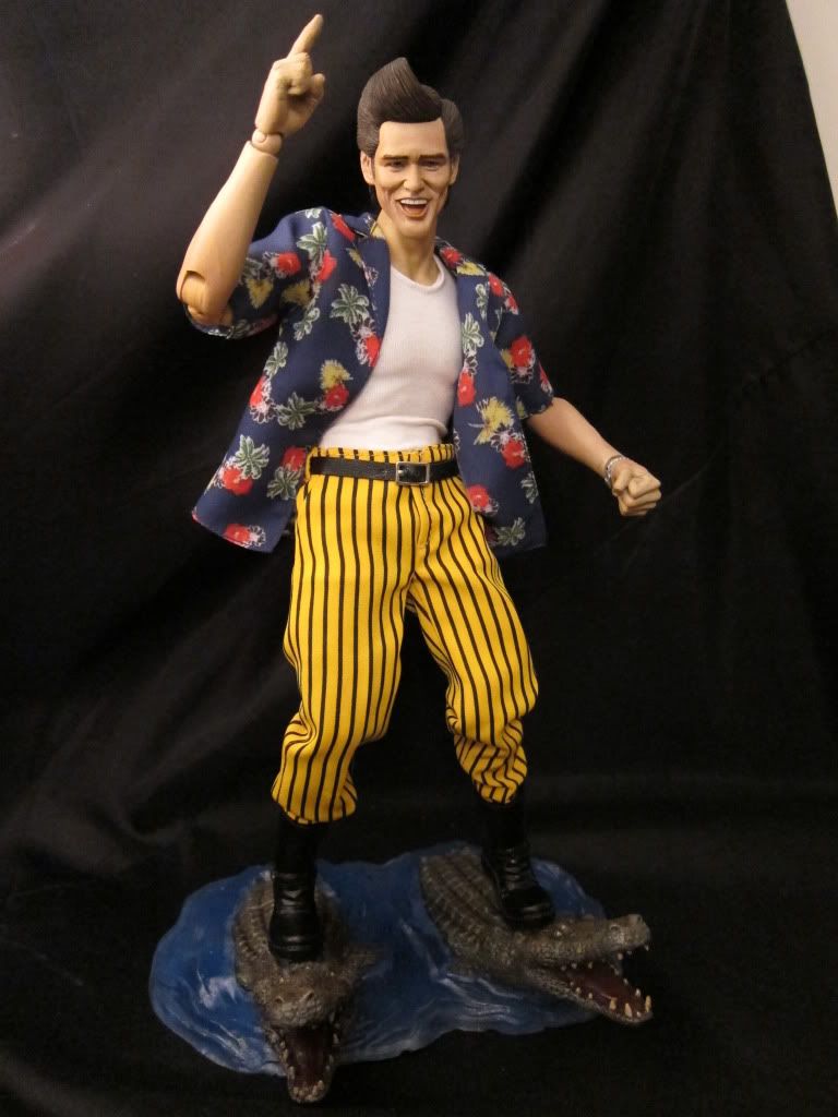
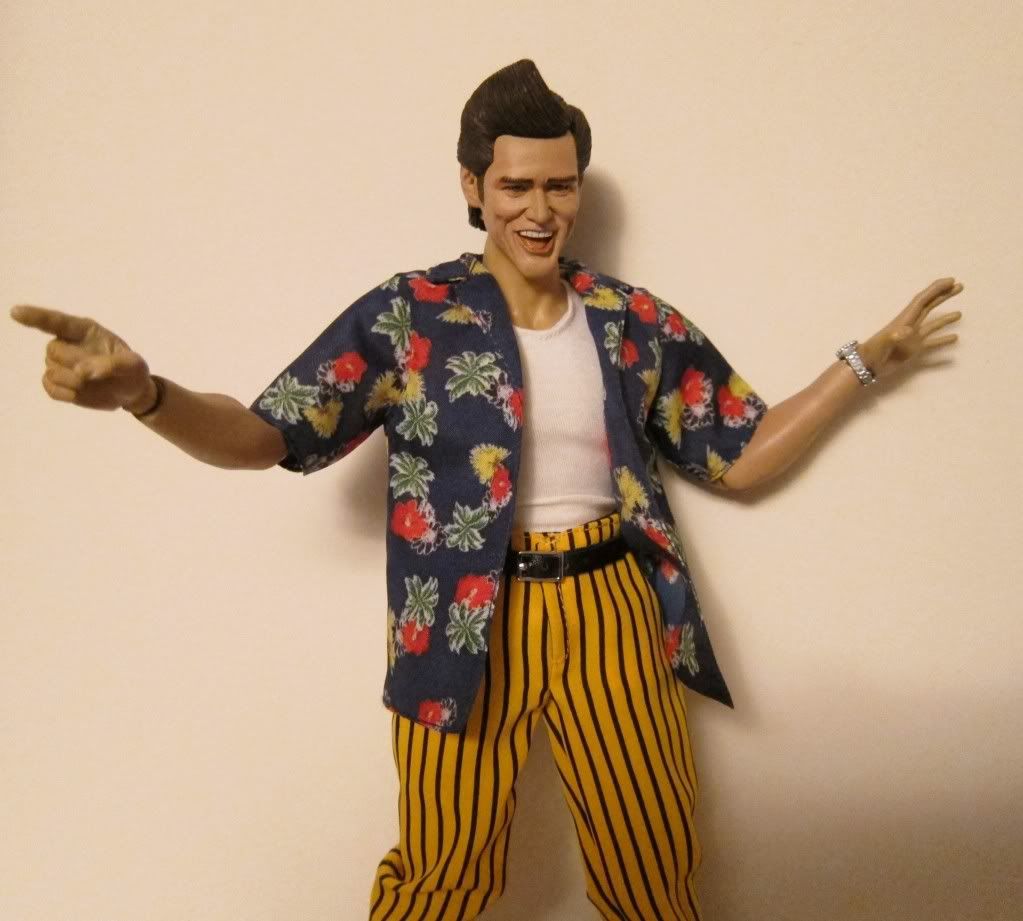
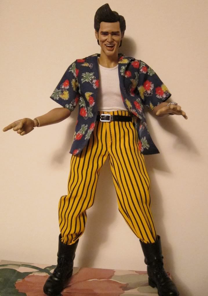
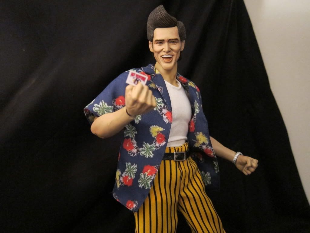
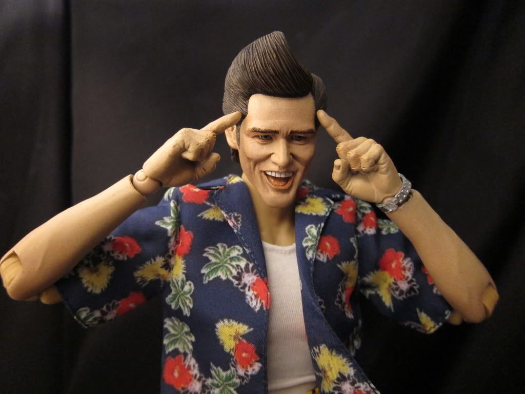
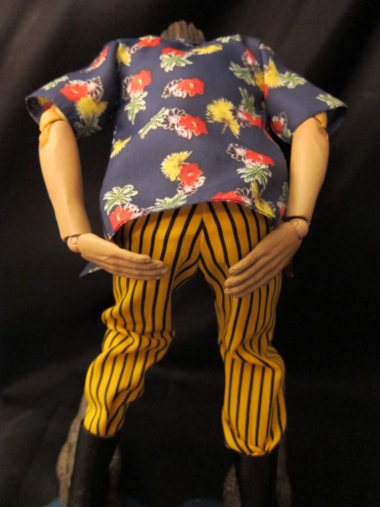
This is the Jim Carrey as Ace Ventura figure that will be released by my contractor - Asmus Toys.

This is not done by me but my colleague - Viva studio, who is also an awsome sculptor and painter, he free-lanced some really amazing works and has finally joined our team. and he is very keen to introduce his stuffs to he sideshow world too.

Well, that's let the pictures tell the story.

cheers


88509223.jpg

102sf.jpg

18708495.jpg

33055055.jpg

37392139.jpg

40742379.jpg

57599183.jpg

76573223.jpg

77079085.jpg

82798270.jpg
 
Very cool figure! Although, If I'm being 100% honest, I think it looks a bit more like Kurt Russell in the face.

Anybody else get that, too or is it just me?
 
No I see Kurt too.
Looks like they were going for this look
https://filmup.leonardo.it/posters/loc/500/aceventura2.jpg

Personally I prefer the first film.

The eyebrows are too thick for one thing, too even. They need to start out thick, then get more angled and pointy. For the deranged look Carrey goes for. He looks happy not nuts. Changing that would help sell it as ace a lot more and would be an easy change to make. They need to be lower as well, they look like their up too high. One eyebrow is also usually slightly higher than the other when Carrey is making expressions.
it should look more like
https://fc04.deviantart.net/fs37/i/2008/252/5/2/Ace_Ventura___Animal_Detective_by_Magickalisch.jpg
https://farm4.static.flickr.com/3660/3352697454_641d83cefb_o.jpg
https://media.photobucket.com/image/ace ventura/sandstorm2008/AceVentura.jpg
https://chud.com/nextraimages/aug6ace2.jpg
https://www.ted-aylward.com/root/ace_ventura.gif

The face needs to be thinner as well. It's too thick. Jim Carrey was very skinny in those movies. The body too muscular and the neck is too thick as well. More of a hot toys slim type not one of the regular bodies.

The hair is dead on though.
 
Last edited:
No I see Kurt too.
Looks like they were going for this look
https://filmup.leonardo.it/posters/loc/500/aceventura2.jpg

Personally I prefer the first film.

The eyebrows are too thick for one thing, too even. They need to start out thick, then get more angled and pointy. For the deranged look Carrey goes for. He looks happy not nuts. Changing that would help sell it as ace a lot more and would be an easy change to make. They need to be lower as well, they look like their up too high. One eyebrow is also usually slightly higher than the other when Carrey is making expressions.
it should look more like
https://fc04.deviantart.net/fs37/i/2008/252/5/2/Ace_Ventura___Animal_Detective_by_Magickalisch.jpg
https://farm4.static.flickr.com/3660/3352697454_641d83cefb_o.jpg
https://media.photobucket.com/image/ace ventura/sandstorm2008/AceVentura.jpg
https://chud.com/nextraimages/aug6ace2.jpg
https://www.ted-aylward.com/root/ace_ventura.gif

The face needs to be thinner as well. It's too thick. Jim Carrey was very skinny in those movies. The body too muscular and the neck is too thick as well. More of a hot toys slim type not one of the regular bodies.

The hair is dead on though.

Yeah,
i have problem with his eyebrows too.
try to tell him that,
but it is hard to tell as a colleague...
definately passing on the message.
 
I don't have a problem with it... I look at it and see Ace, so this is a definite buy for me!
 
I am so glad to see my best friend Viva, another young genius artist, has a chance to share his job here!

Don't worry!

I know that he has already destroyed this old HS and make a new one !

I hv confidence that you will see a much better one soon!

Kato


No I see Kurt too.
Looks like they were going for this look
https://filmup.leonardo.it/posters/loc/500/aceventura2.jpg

Personally I prefer the first film.

The eyebrows are too thick for one thing, too even. They need to start out thick, then get more angled and pointy. For the deranged look Carrey goes for. He looks happy not nuts. Changing that would help sell it as ace a lot more and would be an easy change to make. They need to be lower as well, they look like their up too high. One eyebrow is also usually slightly higher than the other when Carrey is making expressions.
it should look more like
https://fc04.deviantart.net/fs37/i/2008/252/5/2/Ace_Ventura___Animal_Detective_by_Magickalisch.jpg
https://farm4.static.flickr.com/3660/3352697454_641d83cefb_o.jpg
https://media.photobucket.com/image/ace ventura/sandstorm2008/AceVentura.jpg
https://chud.com/nextraimages/aug6ace2.jpg
https://www.ted-aylward.com/root/ace_ventura.gif

The face needs to be thinner as well. It's too thick. Jim Carrey was very skinny in those movies. The body too muscular and the neck is too thick as well. More of a hot toys slim type not one of the regular bodies.

The hair is dead on though.
 
I think this thread could scare off people who haven't seen the new sculpt. I would delete it or edit the first post.
 
no interest in this really, but it's nice, and fun to lol at the fact that this is a nice 1/6 ventura figure.
 
Back
Top