Orignal BATMAN Artwork! Show me YOURS!!

Collector Freaks Forum

Help Support Collector Freaks Forum:

This site may earn a commission from merchant affiliate links, including eBay, Amazon, and others.

Darklord1967

Freaked Out
Joined
Feb 17, 2008
Messages
191
Reaction score
0
Location
Brooklyn, NY
I've had this Batman and Robin pencil sketch that I've been toying with on and off for the last couple of years, and I thought I'd share.

Maybe some of you guys have created a nice Batman-related piece of artwork (or two) that you'd like to share?

Here's my contribution:

This un-finished pencil drawing is titled “Gotham Night Patrol”.

MEDIA: Mixed-hardness pencils on 1/4 inch thick white painted masonite hardboard.

MEASURE: 4 feet wide by 6 feet tall.


SYNOPSIS: This is a night time scene depicting the Dynamic Duo on vigilant patrol from a grimy rooftop in Gotham City. The scream of a crime victim has just risen from far below, and the pair prepare to leap into action. A pale full moon lights the scene, and the hazy smoke from a nearby roof top’s chimney hangs behind our heroes.

Hope you guys like it.
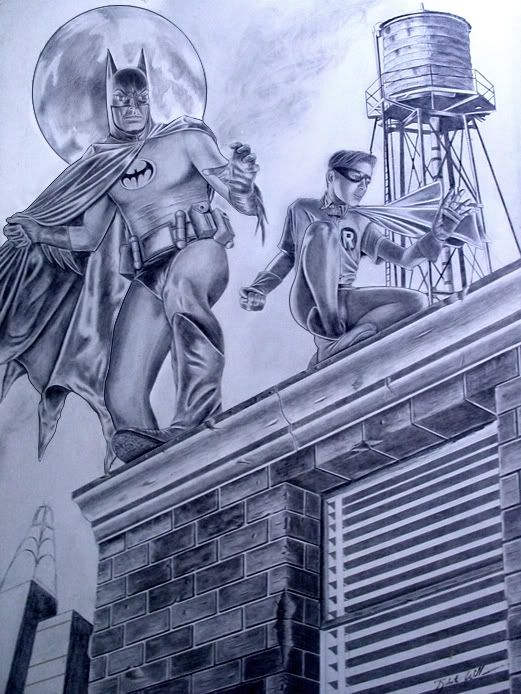

BATMANROBIN-3.jpg
 
Last edited:
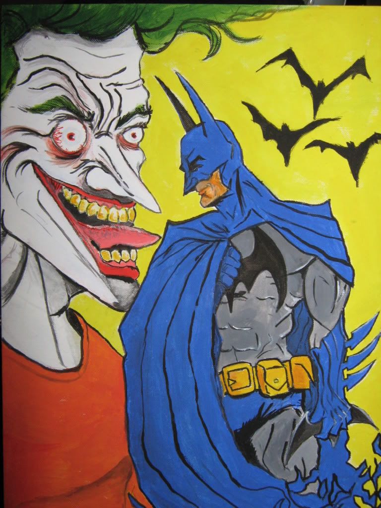
this is a concept im using in one of my classes. Its a mix between ironman and batman if both worlds ever collided. i'll build it the next semester.
 
Hi there. I'm new to the board and thought I'd share a Batman sketch I did waaaaaay back...let me know what you think.

img0062jv3.jpg
 
Last edited:
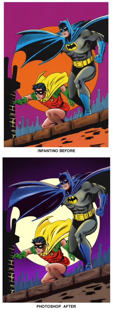
The famous Infantino / Anderson Batman and Robin pin-up.

I thought I'd have some Photoshop fun and "correct" some of the details and colors of this piece.

This is probably the quintessential Batman & Robin pin-up image from the early 1970's. Pencils by Carmine Infantino and inks by Murphy Anderson. Color and digital enhancement by Roberto Williams.

The first time I saw this image was at a 1974 toy store opening on Flatbush Ave, Brooklyn in the King's Plaza shopping mall. "The Batman and Robin" were on-hand LIVE to greet kids, shake hands, pose for pictures, and hand out copies of this pin-up. Batman was the life of the party, laughing(?) and chatting it up with kids. Robin looked bored, sitting with a stack of these pin-ups handing them to kids and trying to keep the line moving.

The adjustements I made on this piece were:

1) Overall Colors: A more appropriate sky and moon color. A more neutral brown for the building, Darker blues for Batman's mask, cape, gloves, trunks, and boots / highlights added.

2) Adjustment's to the Batman's face to give it a bit more of a sneer.

3) The Batman's chest emblem replacement

4) The Batman's boots made longer

5) The Batman's cape widened

6) The Batman's utility belt re-drawn completely

7) Robin's "R" monogram cleaned up.

8) Highlights and shadow added to Robin's costume and cape.

9) Textures, shadows, and highlights added to the building's roof border blocks


Infantinocompare.jpg
 
Last edited:
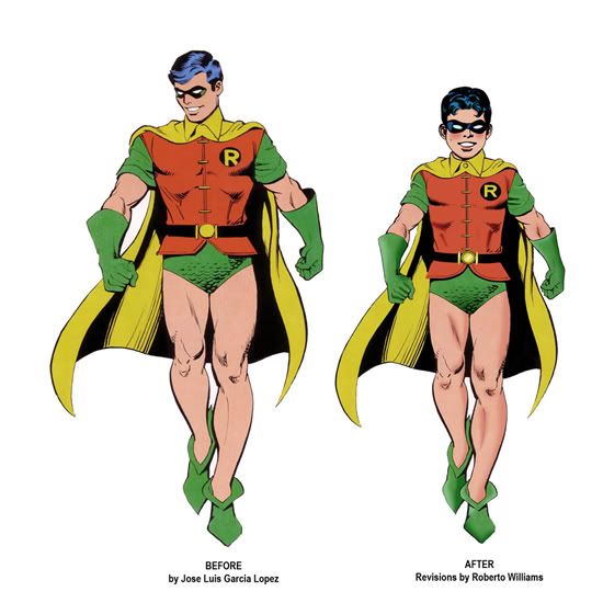
TURNING A "TEEN WONDER" back into a BOY WONDER (like he should be!)

I LOVE the artwork of comic book artist Jose Luis Garcia Lopez. During the 1980's, he created a DC Super Heroes calendar for which this image of Robin was drawn. later on, it was available as a life-size cardboard standee.

The trouble is, at that time, Batman's partner Robin had grown up in the comics, and he was no longer a "Boy Wonder". He was a twenty-something year old university student and the leader of the Teen Titans.

Call me a "Batman purist", but I don't believe that Bob Kane (Batman's creator) intended that for the character. He is supposed to be a "kid sidekick" to the main hero, no older than about 14. He is NOT really designed as a hero unto himself.

Also, that outfit (with its bright colors, green short-shorts, bare legs , and pixie shoes) is really meant for a young BOY to wear... not a college-aged young man. Worn by an adult, the whole thing just looks silly.

Anyway, I took Garcia Lopez's Robin (The "Man Wonder") image and made a few changes to turn him into something that I think is much more appropriate...


RobinCompare.jpg
 
Last edited:
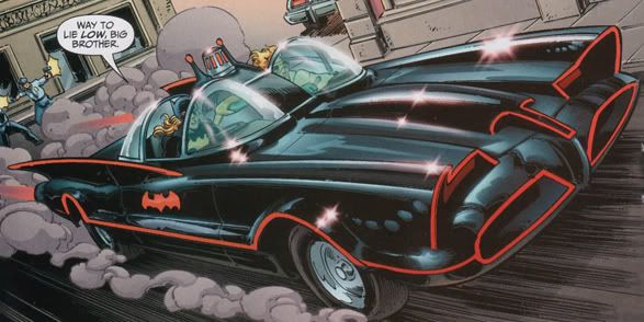
I decided to have some fun with Adobe Photoshop to convert Dan Jurgens's Batmobile splash panel (from Booster Gold #12) into a bonafide (accurate 1966 Batmobile) pin-up.


boostergold.jpg


I really loved the composition that Jurgens came up with, but A LOT of stuff here needed re-working to make it correct:

1) The tip of the hood scoop nose had to be changed from a flat tip to a pointed tip.

2) The headlights were changed from red to the correct amber.

3) The missing Bat-Laser antenna on the car’s hood was added.

4) The (broken) red pinstripe around the front wheel fender was smoothed and made seamless. The red pinstripe behind the rear wheel fender was made more pronounced.

5) The door's bat-emblem was replaced with the correct size and shape emblem (and in the proper perspective).

6) The overly rounded bat tail-fins were re-contoured into the correct shape.

7) The entire shape and contour of the rear fender was re-drawn to be the correct for the 66' Futura Bat.

8) The siren beacon cage was re-drawn to be correct.

9) The top antlers atop the roll bar were shortened and moved to their correct height and position. The warning light bezels on top of the antlers were re-shaped to be uniform and correct.

10) The missing three "anti-theft Rocket Tubes" were added to the rear deck of the car.

11) The front tire and wheel were re-drawn to be accurate, and the Bat spinner hub was added.

12) The missing honeycomb-pattern front grilles were added

13) Michelle's word balloon was eliminated.

14) The figures of the two police officers firing upon the car were eliminated and Booster Gold and Michelle "Batgirl" were replaced with The Batman and Robin.

My finished altered "pin-up":

Batmobiledesktop.jpg
 
Back
Top