greygoose
Super Freak
Love the base on this. The hunting camp set was the best part of this movie.


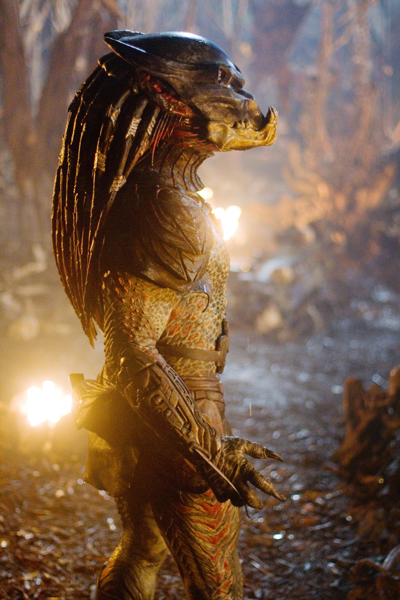
This Berserker Predator looks way better than the Assassin Predator. I wish it was a 1/4 or they had a bust 1/3 version like P1&2.

P1 just need to make the bio mask a bit wider, show less of his head on the left and right side while he's wearing his bio mask, and it will be PERFECT!!!!.....Base actually looks a bit busy in this shot.
All those extra elements are going to add $ also.
View attachment 609794


The Assassin Predator was cool, but I didn't get that menacing feeling from it like you did from the Berserker Predator in Predators.I actually prefer the movie design for the Assassin to that of the Berserker, but PRIME1 did an amazing job of the sculpts & art direction on both their statues.
I'll never own either though (would have got the Assassin if the "options" were better - I wanted that "Fugitive" head/spine, but not the dog).
Why-o-why did they put the C-team on the City Hunter
Thanks to everyone for the heads-up and all the pics.
.
I noticed that looked off in the sculpt as well, but hadn't checked any reference photos. You're absolutely right.I do like this, but the more I look at it, the more I think we shouldn't see quite so much face sticking out behind the mask. Also the Jaw looks crooked and sat a little low in those images. The bio is also entirely missing a groove along the cheek, it has one which should be much more pronounced and ultimately become a double line. Yeah the mask needs a bit of work.

Makes perfect sense. I got the same impression.I like the P1 and Berserker in their own but that doesn’t scream complimentary pieces. I get they’re solo characters but there’s just so “flow” to them two next to each other, if that makes sense.


Unmasked pics from Tokyo Comic con.
Nah Steve - they're all masked - I can see them clearly behind the statue

Masked head aside, I really like this. The more I see it, the more I want it...
Me 100%. Was contemplating getting the Infinty Studios Berserker but this has put the nail in the coffin in regards to that. I just hope there's more surprises with the full statue revealWho's getting this?
Enter your email address to join: