You are using an out of date browser. It may not display this or other websites correctly.
You should upgrade or use an alternative browser.
You should upgrade or use an alternative browser.
1/6 Indy Customizations: Image Thread
- Thread starter IrishJedi
- Start date

Help Support Collector Freaks Forum:
This site may earn a commission from merchant affiliate
links, including eBay, Amazon, and others.
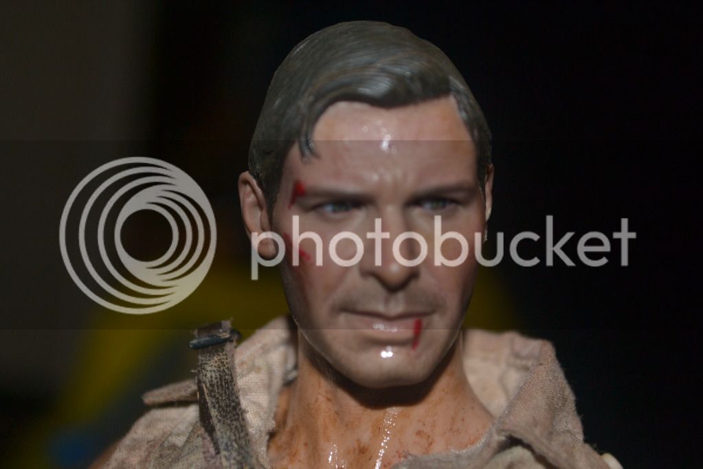
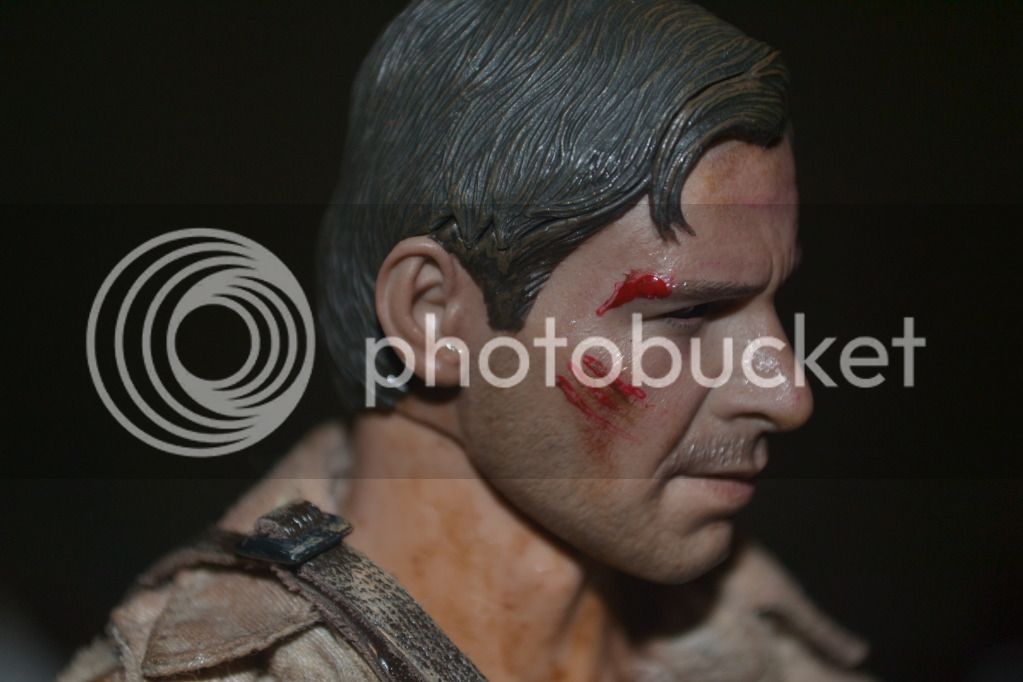
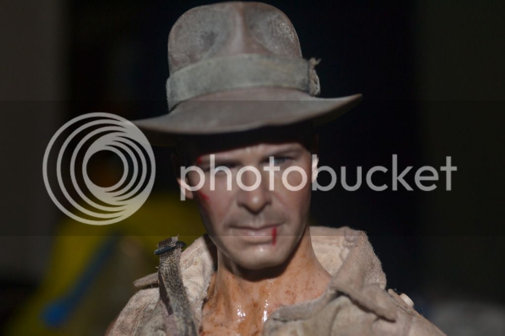
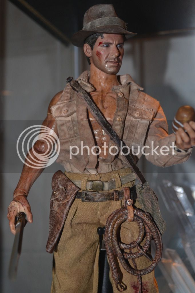
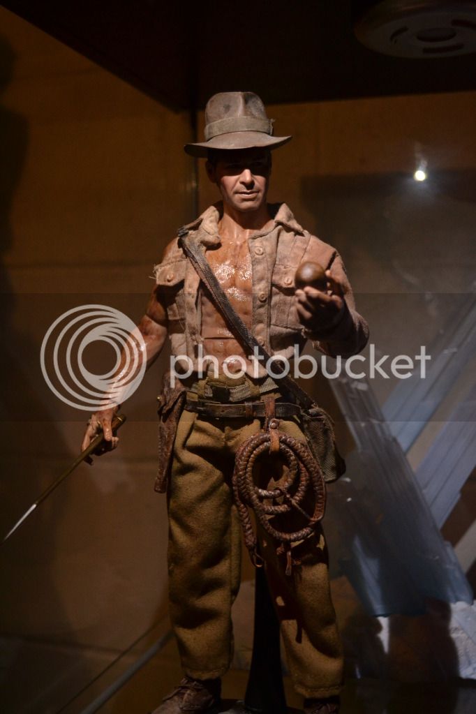
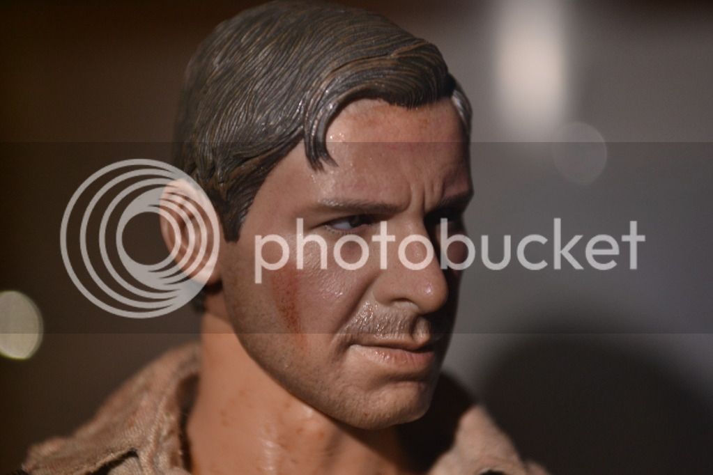
Here is my custom Indy from Temple Of Doom. The head sculpt is from the HT Indy repainted by me. The clothes are from the Relic Hunter figure I bought a while back. The figure is built on an HT Advanced Muscular Body.
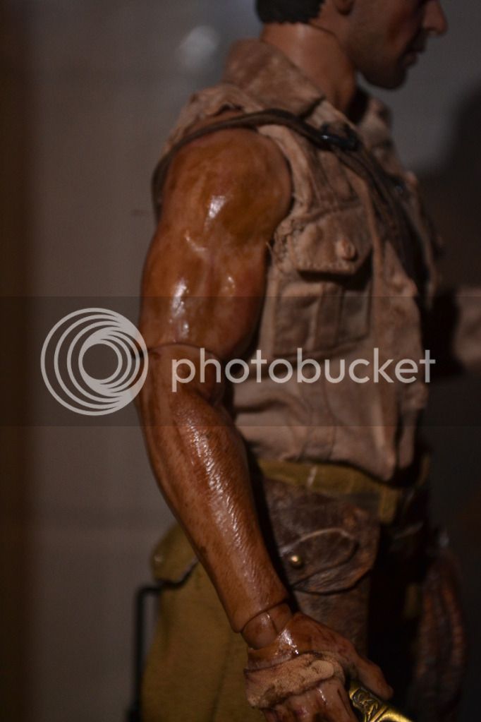
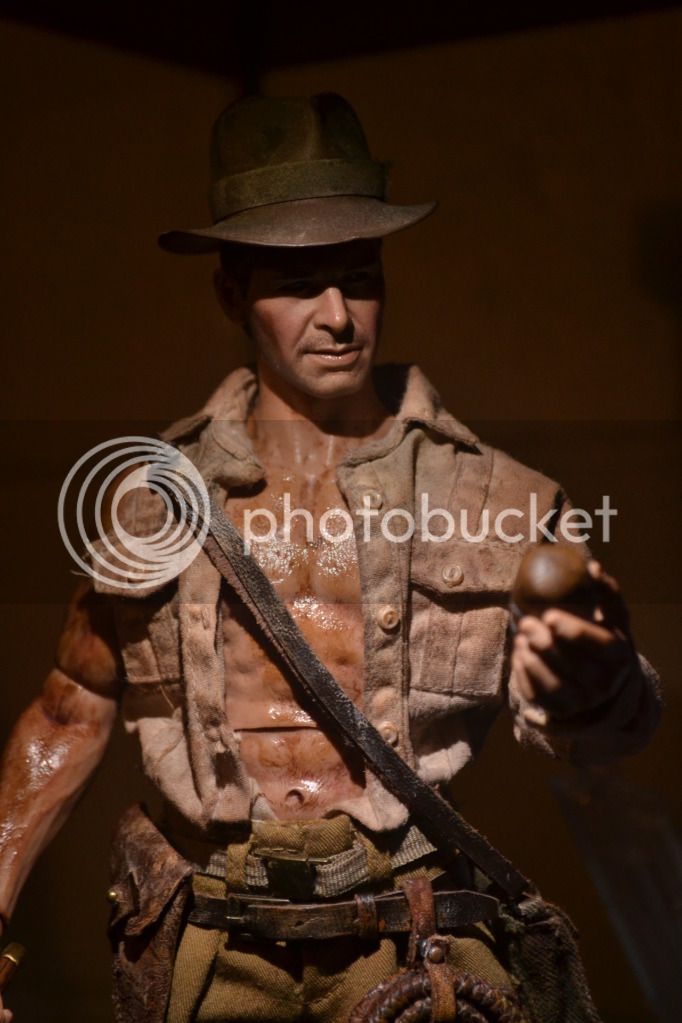
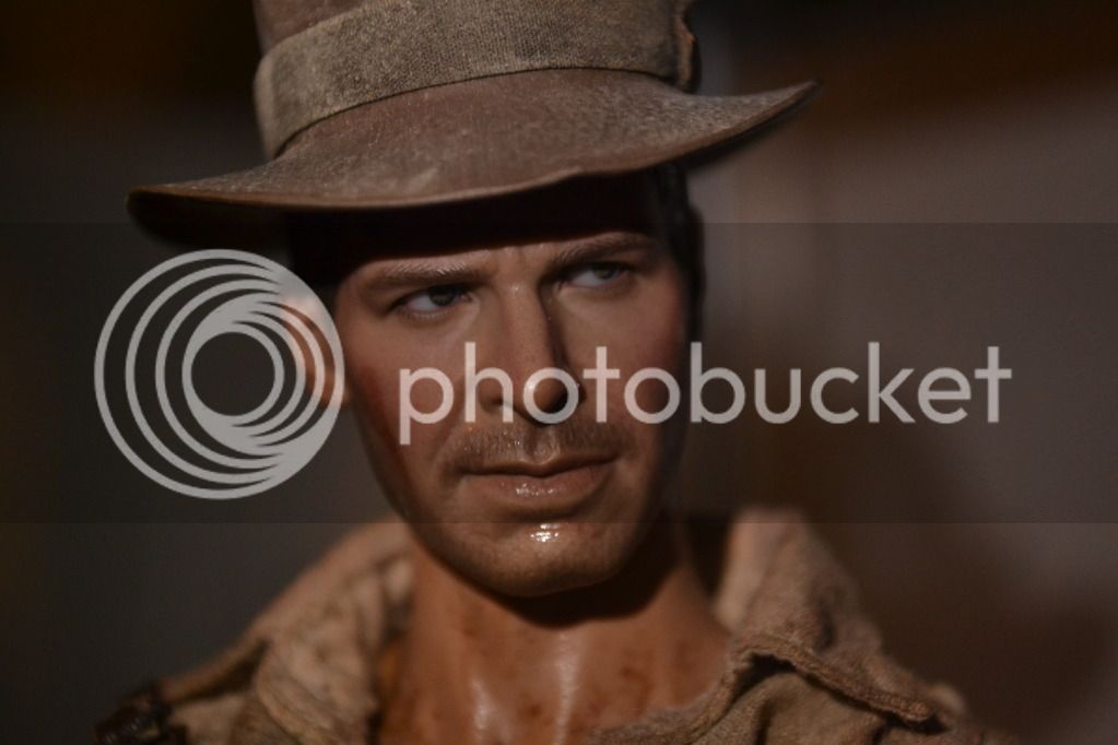


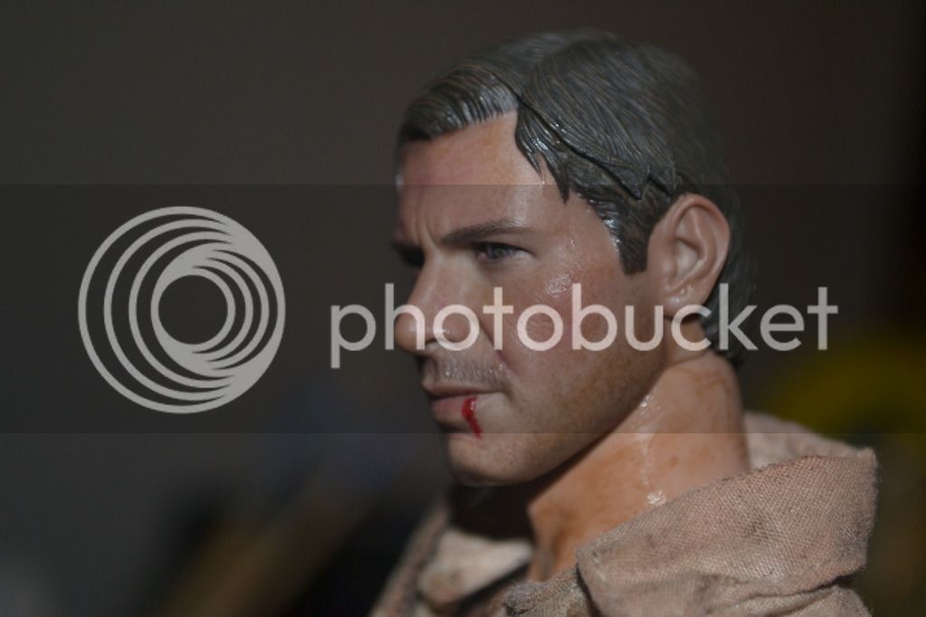
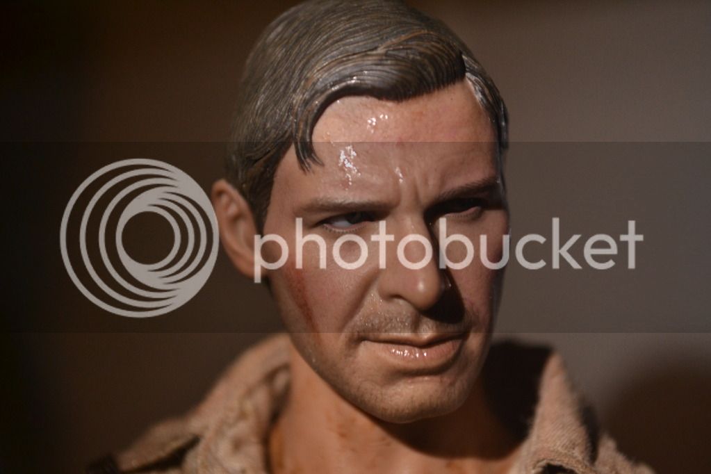
Here are more close ups. I weathered his face and added some sweat and blemishes.
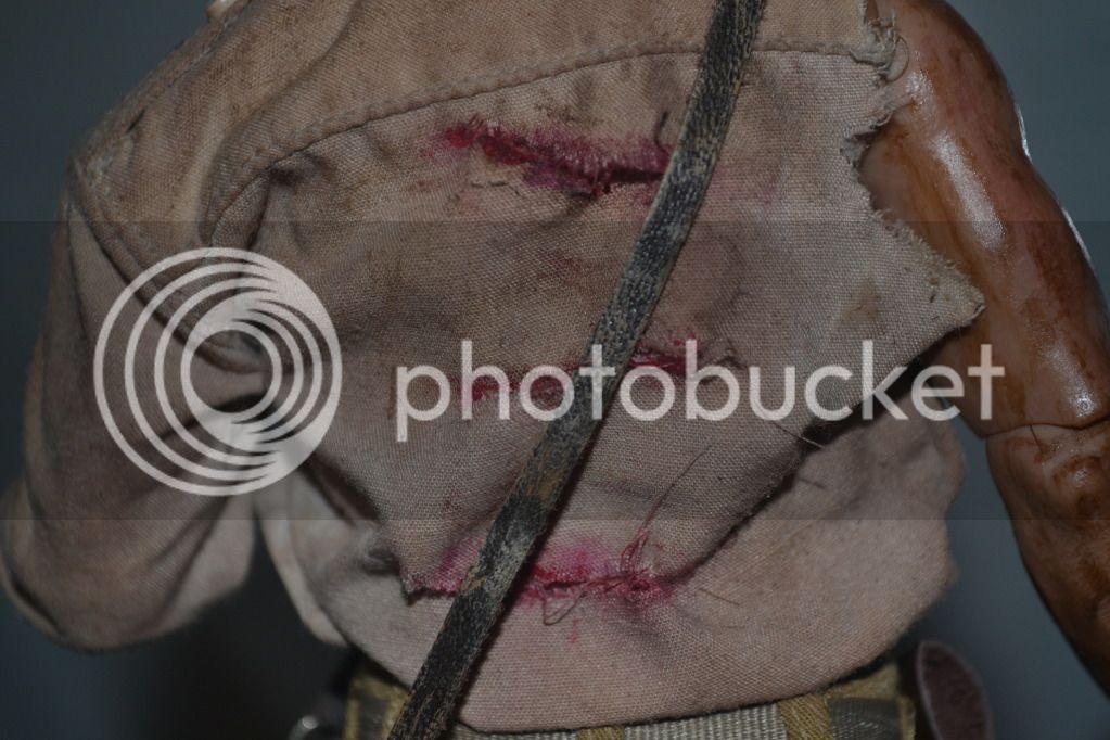
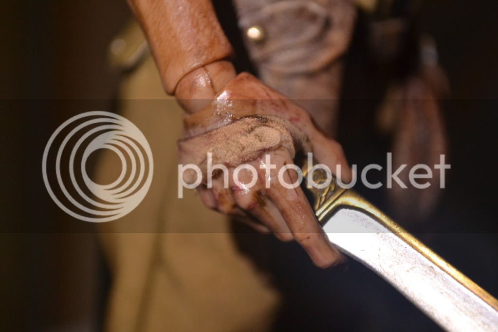
Here's a close up of his hand showing the bandage made from a part of his ripped shirt......
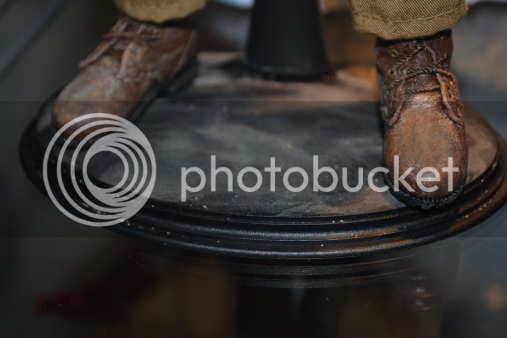
I weathered up the base to look like sand and dust.....


Here's a close up of his hand showing the bandage made from a part of his ripped shirt......

I weathered up the base to look like sand and dust.....

bbl
Super Freak
- Joined
- Jan 4, 2011
- Messages
- 1,633
- Reaction score
- 10
Hi,
Looking good. Don't forget the scratches on the face.
Looking good. Don't forget the scratches on the face.
Here are a few more showing him holding one of the stones. I made the stone from scratch and painted it. It's not dead on accurate but good enough for a cool accessory...
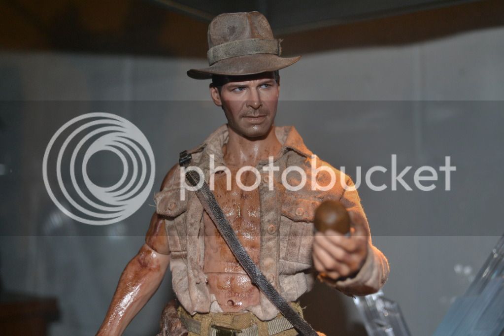
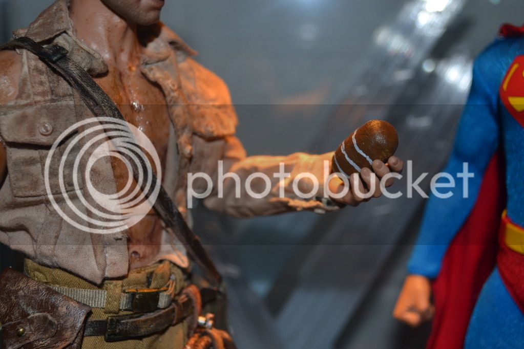
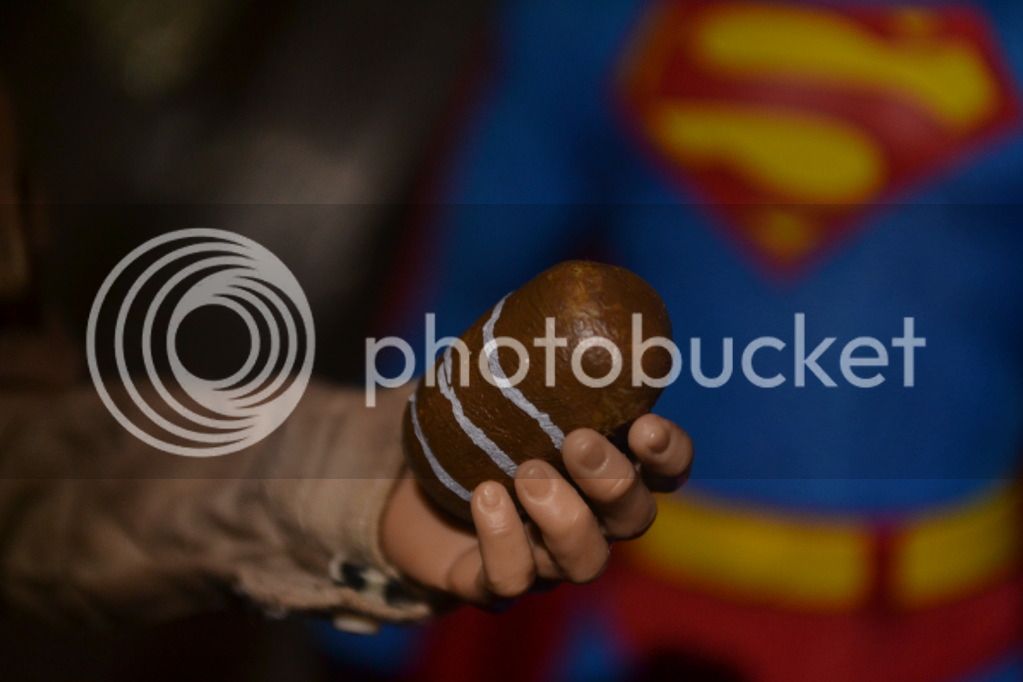
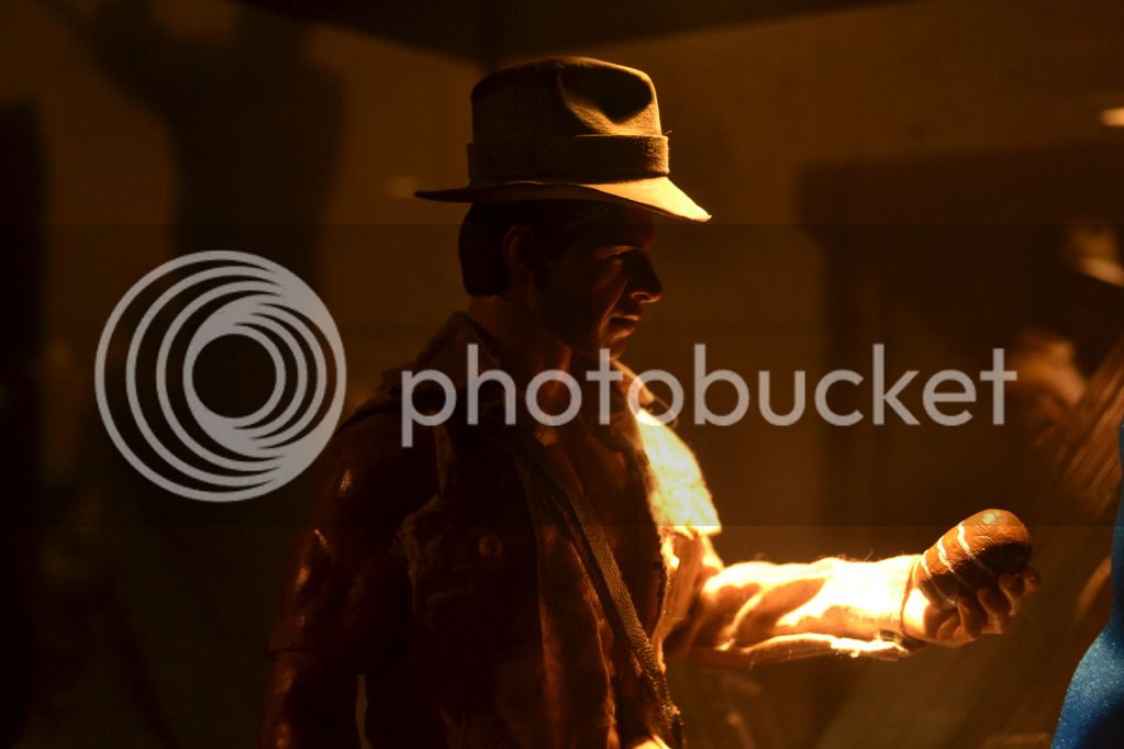
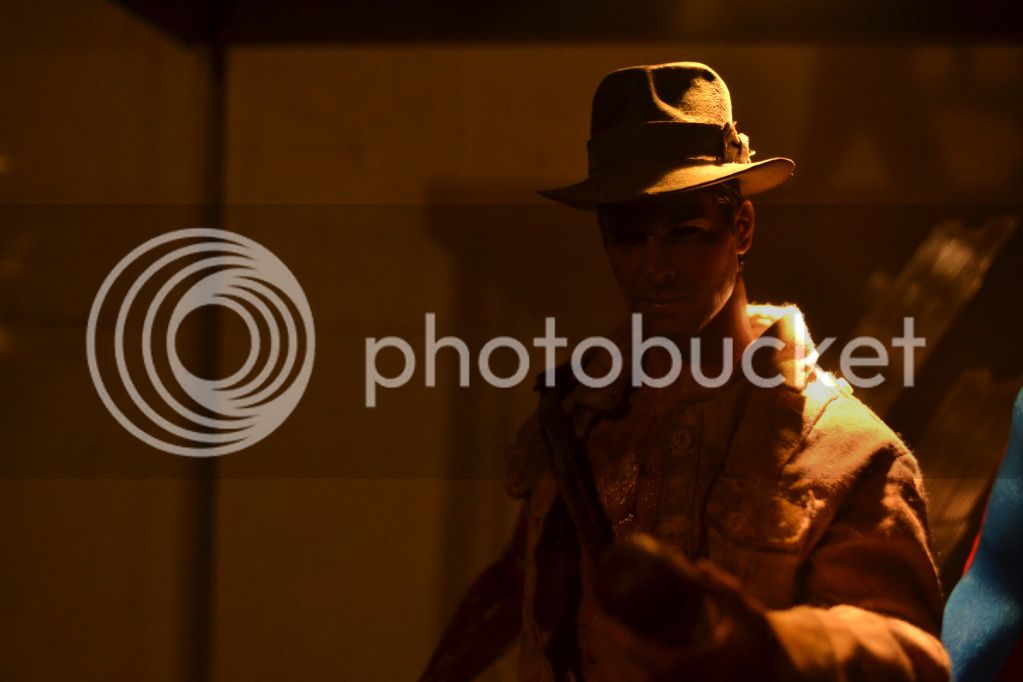
Hi,
Looking good. Don't forget the scratches on the face.
Good point!! I will work on adding that. Thanks

$59.99
Marvel Legends Series Venom, Marvel Comics Collectible Action Figure 6” - Exclusive
Package Outbound

$8.99
$19.98
DC Comics, Hawkman 12-inch Action Figure, Black Adam Movie Collectible Kids Toys for Boys and Girls Ages 3 and Up
Amazon.com

$12.39
$13.99
TPAECJM 5pcs Collectible Super Hero Series Exclusive Figure Set, 4.7-Inch Action Figures
MNXBB

$23.74
$24.99
Marvel Legends Series Ikaris, Comics Collectible 6-Inch Action Figure with Build-A-Figure Part
Amazon.com
CAZAFANTASMA
Super Freak
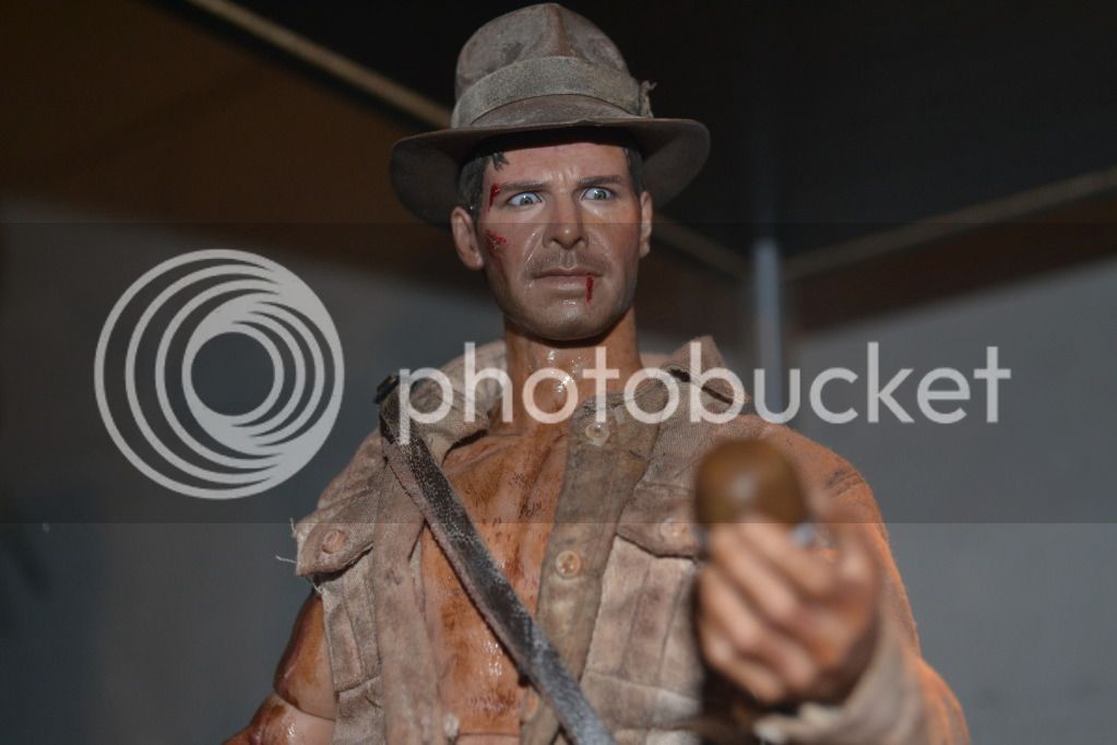
LOL, he's like "WTF is this!!!!!!!!" Like all u did to it, a little advice, for blood I like to mix a flat acrylic red with some black to make it look more realistic!
Good job!
Sal


LOL, he's like "WTF is this!!!!!!!!" Like all u did to it, a little advice, for blood I like to mix a flat acrylic red with some black to make it look more realistic!
Good job!
Sal
Thanks and yes I am well aware of the black and red thing. I guess you haven't see a lot of my horror customs.
 The camera is making it a brighter red then it is but I did mix the 2 together. I might go back and darken it if necessary. Thanks for the tip and feedback!!
- Joined
- Mar 13, 2010
- Messages
- 1,299
- Reaction score
- 0
Indy's stones aren't big enough.
Indy's stones aren't big enough.
That sounds like a personal problem.

Nice. But his hat's seated a bit high, don't you think?
Nice. But his hat's seated a bit high, don't you think?
Thanks and sure I can push the hat down more. It's both the HT hat and head so they go together. I was going back and forth taking pics with the hat on and off so I probably just didn't push it down all the way.
LOL, he's like "WTF is this!!!!!!!!" Like all u did to it, a little advice, for blood I like to mix a flat acrylic red with some black to make it look more realistic!
Good job!
Sal
Nice. But his hat's seated a bit high, don't you think?
Ok guys...to show that I take feedback seriously good or bad, here is some updated pics. First I did darken the blood and second, I lowered the hat this time.
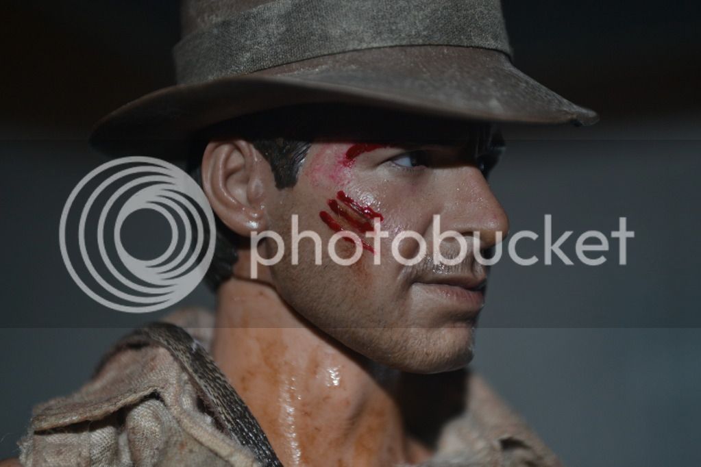
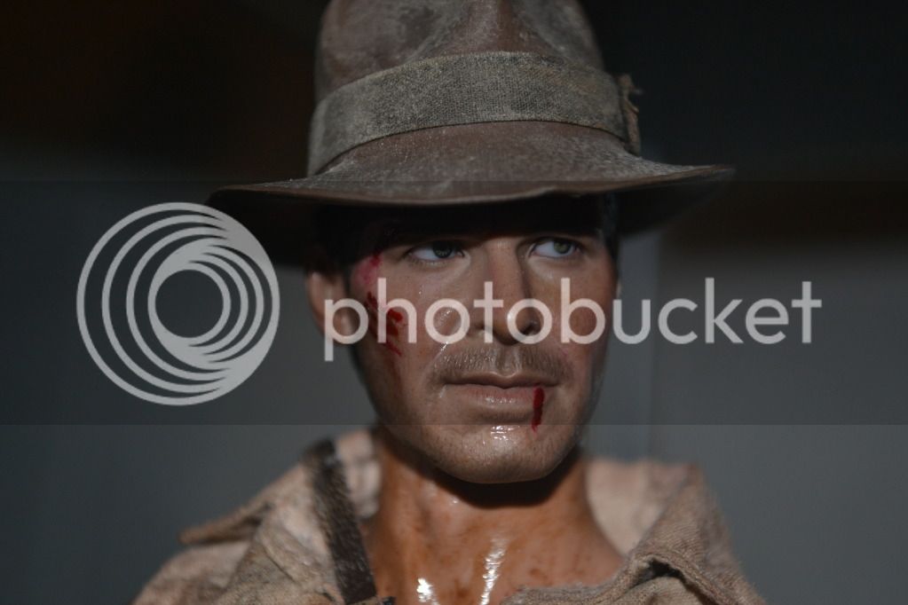
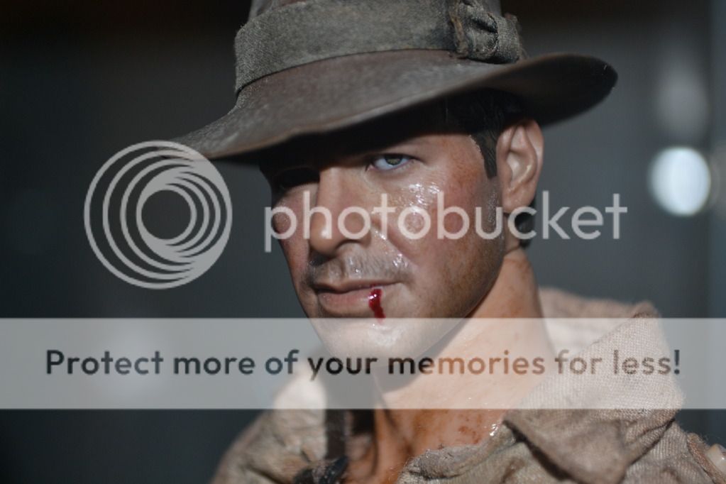
CAZAFANTASMA
Super Freak
Much better IMO!!!!!
Love them. This one seems to be saying "How you doing!" (in Joey Triviani's voice)
 [/QUOTE]
Love them. This one seems to be saying "How you doing!" (in Joey Triviani's voice)


[/QUOTE]Much better IMO!!!!!
Love them. This one seems to be saying "How you doing!" (in Joey Triviani's voice)

 That is the money shot right there for the ladies. It is amazing how many different expressions you can get out of him just by moving the eyes around. Like you said earlier, he had the WTF? face with the pers pointing down but this way he looks calm and collective almost posing for the camera.
CAZAFANTASMA
Super Freak
Yeah , and still 90% of members hate this sculpt (yes its smaller than it should be but I don't think is HORRIBLE) .
Yeah , and still 90% of members hate this sculpt (yes its smaller than it should be but I don't think is HORRIBLE) .
I tend to agree with you now. I didn't like the sculpt either at first but after seeing it in hand and seeing others improve it with weathering or painting I like it much more now. After I weathered this one a bit I see much more Ford in there.
Ok guys...to show that I take feedback seriously good or bad, here is some updated pics. First I did darken the blood and second, I lowered the hat this time.
Much better. Don't you think?
This one was just....

...I hear him saying: What do you mean? There's nothing under my hat. Like he's trying to steal a Shankara stone.
Similar threads
- Replies
- 2
- Views
- 290
- Replies
- 4
- Views
- 401


