Well, then I guess you asked for it.
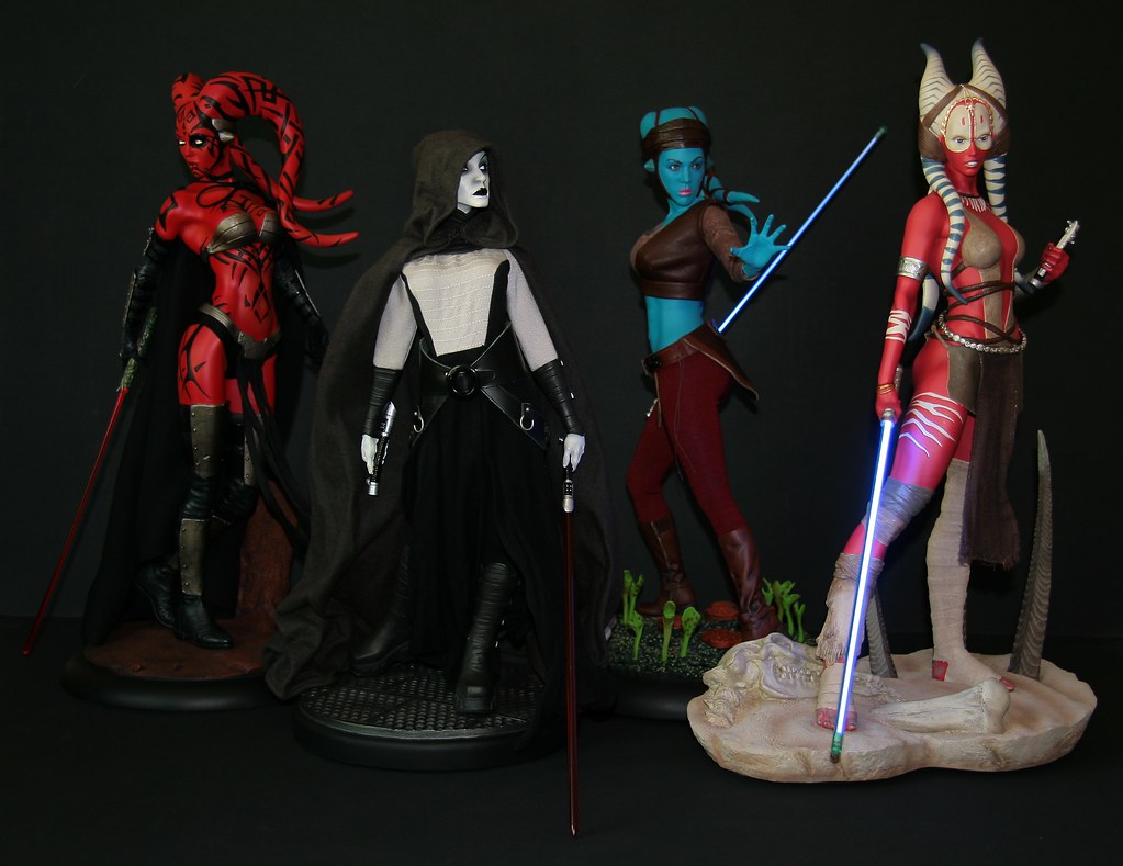
1. The pose. It's awkward. Her head is almost turned 90 degrees to the left. It looks unrealistic to me.
2. The use of fabrics. They looks amateurish. They are stiff and the choice of materials not optimal. They do not fit on her body in an authentic or natural way. Does not look or feel like a professionally hand-crafted piece of licensed collectible to me.
3. Most importantly. Her color. The blue color of her skin is nowhere like the one seen in the movie. This looks way too saturated and artificial. The details and surface of her skin almost drowns in an ocean of all blue. There are no highlights or tones. It's just BLUE. They should have spent more time applying some levels to her skin.
4. The base. Well, it just looks like them bottom of an aquarium. It may look a little like Felucia, but it looks half-hearted to me.
Bottomline, this piece was rushed.
Also, this is my personal opinion. I do not HATE this piece. I just feel that it is a missed opportunity. Do not mistake dissatisfaction with hatred. We are all allowed to have our views and opinions on certain pieces, and as I have made clear before, I respect the collectors who like this piece, and I feel happy for them.
Still, I maintain my personal view on this piece.