You are using an out of date browser. It may not display this or other websites correctly.
You should upgrade or use an alternative browser.
You should upgrade or use an alternative browser.
ALL THINGS TRANSFORMERS!!!!
- Thread starter p!tu
- Start date

Help Support Collector Freaks Forum:
This site may earn a commission from merchant affiliate
links, including eBay, Amazon, and others.
I love Inferno. He looks absolutely spot on and I am SO curious on how the transformation will turn out.
Especially the part with his legs and the ladder.
I suppose the ladder will collapse in itself (that was the easy part), clip into place, slide down in the back of his vehiclemode, his back will then split, 2 plates turn upward and close the gap where the ladder come out.
Ingenious, if you ask me.
Especially the part with his legs and the ladder.
I suppose the ladder will collapse in itself (that was the easy part), clip into place, slide down in the back of his vehiclemode, his back will then split, 2 plates turn upward and close the gap where the ladder come out.
Ingenious, if you ask me.
franpincho
lol@$300 head sculpts
The only Transformers movie that actually matters finally gets the proper treatment. Amazing!
Can't wait for Inferno!
franpincho
lol@$300 head sculpts
I was so looking forward to Thrust but I honestly think he looks terrible. The red is ugly, the ghost-white face feels really out of place, but worst of all is the grey wings mismatched with the black body. What the hell were they thinking? All of those grey wing bits should be black as well. Really disappointed.
Regarding Inferno, he looks great! And his colored reveal gives us the answer to how the Masterpiece line will proceed following their announcement of doing toon-accurate redecos; Inferno comes with extra accessories to swap-out the chrome bits for flat grey cartoon bits if you're into that sort of thing. This is definitely the best of both worlds, although the mold certainly still skews on the side of toon-simplicity.
It does look accurate enough, as one of the gray areas was actually a bit darker in the cartoon. Courtesy of Dannyboy at TFW:

Looks totally spot on to me, and that HS is amazingly similar as well.
Honestly, I can't stand the new coneheads. I feel like the old IGear ones looked much better, and the upcoming Toyworld ones just blow them away. The MP11 mold is so good but those things look a damned mess to me.
https://kumastyledesigns.com/ripper-gallery/
Got a decent sized gallery up of MakeToys ripper at over 20 pics. Check it out and let me know what you think by clicking the pic below:

Here are a few pics from it:


https://kumastyledesigns.com/ripper-gallery/
Got a decent sized gallery up of MakeToys ripper at over 20 pics. Check it out and let me know what you think by clicking the pic below:

Here are a few pics from it:


YankeesFanboy
Super Freak
It's pretty cartoon-accurate but damn, everything seems to clash. A darker shade of red and one shade of dark gray would simplify things but those knees.
 Hell, I'll get it anyway, even at $180.
I'm loving that Takara Inferno, especially since it'll come with two heads. I hope Takara one day revisits Optimus Prime and makes a figure just as faithful to the show.
The only Transformers movie that actually matters finally gets the proper treatment. Amazing!
Can't wait for Inferno!
Quoted for truth.


BurningRage
Super Freak
Ordered MP Thrust at BBTS.
koolkollectibleskhai
Super Freak
I ordered mine at Robotkingdom. $149.90 + $30 shipping to Australia!
If I could get the coneheads for $150 shipped I might go for it, but. . .just can't pull the trigger.
Reinhardt
Super Freak
I am interested in Toy World's efforts of the coneheads - and the KO versions of Thundercracker and Skywarp (since I can't justify $200 for each of those)
- Joined
- Nov 18, 2008
- Messages
- 6,966
- Reaction score
- 6,203
It does look accurate enough, as one of the gray areas was actually a bit darker in the cartoon. Courtesy of Dannyboy at TFW:
View attachment 269354
Looks totally spot on to me, and that HS is amazingly similar as well.
I see what they were going for but in my opinion every shade they chose is off just enough to make the whole thing look like a mess. Had they followed the cartoon model instead of the cartoon itself, we'd have ourselves a dramatically better looking figure:
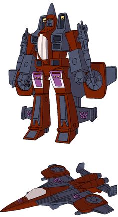
Also, Takara had the opportunity to ditch the extra plastic kibble on the side of the legs with Thrust (as it's completely uneeded), but instead they chose to just make it grey.
That's exactly right. Everything is just too damn bright. Reminds me too much of the Classics Thrust and not enough of G1 Thrust.It's pretty cartoon-accurate but damn, everything seems to clash. A darker shade of red and one shade of dark gray would simplify things...
franpincho
lol@$300 head sculpts
Ordered Thrust at The Chosen Prime, free shipping and free rewards with every dollar spent, much like SSC.
lotus000
Super Freak
- Joined
- Jun 25, 2013
- Messages
- 1,324
- Reaction score
- 8
First pics of someone selling Loud Pedal , that seems pretty fast since the PO just opened up last month. First time I have seen the box. Looks much like the boxes Silverstreak and Tigertrack came in.
https://www.ebay.com/itm/TAKARATOMY...812397?hash=item236b492a2d:g:hNIAAOSwQupXWubf
https://www.ebay.com/itm/TAKARATOMY...812397?hash=item236b492a2d:g:hNIAAOSwQupXWubf
thecorsair
Super Freak
- Joined
- Feb 16, 2012
- Messages
- 3,621
- Reaction score
- 9
franpincho
lol@$300 head sculpts
More close up pics of Inferno, posted by Daimchoc on FB
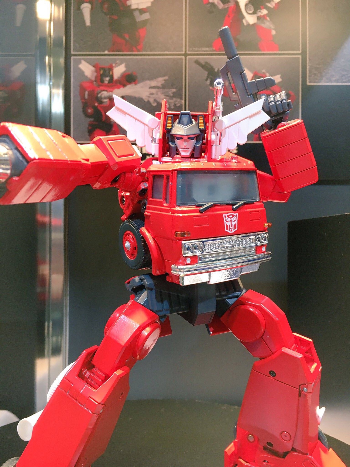


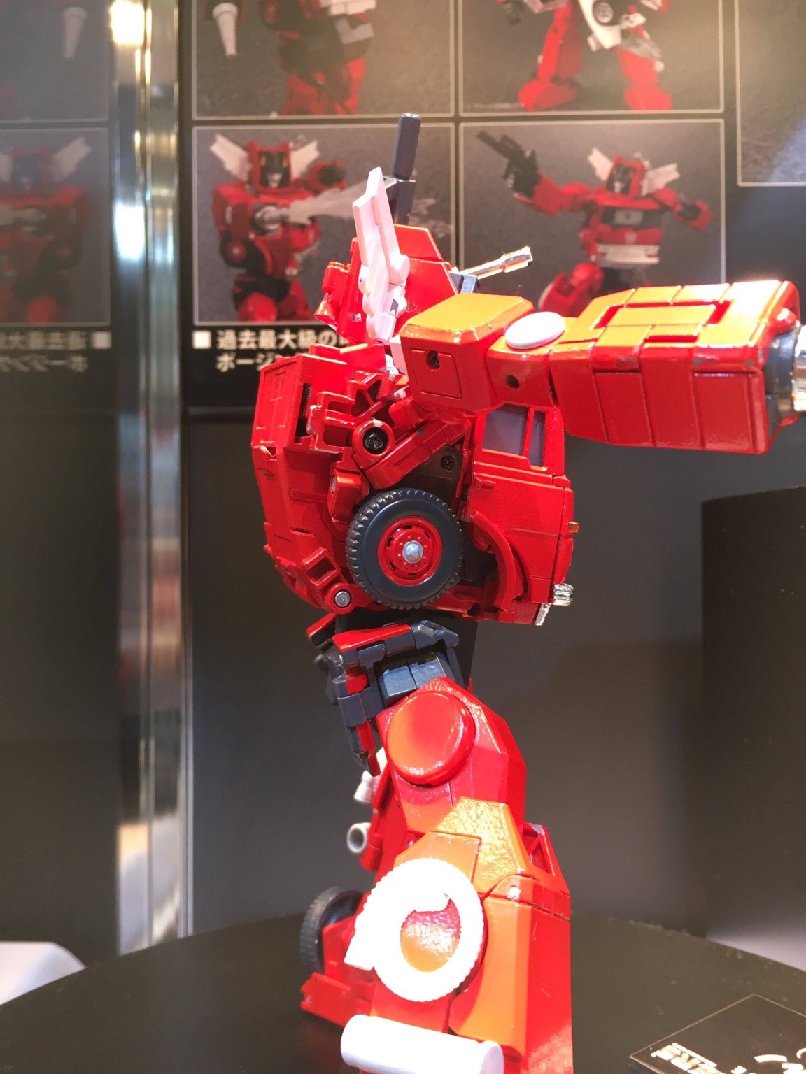
What an amazing achievement by Takara.


What an amazing achievement by Takara.
thecorsair
Super Freak
- Joined
- Feb 16, 2012
- Messages
- 3,621
- Reaction score
- 9
koolkollectibleskhai
Super Freak
MP Inferno is so damn beautiful!!! How they hide the ladder must be some engineering genius!!
Ra88
Super Freak
Inferno does look pretty good, though I'm not a fan of the more cartoon accurate approach. Always been a fan of the Hasui design philophosy of where it's the perfect version of the G1 character. How the ladder hides away is pretty clever, but I like it better when it's left visible. Backdraft still has my money in that regard, along with the better detailing. 
Cheetor though...Now that is a masterpiece! Utterly incredible how good it looks, they NAILED it top to bottom! The only flaws I can find are the robot feet clearly visible in beast mode and the fake chest, but **** it, when the rest is so good I can easily forgive that! Bring on a whole S1 lineup I'd say!
Cheetor though...Now that is a masterpiece! Utterly incredible how good it looks, they NAILED it top to bottom! The only flaws I can find are the robot feet clearly visible in beast mode and the fake chest, but **** it, when the rest is so good I can easily forgive that! Bring on a whole S1 lineup I'd say!
thecorsair
Super Freak
- Joined
- Feb 16, 2012
- Messages
- 3,621
- Reaction score
- 9
Cheetor though...Now that is a masterpiece! Utterly incredible how good it looks, they NAILED it top to bottom! The only flaws I can find are the robot feet clearly visible in beast mode and the fake chest, but **** it, when the rest is so good I can easily forgive that! Bring on a whole S1 lineup I'd say!
Cheetor looks somewhat better than I expected, particularly in beast mode, having a decent looking detailed 3D model to work from as opposed to crappy 2D animation clearly helped the design team.
I think the fake chest is one of those situations where a bit of accuracy was sacrificed in order to get the overall aesthetics as good as possible for both modes and it's paid off.
Looking at the beast mode I'm not sure whether a Tigatron retool is as likely as previously thought as that body with a tiger head would make for a scrawny looking tiger. Tigatron was Big Cat, not Eating Disorder Cat

A retool may be doable but depend on how big the budget for it was....with the first two looking so good I'd hate to see any shortcuts taken just to get another character out there.
It's very cool that my first ever figures of Optimus Primal & Cheetor are going to be Masterpieces although I still intend on picking up the Transmetal versions of both at some point and maybe Optimal Optimus.
With a much smaller cast and no licensing issues a complete series 1 lineup should be a lot easier for Takara to do, much will depend on how the initial ones sell so all I can do is buy 2 of each and see what happens.
Similar threads
- Replies
- 0
- Views
- 299
- Replies
- 3
- Views
- 1K
- Replies
- 2
- Views
- 2K
- Replies
- 4
- Views
- 1K


