You are using an out of date browser. It may not display this or other websites correctly.
You should upgrade or use an alternative browser.
You should upgrade or use an alternative browser.
Premium Format Apocalypse PF
- Thread starter Sebastian
- Start date

Help Support Collector Freaks Forum:
This site may earn a commission from merchant affiliate
links, including eBay, Amazon, and others.
Reme Lebeau
Super Freak
- Joined
- Dec 7, 2010
- Messages
- 252
- Reaction score
- 0
True it doesn't look iconic. Just legendary.
Is that an action figure?
Magneticsoul
Freaked Out
- Joined
- Mar 9, 2013
- Messages
- 133
- Reaction score
- 0
anybody know what we see at the con is the reg or EX? I know that this will have exchange hand.
ilikethat69
Super Freak
anybody know what we see at the con is the reg or EX? I know that this will have exchange hand.
EX....


$57.89
Marvel Legends Series Venom, Marvel Comics Collectible Action Figure 6” - Exclusive
Alliance Collectibles

$35.00
$39.99
San Diego 2024 Previews Exclusive Marvel Comics: Wolverine DS-151 D-Stage Statue
Amazon.com

$44.99
Marvel Legends Series Deadpool, Deadpool 2 Adult Collectible 6-Inch Action Figure
S&A Distribution

$11.99
$13.99
TPAECJM 5pcs Collectible Super Hero Series Exclusive Figure Set, 4.7-Inch Action Figures
MNXBB
anybody know what we see at the con is the reg or EX? I know that this will have exchange hand.
EX....
It should actually be the REG. SSC usually only display the REG editions of their statues at SDCC.
The gun is probably the EX
Bob Morton
Super Freak
Ummm no offense or anything "Bob Morton" and i know everyone has their opinion but that link you posted looks like the Big A has the Big D (as in down syndrome). Either that or you have a really low standard for what your $500 statues are supposed to look like. I dont know whether to laugh at that or cry for you
Oh you big silly goose you!
That picture is of a figure worth $6.99 not of a $500 statue so obviously it is not what an apocalypse statue would look like. That being said there are a lot of features on that figure that I prefer over the statue - he is more squat and solid looking i.e. not as tall but broader, the shoulder pads and the no ridiculous "A" on the belt for easy identification.
akira10
Super Freak
Awesome is an understatement my friend!
This statue is awessome.
TheMadTitan
Super Freak
- Joined
- Jul 9, 2009
- Messages
- 935
- Reaction score
- 0
Oh you big silly goose you!
That picture is of a figure worth $6.99 not of a $500 statue so obviously it is not what an apocalypse statue would look like. That being said there are a lot of features on that figure that I prefer over the statue - he is more squat and solid looking i.e. not as tall but broader, the shoulder pads and the no ridiculous "A" on the belt for easy identification.
Still man, I and I'm sure most everyone will say, that the current iteration of the statue is pretty sick!. I'm sure a better base and a more vibrant paint job would make it even better and that 'A' is meant to be there, there are very few artists that draw him without it, and it has been a mainstay from the beginning.
Bob Morton
Super Freak
Still man, I and I'm sure most everyone will say, that the current iteration of the statue is pretty sick!. I'm sure a better base and a more vibrant paint job would make it even better and that 'A' is meant to be there, there are very few artists that draw him without it, and it has been a mainstay from the beginning.
Well that like your opinion man...
Behold what apocalypse should look like (according to me):
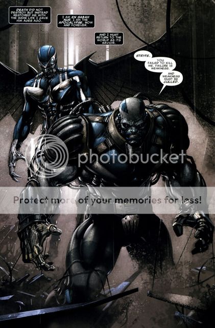
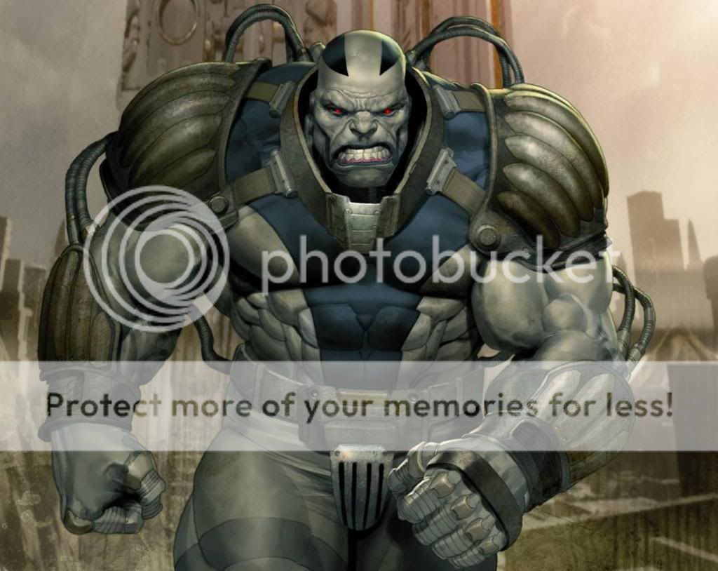
Notice the design of the shoulder and for-arm protectors and the lack of "A" on the belt (which the age of apocalypse one does not have either). These make him look more squat and menacing in my opinion. The SS statue should have been more broad and less tall. Plus I don't like the ski boots he is wearing. I think what I like about the above apocalypses is that the ratio between the shoulder size and the waist size is much greater than that on the statue - giving that version a much bulkier look. Just my opinion.
Last edited:
Mr. Green
Super Freak
there's always a stylized version of a character. it seem the more popular the character is, the more version available. there's always exceptions of course.
Well that like your opinion man...
Behold what apocalypse should look like (according to me):


Notice the design of the shoulder and for-arm protectors and the lack of "A" on the belt (which the age of apocalypse one does not have either). These make him look more squat and menacing in my opinion. The SS statue should have been more broad and less tall. Plus I don't like the ski boots he is wearing. I think what I like about the above apocalypses is that the ratio between the shoulder size and the waist size is much greater than that on the statue - giving that version a much bulkier look. Just my opinion.
You do realize that shoulder protectors and being squat matters not to Apocalypse, because if you knew the character. 1. He can change his form and 2. he's pretty invulnerable to most attacks and can also regenerate/heal himself . So again artist interpretation aside, not arguing that this representation of him is pretty bad *** and wouldn't mind either.
As long as it effen rocks im good man.

savageHULK
Super Freak
Also guys, need a tip. I'm reading the New X-men omnibus right now. Would I go straight to Astonishing X-men or can I read Apocalypse? I've been wanting to so bad. Haha
Figured you guys would know better than most.
Figured you guys would know better than most.
Well that like your opinion man...
Behold what apocalypse should look like (according to me):


Notice the design of the shoulder and for-arm protectors and the lack of "A" on the belt (which the age of apocalypse one does not have either). These make him look more squat and menacing in my opinion. The SS statue should have been more broad and less tall. Plus I don't like the ski boots he is wearing. I think what I like about the above apocalypses is that the ratio between the shoulder size and the waist size is much greater than that on the statue - giving that version a much bulkier look. Just my opinion.
Yeah, that top picture depiction of Apocalypse would have been ****ing sublime.
 The meticulous, countless subtle details all over sculpt would have made it THE star release of the Con. Menacing, great pose, powerful, hyper details would have blown Sideshow's watered down, cookie cutter version to bits. Sideshow, WTF have you done, & why for such a great character???!!! A ****ing shame.
IronLungs31
Super Freak
I'm sure we'll get the other Apocalypse in comiquette form.
Similar threads
- Replies
- 1
- Views
- 968
- Replies
- 0
- Views
- 392
- Replies
- 0
- Views
- 842
- Replies
- 2
- Views
- 2K
- Replies
- 0
- Views
- 604




 that will make a sweet EX