Batman Legendary Scale Figure

Collector Freaks Forum

Help Support Collector Freaks Forum:

This site may earn a commission from merchant affiliate links, including eBay, Amazon, and others.
This looks good if Displayed at 3/4 angle. Straight on it looks odd.
 
I'm not buying this but the statue does look a little better with the cape spread out behind him - the pose doesn't look as awkward.
 
The pose instantly reminded me of the numerous scenes where Gal Gadot stands with her arms in a similar position for several seconds, which I thought looked ridiculous.

glgdt.jpg
 
I have no idea why but when i saw this statue face forward the first time I immediately thought of this....stupid I know...but I specialize in stupid.
bestinshow.jpg
 
Just curious, is anyone on these boards buying this? I know this is a small group compared to the overall pool of potential buyers but still, I haven't heard much interest.
 
Just curious, is anyone on these boards buying this? I know this is a small group compared to the overall pool of potential buyers but still, I haven't heard much interest.

Love this piece, a lot, but I have two sticking points,

-I don't think different scales look good together at all, in any way, so it would greatly limit the 1/4 collection moving forward in terms of space, maybe would have enough room for 2-4 more 1/4th's, period, as I would clear out a huge viewing area for 1/2 scale to exist on it's own. My wife and I love collecting the 1/4th's.

-We don't have a Batman collection, We have a DC collection, if Superman and Wonder Woman wasn't within sight in the next few years, this would be sold.

So going to wait, where does SS go with their DC PF line in the coming years? Where do they go with future DC LSF's? If one slows and the other works out, this would be a welcome addition.
 
Damn what a let down this piece is. This could've been the centerpiece of my collection if it turned out great. It actually doesn't look bad from certain angles in those pictures but if you're gonna shell out that kind of money it had better look good from all vantage points.
 
I would love to see this piece displayed up high - higher than eye level(if you had the ceiling height...I think the way the legs look..sort of wide it would have almost a trompe l'oeil perspective...making it seem menacing..too bad his head was not tilted down more that would complete the look
 
Still don't like the pose, heads sculpt or fabric.
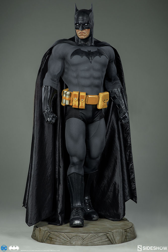

fAJw7w5.jpg


But I think it's a tiny improvement.
 
Back
Top