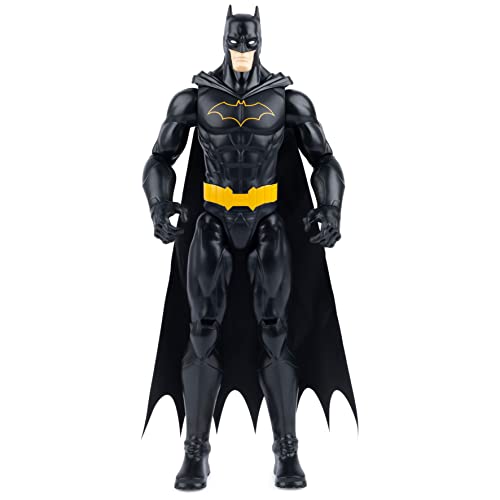
First impressions:
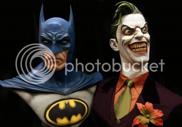
1. The eye issue is not as egregious as photos would indicate. Perhaps the folks at SS should invest in a good portrait lens.
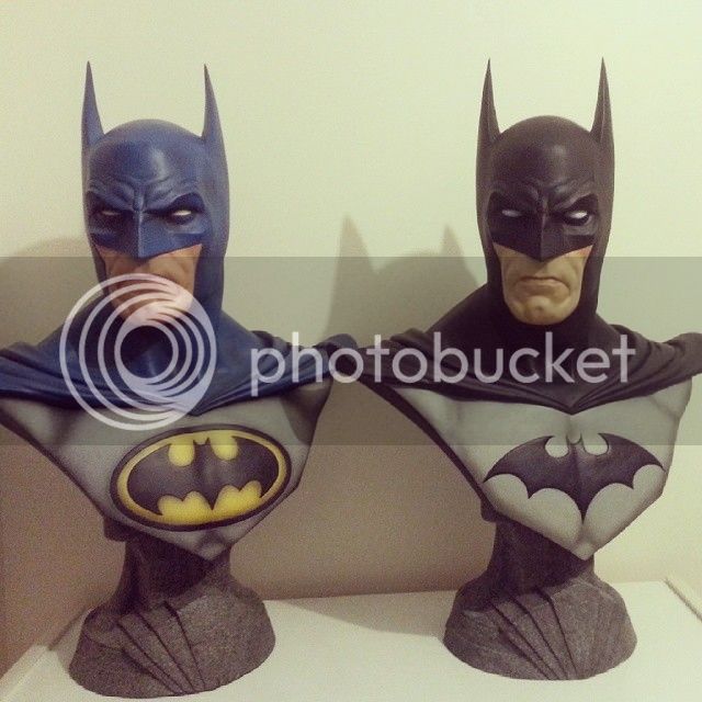
2. The paint apps are pretty great, but there is certainly not the level of subtlety in Batman that we see in the Joker bust. My bat symbol is a little sloppy, and I am debating a call to SS.
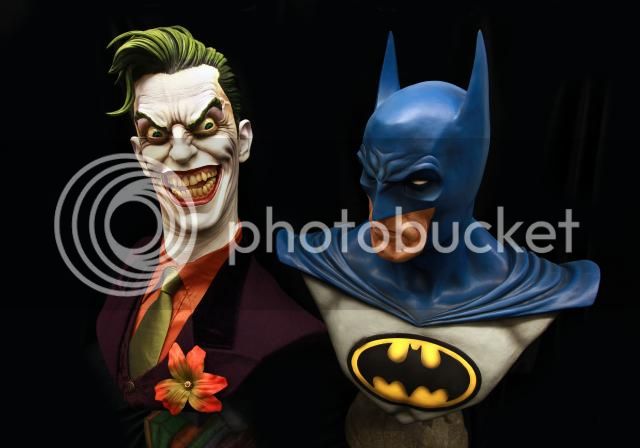
3. Sitting directly next to The Joker, Batman feels slightly smaller. I may ultimately display them on opposite sides of my desk to make the size disparity less obvious.
4. Batman's head is lacking depth. This is only apparent when looking at the bust's profile, but it bugs the hell out of me.
5. I prefer the monochromatic color of Batman's base over the tinting of Joker's.
Overall, I'm glad I got the blue.
