Cobra commander head sculpt and more

Collector Freaks Forum

Help Support Collector Freaks Forum:

This site may earn a commission from merchant affiliate links, including eBay, Amazon, and others.

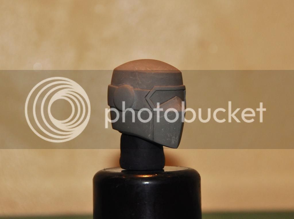
Pace, both your Shockwave and BBQ sculpts look really well done and you have a considerable talent, but I have to point out a flaw each sculpt share. With both sculpts there doesn't seem to be enough volume between the eye level line and the top of the head. The eye level line needs to be in the middle of the head, half way between the top of the head and the bottom of the chin. This is especially noticeable since both characters are wearing something on top of their heads.
It's not off by much, they're both really close to being perfect.

Just trying to be helpful here. :wave
 
Thanks Fuzz, Sir Gor!

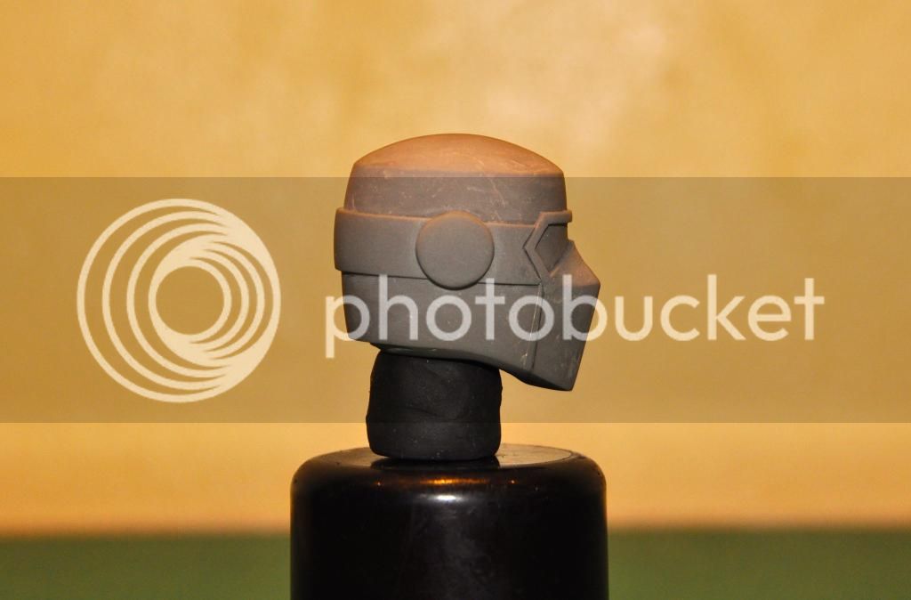
Scream, Thanks for your positive criticism I would surely take that margin on my next sculpt. As for Barbecue, I have taken great consideration of measuring the distance from the eyes to the top of the head (I'm using an engineering grade calliper). If you square the distance of the eye level to the overall height it is dead centre. I have also taken careful proportions with several "naked" head sculpt from sideshow GI Joe and also other manufacturer. The illusion is 1. the slopping of the dome of BBQ head versus the front rim, 2. the upper limit of the front googles, 3. the lower limit of the front google (the vertex that covers the nasal bridge)and lastly 4. the opposite vertex (which is the chin). This will give a "stretch" look making his "forehead" looks a tad smaller. And like you said his wearing a helmet and actually it throws off all the proportion and follows the helmet's shape. I have tried increasing the dome but its looks to high for my taste (like Abraham Lincon's hat) - ok maybe I'm exaggerating. So I decided to settle with this tolerance.


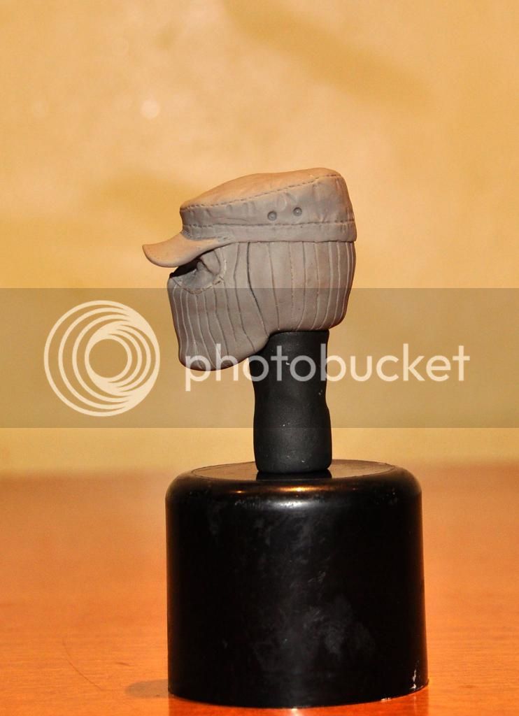
As for SW, I agree that the distance of forehead looks deceiving. I have sculpted him with no patrol cap and this is cross compared again with several naked heads and the distance was taken into account. Again, the patrol cap's angle from the back to the from gave it a steep angle creating an illusion of lack of forehead volume. You can see the "bulge" of the skull dome and again if you draw a line from the top to bottom the eyes are set almost centre. The forehead when view from the side had a gentle slope towards the vertex. I know others had a "square" look and this will be more obvious in showing the eye level proportion. It will also give a fuller forehead but will also give a "frontal" bossing as seen in people with Acromegaly or people with fronto-temporal Dementia (thickened frontal skull) and a lot more medical condition (i'm particular with anatomy - i'm a medical doctor:)). Anyhow, what you have suggested is a very good point. I will take that into account. As for BBQ I will not alter it as on hand I'm sure its not that obvious and like in my first posting, proportions and shape is very challenging especially curve surfaces. You need to shape it correctly to reflect symmetry. The only way to take it to precision is to take laser measurement. As for SW I'll see if I can improve the top front of the patrol cap to give it a "small" volume as I still personally want an aggressive look on the patrol cap, not just being wear on the head. Again very good observations.
 
Last edited:
EF had a point here so I'm showing comparison shots.

The best side by side comp is a bare head but I don't have any bald head to compare, all had hair which can be deceiving. The best I can compare it with is the head from a red ninja. Here goes...

First up is shock wave.... Overall head size is similar. At eye level both forehead are pretty much the same. Vertex of the skull is at the same height. The face is a bit "plump" with SW which I did on purpose.
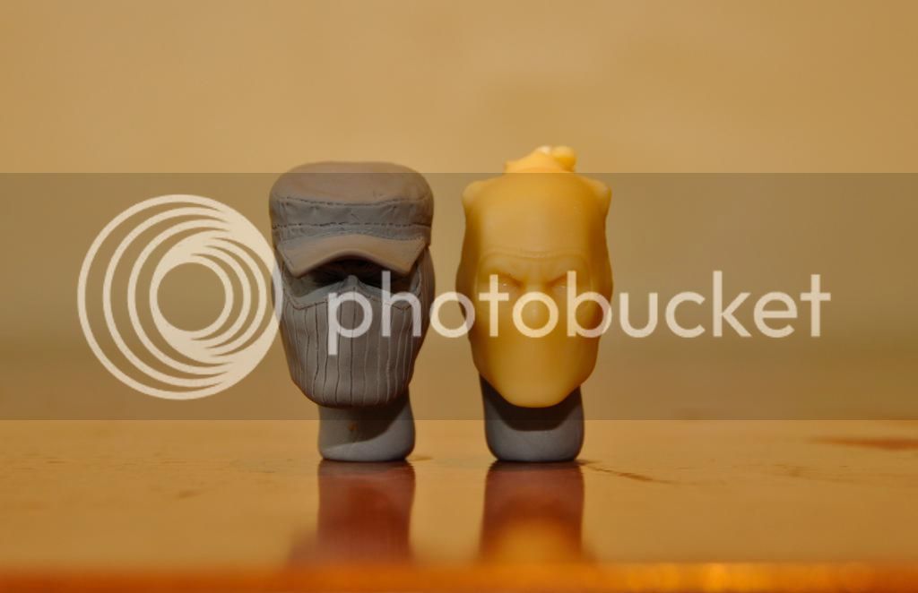

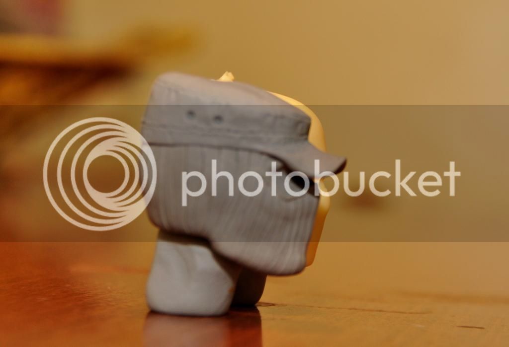
At side angle....Here you can see the silhouette of the ninja head from behind. Take note the almost equal "step" on the forehead then you have the slope transition to the top of the skull which is the vertex.


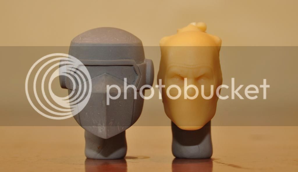
Next stop is Barbecue. Obviously he is wearing a helmet so proportions are off (helmet would be a bit bigger) but the key is to balance a bare head's proportion to fit inside the helmet. The vertex or top of the head is with the contour "dome" of the helmet.

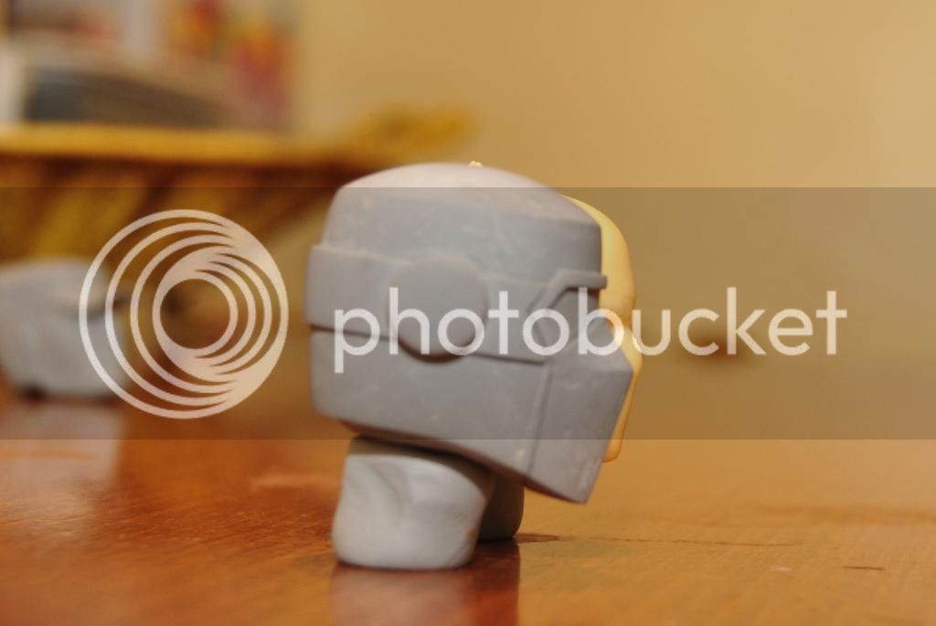
Side elevation comparing the forehead... You can see the step transition (or slope) from forehead to the top of the head.


Now for the interesting part.....
I took MB's head to show the difference. Surprisingly his face is massive and very prominent.
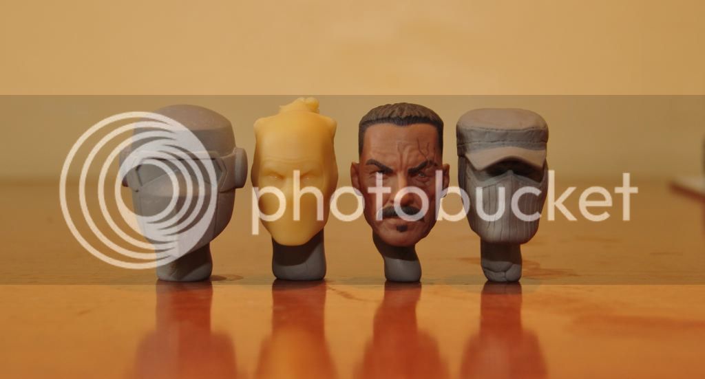
On the side comparison of the stock red ninja sculpt you can tell the difference with the face.......its very big. And it lacks bulk on the occipital area or the back of the head.....Talking about disproportion here. I know that the skull of an individual person can vary in great length so this is not beyond what is normal for a human anatomy. But I think the red ninja is better balance.
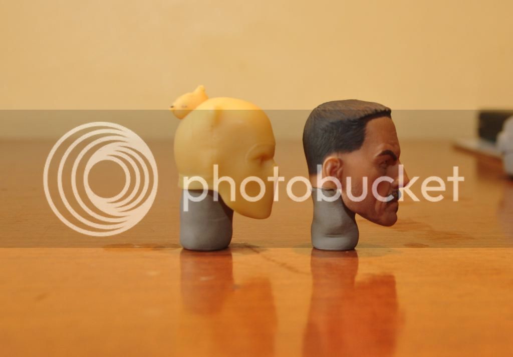

This is the top view showing the lack of volume of MB's occipital area. He might have problem with his balance or vision with a compromise occipital lobe and cerebellum.
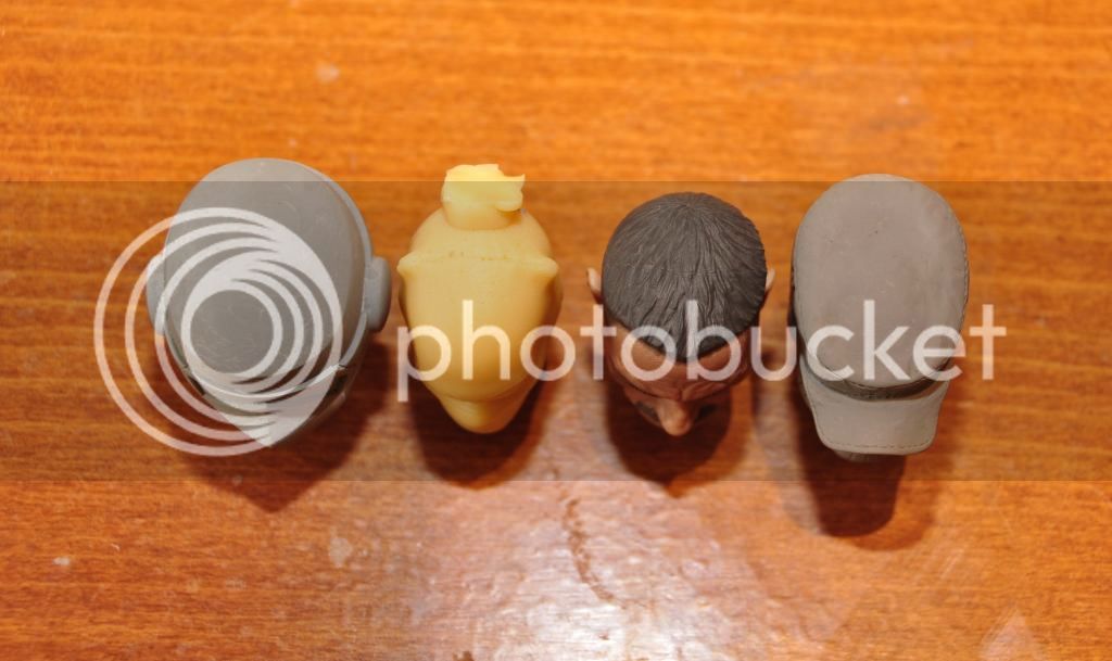
 
Looking at the Barbecue helmet now, I think you nailed it. Yeah it's the chin portion of the helmet that's a little lower that's making it appear off from certain angles. It looks proportional from the side view.

For Shock Wave, I guess he looks alright if you think of him having a steeply sloping forehead. Personally I would give him a bit more volume to his forehead and the very top of the crown, but if you're happy with it, that's all that matters. It's got to be nerve wracking to have to change something that looks almost perfect but is just slightly off in one way and fear that you might lose that cool factor, I've been there before!
Thanks for providing all of these pictures Pacemaker!
 
On the side comparison of the stock red ninja sculpt you can tell the difference with the face.......its very big. And it lacks bulk on the occipital area or the back of the head.....Talking about disproportion here. I know that the skull of an individual person can vary in great length so this is not beyond what is normal for a human anatomy. But I think the red ninja is better balance.
This is the top view showing the lack of volume of MB's occipital area. He might have problem with his balance or vision with a compromise occipital lobe and cerebellum.
This made me curious so I went and looked at pictures of Tom Selleck whom the MB likeness is based on. Surprisingly he does sport head proportions similar to the MB head, but the MB head is just slightly deficient in the occipital area you noticed. I'm thinking Sideshow did it on purpose to ensure that the helmet would fit properly.
 
Looking at the Barbecue helmet now, I think you nailed it. Yeah it's the chin portion of the helmet that's a little lower that's making it appear off from certain angles. It looks proportional from the side view.

For Shock Wave, I guess he looks alright if you think of him having a steeply sloping forehead. Personally I would give him a bit more volume to his forehead and the very top of the crown, but if you're happy with it, that's all that matters. It's got to be nerve wracking to have to change something that looks almost perfect but is just slightly off in one way and fear that you might lose that cool factor, I've been there before!
Thanks for providing all of these pictures Pacemaker!

No probs Scream, this is why I need input from you guys to make it better. I will try to see if I can add a small portion on the front cap for SW.
 
Last edited:
This made me curious so I went and looked at pictures of Tom Selleck whom the MB likeness is based on. Surprisingly he does sport head proportions similar to the MB head, but the MB head is just slightly deficient in the occipital area you noticed. I'm thinking Sideshow did it on purpose to ensure that the helmet would fit properly.

This are my thoughts too. They might have done this to accommodate the helmet. Either way it looks okay to me.
 
Might be good to cast the hat separate?

I'm afraid the cap fused with the head during heat treatment. My initial plan was to remove the cap sculpt after doing it but the sculpt deformed slightly that the fit is off. So I have to apply a gentle force to make a good fit then baked. I was expecting to pry it out but it fused and the rib of the balaclava provided a good grip. Solution for this is to do a prices to piece mold to facilitate good silicone capture and ease of de-moulding.
 
Great sculpts man! I would be interested in buying some if you offer them depending on price point. Any plans?
 
Holly hell! Shock Wave and BBQ look amazing :panic: Want both!

Thanks a lot KD, great support from all of you here. I know I'm new around here but happy that most of you like what I'm doing. Just makes me want to do more....

Guys as for the price I still don't know yet. I'm sure its not that expensive. I want to share with you guys the passion I have for the Joes. This time I plan to cast it only and for you to do your own interpretations of the paint. I can do a few with paints on....just takes a lot of time for me.

I'm still have to finish of cobra commander for the gents that ordered it.


I'm excited for the masters to do their interpretation of the head sculpt...... KD, EF, Spider, Onetrue, Fuzz and everybody!

Stay tune despite I'm doing my night shifts I'm still able to manage another sculpt......guess who?
 
after some joes..id love to see your take on some other things...wolverine, batman, superheros..or actors...things like that...cause if you knock it out like the joe stuff...man....just think of what your other stuff would look like..
 
Back
Top