Cyclops PF

Collector Freaks Forum

Help Support Collector Freaks Forum:

This site may earn a commission from merchant affiliate links, including eBay, Amazon, and others.
Cyclops15.jpg

Thanks for the photos and you have some good shots on your hands.
 
Yea its funny how people like it from "Some angles" lol. I would never settle for that. The problem is some people in here suffer from "I bought it so I have to like it-itis"
 
Yea its funny how people like it from "Some angles" lol. I would never settle for that. The problem is some people in here suffer from "I bought it so I have to like it-itis"

That's 11000% right!!!!
 

Nice to see they tweaked the rock so as to not make him look as if he's tiptoeing. That was absurd and downright distracting.

Shame they did zilt about the ex head, though.


And regarding the EX hand who takes off their glasses like that

Agreed, that looks really awkward. Nobody grabs their glasses halfway through the sidepiece. And those glasses should be facing down, too! Geez, there's no need to do some extensive research. Just take off your (sun)glasses a few times and there you have it!
 
I suppose if someone take a shoot from his buttucks, it suppose to look good too? From his boots? From a bird's eye view? Not every angle is gonna look good. SSC ain't gonna be able to satisfy everyone. I happen to like this piece since the beginning and still do. Not as much as Rogue but still nice.

And thanks for the pics people. I wouldn't be able to match some of the quality pics posted here.
 
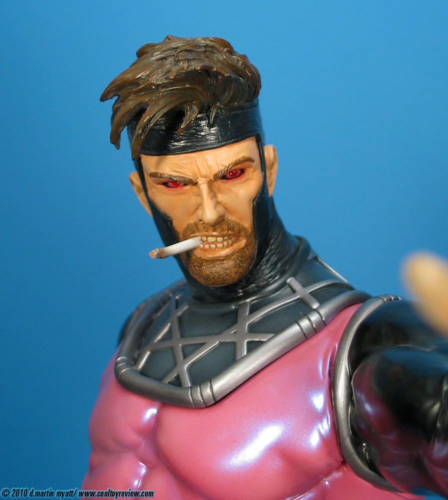
Sick pics mamba , cyclops looks sick if only gambits base could match would be a epic display!

Yeah definitely like the environmental bases better. Not only are they smaller the characters don't have to be standing flat on the ground which allows for different poses. Huge X takes up too much space and is gonna look a little silly with Rogue and Gambit standing on two Xs. IMO of course....I know there are people who want every X-Man to have an X base :)
 
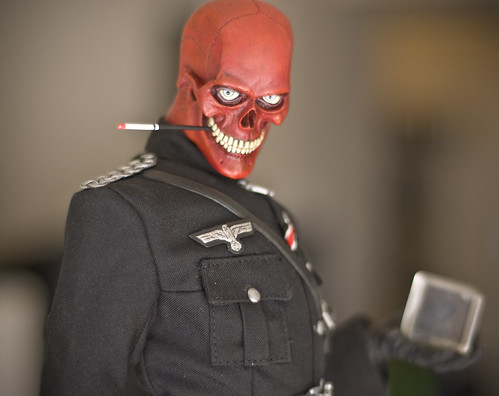
IMO, I think this alternative head, the CA Bukey head, and the Prince Namor head all suffer from not looking quite right... something about the mouth and upper teeth seem odd. I wonder if the alternate heads are being sculpted by the main artist or the sideshow team... have no idea but it would be interesting to know..
 
Nice group shot Mamba.

And I agree with the comments about wanted a more universal look to the bases. Not necessarily the same environment but the drastic difference in Gambits base is a little annoying.
 
IMO, I think this alternative head, the CA Bukey head, and the Prince Namor head all suffer from not looking quite right... something about the mouth and upper teeth seem odd. I wonder if the alternate heads are being sculpted by the main artist or the sideshow team... have no idea but it would be interesting to know..

The 3 statues you mentioned are all done by Tony Cipriano (Gambit too). The teeth look weird because not all teeth look the same. He has sculpted the incisors and canines as being uniformly square which looks extremely unnatural.

Here is an example of more natural looking teeth.
3457580249_f788d64977.jpg

wolverine-premium-format-exclusive-1.jpg


Not all teeth are not square blocks...
teeth-avril-lavigne-400a071807.jpg
14727d1292358119-cyclops-premium-format-figure-1sideclopspff5.jpg

17.jpg

ss_subby_2.jpg
 
Last edited:
Back
Top