InArt: 1/6 Superman (Cavill)

Collector Freaks Forum

Help Support Collector Freaks Forum:

This site may earn a commission from merchant affiliate links, including eBay, Amazon, and others.
You were claiming earlier that you had insider knowledge of InArt then now worried about something that an insider should have already known beforehand... idk man... sus
All of these are current events my friend; the figure is just revealed in its entirety this Monday and also, I don't work at IA. But I still stand by what I said couple of months ago regarding HT BVS+JL 2.0s and IA BVS Bats, Bruce with Lex' Gala Suit and (Diecast) Armored Bats. Time will tell :) Many thanks
 
Last edited:
I will actively root against and send InArt messages to not change body proportions until someone can provide a good looking photoshop markup of inart body. Not just pointing at a different reference photo. Up until now all I have seen is one pic a few pages back that looked like trash and made him look like he has a pinhead. We already have the hot toys figure we dont need another poorly proportioned superman figure.
 
I will actively root against and send InArt messages to not change body proportions until someone can provide a good looking photoshop markup of inart body. Not just pointing at a different reference photo. Up until now all I have seen is one pic a few pages back that looked like trash and made him look like he has a pinhead. We already have the hot toys figure we dont need another poorly proportioned superman figure.
I sort of agree with you. The more ppl push and pull with these photoshops, the more it's going to end up looking like the HT body. The one with the extended neck most notably reminds me of how easily it is to go from proportions looking pretty good to a giraffe neck. Same with the thighs - while, yes, they are a little undersized in the current proto, it's easy to go too far to the extreme that HT went to.

This is why my only real qualms with this figure are the chrome still not showing through quite enough and the smaller edits that DaveW made many pages back now.
 
The main thing they need to do is fix the body proportions, it’s very very doable since it’s a custom body.

I will make more edits later maybe we all can agree on something and send it to InArt.

HT has the broadness especially on the legs, but one of the main off things is their shoulders, way way too big.

For tiny details on the suit, it’s difficult to say if they will update but at the same time they made those detail adjustments to Aragorn so we will have to see.
And yet their body comes across looking more cartoonish and un-proportioned, even if more accurate in bulk. They need to bump the thickness up by just a smidge and fix the fabric they're using on the suit itself. While I personally like the more cloth-cotton-like fabric (has a more classic look to it), I think what the movie (and Hot Toys) was using is a shiny spandex like material. The movie suit looks to have a very smooth finish without any fabric detail seen under the suits overlayed pattern. Almost like the underlying fabric was buffed and polished smooth.

On INART's version, you see both the top suit pattern + the cotton fabric detail. This also results in there being more break ups on the metallic muscle shine. It's smooth on the movie version but "noisy" on the INART because of this cotton fabric material that they're using.

0o6J80W.png

WyZ2Vnk.png
 
Last edited:
Can't order through both of them my friend. Kit doesn't accept debit card, Google Pay and Stripe, and GT are playing hard to get 😂 even after logging in I couldn't look for the figure. Instead got a msg to contact the administrator. Sugo is also $338 shipped.

Darn, that’s unfortunate man.

Well, I guess Sugo it is then. As long as you get the figure, right?
 
Here's one of if not the absolute best repaint and body mods for HT's Sup. It is priced at ~$350 though.

Personally I think it is super tricky to 100% capture both the shine and material of this suit in 1/6 scale. The actual prop suits never had any cotton fabric on the under layers. Hence why it's reflective and shines under lighting. Hot Toys found a great way around this by making under layer fabric and chroming the body to replicate that effect. Judging from the pics I think InArt is going in that same or at least similar route. Now I'm not sure what's the painting process for this customized body below was, but it looks damn good. Not sure how production friendly it would be though

 
Last edited:
Think I rather pay that amount for almost the full price of the Inart figure lol 😅
 
View attachment 665124
Thank you Inart for taking into account our feedback. I was pretty happy with the first reveal but now seeing it side by side its much better.
I'd say its a 9.5/10 now but still room for improvement, I know nothing can be perfect but I hope production will be as good as the prototype which I'm sure it will be with their recent releases.

I thought their Aragorn was pretty much perfect.

And have you guys seen Queen’s new sculpt for Christian Bale. Now that’s a masterpiece.
 
Constructive feedback for Inart Superman (A lot of this is gathered from discussion around the community).

Let me preface this by saying that I'm really passionate about this film, character depiction, and suit adaptation. On the outset, I think that this is a beautiful figure. It's easily the best on the market, and it rivals most customs that I've seen, if not all of them.

I've been looking forward to this, ever since the company stepped on the scene and I started to imagine what an Inart Superman could be. But if I'm being honest, I can't help but feel that they haven't put their best effort into this. And if there's a chance that improvements can be made, then why not ask for it? It's something I would be really eager to see.

Moreover, I'm aware that 1/6 has its limitations. I'm not expecting perfection. But I think the aim is to strive for perfection and deliver the best product that they possibly can. And I'm confident in this companies ability to address some of these concerns. Fortunately there's time for them to consider and implement feedback.

Let's get into it.

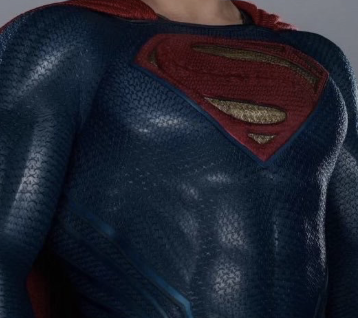
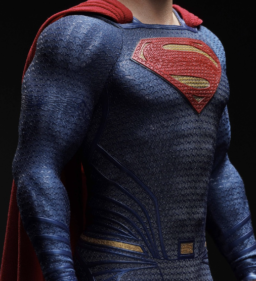
First and foremost, the fabric is dull. The suit is missing its characteristic sheen, which also enhances the muscle toning on the overall figure.

IMG_20230927_042611.png


That's the biggest thing that jumps out at me, and I would be pleased if this point alone is addressed for the final figure. And although I can see an attempt to recreate that, I don't think that they've succeeded or captured it all that well as others have.

Hot Toys base figure, customized beautifully by Rory Kurtz.
IMG_20230927_231655.jpg


The bicep joint is visible through the fabric, and it's extremely unsightly.
IMG_20230927_100626-01.jpeg


The neck opening should have a narrower, more rounded appearance. This is due to a subtle curve in the front collar, and the cape wrapping more closely around the back of his neck.

IMG_20230927_040327.jpg
Screenshot_2023-09-27-05-10-12-87_40deb401b9ffe8e1df2f1cc5ba480b12.jpg


The color (although it resembles the suit in real life) I believe should be adjusted to match more closely with how it appears on the screen.

IMG_20230927_125007.jpg


When we look at Henry Cavill's Superman, we're seeing him within the confines of the film. We're not seeing him inside a backlot. These things are purposely brightened behind the scenes, to factor in color grading and lighting. Sreen tests are made, all in service of achieving the right look for the final frame. I believe the film should guide them and take priority over the real world prop.

As a good frame of reference, the black suit in Justice League was actually blue. The color hues were precisely selected with the intention to change them in post, in the event that Snyder could get his way (Which he did yay!)

Some other things which have been pointed out:

Tubing should terminate at his armpits.


Screenshot_2023-09-27-03-52-01-12_a23b203fd3aafc6dcb84e438dda678b6-01.jpeg

Kryptonian script placement on the shoulders is too low.

Screenshot_2023-09-27-03-52-15-28_a23b203fd3aafc6dcb84e438dda678b6.jpg


Also, pattern texture is too spread apart. Cape sits too high on his shoulders (Refer again to Rory's custom).

Head to body ratio & body proportions need revision.

IMG_20230927_105755.png

The likeness needs a little tuning. Portrait appears more stylized than it should be.

1695776232666-01.jpeg

I would have liked to see a less gleaming expression, given that he's conflicted through most of the film. But that's just a personal preference.

All in all, it's a fairly straight forward design, so every minute detail counts.

It's a good looking piece, but it's not on par with their other work so far. Not even close to their best. It doesn't have the wow! factor that Aragorn does.

1695714257379.png
Screenshot_2023-09-27-11-04-23-86_40deb401b9ffe8e1df2f1cc5ba480b12.jpg


I also think they're making it easy for a company like JND to do better if they tried. I passed on all BvS, JL, and ZSJL Superman figures from Hot Toys, but I think this is more on the level of what Hot Toys can do if they actually gave a ****. (And perhaps they'll try again after this).

Inart is asking a premium price that I don't feel is warranted compared to their other offerings, for something that leaves a fair amount to be desired.

Let's hope they don't get complacent. It doesn't get more iconic than Superman. He should be a prime showcase for their brand and their craft.

Message them on social media. If we can get some of these points across, then they will surely listen.
 
Here's one of if not the absolute best repaint and body mods for HT's Sup. It is priced at ~$350 though.

Personally I think it is super tricky to 100% capture both the shine and material of this suit in 1/6 scale. The actual prop suits never had any cotton fabric on the under layers. Hence why it's reflective and shines under lighting. Hot Toys found a great way around this by making under layer fabric and chroming the body to replicate that effect. Judging from the pics I think InArt is going in that same or at least similar route. Now I'm not sure what's the painting process for this customized body below was, but it looks damn good. Not sure how production friendly it would be though


Are we sure the stock toys body suit is not painted at all and all 'chrome' definition is merely from the underlying body showing through?
 
And yet their body comes across looking more cartoonish and un-proportioned, even if more accurate in bulk. They need to bump the thickness up by just a smidge and fix the fabric they're using on the suit itself. While I personally like the more cloth-cotton-like fabric (has a more classic look to it), I think what the movie (and Hot Toys) was using is a shiny spandex like material. The movie suit looks to have a very smooth finish without any fabric detail seen under the suits overlayed pattern. Almost like the underlying fabric was buffed and polished smooth.

On INART's version, you see both the top suit pattern + the cotton fabric detail. This also results in there being more break ups on the metallic muscle shine. It's smooth on the movie version but "noisy" on the INART because of this cotton fabric material that they're using.

0o6J80W.png

WyZ2Vnk.png
The fabric needs to be more sheer (bigger gaps between the threads) in order for the muscles to shine through. You can see the difference between the BvS and the JL suit.

fabric.jpg
 
Constructive feedback for Inart Superman (A lot of this is gathered from discussion around the community).

Let me preface this by saying that I'm really passionate about this film, character depiction, and suit adaptation. On the outset, I think that this is a beautiful figure. It's easily the best on the market, and it rivals most customs that I've seen, if not all of them.

I've been looking forward to this, ever since the company stepped on the scene and I started to imagine what an Inart Superman could be. But if I'm being honest, I can't help but feel that they haven't put their best effort into this. And if there's a chance that improvements can be made, then why not ask for it? It's something I would be really eager to see.

Moreover, I'm aware that 1/6 has its limitations. I'm not expecting perfection. But I think the aim is to strive for perfection and deliver the best product that they possibly can. And I'm confident in this companies ability to address some of these concerns. Fortunately there's time for them to consider and implement feedback.

Let's get into it.

First and foremost, the fabric is dull. The suit is missing its characteristic sheen, which also enhances the muscle toning on the overall figure.

View attachment 665203

That's the biggest thing that jumps out at me, and I would be pleased if this point alone is addressed for the final figure. And although I can see an attempt to recreate that, I don't think that they've succeeded or captured it all that well as others have.

Hot Toys base figure, customized beautifully by Rory Kurtz.
View attachment 665196

The bicep joint is visible through the fabric, and it's extremely unsightly.View attachment 665200

The neck opening should have a narrower, more rounded appearance. This is due to a subtle curve in the front collar, and the cape wrapping more closely around the back of his neck.

View attachment 665204
View attachment 665201

The color (although it resembles the suit in real life) I believe should be adjusted to match more closely with how it appears on the screen.

View attachment 665198

When we look at Henry Cavill's Superman, we're seeing him within the confines of the film. We're not seeing him inside a backlot. These things are purposely brightened behind the scenes, to factor in color grading and lighting. Sreen tests are made, all in service of achieving the right look for the final frame. I believe the film should guide them and take priority over the real world prop.

As a good frame of reference, the black suit in Justice League was actually blue. The color hues were precisely selected with the intention to change them in post, in the event that Snyder could get his way (Which he did yay!)

Some other things which have been pointed out:

Tubing should terminate at his armpits.


View attachment 665202

Kryptonian script placement on the shoulders is too low.

View attachment 665205

Also, pattern texture is too spread apart. Cape sits too high on his shoulders (Refer again to Rory's custom).

Head to body ratio & body proportions need revision.

View attachment 665199
The likeness needs a little tuning. Portrait appears more stylized than it should be.

View attachment 665207
I would have liked to see a less gleaming expression, given that he's conflicted through most of the film. But that's just a personal preference.

All in all, it's a fairly straight forward design, so every minute detail counts.

It's a good looking piece, but it's not on par with their other work so far. Not even close to their best. It doesn't have the wow! factor that Aragorn does.

View attachment 665206View attachment 665197

I also think they're making it easy for a company like JND to do better if they tried. I passed on all BvS, JL, and ZSJL Superman figures from Hot Toys, but I think this is more on the level of what Hot Toys can do if they actually gave a ****. (And perhaps they'll try again after this).

Inart is asking a premium price that I don't feel is warranted compared to their other offerings, for something that leaves a fair amount to be desired.

Let's hope they don't get complacent. It doesn't get more iconic than Superman. He should be a prime showcase for their brand and their craft.

Message them on social media. If we can get some of these points across, then they will surely listen.
You should message them directly about this, maybe an email or something so that this is all together. Great anaylsis.

I'm not as passionate on this suit design compared to other figures but there are things that are doable. Like what Hologram and others said, the fabric is too noisy and the pattern is too close that it blocks a lot of the shine. They will need to make a new material for sure. I'm okay to live with some of the innacuracies but the proportions really are not that good for an inart figure. They need to do a lot of work.
 
I always get a chuckle seeing things like this, people being so confident where references are from when it's not even their image. Make no mistake, that is the BvS costume. I'm not calling you out, saying it's you who made it though.
Is it? How can you tell?

I'm basing this off the color on the original image, which seemed on the lighter side. I wasn't stating it with confidence, nor did I care if it was. I just didn't want people going "well actually", and invalidating or distracting from the point that I was actually trying to make (Which you've now gone ahead and done anyway lol).

I never gave any attention to the josstice league suit. Regardless. Are there any actual differences between the JL and BvS suits outside the coloration and lightness that comes through?
 
Last edited:
Back
Top