InArt Christopher Reeve Superman/Clark Kent

Collector Freaks Forum

Help Support Collector Freaks Forum:

This site may earn a commission from merchant affiliate links, including eBay, Amazon, and others.
Shocked no one has posted this. I know they will fix this, but jesus, this is not good.
View attachment 666285
Regina Hall Thats Nasty GIF

9aed95f0-54c4-4c1e-94bc-4c4d5e43d25b_text.gif

I was expecting a shrunk down JND statue; this is just awful.

It was gonna take something especially impressive to make me get a Reevesman anyways so at least I can feel good about all the money I'll save.
Completely agree, that JND statue pic a few pages back raised my expectations... and this aint it.
I dont have the same nostalgia factor for Reeve as others may so I dont NEED this, I just wanted a more classic, whimsical, innocent Superman for my collection and I liked Reeve's portrayal.
But this needs work.

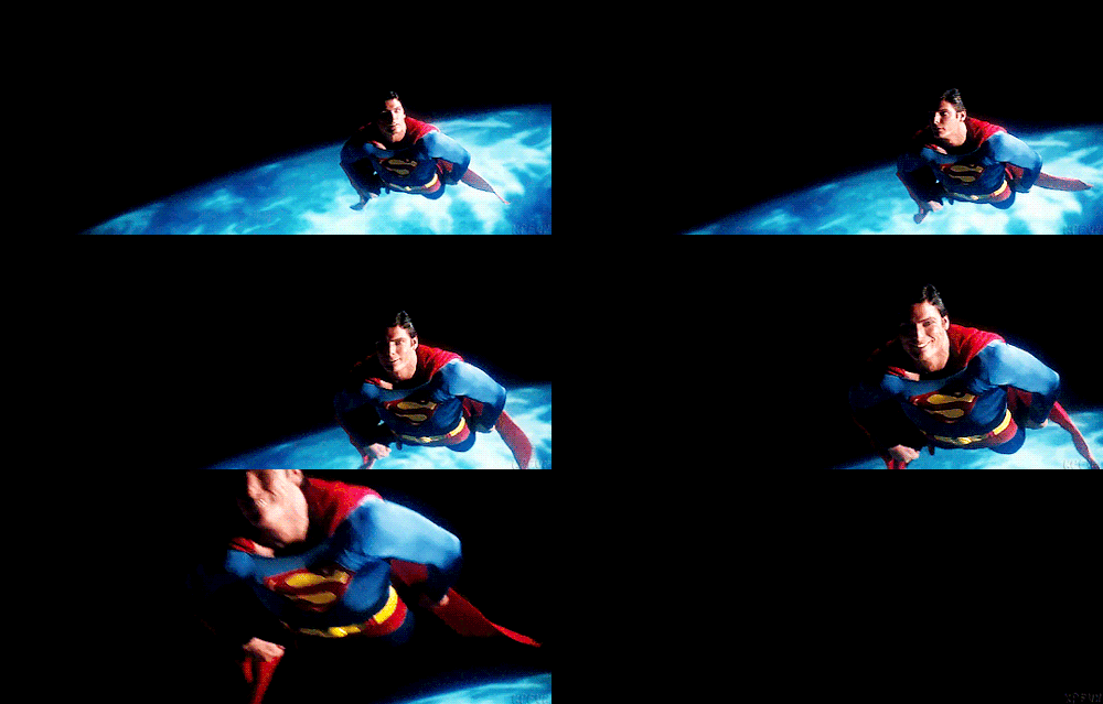
It also NEEDS A SMILING HEAD - his Superman was a kind and affable guy who smiled, its essential for him.
 

Attachments

  • 1696264313489.png
    1696264313489.png
    56.7 KB
Everything about this release, aside from the headsculpt, are what I was expecting and worried about. This kind of outfit doesn't translate to this scale well. The clothes look like a doll. These underpants look like thick material, like he's wearing a diaper. The actual movie suit is almost as tight as spandex. It just doesn't work in this scale unless you change to a different type of material. I would much rather have the proportions fit right, make it not look like a barbie doll- and the tradeoff being that the texture isn't screen accurate.
1696265382154.png
1696265522036.png
 
Everything about this release, aside from the headsculpt, are what I was expecting and worried about. This kind of outfit doesn't translate to this scale well. The clothes look like a doll. These underpants look like thick material, like he's wearing a diaper. The actual movie suit is almost as tight as spandex. It just doesn't work in this scale unless you change to a different type of material. I would much rather have the proportions fit right, make it not look like a barbie doll- and the tradeoff being that the texture isn't screen accurate.
View attachment 666532View attachment 666535

But it does translate to the scale well. Yunsil has proven this.

Just needs the right care and materials.
 
Regina Hall Thats Nasty GIF

9aed95f0-54c4-4c1e-94bc-4c4d5e43d25b_text.gif


Completely agree, that JND statue pic a few pages back raised my expectations... and this aint it.
I dont have the same nostalgia factor for Reeve as others may so I dont NEED this, I just wanted a more classic, whimsical, innocent Superman for my collection and I liked Reeve's portrayal.
But this needs work.

It also NEEDS A SMILING HEAD - his Superman was a kind and affable guy who smiled, its essential for him.
PREACH!!!!!

If he can’t do this…

d9af9301422705214e83ff76c1f44e27bbade06b.gif


He ain’t it. It’s literally the only thing I’ve ever wanted in a Reeve Superman figure and it boggles my mind that Arnie Kim hasn’t even tackled it in his personal collection.

Everything about this release, aside from the headsculpt, are what I was expecting and worried about. This kind of outfit doesn't translate to this scale well. The clothes look like a doll. These underpants look like thick material, like he's wearing a diaper. The actual movie suit is almost as tight as spandex. It just doesn't work in this scale unless you change to a different type of material. I would much rather have the proportions fit right, make it not look like a barbie doll- and the tradeoff being that the texture isn't screen accurate.
View attachment 666532View attachment 666535

Looking at how snug those are to the suit and the thinness almost makes me wonder if it wouldn’t be more prudent to stitch the underpants into the suit a lá the actual logo with some trickery to hide the stitching, rather than attempting to actually layer at this scale.
 
He have the smirk and smile in both of the head guys.

Anyway: the logo needs to be wider, the red area of the logo needs to be thicker.
Wrong shape of trunks. Need Wider shoulder and longer arms.
Fix the hairstyle and curl. Refined the sculpt.

I don't find any green crystal in it... will the base be light up? The SUPERMAN logo type need to used the movie version instead of the comic one.

Someone who can visit there should asked if there will be blue suit inside the white shirt.
 
They're not usually this rough though. And Ledger, HP and Battinson looked pretty much perfect right from the start.

Obviously we know they'll make improvements, but it's only natural for people to react the way they are to something from Inart that looks this bad and this much like a third party figure.
:exactly:Aragorn and Cavill only needed small changes, most looked amazing from the start and just got better. I don't think it's unfair to call a bad sculpt bad, it's like that for any figure from any company. And I haven't seen a single person say it's bad and they know InArt won't fix it lol
 
Ok this guy needs some work. The Superman head is really bad, the Clark Kent head is ok though. The color of the boots are not matching the rest of the body, they look more like Evil Superman's boots and that stitched insignia... oh boy... also, anyone else worried that stitching will come undone or rip altogether when trying to pose him?
 
Last edited:
Weird. Some of the features like the ears, nose, mouth look accurate but all together it looks nothing at all like Reeve. :dunno

Neckline needs work and emblem definitely needs to be wider.

I was thinking the exact same thing. So many features look accurate and yet when you put them together, nope... it's gotta be a really complicated process designing a 1/6 scale head sculpt. Much respect to these artists.
 
Back
Top