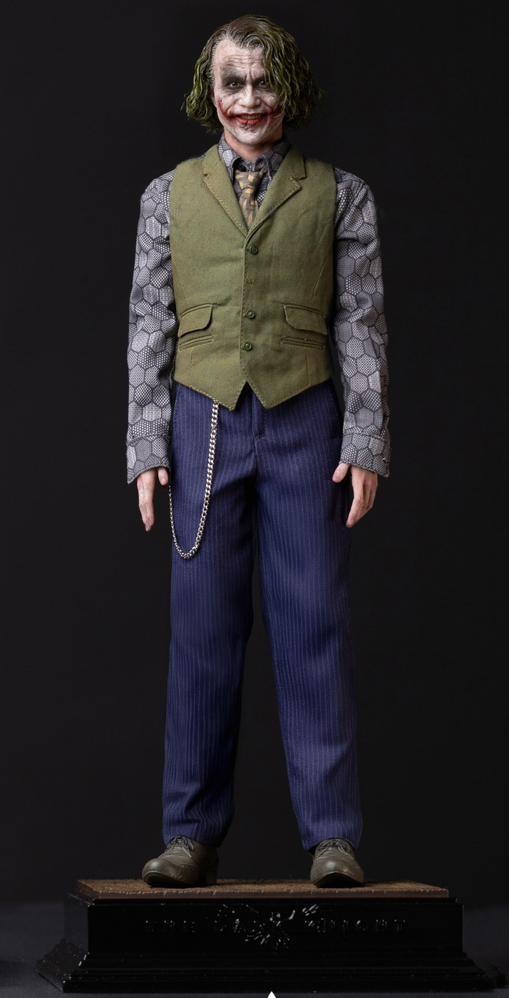
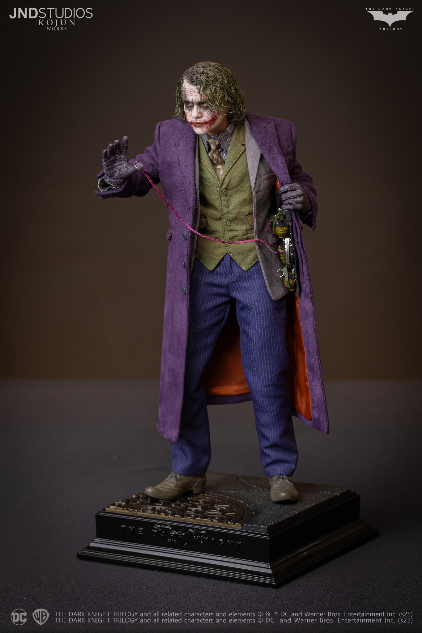
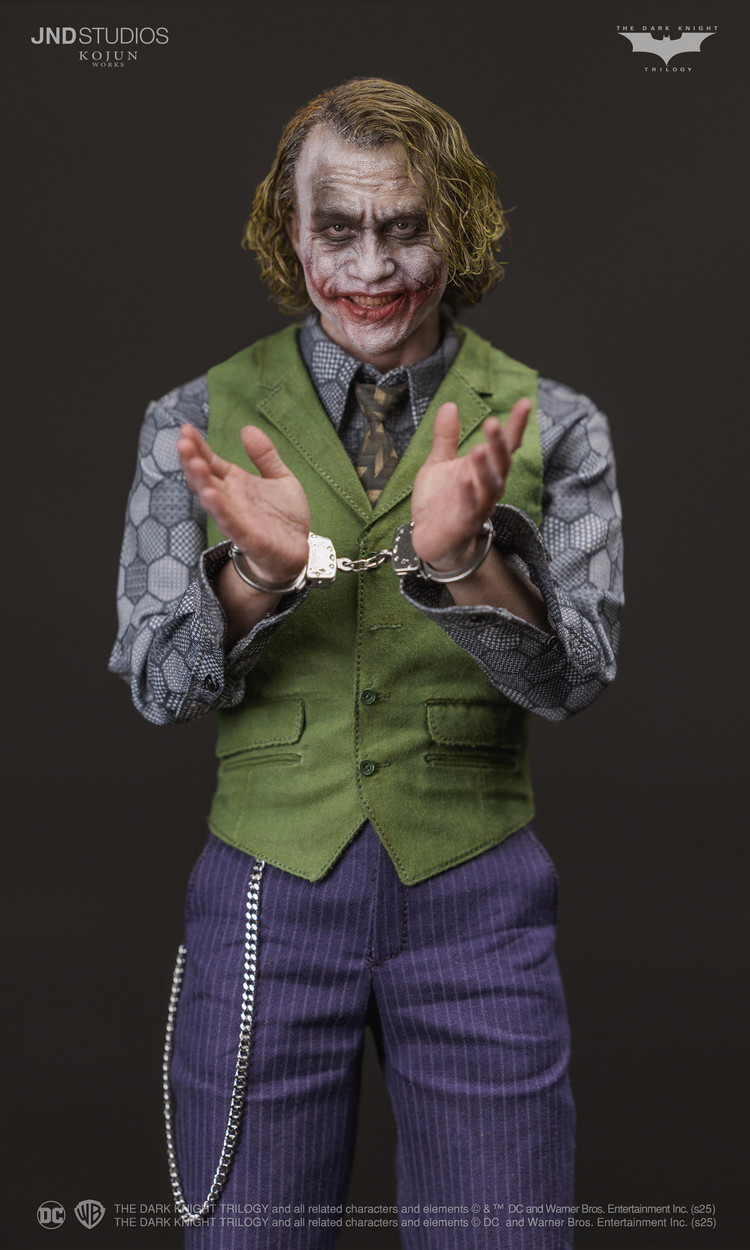
JND Studios 1/6 scale Heath Ledger Joker figure

Collector Freaks Forum

Help Support Collector Freaks Forum:

This site may earn a commission from merchant affiliate links, including eBay, Amazon, and others.
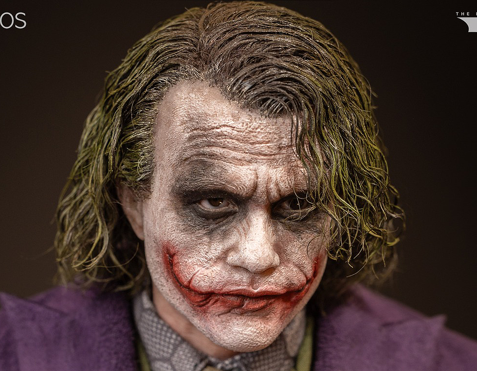
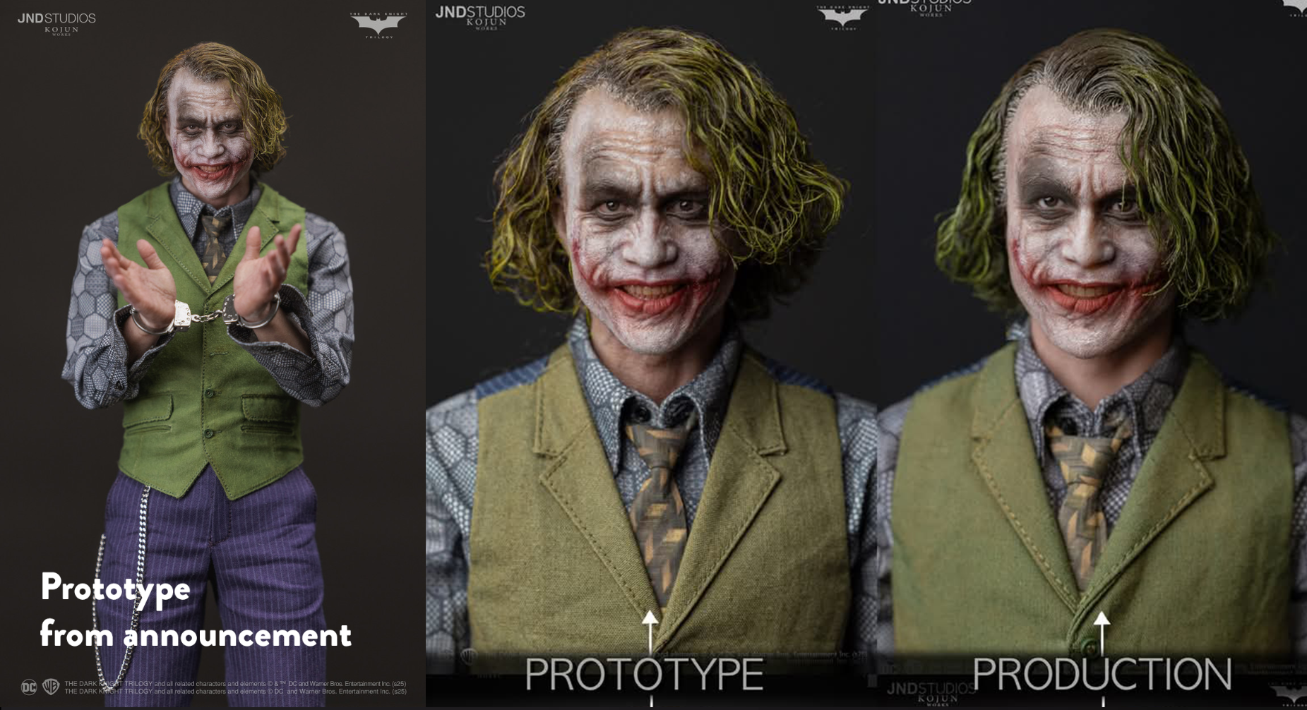
The most annoying thing is why did they change the hair color to this gray green like the 1/3. Their proto was fine. JND trying to gaslight us by saying it's "improved", like wtf we have eyes.

View attachment 747996
What I'm most confused about is why the makeup looks so smudged? It looks like it's supposed to be an interrogation scene sculpt
 
The HT hair seems to vary a lot or that particular photographer overstyled it. It's not THAT voluminous in videos like this. The HT figure here looks way better without that overly produced lighting and setup.


htjoker.jpg


The few things the JND def got better are the vest color and tie. But then they drop the ball with small things like the grenade rig rope color being wrong. So weird.
 
Last edited:
I do think the sculpts would look better with heavier paint, as mentioned at proto stage, but I think the issue is the silicon simply won’t allow it.
I think it's a JND choice thing, same with the faint blood they did on Oldboy, I've seen silicone with very strong colors and sharp lines painted on it without issue and Heise did a repaint on the JND 1/3 making the colors more prominent

1735906770635.png
 
I hope my opinion doesn't take away from anybody's excitement. I know that folks put a lot of stock into what other people think. But I'm still going to speak my mind.

A lot of this can be subjective, but we're also referencing source material.

Sure I see improvements in places, but looking at the grander picture, this appears to have taken a significant dive from the product they initially promoted.

That's becoming a prevalent problem. You're sold on an expensive figure. A company holds you to that commitment with a hefty NRD, and then proceeds to make significant changes that will undoubtedly be to many people's dismay.

That doesn't mean a company shouldn't pursue improvements throughout the process.There are times when changes are necessary, and logical (fixing the seamlines on Catwoman's catsuit for example). JND must exercise caution when making these decisions.

In this case, they made some drastic changes... and their choices are perplexing.

The final figure (though not as bad) evokes their 1/3 statue, which is one of the worst Ledger representations in my opinion.

There are still merits to the figure. But it's not worth the cost.
 
Last edited:
I have mixed feelings about this I haven’t bought the HT or inart and was hoping this would turn out amazing. It’s an overall decent release but definitely not worth what they’re charging.

The biggest difference that would make this a lot better would be thicker makeup, and I don’t know what the hell they did with the hair but their initial prototype was better. Now it’s thicker around the back and they’re saying that it’s more accurate is crazy to me.

I do still like it but it seems heavily stylized. Tempting to repaint it but at this price point it shouldn’t!

IMG_8261.jpeg
 
the laughing sculpt looks like Fred Armisen cosplaying Joker ...overall not impressed...the dogs are nice but it seems, they act like an excuse for the high pricepoint...glad i'm not into this release...
 
Last edited:
Probably a photography thing with silicone but I just can't get over how damn crusty the skin and paint looks. I feel like I'm looking at paint flaking. It just does not look good in photos. Would love to see the sculpt in person to better judge but so far, the sculpt has looked over detailed and wrinkly since the prototype. I like detailed pore filled sculpt as much as the next person but this just looks overdone.

uTqhMHW.png


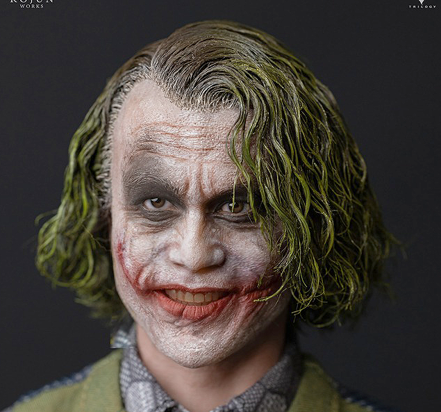
The second smiling sculpt still looks bad. He looks like a kid who's gleefully smiling for getting the answer right in the classroom. Sleeves are also oddly too long on the collar shirt. The green on the vest looks too light and powdery. Almost like they turned down the saturation on the green. Not sure what's going on with this prison look.

GenHZAF.png

jgQqhor.png


The single purple coat version is definitely the way to go here if I was getting one. Looks pretty solid overall for that look and the hunch you're able to get with the silicone neck is pretty nice. Is it worth the almost $1000? Eh. I definitely would feel pretty bad if I went for Type C here though.

fNTwdRB.jpeg
 
This is from "The Dark Knight Returns" released in another timeline back in 2018 where Ledger is still alive but needs a wig because he is now bald.

No but seriously it is giving me a "what if" he returned at a later date vibe older and dirtier.
 
You're right here it is side by side with the one you posted

View attachment 748012

This is like when my daughter gets her school picture retaken, and makes the same awkward smile in both.

I don't get why he looks so... dirty? I know The Joker doesn't have the best hygiene, but his face / makeup doesn't look weathered, or worn in. He just looks dirty.
 
JND really do some strange and outlandish things, don't they?

In the comparison Diostar posted it looks to me like they've deliberately restyled the hair on the prototype to look as goofy and bouffy as possible, to make the final product look better by comparison. But the original prototype pictures didn't look like that. Did they think no one would notice? :lol

Here's a picture of the actual prototype.

526d9d3493743.jpg


Compare that to the pictures of the "prototype" on the left below...


It seems that they've just teased the hair out to make their own prototype hair-rooting look like crap, and make the production piece look like an amazing improvement. But it's... er... not exactly subtle, is it? Why are they like this? :lol
The saturation of the green on the vest is also vastly different than the one they're using for the production comparison. Very odd.

EKRGaY5.png
 
Back
Top