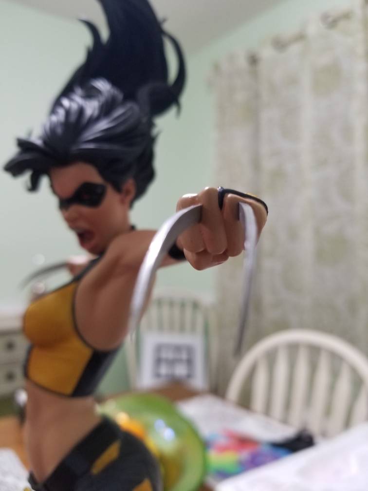
Wow thank you guys so much! I think because her sculpt is so 'open' it makes it much easier to light her... I was really happy with the way the pics turned out, and I'm just happy I can do some justice to how beautiful she is

The one negative I did have with your pics was that I knew there would be no way mine would ever show up looking that good.
And I was right. I have some paint scraping noticeable on her flesh right in line with the face. I'm not sure, but this might be the first time I've had to contact SS about a damage issue.
Other than that-
desertdragon said:
I wasn't sure if anything could match the masterful execution of Rogue, but X-23 astonishingly does it
Yeah.
And I'm completely surprised too, as I wasn't getting that vibe from the recent production photos or the unboxing vid.
In both those I felt like I was seeing a miss in the subtleties of the paint and casting in the unmasked portrait.
In hand, however, it looks remarkably spot on to what I was seeing in the con pics last year. They rarely get any closer to the prototypes than what they were able to get here.
I also see what you mean about it being "open". From a few feet away, that sense to it is...refreshing to me. It's an "airy" piece, if that makes any sense.
There were three qualities to this in the con pics last year, that immediately resonated with me
1) Her very animated expression.
You see this attempted so rarely, especially on attractive female characters because there is such a fine line between pulling it off and simply making her look unattractive and harsh. They pulled it off on the proto and, fortunately, that aspect fully survived the castings and paint on the production pieces.
2) The figure pose is also nicely animated.
Very kinetic and it affords a wonderfully wide range of viewing angles. Honestly, this design yields a good 240+º of prime visual interest (left to right). A little more restrictive vertically. Even then, as long as you keep the head above eye level you're going to be doing it justice.
3) The basic composition of it is that of a tall, relatively narrow, cylinder.
Of the two main display surfaces/areas I have for the larger scales, one is fairly restricted in width and depth, but not height. That's where I usually display 1:6 stuff, though they usually need a riser to own the space properly. The dimensions on Laura here just fit, and the height with the hair, as well as the vertical thrust of the entire piece, is going to yield some major ownage set up there. It may be a huge drag going back to 1:6 pieces there afterwards.
It really is a knockout piece.
Well done SS!


