Statue PCS: Halloween - Michael Myers 1:4

Collector Freaks Forum

Help Support Collector Freaks Forum:

This site may earn a commission from merchant affiliate links, including eBay, Amazon, and others.
The general house theme of the base seems appropriate. Homes were his favorite killing grounds after all. Instead of frames from the movie though just something to suggest a door and darkened windows in their place would be fine. Maybe even something like flickering jack-o-lanterns behind glass windows if they want to get more creative?

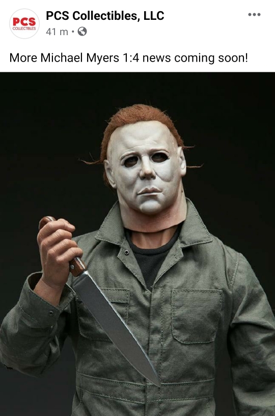
His stance looks a bit odd to me too though.. Kind of bow-legged? Maybe just the way the material around the legs is pulled but the direction the feet are pointing looks a bit duck-like too like a badly posed action figure or something. I hate to complain because they already nailed the most difficult task with the mask and the rest is so close to being spot on. I just hope they address some of the minor tweaks that would greatly improve everything overall.
 
It was mentioned over on StatueForum this will be delayed to adjust the knife arm position. Nothing about the base so far.
 
It was mentioned over on StatueForum this will be delayed to adjust the knife arm position. Nothing about the base so far.

Glad they're fixing the knife. The figure itself, other than the wimpy knife pose, is perfect. Even the neck showing so much skin is accurate and Michael's head tilt. They're all great details and real fans should recognize those things. If that corny base stays though, I'm out. The more I look at it, I think those decals/carvings/pics on the base are a complete eye sore and the focus should be the simplicity of the Shape. The old saying "K I S S" applies here... "Keep it simple stu..."

I hope they scrap that base or do another space saver base in simple black for everyone as an extra because everything else is so good on this. Just the knife pose and cheesy base... that base is worse imo. Scrap those corny images on the base please, PCS! Then they have a home run:pray:
 
Excuse my atrocious paint skills... But here's a neck fix I think is warranted.

View attachment 483651

I like this enough to order as is, but that being said - I'm still open to changes and improvements. I do agree that the weakest parts are the right hand pose and the pics on the base (I would be fine with them uncolored like the SSC pieces). As far as the neck gap; it is fine as is, and matches Nick Castle's long neck.

View attachment 483744

View attachment 483745

View attachment 483746

I agree with
NAZGUL-KING.. Neck seems fine... It could maybe be lowered by a fraction... The photoshop above was too low.... Don't want no Halloween 4 Michael Myers.
 
No Jaws, did you see the footage? The neck spacing is accurate. Google images of Myers Halloween 1. They got it right and the mask had a big space. Just fix the base and the knife pose. Happy collecting all :)
 
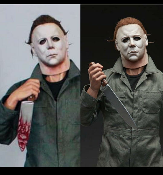
Not sure where this came from originally but apparently they've altered the neck tilt and hand placement. Possibly more.

I found this in a facebook group.
eeb0374ac728e251436b496f4d794ea5.jpg


Sent from my SM-G960F using Tapatalk
 
Not sure where this came from originally but apparently they've altered the neck tilt and hand placement. Possibly more.

I found this in a facebook group.
eeb0374ac728e251436b496f4d794ea5.jpg


Sent from my SM-G960F using Tapatalk

That's looking stunning. Now let's just hope they scrap that awful busy base and do a simple base design where that figure has no distractions and can speak for itself. Maybe throw him on some stairs again or something simple. Looks great tho with the changes. We need a swap out head with sculpted hair as well as regular hair like in the pic. Two heads in total hopefully
 
Here's hoping that the reason they haven't revealed the rest of the piece since fixing the angle of the wrist is because the other surprise will be a much better base design. Here's hoping. Please. Thank you.
 
You must shut up. Everything is perfect in this statue. Great job PCS, where is the pre-order?
 
The general house theme of the base seems appropriate. Homes were his favorite killing grounds after all. Instead of frames from the movie though just something to suggest a door and darkened windows in their place would be fine. Maybe even something like flickering jack-o-lanterns behind glass windows if they want to get more creative?

His stance looks a bit odd to me too though.. Kind of bow-legged? Maybe just the way the material around the legs is pulled but the direction the feet are pointing looks a bit duck-like too like a badly posed action figure or something. I hate to complain because they already nailed the most difficult task with the mask and the rest is so close to being spot on. I just hope they address some of the minor tweaks that would greatly improve everything overall.

Wtf are you talking abou blind man
 
i complained about the 1/3 scale mask awhile back but this mask is the best i have seen. i still think the mask on the 1/3 is not great just my opinion, i think it is still way off. but this mask is just so good, this mask and the 1/3 mask are so different so 1 of has to be way off and in my opinion this new 1/4 mask is spot on whoever sculpted this BRAVO man take a bow
 
Guys, can we get this new troll banned? He/she needs to drop the attitude.

Regarding the statue's new reveal, it's looking stunning. I hope they sculpt a far more simple base as that beauty of a sculpt needs no busy distractions. Awesome work PCS!
 
Back
Top