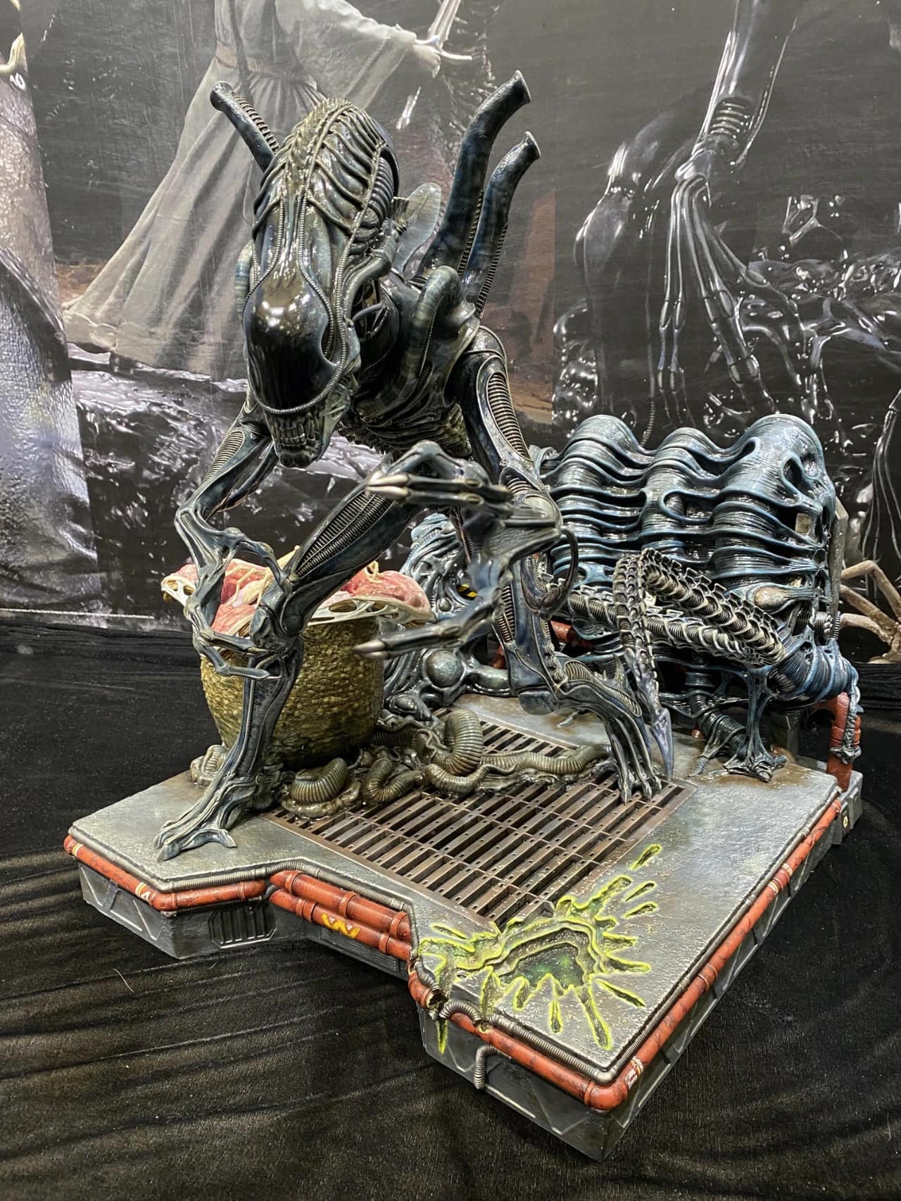
Prime 1 - Alien Warrior 1/3

Collector Freaks Forum

Help Support Collector Freaks Forum:

This site may earn a commission from merchant affiliate links, including eBay, Amazon, and others.
Wow the arm is different!! Did they put it on wrong or is that an update with switch out arms?? That would be amazing.
 
IMG_20201004_084008.jpg

Very interesting, maybe a switch out arm added to the statue. That was be pretty amazing.
 
Maybe the key is cubic, and therefor it might be possible to just put the arm in this or that angle. Anyway, it works actually and would give a nice touch of "customisation" :yess:
 
That splatter on the base looks awful.

In a weird way I'm kinda glad these newer statues aren't looking that stupendous. Makes me not want to spend money on stuff I really do not need. Lol!
 
To be honest since I do custom work it will be so easy to alter that acid burn. Looking at the original Alien acid burn it has a similar foundation it just needs tweeking.
This for me is absolutely not a deal breaker considering the level of how good the rest of he statue is.
 
That paint app is so pedestrian and flat. Looks like and old Palisades Alien. The CoolProps Warrior is so much vibrant, detailed, glossy, and wet.

Who would be thunk it...CoolProps now with better paint apps than P1...
 
Who would be thunk it...CoolProps now with better paint apps than P1...

Better paint scheme, yeah. Better application... let's not get ahead of ourselves. Although the P1 colors don't pop as well, the quality is less likely to take a nosedive on the final. CP still have to prove themselves.

I'm not ordering any of these for another few months, maybe a year. :lol
 
If CP can strike the right balance with enough gloss, organic and pop look without losing detail and sharpness, it would be very hard to beat. A big if. It's on their terms. P1 is an auto no for me, for the exact same reason, the alien doesn't look organic, alive and eerie.
 
The more I look at Prime 1's, the more it looks like a missed opportunity to me. The actual Alien sculpt is pretty good. But that pose really doesn't do anything for me and the base is ridiculously big with comical looking acid burns. I don't love CP's pose either, but it is better than Primes, especially since they actually listened and altered it a bit. It'd be nice if somebody could just produce a really nice Warrior standing tall on a nice simple base.
 
P1 has the capability but geeze they really went a bit overboard in concept. Way too much stuff going on in the base, flat paint, alien pose is terrible come get me rambo look. It looks like a cartoon action scene rather than a real looking alien. Maybe this was their vision and I'm sure some dig it, but for me, it completely missed the mark.
 
That paint app is so pedestrian and flat. Looks like and old Palisades Alien. The CoolProps Warrior is so much vibrant, detailed, glossy, and wet.

Who would be thunk it...CoolProps now with better paint apps than P1...
I'm sorry but I had to giggle a bit.
Cool props put forth a piece that doesn't even have finished tendons, gaps and seams. And an over glossed piece that covered up details.
The prime 1 piece has by FAR the superior crispness and paint app. Any side by side comparison of the statues shows the company withthe better tools 20201122_074224.jpg
 

Attachments

  • IMG_20200621_134248.jpg
    IMG_20200621_134248.jpg
    1.2 MB
  • 4ckC3UR.jpg
    4ckC3UR.jpg
    715.1 KB
P1 has the capability but geeze they really went a bit overboard in concept. Way too much stuff going on in the base, flat paint, alien pose is terrible come get me rambo look. It looks like a cartoon action scene rather than a real looking alien. Maybe this was their vision and I'm sure some dig it, but for me, it completely missed the mark.

It is sculpted directly from the film. The scene when Vasquez yells to drake. The only difference from the shot is the tail. And the front side is based on when she shoots it and the acid burns drake. So it's a front view and side view from the film. Hence the base with the egg and hive. 20201122_075354.jpg
 
It'd be nice if somebody could just produce a really nice Warrior standing tall on a nice simple base.

Remember when everyone was clamoring for a crawling or hunched Alien Warrior? That ship sailed real fast. :lol I looked for months through SWS photos to find something to capture what I was looking for, but nothing quite could.
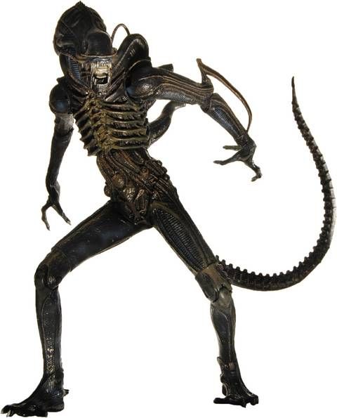
Posing the suit design like that looks odd because of how squat the suits were. Posing the puppet design is challenging because you have to keep those long arms and legs from dominating visually -- you risk it looking like a top-heavy monkey or like something on stilts.

Super old photo, but I always thought this promotional image for NECA's first Alien Warrior (around 2009) struck a good balance. The tail could be doing something more interesting though. Plop it on a small hive base (just big enough for the feet to plant, like what McFarlane used to do), maybe add a single egg and done. Doesn't need to be standing on a 30"-long brick.

aliens---neca---alien-warrior--james-cameron-s-movie--p-image-269557-grande.jpg
 
Last edited:
Even that pose would be dragged across the coals if it were announced. The side lean would have collectors foaming at the mouth lol.
My thing is I want what I see on screen in the movies. The dog was designed to be a shot from the film. The big chap is such a simple pose it could be anywhere in the film. And the warrior is directly out of the film. This is however coolprops first time sculpting and I'd say doing paint apps on an alien other than their life-size heads ( which are a disaster paint wise) the dog was completely re sculpted by p1 and printed and painted. What cp provided prime was was pretty terrible.
Cp also had go hire another company to do the paint on this one. Which is interesting, and these promo pieces are the same statue from ages ago. It's all really odd.
 
Back
Top