You are using an out of date browser. It may not display this or other websites correctly.
You should upgrade or use an alternative browser.
You should upgrade or use an alternative browser.
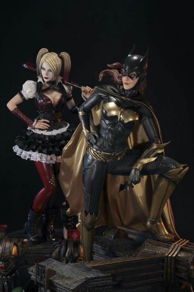
Statue Prime 1 Studio - Batman: Arkham Knight - Batgirl
- Thread starter Shoo
- Start date

Help Support Collector Freaks Forum:
This site may earn a commission from merchant affiliate
links, including eBay, Amazon, and others.
SuperJ300
Super Freak
This looks good!
https://www.sideshowcollectors.com/forums/attachment.php?attachmentid=269037&d=1465370385[/IMG]
That's the look that made this an instant PO for me. The updated photos from CON make her look to lifeless... zombie Batgirl
tacticnf
Super Freak
I really wanted to like this piece (I love how the SSC version came out) but as mentioned they changed the face sculpt from the original preview image which had her with a small smirk which looked good and her hair flowing sideways vs going straight down. Not sure why they'd change this taking into consideration the Noel Batman with his screaming/angry expression sculpt is making him one of my favourite looking Bats in the P1 line so far. P1 can do good facial expressions so not sure why they decided to make Batgirl expressionless!
attom44
Super Freak
I just watched the video by Maxcollector and the head looked perfectly normal....not sure why it seems to be elongated in still photos...hmmm.
Because lens distortion. Lens distortion.

$33.27
Marvel 60th Anniversary Captain America DS-086 D-Stage Previews Exclusive Statue
Green Bargain

$39.92
$47.95
Marvel Legends Series Deadpool, Deadpool & Wolverine Collectible 6 Inch Action Figure for Adults Ages 14 and Up
Ard Skellig

$38.93
Marvel Legends Series Wolverine, X-Men Retro Comics Secret Wars Collectible 6 Inch Action Figure with Shield
LowPriceFastShipping
Ehollywood
Super Freak
I saw her in person and wasn't feeling it. Don't like the face or the pose that much on this.
Decoyoctopus10
Super Freak
Yeah I'm not sold on this one either yet. I'm hoping for COHs.I saw her in person and wasn't feeling it. Don't like the face or the pose that much on this.
Sent from my HTC6525LVW using Tapatalk
attom44
Super Freak
Yes, don't get me wrong ... I'm not sold either.. I like it but until I see a better portrait I'm not sold!
Decoyoctopus10
Super Freak
They're the bookends so to speak I assume.I still don't get how the bases of the statues would connect with each other. Especially with nightwing and batgirl.
Sent from my HTC6525LVW using Tapatalk
jadekite22
Super Freak
- Joined
- Sep 26, 2015
- Messages
- 541
- Reaction score
- 2
From the collectors FB, the smirk face:

That's a great photo. I still think the head is a bit high (I know it's the design), but the face looks much less elongated with the smirk.
Not a big Batgirl fan but she looks great IMO. Prime is really doing a hell of a job on the 1/3 Arkham line. The only Arkham piece that looks a bit off to me is the Origins Batman. I really like the look of all the other pieces in the line and I'm absolutely blown away with what Prime did with Deathstroke.
Looks like a tiny bit of lens distortion on that one. I kind of wish she had a headsculpt that's looking away, to her left. I think it would work well with the pose.
jadekite22
Super Freak
- Joined
- Sep 26, 2015
- Messages
- 541
- Reaction score
- 2
Looks like a tiny bit of lens distortion on that one. I kind of wish she had a headsculpt that's looking away, to her left. I think it would work well with the pose.
I agree. I think the current smirking head works well with the batarang hand resting on her knee because it's a playful pose. I don't like it with the grappling hook switch-out that was previewed and think the stern face should've been to the side, as you said.
CallMeTheDoctor
Super Freak
Face kind of looks like Katie Cassidy at a quick glance, which is a big plus for me!
The Giamontan
Super Freak
I think anything negative i would have to say about this piece would be purely for satisfying the fact I can't afford nor have space for this piece. She's cool. I agree with a portrait looking to the left as a change would have made this a must have. She's still really cool.
jadekite22
Super Freak
- Joined
- Sep 26, 2015
- Messages
- 541
- Reaction score
- 2
I think anything negative i would have to say about this piece would be purely for satisfying the fact I can't afford nor have space for this piece. She's cool. I agree with a portrait looking to the left as a change would have made this a must have. She's still really cool.
I'm with you. The smirking face brings this as close to a must-buy as my wallet allows. Even when I like all the switch-out options on pieces I own, it's rare that I pull the alternate portraits out of the box once I've settled on a favorite. I still like having them as more bang for the buck.
Similar threads
- Replies
- 1
- Views
- 345
- Replies
- 0
- Views
- 338
- Replies
- 0
- Views
- 134


