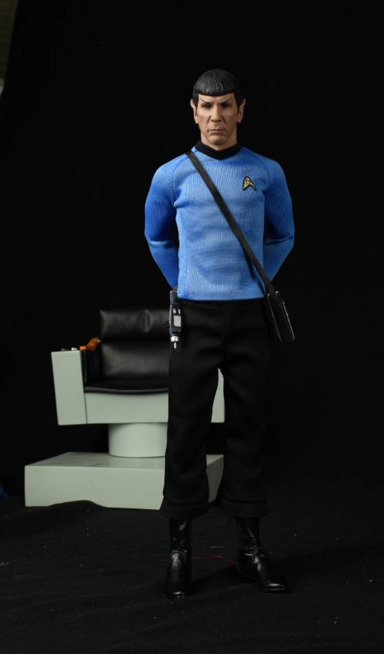
Here are my last production at QMx.
With less than 1/2 the support I once had in 2016, and all these problems that i faced, my in-house production still able to deliver.
These figures were done by mostly handicaps whom never touched a paint brush or a needle before.
Note the natural hang of the arms. 40/60 weight distribution do works. Free standing is a lot easier.
Paintjob is unbelievable well done even for experience painters (imagine their skills after 5000 heads)
2nd round Kirk and Spock are almost perfect.
Sent from my SM-N9600 using Tapatalk
I am only interested in the TWOK crew. I trekness developed with those movies.
And I don't want to rain on anybody's parade, but I can't but make some observations, especially because the artist, the expert is around to be asked (even if everybody is invited to comment on my observations, not only Mr. Nanjin) and because they are put forward as "perfect". Before going any further, let me admit that I am not by any means a huge Trek expert, nor an expert 1/6 figure designer. Anyway, the observations above are not very heavily lore-related, and are just my reaction to the figures as I study them visually. Last disclaimer: this is the best Trek stuff ever to be manufactured, and we owe it all to Mr. Nanjin and QMx. Thanks dudes! BTW most of the problems I see are fixable. Others would need changes on the sculpt... Too late?
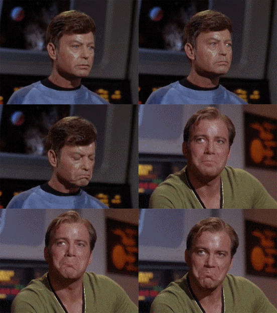
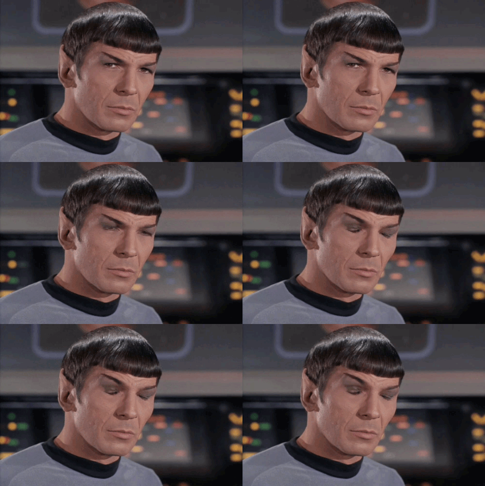
For ref:


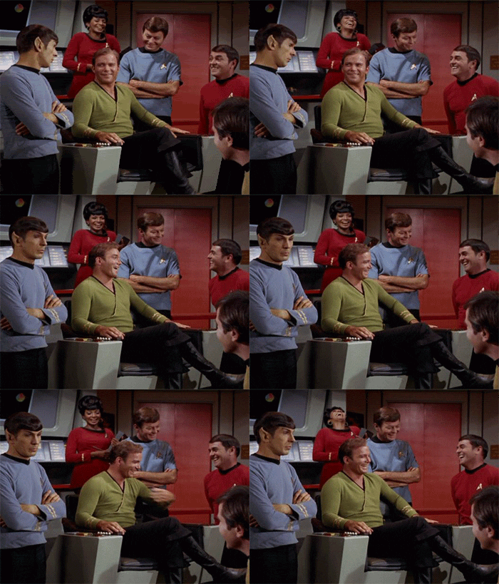
1) The evident one: the bodys have some abs and pecs, and it shows too much. That alone sets them off quite a bit when compared to pics of the real thing.
2) These figs suffer from a pretty normal problem, which breaks the suspencion of disbelief created by the awesome sculpts, paint applications and tailoring of these days: since the subject matter is just 2 guys with normal built (no Arnie yet), and we know just how we normal guys accumulate fat on the sides of our torsos, the way the torso/shirts taper from arm-level to waist-level is very heroic, but very unrealistic, very toy-ish, very action figure-ish. That is exactly where a fatsuit can do a lot, even if it is only loaded on the sides.
3) Another typical problem of Chinese sculpts: the bull neck. Guys, have a look at the ref pic #2. A thick neck might be sexy and heroic as hell, but not accurate. It might be a matter of less than 1mm, but man... does it show... Each side of the head must protrude a bit to the sides beyond the 2 vertical lines that define the neck on each side of the body (even if I am not sure these are actually 2 straight vertical lines, or rather subtel curves).
4) Too long, skinny legs an lack of ass also give you the tsa-figure look, particularly on Spock, and further breaking the suspension of disbelief even if the pants drape realistically and the boots really look the part. Please check out picture #3 (not perfect choice but I can't find any better; you have to compare carefully). It could also be that the crotch area of Spock's pants is too long from the end of the shirt up to the beginning of the legs. This might be happening on Kirk too, even if I also think that his torso might also be a bit too long (see pic #5). Anyway: Spock is clearly too long for its width, and even if I am assuming it has exactly Nymoy's height divided by 6, that is not his physicality. If I am correct, that would imply changes on Kirk, since the difference in height seems OK to me (see pic #2). Also, if I compare the shirt-to-pants length proportion on Spock (length of the shirt from the black neck to the lower end, to the length of the pants from the shirt's lower end to the pants lower end), I'd say your pants are a bit too long (because of the crotch, legs, or both) when compared to ref pics.
5) Another huge issue: head-to-body proportion. The 2 heads are too long vertically and too thick horizontally, each one in differing degrees, and are disproportionate with the body. Don't you guys see it? Am I the only one annoyed by this? Proportions are the first thing you really have to nail before going on to the details (in a sculpt, but also in a figure as a whole).
6) I know that you, Mr Nanjin, have studied zillions and zillions of pics, and that I am going just by only a bunch of them. But anyway: I agree with the way you have differentiated the thickness of Kirk's arms vs Spock's. I see it on pic #4. But I am annoyed by the way the biceps don't fully bulge on the arms of both figures, while the triceps on Spock bulge too much on your last picture (makes him look too strong). Concerning the latter problem, since it happens on both arms, I don't think it is a draping problem. Concerning the former, the biceps problem: shouldn't those areas be more rounded? I understand the problem that the elbow articulation poses and the deep crease that it causes on the sleeves, as well as the need for the arms to be able to deeply and fully flex (forcing the removal of biceps mass towards the elbow), but I am wondering if the biceps are sculpted in a realitic enough way...
7) Sleeves: I guess this must be the subject of some debate, but some ref pics (like #5 and #6) would show that maybe the length of the sleeves/arms on Kirk would be excessive...? Maybe I am wrong, but with the arms fully extended, I'd say that the first golden ring on each sleeve should be at the same height as the lower end of the torso of the shirt.
8) Emblem: agreed on the emblem being a tad too small, Mr Nanjin. It is also positioned at a slightly wrong place, and the shape is not accurate and the black outline is too thick (ok, nitpicking there). But it really hurts accuracy because it is so visible. You should ask Qmx to fix it at all costs.
9) Seams: OK on the shoulders, but the seam that runs down the torso, shouldnt it be more toward the back, maybe centerd on each side of the torso? Why so visible? Please look at pic #1.
Well that was about it. Please guys don't hit me too hard!

RfC
m.


