You are using an out of date browser. It may not display this or other websites correctly.
You should upgrade or use an alternative browser.
You should upgrade or use an alternative browser.
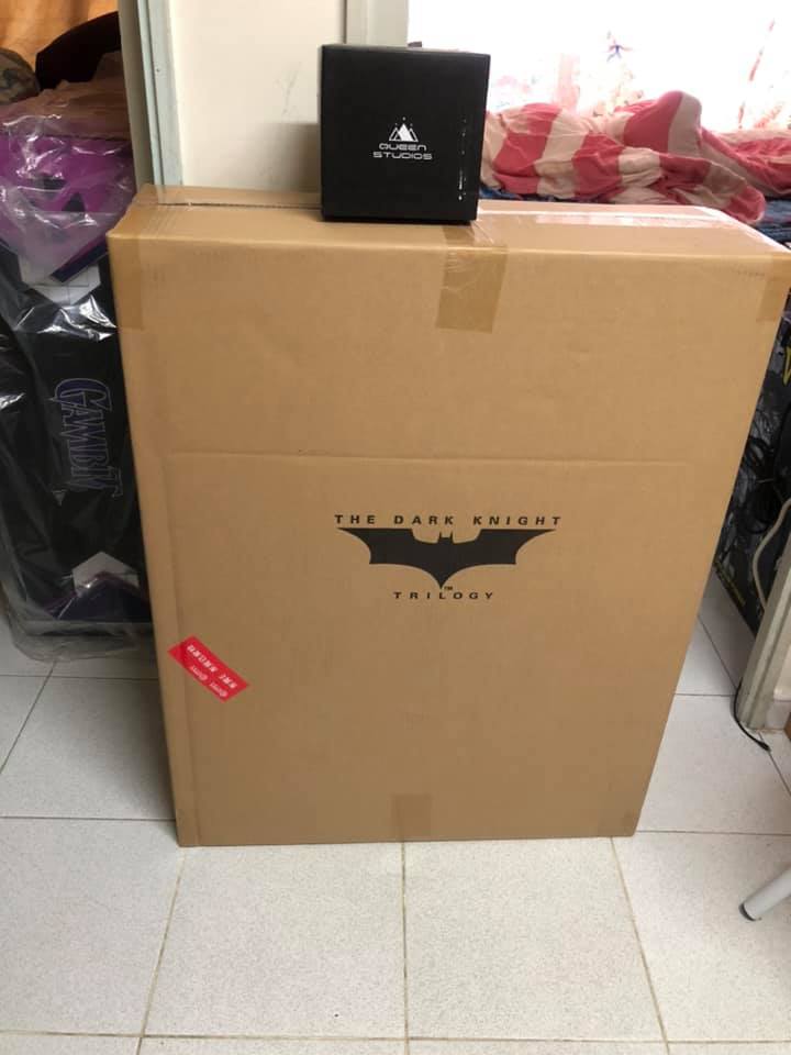
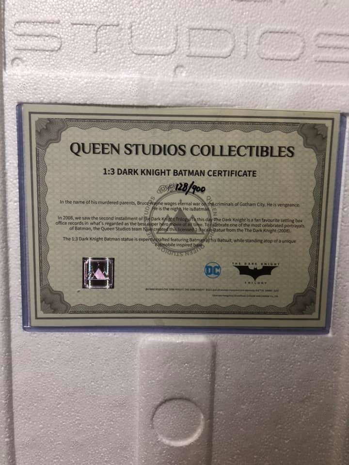
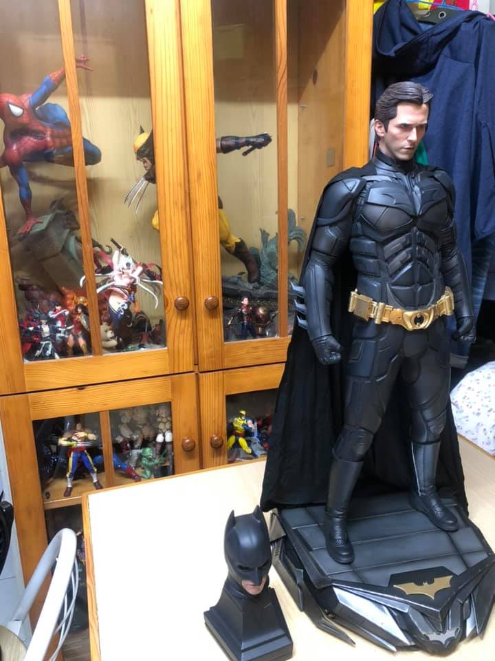
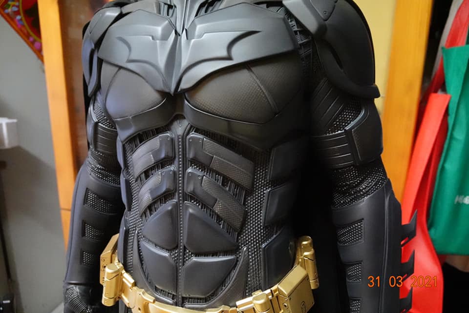
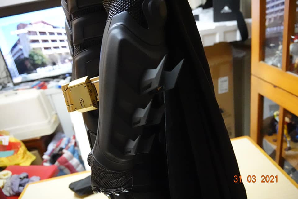
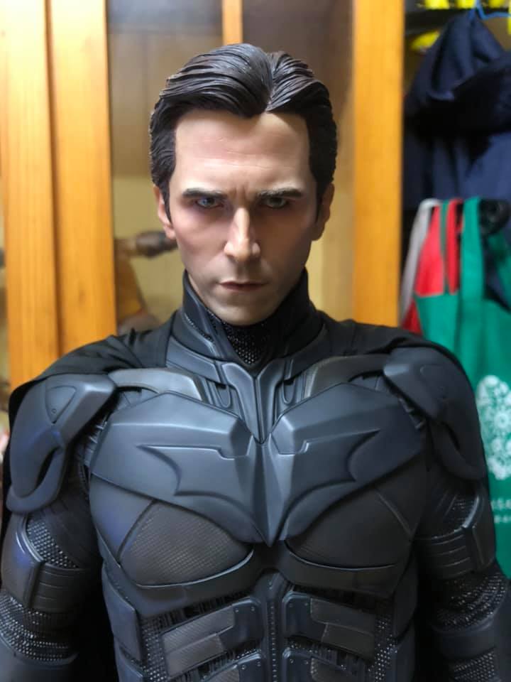
Statue Queen Studios: The Dark Knight - Bale Batman 1:3
- Thread starter Shoo
- Start date

Help Support Collector Freaks Forum:
This site may earn a commission from merchant affiliate
links, including eBay, Amazon, and others.
GaryPool
Super Freak
Queen Studios are a prime example of looking good at proto and then nowhere near as good for the price in production. No wonder they hired Viper for the new Joker.
Phoenixblazes
Super Freak
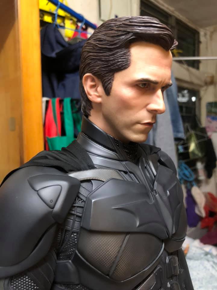
Not the greatest picture quality there.
generalszabo
Super Freak
No, with better lighting and camera I'm sure it looks good

$33.27
Marvel 60th Anniversary Captain America DS-086 D-Stage Previews Exclusive Statue
Green Bargain

$42.00
$47.95
Marvel Legends Series Deadpool, Deadpool & Wolverine Collectible 6 Inch Action Figure for Adults Ages 14 and Up
Vonubroh
Phoenixblazes
Super Freak
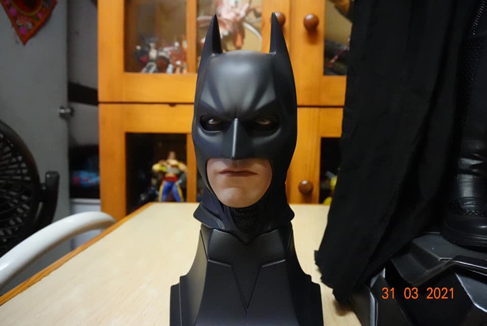
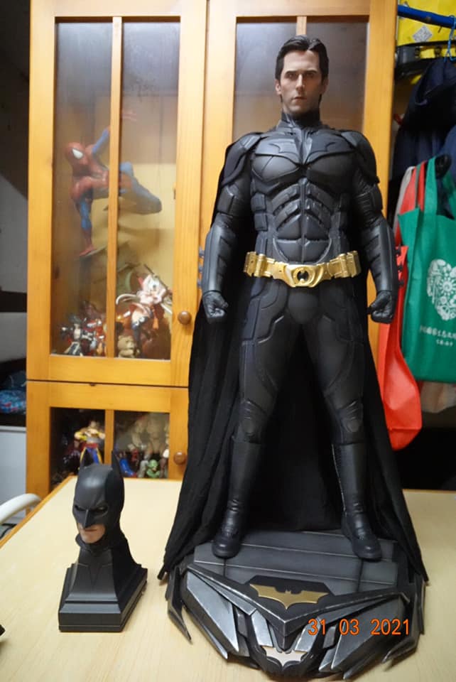
To me his body looks skinny and elongated and the mouth and cowl has turned smoother and less angular. Hopefully the 1/4 version would be much improved.
I’m thinking that this at least is due solely to the camera lens/settings being used. I find a lot of phone cameras narrow the object in question.
I had this happen on quite a few occasions when using my iPhone camera, especially on older models, but now it still happens if I don’t use the correct setting on newer ones.
I just wish the collectors who post early pics only posted them online if they’re representative of how it truly looks in hand and isn’t being distorted due to the lens being used or lack of sharpness.
gardensnome
Freakalicious
- Joined
- Aug 12, 2013
- Messages
- 25
- Reaction score
- 2
23 seconds Facebook video of what's apparently a production rooted hair Bale head sculpt.
https://www.facebook.com/GloriousToys/videos/448638306368292/
https://www.facebook.com/GloriousToys/videos/448638306368292/
Queen Studios 1/3 TDK Batman Deluxe Christian Bale Portrait video review by China fans
#glorioustoys #tdk #batman #christianbale #queenstudios
- Joined
- Dec 12, 2015
- Messages
- 277
- Reaction score
- 4
Still no update regarding the standard version..
I always thought that companies usually release cheaper standard versions first.
I always thought that companies usually release cheaper standard versions first.
xAgentofChaosx
Freaked Out
- Joined
- Jun 3, 2015
- Messages
- 110
- Reaction score
- 8
https://www.instagram.com/p/CNlbnnNlRHV/?igshid=hvgjiouwxixm
https://www.instagram.com/p/CNlbOVUlKDW/?igshid=3pmdw7pc6ltf
Found these two posts on Instagram.
https://www.instagram.com/p/CNlbOVUlKDW/?igshid=3pmdw7pc6ltf
Found these two posts on Instagram.
Found these two posts on Instagram.
Thanks!
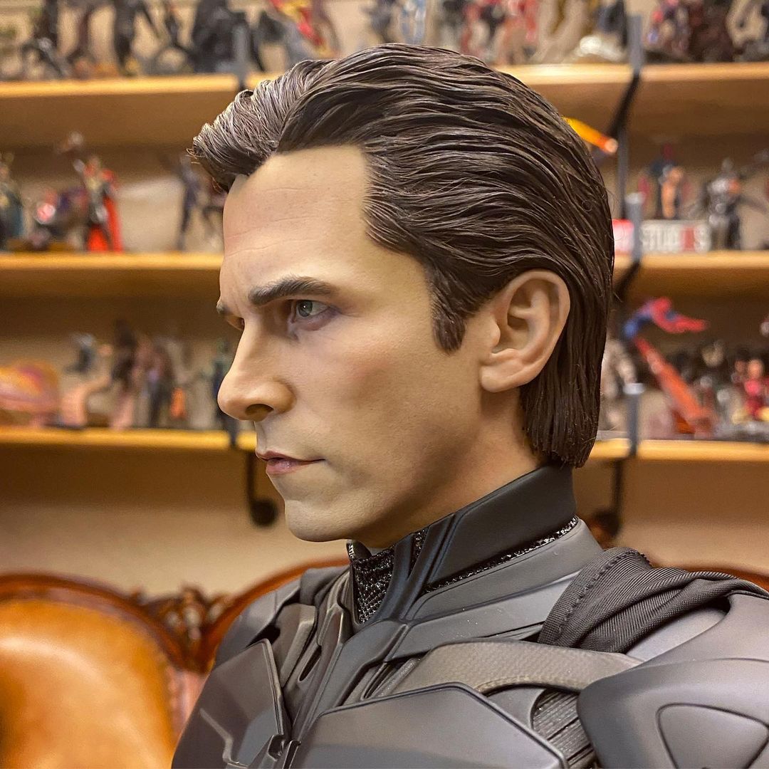
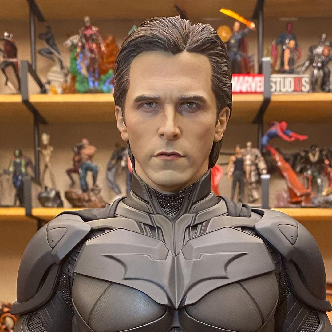
Pics by yangdeguang:
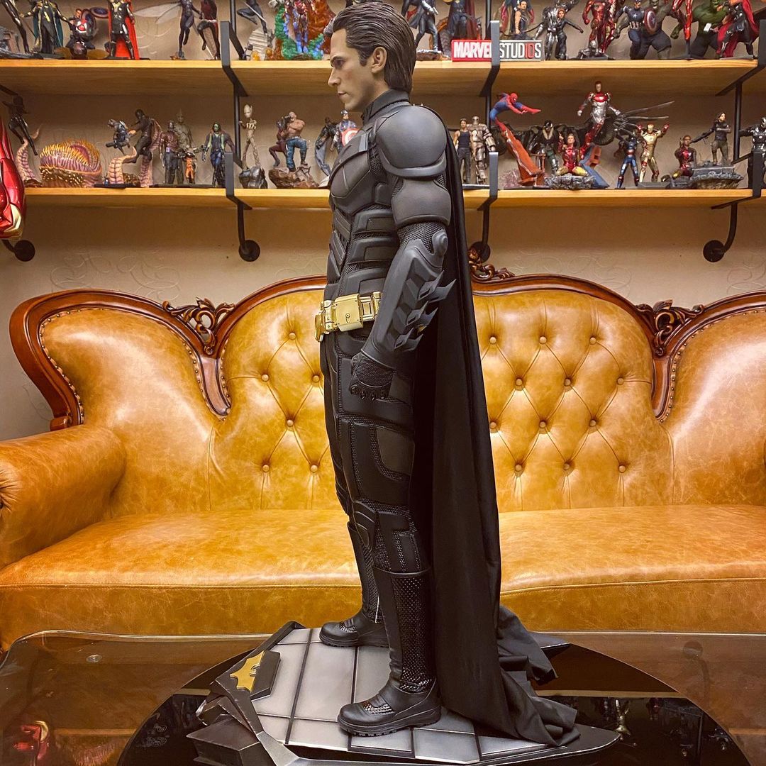
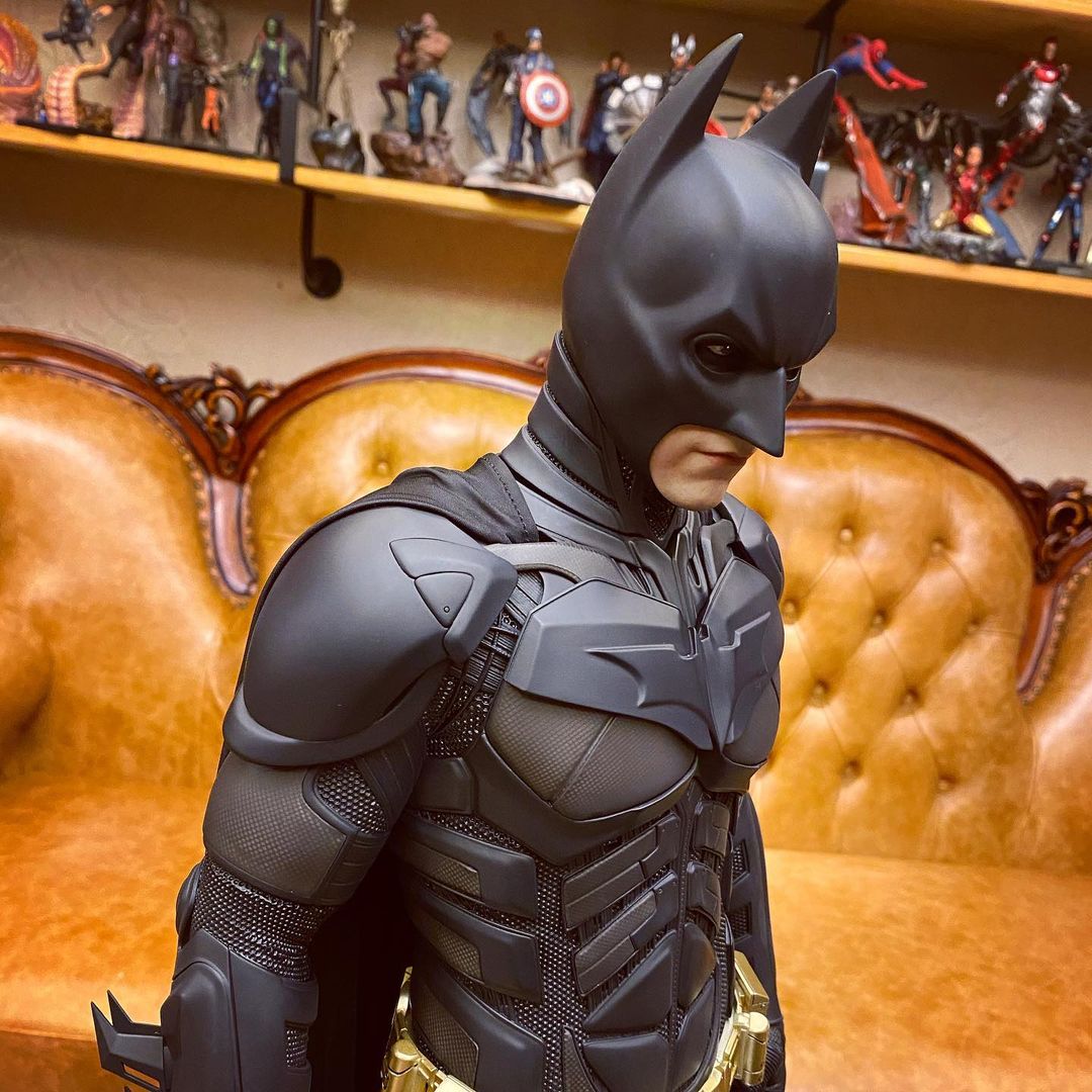
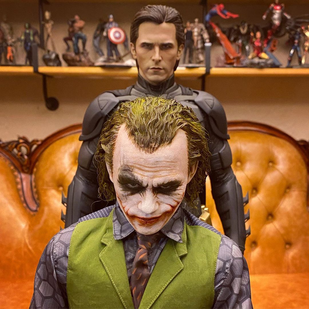
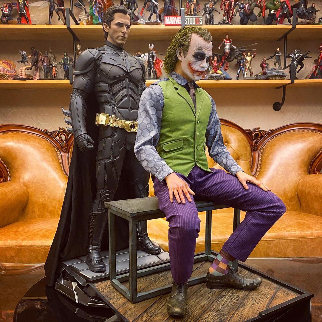
xAgentofChaosx
Freaked Out
- Joined
- Jun 3, 2015
- Messages
- 110
- Reaction score
- 8
Much better pictures.
Do we know if anyone is making a custom cape for this piece? The stock one is too long, and someone pointed out the visible stitching around the neck collar portion of the cape.
Do we know if anyone is making a custom cape for this piece? The stock one is too long, and someone pointed out the visible stitching around the neck collar portion of the cape.
dw316
Super Freak
Damn, I'm still unsure about this piece. That cowl has been holding me back, but I'm worried there may not be another Bale 1/3 made for a while. I wasn't a fan of the P1 cowl but I think it looks a little better than this one, I'm hoping a video will show whether or not the photos are distortions or not but the shapes around the face area just looks off. The body posture doesn't seem as bad as before, I'm not sure if they adjusted or fixed that or not. Thanks for pointing out the seams on the cape, is it placed the correct way or upside down perhaps? Maybe from afar or if it's futzed a bit it won't be so noticeable? 

Much better pictures.
Do we know if anyone is making a custom cape for this piece? The stock one is too long, and someone pointed out the visible stitching around the neck collar portion of the cape.
Looks like from the video cape comes attached already. Not sure if it can be removed.
franpincho
lol@$300 head sculpts
Rooted hair looks weird as ****. Glad I got sculpted for both.
Similar threads
- Replies
- 8
- Views
- 2K
- Replies
- 122
- Views
- 8K
- Replies
- 0
- Views
- 233
- Replies
- 7
- Views
- 1K


