You are using an out of date browser. It may not display this or other websites correctly.
You should upgrade or use an alternative browser.
You should upgrade or use an alternative browser.
Red Light Max by Susala & OneSixthBruce
- Thread starter meth head
- Start date

Help Support Collector Freaks Forum:
This site may earn a commission from merchant affiliate
links, including eBay, Amazon, and others.
hot damn it's looking good.
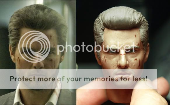
it does look really good there, only thing I can see wrong with it though, it the chin to mouth area seems a bit too small compared to the photo
I agree with Mollins on the mouth-to-chin, and the 2 "lumps" below his lip are too defined (a bit too "swollen").
Someone had mentioned earlier about the nose bridge needs to be narrower and nose "knob" smaller (his illustration was much more detailed and specific, pls read his suggestion).
Also, from the profile view, his nose looked too big.
I think his mouth tips need to be curved downward a little bit more (see Tyler's side-by-side photo comparison). his facial expression in the movie was consistently "stern", "serious", "pissed".
Thanks for listening, Sus.
breakersrevenge
Super Freak
Hey Tyler, Thanks for that! It looks great!
I did the last one really late last night and didn't really like it. I tried again with an earlier photo with no sculpted hair this time. I'm sure when Susala has the face and hair fully finished it will look perfect.
Anyway here it is.
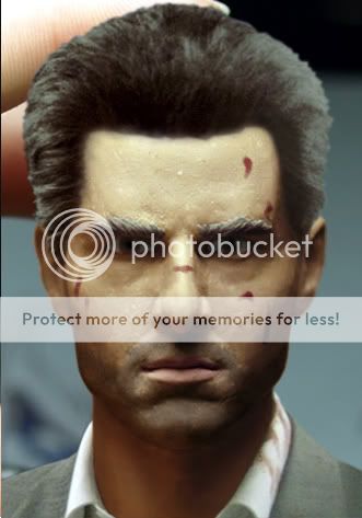
Anyway here it is.


$39.01
$47.89
Marvel Legends Series Deadpool, Deadpool & Wolverine Collectible 6 Inch Action Figure for Adults Ages 14 and Up
Bakchoi Enterprises
plasmid303
Super Freak
Looking good. The only thing that throws it off a bit for me is the eyes.
I don't know if it's the photo manipulation that is making the eyes look odd, but the sclera (the whites) of the human eye doesn't fill the entire opening. There are blood vessels and the pink areas at the corners of the eye cavity.
I don't know if it's the photo manipulation that is making the eyes look odd, but the sclera (the whites) of the human eye doesn't fill the entire opening. There are blood vessels and the pink areas at the corners of the eye cavity.
jimjimmyjones85
Super Freak
- Joined
- Jul 15, 2009
- Messages
- 20,389
- Reaction score
- 127
I just said it´s hard to compare a picture where he is looking down with a picture where he is looking up. I didn´t want to raise a controversy because of it and I´m sorry for that. Just tell me what specific I have to change on the sculpt and I´ll see what I can do.
And please, this debate has to stop here , this head is not the world and there´s no need to argue about it.
Sus, don;t worry, some people who don't even have the skills that you and some of the people here have, criticize. If you don't like the product, don't buy it. If you can do better, do it yourself.
I personally appreciate all your efforts in all your sculpts and think you are a great talent and contributor to our hobby and for that I thank you.
Looking good. The only thing that throws it off a bit for me is the eyes.
I don't know if it's the photo manipulation that is making the eyes look odd, but the sclera (the whites) of the human eye doesn't fill the entire opening. There are blood vessels and the pink areas at the corners of the eye cavity.
You are correct. I totaly forgot to do that on the colouring. I think the sculpt is fine. It's just my attemt to colour it that failed.
darkchylde80
Super Freak
Wow, another amazing sculpt. I will certainly be looking out for one of these.
jimjimmyjones85
Super Freak
- Joined
- Jul 15, 2009
- Messages
- 20,389
- Reaction score
- 127
See Sus, score !
eighthsamurai
Super Freak
great sculpt susala. can't wait to see this thing come together!
jimjimmyjones85
Super Freak
- Joined
- Jul 15, 2009
- Messages
- 20,389
- Reaction score
- 127
Now it's only a matter of me being able to afford it 
meth head
Super Freak
- Joined
- Feb 12, 2009
- Messages
- 18,243
- Reaction score
- 19
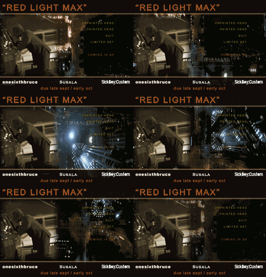
All the details are here my friend
https://www.onesixthbruce.co.uk/custom-figure-work-5-c.asp
Hoping this will be available between Sept/Oct time
Thanks again
https://www.onesixthbruce.co.uk/custom-figure-work-5-c.asp
Hoping this will be available between Sept/Oct time
Thanks again
I agree with Mollins on the mouth-to-chin, and the 2 "lumps" below his lip are too defined (a bit too "swollen").
Someone had mentioned earlier about the nose bridge needs to be narrower and nose "knob" smaller (his illustration was much more detailed and specific, pls read his suggestion).
Also, from the profile view, his nose looked too big.
I think his mouth tips need to be curved downward a little bit more (see Tyler's side-by-side photo comparison). his facial expression in the movie was consistently "stern", "serious", "pissed".
Thanks for listening, Sus.
Good Eye !! Thats what I suggested before I got a response spanking...
meth head
Super Freak
- Joined
- Feb 12, 2009
- Messages
- 18,243
- Reaction score
- 19
I am not wanting to argue anymore with you Preshea or anybody else for that matter but you did not get a ''response spanking'' i just didnt agree with your defence of Madbatt over on OSW his side by side comparison was way off thats all
Similar threads
- Replies
- 7
- Views
- 884
- Replies
- 4
- Views
- 642
- Replies
- 0
- Views
- 445
- Replies
- 13
- Views
- 2K


