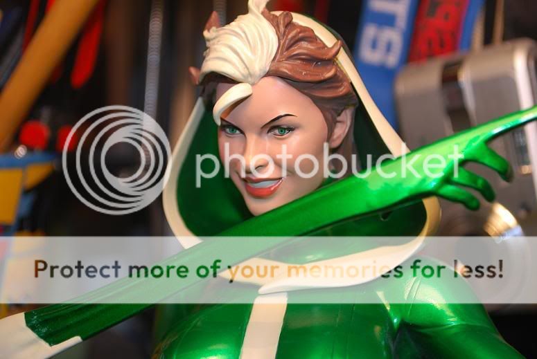
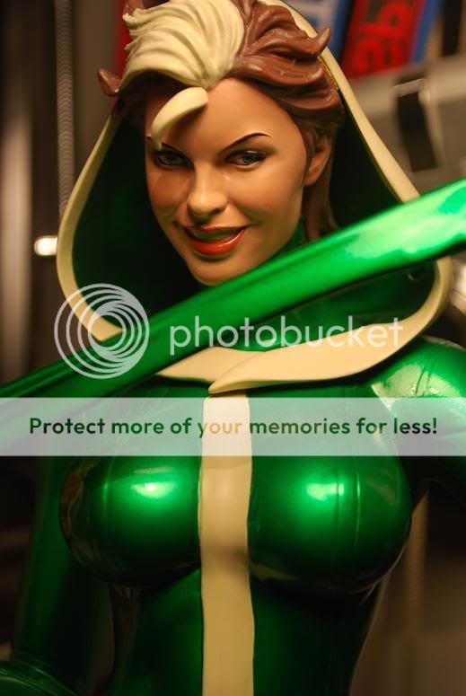
Rogue Comiquette

Collector Freaks Forum

Help Support Collector Freaks Forum:

This site may earn a commission from merchant affiliate links, including eBay, Amazon, and others.
HEre is mine..though mine looks like its a little she has goofy eyes. Its odd how mine looks a little different than others. What do you think?
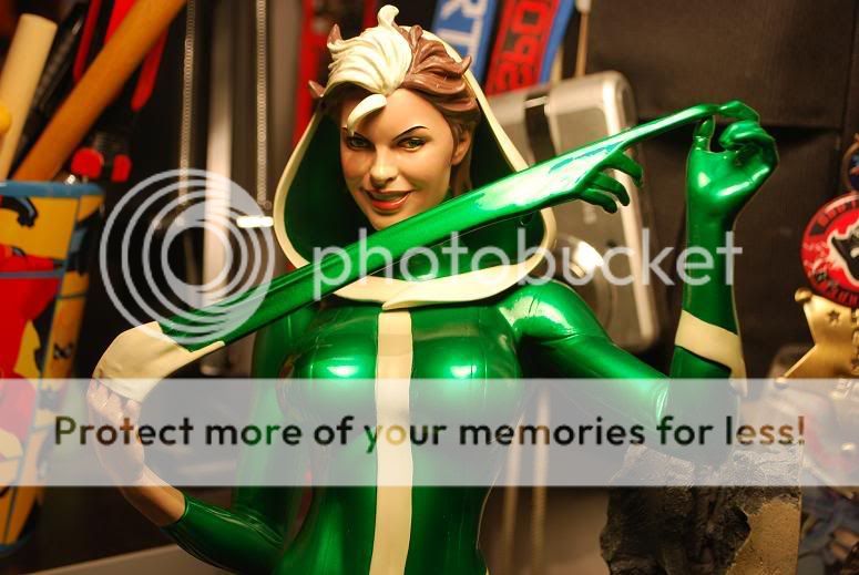
DSC_0140.jpg

Yeah it looks like in this picture that her left eye, the right one in the photo is going off to the side, while the other is looking more straight. I kind of like the way the eye going off to the side looks in a way but it doesn't really look right with the other eye looking straight. Also I don't know if it's the lighting in your photo but her eyes look a different color. On mine her eyes are pretty green. Yours almost looks the way she did in the prototype version. Sorry to hear about the problem man, maybe if you position her a certain way you might not be able to notice. Are you gonna get a replacement?
 
Last edited:
HEre is mine..though mine looks like its a little she has goofy eyes. Its odd how mine looks a little different than others. What do you think?

DSC_0140.jpg


i have the same problem with my rogue, i think the eyes were painted wrong on the EX versions
 
robotcp, I actually like yours better
than the others I've seen on here! :D
She looks awesome! I wish I could've gotten
one. I entered the recent Sideshow contest
to try to win her and I actually placed, but
I won a Clone Trooper instead. (Hey, not that
I'm complaining. That's cool, too!!!) Hopefully,
I'll be able to order a Rogue before they sell out. :naughty
 
Thanks for the info everywhere. Its odd.....im slowly getting bothered by it but i know that i wont really notice it from afar. So i might just keep it. Here is one more picture, what do you guys think? Also, this is the first print i have ever gotten on ex and i regret not getting it on the others. I need to get the rest on ebay now!

My favorite of this line so far

DSC_0118.jpg


DSC_0007.jpg

Actually looking at these two pictures her eyes look fine to me. I think it was just the lighting in the others that made them look off....And Congrats on getting yours Snoopy! :rock2
 
I saw this in person yesterday at my LCD. Very nice. Nice green color the chose. Not too shiny and goes well with the overall piece. The bricks suspended in the air effect didn't come out that well for me.

The eye issue is not really noticeable as much as Mary Jane's.
 
I don't like the bricks either. I keep thinking why aren't they more broken up. I also don't like the fact that they cover her figure. They seem misplaced and in the way... in a bad way.

Mine has some issues so I think she is going back.

I did like the green though, and I really dug the entire piece till I put on those bricks.
 
I got mine the other day. Overall I loved the piece.. I had the seam issue with the gloved hand but with a little careful manuvering it worked out well. It actually fits in perfectly until you try to place the pulled finger between her other hands. I dont think think the issue is that the peg was not cut right it's the extra stress placed on it by putting it in her hand but still nice. My biggest issue with this piece is the brick that actually attaches to her leg. I was actually going to display this without that piece of brick until I realized there would be a big huge peg hole in her leg if I didn't. Thumbs down on that feature but otherwise a great piece
 
MattFromGeekStuf;1365244 My biggest issue with this piece is the brick that actually attaches to her leg. I was actually going to display this without that piece of brick until I realized there would be a big huge peg hole in her leg if I didn't. Thumbs down on that feature but otherwise a great piece[/QUOTE said:
I was going to do the same thing. I don't have the bricks at the bottom covering her right leg. You don't really notice the hole in the wall as much as on her leg. This was my only complaint as well. Best sculpt of Rogue I've seen yet.
 
I read that alot of people here and on other forums aren't in love with the bricks. Just to give you a bit of insight to why Adam went with that concept:

Adam feels that so many comic character statues are ones in which the character is frozen in a heroic looking pose, like they were modeling for a photo. He wanted to make his a little different from the norm by making them what he is calling a "frozen moment in time". The idea is that you have caught the character mid-action, rather than them preening for a camera. In Emma Frosts case, her cape is frozen as it falls from her shoulders, suspended before it collapses to the ground. Black Cat has just swung through a ventilation grate, and is just touching her toes to the top of a pile of crates. Mary Jane is sharing a moment of revelation with the viewer: "ooooh... my boyfriend Peter is Spiderman!" And Rogue is breaking through the wall, in the process of removing her glove.

Some are more "frozen moments" than others. I think that Emma and Rogue are probably the most successful with that concept; with Rogue having taken the idea the farthest. But it makes her the least successful as a "posing for a camera" type pin-up statue.

Just wanted to share a little "behind the scenes" stuff...
Allison
 
I see, that does make sense. In this particular case I would have preferred the bricks not covering her up so much. I really was like "Wow- she looks so great!" as I opened up the package and placed her on the base but once those bricks were placed on the piece some magic was lost for me.

The only other pose I haven't really liked in this line is Black Cats because I find it a bit awkward. Something about the lean and the ceiling piece.

It's cool that you guys are trying different things with these statues though. :)
 
I

The only other pose I haven't really liked in this line is Black Cats because I find it a bit awkward. Something about the lean and the ceiling piece.
Yeah; some of these have been more successful "frozen moments" than others. I think the Black Cat 2-D art got the message across, but it was a bit lost in the 3-D version. Still its a learning process, and I think each one gets a little bit better. The one following Black Queen is very "frozen moment" and I think it has a cute, humorous, and fun quality to it. But time will tell if it's enjoyed by the fans or not.
 
I don't like the bricks either. I keep thinking why aren't they more broken up. I also don't like the fact that they cover her figure. They seem misplaced and in the way... in a bad way.

Mine has some issues so I think she is going back.

I did like the green though, and I really dug the entire piece till I put on those bricks.

replacement?
 
Back
Top