misterW
Super Freak
- Joined
- Jun 10, 2015
- Messages
- 463
- Reaction score
- 1
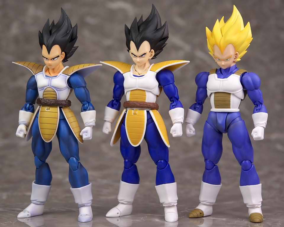
Ok, I get where you are both coming from, but its far from as bad as you are both trying to say. Sure, there isnt as much in the way of shading, but even with that we have had some amazing releases since we moved to the 2.0 mold. some examples are ssj3 Goku, goku black, frieza, godku and of course super vegeta and armoured trunks (not including awakening goku since he did have shading) but literally every ssj release has still had hair shading and the "plastic faces" mentioned arent noticeable in person and tbh I prefer it as its more anime accurate, especially the eyes, plus they used to go WAY ott with shading.
What im saying is that the older releases were far from perfect and had way worse design choices than what we are seeing now like cheeto ssj3 goku, or ANY Goku with his monkey arms and shoulders that stick out like blades, then theres the QC on some of the older figures like that fabled scouter Vegeta you both mentioned, who cant even stand up straight because of his loose hips, or the og frieza with his stick out ball joint at the hip. I could go on. The new ones may have some slight paint app bleeding for example, but none of them fall over from their own weight because the joints cant handle it
Its getting to the stage where, sure, we arent happy with some choices, but we cant at the same time look back with rose-tinted glasses and say they used to be perfect, they werent.
im with you on that deano. I also forgot about the loose hip problem with OG scouter vegeta too since i fixed mine a long time ago lol. Overall although there's alot of corner cutting, the overall products arent as bad, but they could be better. We know tamashii can knock out of the park if they want, and i think that's where all the anger and disappointment comes from. They keep releasing decent or okay figures when we're expecting them to full 100 on it and it feels like wasted potential. But overall the newer releases have better articulation and proportions. I dont think yamcha and tien wouldve came out as good as they are if they had released them in the 1.0 days.
Also agree that faces are more accurate, they use to sculpt the eyes etc and paint them in and then they switched to tampagraphed eyes, and faces look much better imo. I also think the SDCC 2011 goku hair shading is way over done, looks like candy corn (although i still wouldnt mind having it for my collection lol) and the SWA goku shading is much better (which is why i used it as the head for my custom SDCC 2011 goku).
Dont get me wrong guys, i love my collection, 1.0 and 2.0's, but the old figures are very dated. Heck we now have a goku body mold that can even do the goku vs vegeta (or gohan vs super buu) pose! the 1.0 body could never dream of doing that pose! likewise 2.0 scouter vegeta can pull off his stance much more convincingly and naturally as well (although there are inaccuracies to his proportions and he def needs some detailing).
P.S. i forgot who keeps mentioning that the kanji symbols are beige? but i dont see it? it might look slightly gray to me but it doesnt bother me tbh, or it could be the base color (orange) is darker and could be leaking through the white background making it possibly appear beige? but i really dont see the beige at all and it's also the first time im hearing this complaint, or maybe im mildly color blind lol


