You are using an out of date browser. It may not display this or other websites correctly.
You should upgrade or use an alternative browser.
You should upgrade or use an alternative browser.
S.H.FiguArts Dragonball Z figures!!!
- Thread starter Grange Wallis
- Start date

Help Support Collector Freaks Forum:
This site may earn a commission from merchant affiliate
links, including eBay, Amazon, and others.
Silrian
Super Freak
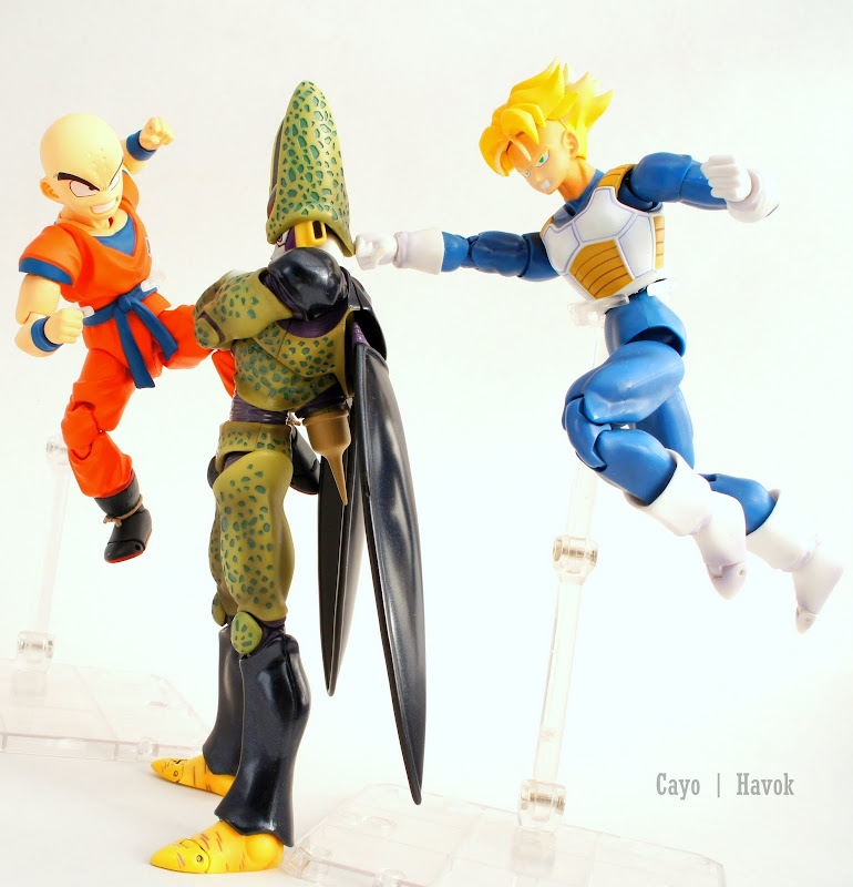
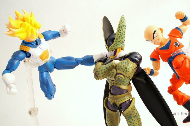
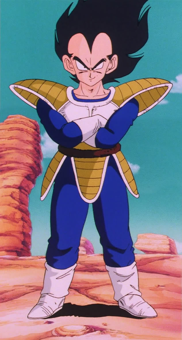
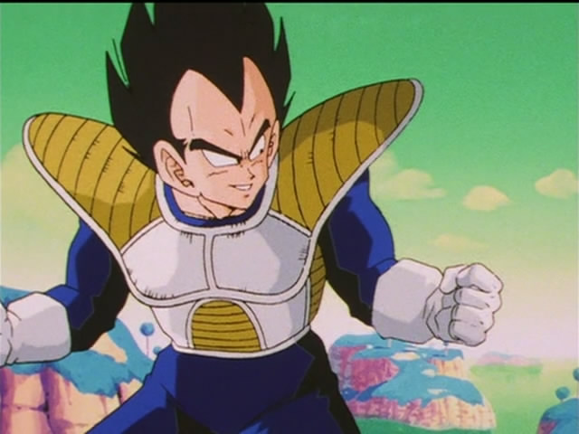
There's actually one thing that bothers me with Vegeta's headsculpt and I honestly hope (though highly doubt) they change it: his hair. He usually has a spike of hair coming up directly in the middle of his forehead, yet on the figure, they divide and split into two (the two attached to his interchangeable faces), with one from the back forming the highest spike. I'm annoyed by this because when you view it from any angle below eye level, the central spike in his hair disappears and that isn't (usually) anime (manga?) accurate. I think it's done this way exactly because of the interchangeable faces, so it might be somewhat unsolvable, but it does annoy me a bit.
Big Deano
Super Freak
I guess it depends what artist you are looking at; up until the cell saga, Vegetas, and for that matter, everyones hair was more one big clump, its not until after we meet the andoids and the artist changes, that we see visible bangs and spikes, and even after that there are times where there is one spike at the front like you said, but others when he has two, specifically later on.
I do agree that on the black hair he shouldnt have those bangs, though I see why remoulding the ssj hair black was a good compromise, still, he should have different hair for both forms like Goku, as it does change, just not as much, just my nitpicking though
I do agree that on the black hair he shouldnt have those bangs, though I see why remoulding the ssj hair black was a good compromise, still, he should have different hair for both forms like Goku, as it does change, just not as much, just my nitpicking though
Last edited:
Damn, that looks kool.
Silrian
Super Freak
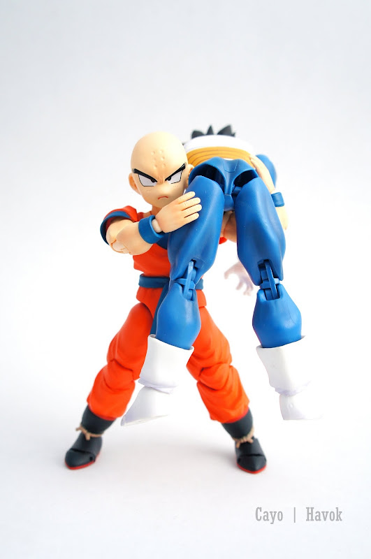
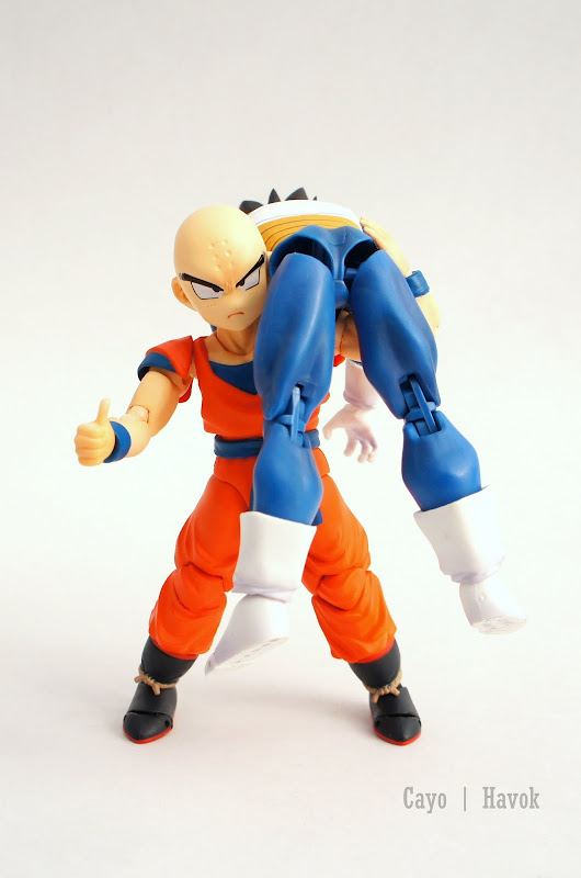
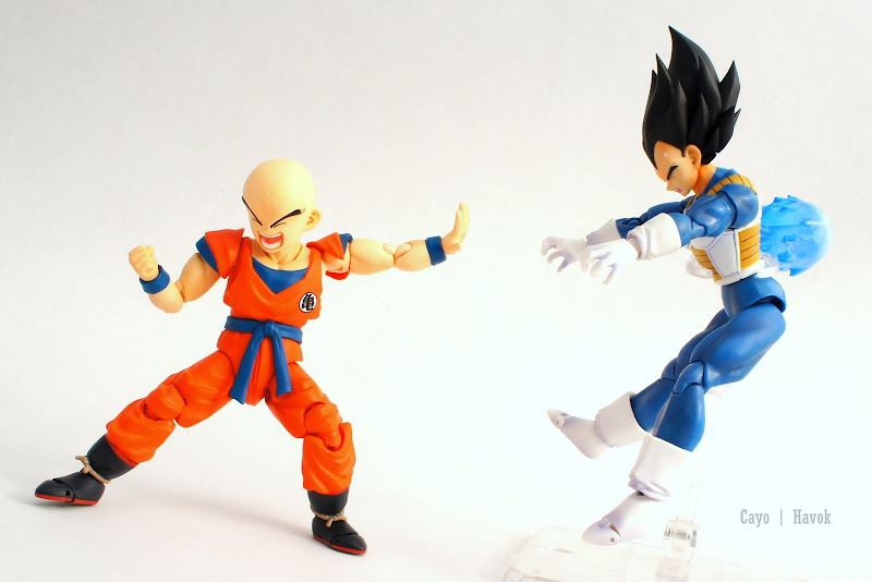
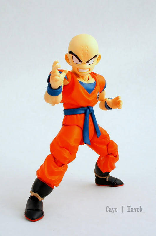
Bloody hell Havok, now that's some gallery! Love the vegeta blast recall.
 Love the vegeta blast recall.
Great pics and pose Havok 

FanAtticus
Freaked Out
- Joined
- Dec 4, 2013
- Messages
- 161
- Reaction score
- 1
Silrian
Super Freak
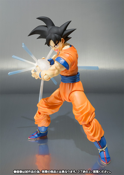
I guess I'm probably one of the only ones who likes the white in the middle? It's too bad they can't paint the edges due to real life being 3D and it not being real light (which can keep it's appearance from any angle). I don't like that they've shortened it though, kinda cheap tbh.
I guess I'm probably one of the only ones who likes the white in the middle? It's too bad they can't paint the edges due to real life being 3D and it not being real light (which can keep it's appearance from any angle). I don't like that they've shortened it though, kinda cheap tbh.
I like it, it's the closest they can get it without making it all blue


Silrian
Super Freak
I like it too but they really should've kept the length and just let the beams detach, seems freakin simple to me. I'm gonna buy Goku, obviously, but I can't help but feel they went cheap on him.
Big Deano
Super Freak
I liked the length of the light beams too, but as I look at it, they were the size of Goku in the old pic! It was probably too awkward to package, especially since the new one looks like a solid piece instead of one you put together, might just be me though!
I also like the white colour they went with, though there could be a bit more blue on the beams.
Someone should be fired at tamashii for that pitiful attempt at a kamehameha pose though
I also like the white colour they went with, though there could be a bit more blue on the beams.
Someone should be fired at tamashii for that pitiful attempt at a kamehameha pose though

lerath666
Super Freak
heh, awesome.
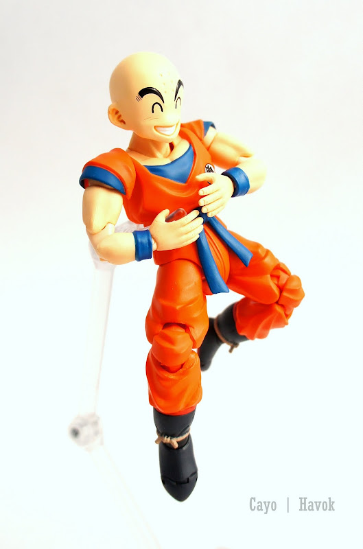
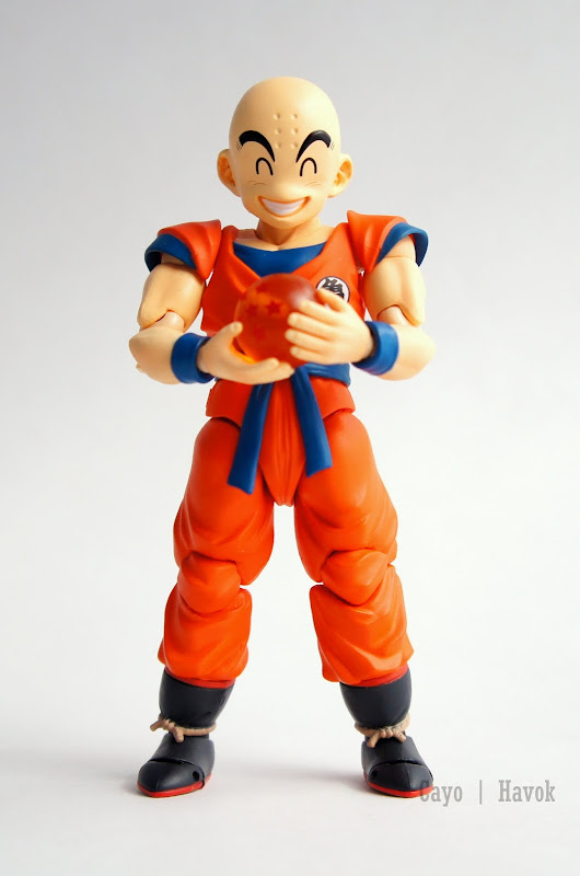
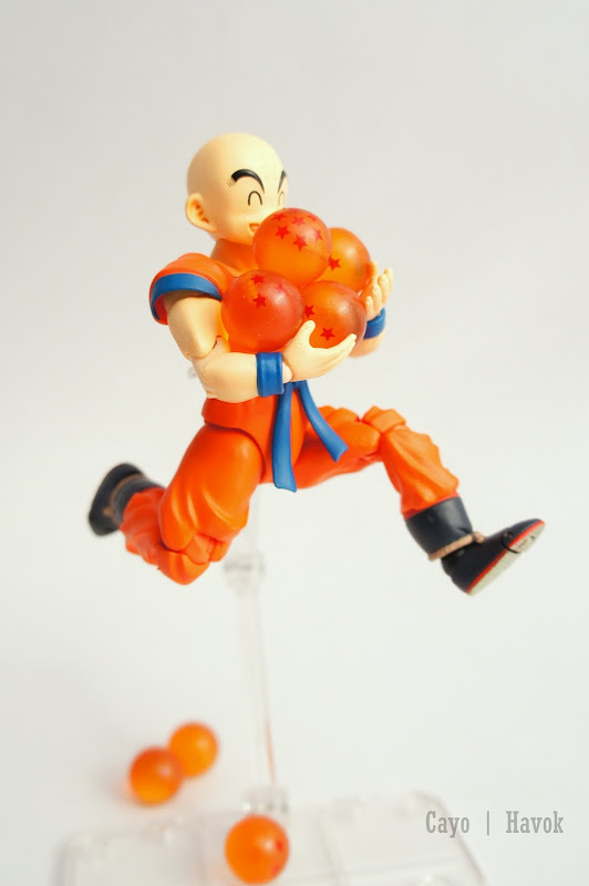
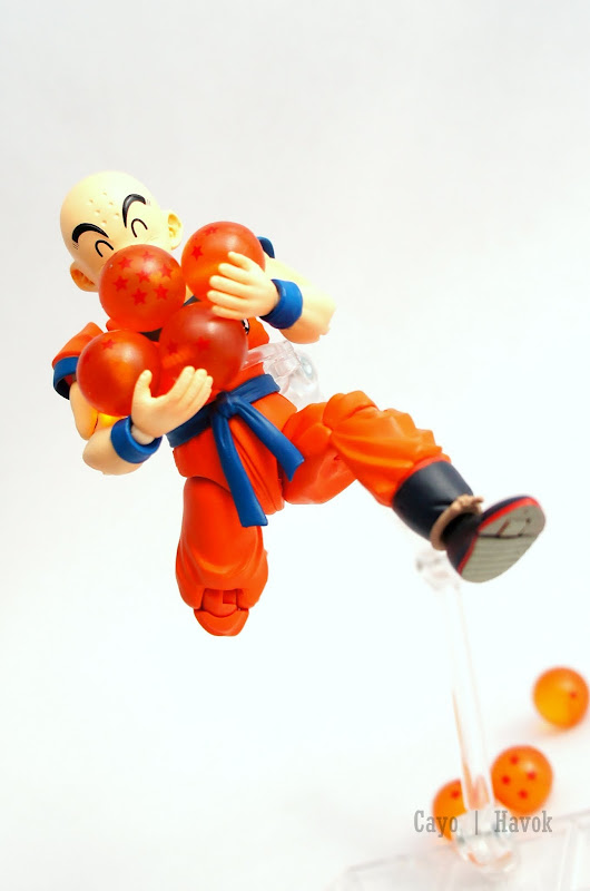
Havok, this may be a stupid question but, where'd you get those Dragon *****?
thanks guys.
you can find these dragon ***** on ebay by looking for chara strap dragon ball.
imaI2EAPEi2
Super Freak
- Joined
- Jan 20, 2013
- Messages
- 1,111
- Reaction score
- 6
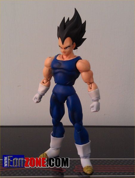
Want Majin Vegeta now. Also, when/if they rerelease SSJ Vegeta I'll buy 10 of him. And get 5 more normal Vegetas for these
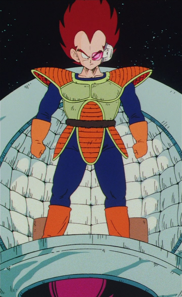

dat vegeta custom is super nice!
Similar threads
- Replies
- 4
- Views
- 1K
- Replies
- 126
- Views
- 24K
- Locked
- Replies
- 0
- Views
- 934


