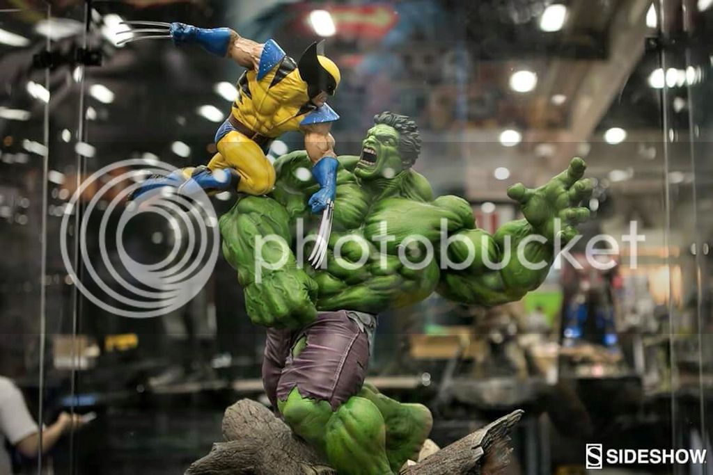
Statue Sideshow Hulk vs Wolverine Dio - 1/5 Scale

Collector Freaks Forum

Help Support Collector Freaks Forum:

This site may earn a commission from merchant affiliate links, including eBay, Amazon, and others.
Looks like it was made from those Singarpoor bootleg companies.

Lol, although it's not the best that ssc has done I wouldn't go that far as to compare it to the bootleg Hulks. Those are really just awful looking.
 
This looks amazing... Wow....

Looks like bothe Wolverine and Hulk may have a change of head
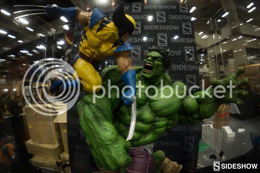
c1d7ed5bbe6464a7c495909183f17c98_zpsh4fbloph.jpg


21f71bc8fb20d948ff1fab835585567c_zps2n7gs7l2.jpg


Or at least they both have a head seam.

Another seamgate??? Ugh. Wolverine looks awesome but Hulk looks just...ok.
 
Nahhh this is Sideshow's weakest Hulk sculpt IMO. Looks like it was made from those Singarpoor bootleg companies. The Wolverine is good.

Shai is right. This looks odd. This is nothing like the Green Scar vs Silver Savage. Still be hard to pass.
Wonder who sculpted this.
 
Hulk seems clearly inspired to Deodato's style to me. I think it's intentionally exaggerated in the forms to give a more comic vibe to it, as opposed to PFs that tend to have more realistic cut. If I wanted to bet, I'd say their diorama vs line will be more comic oriented in style.

Wolverine looks more realistic because he is a normal generic human figure while Hulk is big oversized monster, some details look a bit off like the "double bicep shoulder" or his chunky right forearm but considering the character they don't seem that much out of place to me.
The praised Thanos diorama has similar issues like the inflated lats and an infinite amount of abs perfectly defined and pushing through the costume, doesn't seem to bother people in the least when they drop a grand for it.
This Wolvie vs Hulk is easily their best Marvel diorama imho, overall probably their second best diorama ever behind the Fury of the Beast.

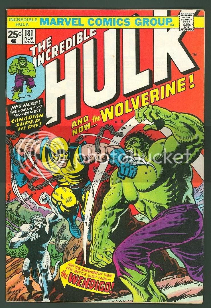
I would say that Hulk is sticking with Canale's style of Hulk for the most part. Like his King Hulk finally busted lose to kick some a$$. Now I think some are totally getting tied up with the Hulks head sculpt, BUT I think with the seam line there we will most likely get a change of head, because the more and more I look at the head that is on it right now the more I see how they were going for a more realistic version of this Herb Trimpe cover for Incredible Hulk 181

HULK181A.jpg


I will add that Tavegg is there at SDCC and he estimates that the Hulk is a little smaller than the Com, and some height estimates have this at about or just below 2 feet
 
Nahhh this is Sideshow's weakest Hulk sculpt IMO. Looks like it was made from those Singarpoor bootleg companies. The Wolverine is good.

Your weak ;) :lol

Agreed, the PF, king hulk etc were really better compared to how these pics look.

Sent from my iPhone using Tapatalk

Yup. Not diggin Hulk at all

Another seamgate??? Ugh. Wolverine looks awesome but Hulk looks just...ok.

Shai is right. This looks odd. This is nothing like the Green Scar vs Silver Savage. Still be hard to pass.
Wonder who sculpted this.


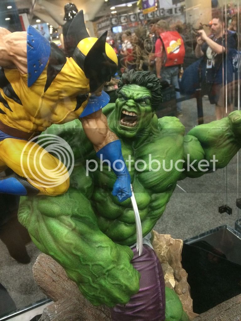
Without question I can understand where some are coming from... I think a full 360 video will help with it's "strange" proportions. Personally I like it's "comic" style because I have plenty of realistic hulks.... But it does seem a bit off and "custom looking... I think some better paint apps would help. IMO the paint apps on Hulk are a bit weak.... I am not nuts about his flowing hair either... But I love the face sculpt and love the fact he is so ripped.

Hulk, Bane, and Predator are my favs so far.
 
I would say that Hulk is sticking with Canale's style of Hulk for the most part. Like his King Hulk finally busted lose to kick some a$$.
I agree.

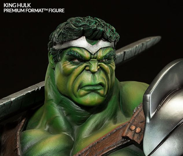
I think if you compare the King / Gladiator head sculpts with the new one they look very similar... Just different emotions.

The Chin, the brow, the cheek bones.... All very similar to each other.

I think you can easily see it in these shots.

2924233C-17AF-461B-9713-3C64AE7BCF33_zpsslzju5cf.jpg


background.jpg
 
Last edited:
Its probably the street fighter style hairdo that's making the hulk look different.


Sent from my iPhone using Tapatalk
 
Your weak ;) :lol


Without question I can understand where some are coming from... I think a full 360 video will help with it's "strange" proportions. Personally I like it's "comic" style because I have plenty of realistic hulks.... But it does seem a bit off and "custom looking... I think some better paint apps would help. IMO the paint apps on Hulk are a bit weak.... I am not nuts about his flowing hair either... But I love the face sculpt and love the fact he is so ripped.

Hulk, Bane, and Predator are my favs so far.

There is a really good video of this from SSC where they literally say that the paint was "still drying" on this one when it went up for display. I know they are still tweaking this one.

I agree.

I think if you compare the King / Gladiator head sculpts with the new one they look very similar... Just different emotions.

The Chin, the brow, the cheek bones.... All very similar to each other.

I think you can easily see it in these shots.

2924233C-17AF-461B-9713-3C64AE7BCF33_zpsslzju5cf.jpg


background.jpg

Agreed... totally Canale
 
There is a really good video of this from SSC where they literally say that the paint was "still drying" on this one when it went up for display. I know they are still tweaking this one.

In that same video the SSC Rep confirmed a COH for Wolverine so his retro mask is definitely a go on this piece. Can't wait to see it.
 
From what I see I love it, I agree hulk needs some help with paints and he is Huge but I think this is def a buy for me depending on price. We will see more of this in coming months
 
Back
Top