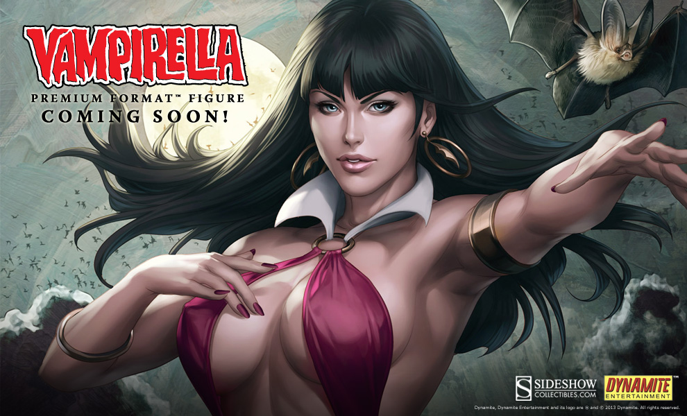
My wife liked this one, and I like the artist; however, am I just seeing things with her shoulder and head being way off center? The first time I saw it I thought it looked great, and I know she's supposed to have her right arm back behind her more, so it'll change the perspective a bit, but now it looks like the shoulder goes too far back, and it makes her head look off center. It's just one of those things that's nagging at me every time I look at it now!

I mean, I may be completely wrong, as sometimes you just need to look at it in a new way and the issue will disappear (as odd as that sounds)...anyone able to see this in a way that I'm not that could help me unsee it?


