Statue Sideshow Superman Rebirth Premium Format Statue

Collector Freaks Forum

Help Support Collector Freaks Forum:

This site may earn a commission from merchant affiliate links, including eBay, Amazon, and others.
Is your Superman Mexican?

No offense to the Mexicans but I was under the impression Superman couldn't tan his skin.

[emoji19]

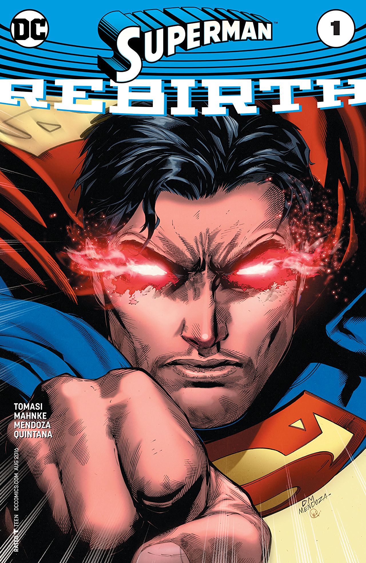
The skin tone is by far lighter than the First Batman PF. Also Lighter than Lex Luthor. I'm not sure what Mexican has to do with any of this. He's no Darker than on the Cover of Superman:Rebirth #1, the first book showing the Superman this piece is influenced by.

No one ever refered to Superman by nationality after seeing this cover.
0nag7Mu.jpg
 
We all know Superman's nationality is Kryptonian...

I was just trying to be funny... You can replace Mexican with any nationality with darker skin tones. Guess I missed the mark with that comment... But by all means, take offense over nothing.
 
Yeah I don't think Supes looks Hispanic, he just looks like he has a dark tan... which isn't comic accurate, given how many times I've had to listen to collectors whine about him not having red trunks you would think they would be upset about the inaccurate tan.... I don't remember the prototype looking that dark so I would have to guess the factory screwed up like they did with Lex and used a darker paint... as is the case with SS most of the time, they just don't care... take it or leave it is their motto..


The skin tone is by far lighter than the First Batman PF. Also Lighter than Lex Luthor. I'm not sure what Mexican has to do with any of this. He's no Darker than on the Cover of Superman:Rebirth #1, the first book showing the Superman this piece is influenced by.

No one ever refered to Superman by nationality after seeing this cover.

I think that's actually a red glow off his skin from his heat vision....
 
I live in Southern California where a significant % of the population is Hispanic. I also own this statue. Superman does not appear Hispanic.
You guys are too much. lol
And taking my comments way too literally. I just meant he is obviously darker than he should be. Whether Hispanic or Sicilian, it really isn't the point.
 
You guys are too much. lol
And taking my comments way too literally. I just meant he is obviously darker than he should be. Whether Hispanic or Sicilian, it really isn't the point.

So you're saying he hates Mexicans because he is sicilian?

Haha just messing :lol
 
I think that's actually a red glow off his skin from his heat vision....

There's plenty of other examples in recent comics, just grabbed the 1st appearance. The point of my post was simply to imply that putting the piece down for a slight skin tone variation is insane. It's an amazing piece! Can't wait for the rest the line.
 
The new Supes lookes just healty; too light skin colours comes from *******/orgasming or low testosterone levels...healty young men are not pale..
 
Just got this delivered today... Generally pretty happy with the final product. No issues. A few things not to my taste though. First and foremost, I will say that the skin tone is WAY darker than I would have wanted. He looks as if he has been in Mexico vacationing for the last six months. I don't really know what they were thinking... Yeah, it's that dark, but strangely doesn't show up that bad in pictures. Second, the cape look pretty cheap. I don't mind the idea of a fabric cape but this attempt is a fail IMO. Third, his hair has too much blue in it. I'd prefer it just be black or dark.

Here are a few quick shots of the new and old Superman PF's.

You be the judge.
b76c11f249110db015a79e6239127372.jpg


This right here is a good comparison. Both PF is under the same light and there's hardly any shadow on the right side of their faces. Just by looking at this pic, you can see that the difference in skin tone is not drastic. They are closer in skin tone than different.

And the way I see it, this is a great sculpt of Superman. The difference in skin tone is minute ...and not enough to negate this sculpt.

The lighting is horrible in that picture it's washing it out.... If collectors can negate a sculpt because he's not wearing red underwear I can negate a sculpt because he's to tan :p
 
The lighting is horrible in that picture it's washing it out.... If collectors can negate a sculpt because he's not wearing red underwear I can negate a sculpt because he's to tan :p

:lol ...alright man, you can negate it if you want to.

I'm just saying both of them are under the same light, so you can compare skin tone between the 2 of them. The light is a tad bright but one can still see the difference between them. And its not drastic.
 
The sculpt is def not the issue on most SSC pieces. Pretty sure Steve Lord did the new Supes and he is an amazing sculptor...esp with anatomy. But the paints leave more to be desired. I also saw someone say the first Supes PF was limited by sculpting tech at that time and this is quite untrue lol. It was SSC's choice to simplify it and cover it with a cloth outfit. Whether you prefer that to fully sculpted or not is a matter of preference. In any case, the first Supes was also $180 cheaper so there's that too.
 
Average price on Ebay right now for the OG Superman PF is around $350.00 and some of those were exclusives...
 
The sculpt is def not the issue on most SSC pieces. Pretty sure Steve Lord did the new Supes and he is an amazing sculptor...esp with anatomy. But the paints leave more to be desired. I also saw someone say the first Supes PF was limited by sculpting tech at that time and this is quite untrue lol. It was SSC's choice to simplify it and cover it with a cloth outfit. Whether you prefer that to fully sculpted or not is a matter of preference. In any case, the first Supes was also $180 cheaper so there's that too.

I prefer the new sculpts personally, even taking into account the sculpt of the OGs underneath the cloth. The proportions just look better to me. Not saying the new ones are all better, just that they are better proportioned and more detail
 
I prefer the new sculpts personally, even taking into account the sculpt of the OGs underneath the cloth. The proportions just look better to me. Not saying the new ones are all better, just that they are better proportioned and more detail

I think the detail is higher but the proportions seem good on both to me. My point was that they could have detailed the OG Supes but just chose not to cuz of the cloth going on top. The capability for detail existed even back then.
 
I think the detail is higher but the proportions seem good on both to me. My point was that they could have detailed the OG Supes but just chose not to cuz of the cloth going on top. The capability for detail existed even back then.

Yep I definitely agree that cloth hides the sculpt. Maybe I'm mainly talking about batman with my issues with sculpt - he has an overly long neck and only looks good from certain angles IMO. That wouldn't happen nowadays, maybe due to more 3d sculpting, I dunno
 
Yep I definitely agree that cloth hides the sculpt. Maybe I'm mainly talking about batman with my issues with sculpt - he has an overly long neck and only looks good from certain angles IMO. That wouldn't happen nowadays, maybe due to more 3d sculpting, I dunno

I think companies like XM and Prime1 have pushed SSC to probably be more critical of proportions and posing early on in prototype phase. I just wish that carried over into the production phases, esp in paints.
 
Back
Top