Armymedic1980
Super Freak
I have both too. I think they are equally the best Batman PFs for the money. I wish they would've made a print to go with the modern version.

I owned both and I have to say, overall the original is the best. The modern's face is too dark and the belt looks really cheap. The orignal's face is also dark, but they made it look like a five o'clock shadow. On the modern PF the whole face is dark and it doesn't look right. Still, both statues are beautiful and look amazing in person
The black versions faces were definitely darker, I don't know what you guys are talking about
I think the head sculpts are better on the black one. Never cared for the Adams head sculpt. This piece in general doesn't even look like a Adam's Bats. He's way too muscular to be a Adam's Bats. It's just an awkward looking piece IMO. The black PF just nails it.
Seems we go round and round about this. It’s all what you dig for sure.
Dark knight or Blue Knight. No wrong or right.
I've personally had the modern, and have seen both Black and Blue versions on display side-by-side at stores and at some friends' displays, and IMO neither are perfect just as both have their own strong points when compared to each other. However both are very nice statues and are certainly great value for money considering today's prices.
 J/K
J/K
Consider the source
I liked the original... I just never loved it.. I did not care for the "forward" looking head sculpt but thought the positioning looked more natural. I thought the "turned" head sculpt was much better sculpt wise but the positioning caused the piece to look odd and awkward from some angles... Even feminine due to the leg being up and bats looking so far to the left like the wind was in his hair.
The Modern was a perfect blend of sculpt and positioning... I said this before.. I think the piece looks like it was originally sculpted with the modern head in mind. It just fits the piece much more naturally.
The Original had the better Belt for sure. But SSC made all the major improvements to the Modern... (more body shading, no balance issues, better base paints, no pit issues, better paint apps on the head etc.)
Anyways.. Its all opinion.. I am not trying to say your wrong just posting my thoughts on what is IMO SSC best piece.
Blue and Grey Bats has always been my Bats... It's what I grew up with so I have a biased for sure... I still had issues with the original though. But I liked it when I had it.
Seems we go round and round about this. It’s all what you dig for sure.
Dark knight or Blue Knight. No wrong or right.
I grew up on blue and grey Bats as well. I devoured Batman comics and covers drawn by Neal Adams, Jim Aparo, Marshall Rogers, and Jose Luis Gracia-Lopez as a kid. You know what all of their art work has in common? None of their Batman art looks like the modern PF. Sure the costume is accurate but none of those artists drew a Batman as huge as the PF. Not even close. All of them drew a slimmer athletic looking Bats. IMO, the Adams portrait looks all wrong on the modern PF. As far as I'm concerned, we have yet to see a proper 70's-80's Batman PF. For me the modern PF looks exactly like what it is...an awkward and out of place variant. A dedicated and accurate to the era blue and grey Bats PF still has yet to be made. The OG PF was specifically made for the black and grey costume. It's a natural fit. That's why the black and grey PF looks so bad ass to me (warts and all).
I grew up on blue and grey Bats as well. I devoured Batman comics and covers drawn by Neal Adams, Jim Aparo, Marshall Rogers, and Jose Luis Gracia-Lopez as a kid. You know what all of their art work has in common? None of their Batman art looks like the modern PF. Sure the costume is accurate but none of those artists drew a Batman as huge as the PF. Not even close. All of them drew a slimmer athletic looking Bats. IMO, the Adams portrait looks all wrong on the modern PF. As far as I'm concerned, we have yet to see a proper 70's-80's Batman PF. For me the modern PF looks exactly like what it is...an awkward and out of place variant. A dedicated and accurate to the era blue and grey Bats PF still has yet to be made. The OG PF was specifically made for the black and grey costume. It's a natural fit. That's why the black and grey PF looks so bad ass to me (warts and all).

Sorry, but IMO that Aparo art is still a skinny Bats when compared to the modern PF. I'm not saying the modern PF looks bad. It's not a horrible PF. I just find it to be off considering the era it represents. That said, I can understand why collectors like the modern PF. Bottom line, we both have the Bats PF we like most in our collection and that's nothing but a good thing.I get what you are saying... Yes he is too large for those classic artist... But you have other artist like Brian Bolland, Frank Miller Etc... that have drawn the Bat in his classic costume and made him plenty large.
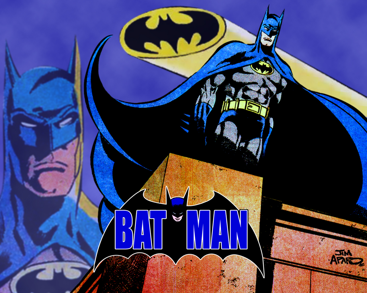
Jim Aparo has even drawn him a bit bigger at times.
Take the photo below.. Nothing Unnatural looking here size wise... Now I know there are plenty of examples (way more) that can be pointed out to how skinny he was.. My point is that in the pic below he is plenty big and he looks great...
But I get what you guys are saying.. I don't agree at all as I think he looks great but that is what is fun in all of this.. It's great that we don;t have all the exact same Batman's in our collection

Absolutely guys! That’s even why they made two separate threads! He’s just that awesome!

Absolutely guys! That’s even why they made two separate threads! He’s just that awesome!
Haha, well played.

True that.
Yeah but what fun is it to go into the Modern Bats thread to talk about how great it is with a bunch of like minded people... I like to live on the wild side

