You are using an out of date browser. It may not display this or other websites correctly.
You should upgrade or use an alternative browser.
You should upgrade or use an alternative browser.
1/6 SSC ROTJ Luke Skywalker Deluxe Sixth Scale Figure
- Thread starter BurningRage
- Start date

Help Support Collector Freaks Forum:
This site may earn a commission from merchant affiliate
links, including eBay, Amazon, and others.
Chakaman
Super Freak
That looks great TonTon!
That looks great TonTon!
Thanks, Chakaman! What was your verdict again on the SS pants/shirt? And did you ever try them on the Hot Toys figure, or try the HT head on the SS body (if compatible)? I still feel like we only saw one or two shots of that combination.
Never sure where to post these pics.
But enjoying the SS Endor gear, got me to pick up the speeder bike again. The helmet was a ***** to get off the head sculpt.
Beautiful pics! I’d love to see him on the speeder!
can the helmet fit on the HT sculpt if you remove his hair?
andrey
Freakalicious
Gorgeous photos Ton Ton!
You make me spend money on a speeder bike
You make me spend money on a speeder bike
Beautiful pics! I’d love to see him on the speeder!
can the helmet fit on the HT sculpt if you remove his hair?
Gorgeous photos Ton Ton!
You make me spend money on a speeder bike
 Thanks guys. Something needs to be modded, either the helmet or sculpt or both. Wasn’t willing to try. It’s possible the helmet would fit on the DX 07 sculpt — but don’t have that one to try.
 I took some pics of Luke riding the speeder and posted in the speeder bike thread a couple weeks back. Tough to get him looking natural on there, and the fixed neck presents an obstacle when trying to get him looking straight ahead.

$14.99
DC Comics, 12-Inch Superman Action Figure, Collectible Kids Toys for Boys and Girls
Bopster USA Inc
Thanks guys. Something needs to be modded, either the helmet or sculpt or both. Wasn’t willing to try. It’s possible the helmet would fit on the DX 07 sculpt — but don’t have that one to try.
I took some pics of Luke riding the speeder and posted in the speeder bike thread a couple weeks back. Tough to get him looking natural on there, and the fixed neck presents an obstacle when trying to get him looking straight ahead.
I have been toying with the idea of removing the neck on one of my spare sculpts. I have a SS Endor helmeted head coming, so i might try to fit the helmet on the same sculpt.
I'll check out the Speeder thread.
- Joined
- Jul 13, 2006
- Messages
- 9,178
- Reaction score
- 4,452
SkullDuggery
Super Freak
- Joined
- Nov 18, 2007
- Messages
- 273
- Reaction score
- 0
Welp mine will be here Wednesday. I know it's not Hot Toys level of paint quality. Not many other companies can produce that eerie life like effect , but with free shipping and reward points softening the blow of the high price tag I am getting pumped for it! I mean it's a Luke Skywalker action figure for crying out loud. He should be a lot of fun to pose up and maybe get some more dynamic poses than the fat suit limited HT Luke. And if worse comes to worse I think the SS belt would go along way to make the HT Luke look that much cooler. I just wish I wouldn't have given my MIB Hasbro 1/6 Luke and Speeder bike to my nephew cuz the SOB won't give it back so now I gotta get ANOTHER speeder for him, arrrgh!
Knightstalker
Super Freak
Well, not quite the horror show I was expecting......but interesting.
A quick shot with more observations later...
View attachment 445817
I like it, and I’ll still get it at some stage.
- Joined
- Jul 13, 2006
- Messages
- 9,178
- Reaction score
- 4,452
Another look and some comments....

It's a Sideshow figure.
I don't mean that as a jibe. It just sums it up. I don't look at this as a comparison to the HT version. While that may be an apples n' oranges comparison to some, I'll just say they both have their respective issues as figures. I will give HT the edge for it's issues not being quite so glaring as the ones with this figure, but as one who appreciates an entire figure, from box to boots, there is a lot to like here.
Let's get the good stuff onto the table first. I like the proportions of this figure a lot. While the limbs on the base body are a bit scary-loose, they seem to hold the poses and articulate well. The outfit fits the proportions of the figure, with the tunic and trousers having a good, realistic fit (with one major issue I'll visit below). The chest front folds over crisply and stays well-seated with it's magnet. The boots come across better in person with the pliable upper portions not looking too stiff and the break at the foot allowing for some extreme stances.
All of the materials are well selected and feature good texture. The hooded cloak has great weight and is especially nice with it's well-hanging folds and drape. The only unfortunate feature is it's glaring top stitch on the top of the hood.
I'm surprised on how much I like the flexible hands. What they lack in detail they make up for in how easily they switch and they are not the oversized mitts HT has been featuring lately.
The box is styled like the recent Mythos Kenobi...straying a bit from the standard formula by featuring close-up details of the figure making for a nice visual touch as the figure is being unboxed. The one thing I did notice with the box is the weight- a much lighter stock is being used here. In fact the box took me by surprise with how slight it was, right down to the shipper. I'm old-fashioned, but when I see the word "deluxe" in the title of something, I'm expecting it to follow through the entire presentation.
Now for the not so good.
I mention how much I like the outfit and the materials. The big crime here is how incredibly lumpy and wrinkled the base suit is. I don't know if even stripping it down and water-treating will do the trick. (If anyone's had a go at it it with any success, please share with us here!)
The portrait has a stylized look to it. Not bad, just different. The features and imperfections of Hamill's face are present, but with the clean but flat paint apps, the slightly widened eyes (not to the level of the original "deer-in-the-headlights" one from years ago mind you) to the "saw-toothed" hairline across the forehead, the portrait comes across as an idealized version. It's not bad, like all portraits, a certain angle and light capture the best look for the young Hamill here.
The one crime of the head itself for me is how it attaches to the body. The huge gap behind the ears and base of the neck are pretty unsightly and limit effective display angles. The big black collar helps as do the hoods on the poncho and cloak...it just would have been nicer if the engineering here were a bit cleaner. You can see what I mean with this profile view:

I'll have some more shots and thoughts about this one later. I am glad I kept the order. It is interesting seeing different presentations of the same iconic character. Still dig my Sideshow figures....
(BTW...before folks ask, the Endor helmet is NOT the one the comes with the figure...I borrowed it from one of the Endor Rebel Troopers SSC produced years ago. I'll have some shots of that portrait with it's helmet up later)

It's a Sideshow figure.
I don't mean that as a jibe. It just sums it up. I don't look at this as a comparison to the HT version. While that may be an apples n' oranges comparison to some, I'll just say they both have their respective issues as figures. I will give HT the edge for it's issues not being quite so glaring as the ones with this figure, but as one who appreciates an entire figure, from box to boots, there is a lot to like here.
Let's get the good stuff onto the table first. I like the proportions of this figure a lot. While the limbs on the base body are a bit scary-loose, they seem to hold the poses and articulate well. The outfit fits the proportions of the figure, with the tunic and trousers having a good, realistic fit (with one major issue I'll visit below). The chest front folds over crisply and stays well-seated with it's magnet. The boots come across better in person with the pliable upper portions not looking too stiff and the break at the foot allowing for some extreme stances.
All of the materials are well selected and feature good texture. The hooded cloak has great weight and is especially nice with it's well-hanging folds and drape. The only unfortunate feature is it's glaring top stitch on the top of the hood.
I'm surprised on how much I like the flexible hands. What they lack in detail they make up for in how easily they switch and they are not the oversized mitts HT has been featuring lately.
The box is styled like the recent Mythos Kenobi...straying a bit from the standard formula by featuring close-up details of the figure making for a nice visual touch as the figure is being unboxed. The one thing I did notice with the box is the weight- a much lighter stock is being used here. In fact the box took me by surprise with how slight it was, right down to the shipper. I'm old-fashioned, but when I see the word "deluxe" in the title of something, I'm expecting it to follow through the entire presentation.
Now for the not so good.
I mention how much I like the outfit and the materials. The big crime here is how incredibly lumpy and wrinkled the base suit is. I don't know if even stripping it down and water-treating will do the trick. (If anyone's had a go at it it with any success, please share with us here!)
The portrait has a stylized look to it. Not bad, just different. The features and imperfections of Hamill's face are present, but with the clean but flat paint apps, the slightly widened eyes (not to the level of the original "deer-in-the-headlights" one from years ago mind you) to the "saw-toothed" hairline across the forehead, the portrait comes across as an idealized version. It's not bad, like all portraits, a certain angle and light capture the best look for the young Hamill here.
The one crime of the head itself for me is how it attaches to the body. The huge gap behind the ears and base of the neck are pretty unsightly and limit effective display angles. The big black collar helps as do the hoods on the poncho and cloak...it just would have been nicer if the engineering here were a bit cleaner. You can see what I mean with this profile view:

I'll have some more shots and thoughts about this one later. I am glad I kept the order. It is interesting seeing different presentations of the same iconic character. Still dig my Sideshow figures....
(BTW...before folks ask, the Endor helmet is NOT the one the comes with the figure...I borrowed it from one of the Endor Rebel Troopers SSC produced years ago. I'll have some shots of that portrait with it's helmet up later)
Last edited:
- Joined
- Nov 25, 2007
- Messages
- 3,300
- Reaction score
- 112
These figures would be a lot more palatable for less money. SS charging HT prices doesn't help their cause. Like Honda charging the same price as Mercedes.
Great pics and review, JB.
I picked up a helmeted head to see what the fuss is about. The peak looks all warped and the paint doesn't seem great but I'm hoping to cast the top part of the helmet. I may try to put a HT Luke head into the hlemet but TonTon seemed to think the SSC headsculpt was tough to remove.

I picked up a helmeted head to see what the fuss is about. The peak looks all warped and the paint doesn't seem great but I'm hoping to cast the top part of the helmet. I may try to put a HT Luke head into the hlemet but TonTon seemed to think the SSC headsculpt was tough to remove.
Just dunk it in a cup of boiling water. It will just fall out.Great pics and review, JB.
I picked up a helmeted head to see what the fuss is about. The peak looks all warped and the paint doesn't seem great but I'm hoping to cast the top part of the helmet. I may try to put a HT Luke head into the hlemet but TonTon seemed to think the SSC headsculpt was tough to remove.
- Joined
- Jul 13, 2006
- Messages
- 9,178
- Reaction score
- 4,452
Thanks!
Here's a shot with the helmeted head...

Yes, that brim is warped - I've noticed that on a lot of other shots and reviews too. Paint is okay...good for Sideshow. Changing the head out is a bit harder to do than I'd like...really had to use a little force (no pun intended) to get it to seat on the ball peg.
One other thing I'll concede to HT here...initially, I didn't like the gritting teeth intense expression on the portrait of their forthcoming version. Now after having this one in front of me and trying some more dynamic stances, the overly-serene (almost blank) expression on this one really stands out. Out of the two portraits included with this SSC figure, it's a draw for me....one isn't necessarily "better" than the other I like the earlier version of the Endor helmet (featured in my first shots) much better than this one. The materials, casting, fabric and details work much better than on this all-plastic one.
A couple of shots in the DS get-up, than I gotta decide how I want to include this in my display....
Here's a shot with the helmeted head...

Yes, that brim is warped - I've noticed that on a lot of other shots and reviews too. Paint is okay...good for Sideshow. Changing the head out is a bit harder to do than I'd like...really had to use a little force (no pun intended) to get it to seat on the ball peg.
One other thing I'll concede to HT here...initially, I didn't like the gritting teeth intense expression on the portrait of their forthcoming version. Now after having this one in front of me and trying some more dynamic stances, the overly-serene (almost blank) expression on this one really stands out. Out of the two portraits included with this SSC figure, it's a draw for me....one isn't necessarily "better" than the other I like the earlier version of the Endor helmet (featured in my first shots) much better than this one. The materials, casting, fabric and details work much better than on this all-plastic one.
A couple of shots in the DS get-up, than I gotta decide how I want to include this in my display....
Yeah, while "your hero watching TV" facial expression is a common choice for a variety of companies (BW and HT included) SSC does the same bland expressions but with dull, just-okay paint apps.
Is the head in the helmet the exact same sculpt and the no-helmet one?
Is the head in the helmet the exact same sculpt and the no-helmet one?
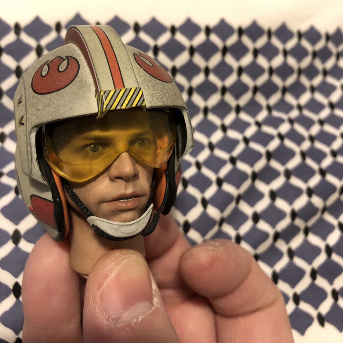
One of my questions is is the head the same as the Snowspeeder one. Here is the x-wing helmet on this helmet sculpt and the HT sculpt.
Sorry for the hands.


Sorry for the hands.


Similar threads
- Replies
- 37
- Views
- 4K
- Replies
- 0
- Views
- 126
- Replies
- 0
- Views
- 547
- Replies
- 0
- Views
- 163


