ironwez20
Super Freak
- Joined
- Nov 17, 2008
- Messages
- 28,141
- Reaction score
- 6,166
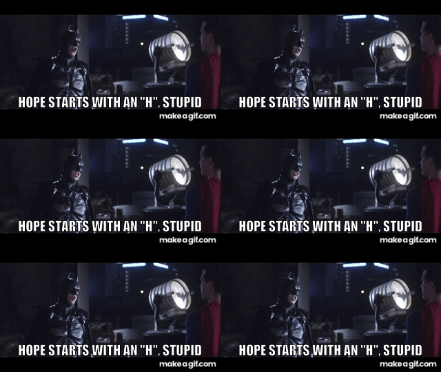
It’s not an s it’s more of a symbol of hope. Call me hopemanits not an S brother, it's a symbol for HOPE

It’s not an s it’s more of a symbol of hope. Call me hopemanits not an S brother, it's a symbol for HOPE
its not an S brother, it's a symbol for HOPE
It’s not an s it’s more of a symbol of hope. Call me hopeman

The colour scheme's different, but that's the logo designed by Alex Ross for Earth-22's Superman (Kingdom Come, Kingdom).
I actually quite like it. While it's not 'classic' I find it dynamic and perhaps befitting an alien glyph. I grew up a fan of the traditional, classical Superman but I like both styles.
My biggest gripe is the unnecessary and arbitrary panel lining, which we saw done to death in the MCU as well. I think it's the design shorthand they chose to make Superheroes more 'grounded' for the general public.
But I'm hoping the suit will look better in the final film and as much as I hate panel lines I like it better than Snyder's version, maybe *because* of the naivete and classicism of the trunks, which I get a lot of people hate but there's no accounting for my nerd taste.
I've seen some good designs without trunks but as much as Cavill Superman looked good I once again 'accepted' rather than loved the suit, which I found too busy and usually too dark.
I prefer graphic simplicity but that's not in the cards for most modern live action costumes.


no more terrible than the current one, the red panties over blue pantyhose on Superman will never look good.That looks terrible and you know it
Gunn is hard for me to pin down. He seems to veer from chaotic to conservative in one breath. GOTG seemed like a fresh take on old tropes. Maybe it wasn't and I just hadn't seen anything like it in years, who knows.If I were making a Superman for a general audiences, I think there are better comic-accurate ones to choose from (if comic accuracy is Gunn's main goal here) - but each to their own, I guess.
I hated it at first, grew to love it ... really enjoy the film. But that's a different suspension of disbelief. I'm athletic and also work a physical job so I know what it feels like to move in different gear and/or weighed down by tools.I've never been into Batman but bought the JND Pattinson one because I love the design so much - but I'm sure there's plenty of people that hate it. It felt grounded and functional and every piece seemed to have a purpose.
I can see where it comes from. New 52 panel lines meets MCU style meets old school trunks. It's kinda all over the place.Whereas this thing seems like the mandate was to try and make something cool and disregard any and all purpose for any part of the suit whatsoever (those panels as an example).
Ugly, ill-fitting, generic, and already feels dated.
It does, but I guess the materials and the way it was shot make it feel dated to me now. I'd love to see a modern take on that minimal, colour-blocked style without all the textures, panels, glyphs etc. of contemporary suits.The Reeve one feels the most comic accurate and effortless out of all the film ones I've seen so far.
Here a brighter look for Man of Steel. You can be a vibrant and colorful movie while retaining a cinematic look.
Sure you could still pump the brightness and color. At least it looks cinematic.still dark as hell
99% more rejigging needed.
Damn! I wish we would have a Superman suit like that. I love the trailer but the suit is horrible.
Yeah it should not be that hard to create a comic-accurate Superman suit that would hold up on the big screen today and not be made of thin spandex or be too overly complex like Snyder's. And I'm sure Gunn was probably presented with hundreds of examples like all new Superman directors, but for some reason went with... this one.
Enter your email address to join: