The Anatomy of a Pose - A Central Hub for Tips and Tricks to Better Your Figures

Collector Freaks Forum

Help Support Collector Freaks Forum:

This site may earn a commission from merchant affiliate links, including eBay, Amazon, and others.
Excellent work davejames! So subtle but so natural! And definitely agree with you with over exaggerating poses to show up better on camera.


Sent from my iPhone using Tapatalk
 
Great thread DioramaMaker! Here's a few of mine.

One thing I nearly always do with female figures is angle the hips out to one side, to emphasize their femininity a bit more.

And I've also discovered that a pose can look really cool in hand but come across way too subtle on camera, so I often have to go back and exaggerate it a bit more to make it show up better in pics.

And there are times, like with my Thor and Hela, where I pose one figure based on what the other is doing, even if they're not actually interacting.

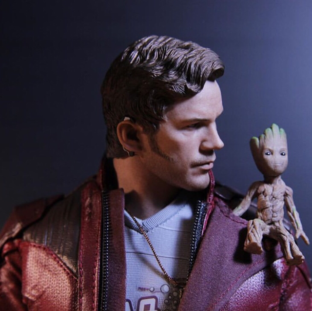
And there are some figures, like Star-Lord, where you just have to put him in a more showoffy pose. :D

View attachment 456165

View attachment 456166

View attachment 456167

View attachment 456170

Awesome job on all, but I especially love your McCoy! :clap
 
[...]And definitely agree with you with over exaggerating poses to show up better on camera.


Sent from my iPhone using Tapatalk

Yep, the camera has different 'eyes'. That said, when posing for the display and human eyes I'll find myself dialing back on initial poses to make them look more natural.
 
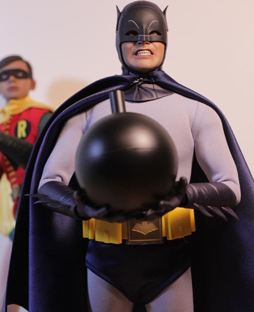
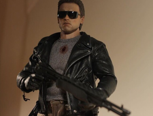
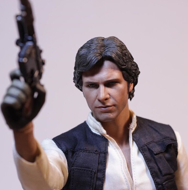
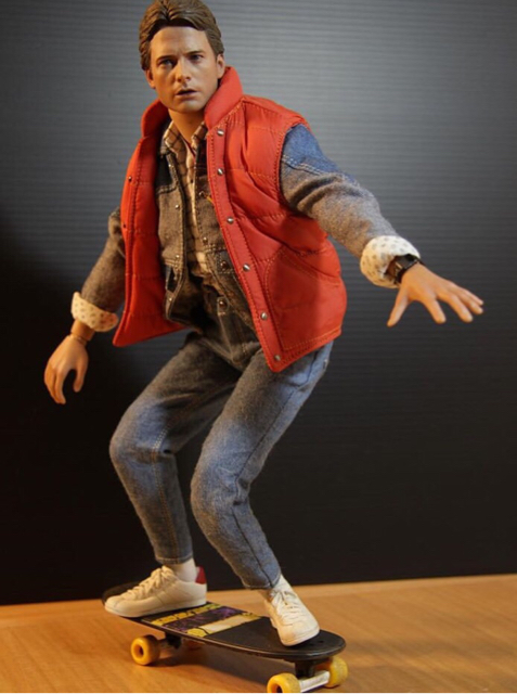
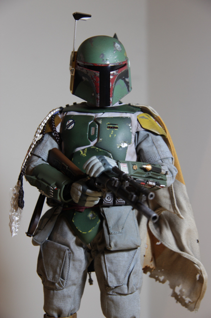
Here are a few of mine. The great thing about some of these figures (especially the newer ones) is that the detail and paint can be so lifelike, that they don't require a DYNAMIC pose. Just a little turn of the torso, or tilt of the head can look very natural and real. Also, at worst, just copy one of the poses from the official pics from Hot Toys, or Sideshow, or whoever....
HTANH.jpg
WM1.jpg
HTHulka.jpg
RayPunisher.jpg
RayHB2.jpg
tmnth.jpg
SSwolviepose.jpg
SSCJoker.jpg
T8002.JPG
HTObi.JPG
BvSBatsPose.jpg
 
Great thread DioramaMaker! Here's a few of mine.

One thing I nearly always do with female figures is angle the hips out to one side, to emphasize their femininity a bit more.

And I've also discovered that a pose can look really cool in hand but come across way too subtle on camera, so I often have to go back and exaggerate it a bit more to make it show up better in pics.

And there are times, like with my Thor and Hela, where I pose one figure based on what the other is doing, even if they're not actually interacting.

And of course there are some figures, like Star-Lord, where you just have to put him in a more showoffy pose. :D

View attachment 456165

View attachment 456166

View attachment 456167

View attachment 456170

View attachment 456171
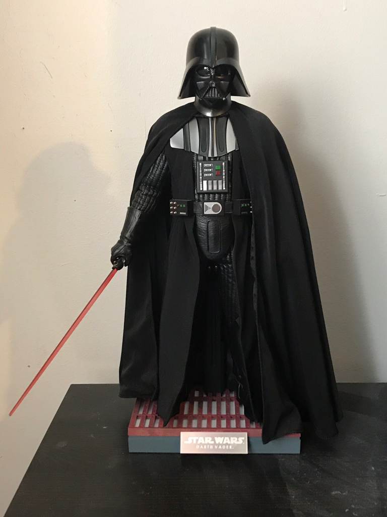
Great pics and poses. Really nailing the characters with these.


Sent from my iPhone using Tapatalk Pro
 
I don’t have anything too crazy to add but these two are probably my favorite poses currently.
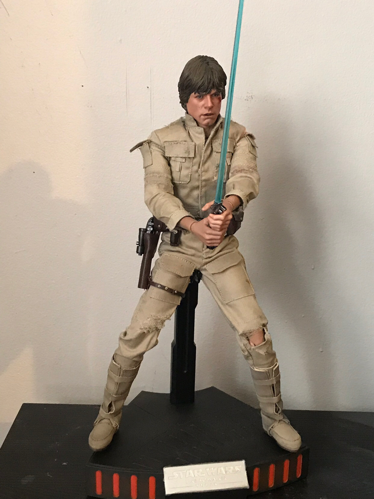
Here’s ANH Vader standing in for an Empire version. For him I went with something very simple to give off the almost elegant fencer vibe in the Carbon Freezing Chamber (plus the cape helps hide the ANH style glove on the other side)
309cadced82ce7b7c11bd319e5a9dd8b.jpg

Luke is a bit more dynamic, he has the battle damaged head/clothes so this is him towards the middle/end of the fight. He’s hurt, he’s losing, and scared ****less of Vader so it’s a much more defensive pose, almost like he’s distancing himself from Vader while still trying to keep his guard up. I’ve played around with the arms quite a bit to get them “just right” and I’m fairly happy with how they are now.
f833288dba2e46e1bc651b28c84118ad.jpg


Sent from my iPhone using Tapatalk
 
Man what a terrific idea for a thread.

Here’s a few photos...

I have zero confidence in my ability to pose figures (or photograph them for that matter) but I find Terry on How To Be A Poser incredibly inspiring in his methods and thoughts behind it. I definitely think I’m better than when I started! Futzing certainly helps, good lighting, thinking about posture and body language, generally be subtle and don’t exaggerate too much. Terry often talks about twisting the head a little and always twist the torso. There is a lot to talk about with this subject ...

80d9817012b11b26f002647e486eb70f.jpg


ee06a5676f3475c16eb933abeba2c56a.jpg


4ada6749f2b61ec89539264c514faa63.jpg


5075bd2fbddc20f81dced8c5d51f5822.jpg


e27f0372b031439d567f68a37adaee96.jpg


d302d6c99d616030572be26a8aced370.jpg


Sent from my iPhone using Tapatalk
 
This is a great idea.
And I agree, when posed and put in the right lighting, these figures go from toys to looking like museum pieces.

I've gone through and dig through the vault.
I've done a huge update on my collection, but I'll start off with some of the oldies but goodies.


Connorb.jpg


Horrorcrew1d.jpg


Arnie2c.jpg


Superman3.jpg


Dexter5c.jpg


Jack1.jpg


Last edited:
Great thread Dioramamaker. Not just to learn but also to simply steal the best poses people have to offer :lol

But more seriously sometimes an iconic background can really accentuate the pose, or make a potentially boring pose into something which looks great.

Here are a couple of mine which while perhaps are not posed exceptionally, however I find the background also makes the end pose and effect pretty damn cool.

A_5.jpg

A_4.jpg

A_6.jpg
 
:clap :hi5: :duff for the thread. Rep'd

Got a few compliments on this one, when I was planning out my Avengers dio:

411798661.jpg


The "selling point" here is Loki. You have to tweak and tweak until you get that 'surprised' body language. You can change or sell a facial expression, but body language can tell the story.

And how it ultimately looks in context:

412461657.jpg


I'm going to eventually do a DP dio, and here I was tinkering with what it might look like (but with HT Deadpool):

412781024.jpg


Angles in photography and angle you present viewer in your case mean everything -

"meh"

413054015.jpg


much more interesting:

413054016.jpg


Sometimes simple is better.

413413813.jpg


Lighting is critical...

413493409.jpg


tweak tweak tweak...

Note here the element of surprise is sold in how the forefront villain is twisted around. The pose sells that he was facing the other direction and has spun to face the commotion or noise.

413789754.jpg


413797347.jpg


413995368.jpg


Slight bend at waist, the lean in, sells this:

414108230.jpg


Also crucial is eye lines. If multiple characters involved, make sure the are looking face to face, eye to eye.


"Energy" and action is usually conveyed in the lower body. Look at yourself in the mirror. Mimic what you want to see the figure do, and what figure out what works and doesn't work in reality. Then tweak the figure until you see that. Twisting the waist, arching back.....ways to convey power/energy/emotion.


Great thread.
 
Great thread Dioramamaker. Not just to learn but also to simply steal the best poses people have to offer :lol

But more seriously sometimes an iconic background can really accentuate the pose, or make a potentially boring pose into something which looks great.

Here are a couple of mine which while perhaps are not posed exceptionally, however I find the background also makes the end pose and effect pretty damn cool.

View attachment 456340

View attachment 456341

View attachment 456342

Very cool!


Sent from my iPhone using Tapatalk Pro
 
:clap :hi5: :duff for the thread. Rep'd

Got a few compliments on this one, when I was planning out my Avengers dio:

411798661.jpg


The "selling point" here is Loki. You have to tweak and tweak until you get that 'surprised' body language. You can change or sell a facial expression, but body language can tell the story.

And how it ultimately looks in context:

412461657.jpg


I'm going to eventually do a DP dio, and here I was tinkering with what it might look like (but with HT Deadpool):

412781024.jpg


Angles in photography and angle you present viewer in your case mean everything -

"meh"

413054015.jpg


much more interesting:

413054016.jpg


Sometimes simple is better.

413413813.jpg


Lighting is critical...

413493409.jpg


tweak tweak tweak...

Note here the element of surprise is sold in how the forefront villain is twisted around. The pose sells that he was facing the other direction and has spun to face the commotion or noise.

413789754.jpg


413797347.jpg


413995368.jpg


Slight bend at waist, the lean in, sells this:

414108230.jpg


Also crucial is eye lines. If multiple characters involved, make sure the are looking face to face, eye to eye.


"Energy" and action is usually conveyed in the lower body. Look at yourself in the mirror. Mimic what you want to see the figure do, and what figure out what works and doesn't work in reality. Then tweak the figure until you see that. Twisting the waist, arching back.....ways to convey power/energy/emotion.


Great thread.

All good points!


Sent from my iPhone using Tapatalk Pro
 
This thread has also inspired me at work. I’m teaching animation to high school students and yesterday I created some posing exercises with a rigged character with no face. I gave them a list of poses with action/emotion/attitude and they had to think how they could convey them through the body language of the character. It was great![emoji106][emoji106]


Sent from my iPhone using Tapatalk Pro
 
Back
Top