The Latest Tolkien Calendar

Collector Freaks Forum

Help Support Collector Freaks Forum:

This site may earn a commission from merchant affiliate links, including eBay, Amazon, and others.
Do you like Nasmith? If doing justice to the story means preserving accuracy then I would think you would like him. However his painting tend to leave me feeling flat. It's almost like he's just going through a checklist to make sure he's got his facts right on the canvas. I'm pretty sure 2010 is Nasmith. (I'm at work so I can't check... funy I can't remember...)

Cor Blok is not "accurate" but is full of feeling. For the record Tolkien liked Blok's work and Block is on the cover of the Trilogy in a Eouropean edition.

I agree, his works have no life in them, (Nasmith) just not my taste, really. I was not too impressed with the 2010 version either.

As far as Cor Blok is concerned, his sparse artwork just doesn't seem to fit something that is so teeming with detail and life. That is just my opinion though. I am not objecting to his artwork or style in whole, just in this context.

My favorite Calender editions were probaby the ones in the mid 1990's. It was kind of cool seeing paintings from the calendar lovingly reproduced in the films. Those images were so ingrained in my mind as being "proper Tolkein" that by using those artists for the film, the movie had overcome the first hurdle, by looking and feeling like Lord of the Rings.
 
That new calendar is kind of scary. :lol Nothing about it makes me think LOTR other than the scenes its trying to remake.
 
As far as Cor Blok is concerned, his sparse artwork just doesn't seem to fit something that is so teeming with detail and life. That is just my opinion though. I am not objecting to his artwork or style in whole, just in this context.

That new calendar is kind of scary. :lol Nothing about it makes me think LOTR other than the scenes its trying to remake.


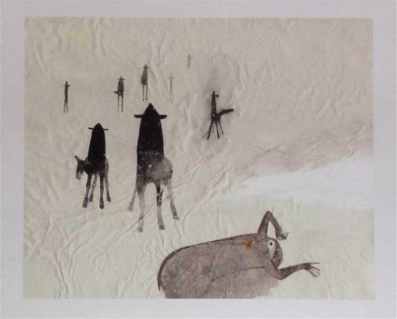
I don't know guys, read the following passages and look at the corresponding pictures:


At the top of the bank the horse halted and turned about neighing fiercely. There were Nine Riders at the water's edge below, and Frodo's spirit quailed before the threat of their uplifted faces. He knew of nothing that would prevent them from crossing as easily as he had done; and he felt that it was useless to try to escape over the long uncertain path from the Ford to the edge of Rivendell, if once the Riders crossed. In any case he felt that he was commanded urgently to halt. Hatred again stirred in him, but he had no longer the strength to refuse.

P1100884.jpg


I think this picture just exudes fear and despair.


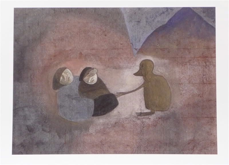
Gollum looked at them. A strange expression passed over his lean hungry face. The gleam faded from his eyes, and they went dim and grey, old and tired. A spasm of pain seemed to twist him, and he turned away, peering back up towards the pass, shaking his head, as if engaged in some interior debate. Then he came back, and slowly putting out a trembling hand, very cautiously he touched Frodo's knee -- but almost the touch was a caress. For a fleeting moment, could one of the sleepers have seen him, they would have thought that they beheld an old weary hobbit, shrunken by the years that had carried him far beyond his time, beyond friends and kin, and the fields and streams of youth, an old starved pitiable thing.

P1100896.jpg


I think the picture is every bit as heartbreaking as the passage, and does it justice brilliantly.


The pictures are very minimalistic, but not short on feeling. Again, the exact opposite of Nasmith. The reason this minimalistic approach appeals to me is that I can enjoy the feel of the scene without compromising my own mental visualization of it. Nasmith is so explicit that you must accept his interpretation. The same could be said of other Tolkien artists, and sometimes I enjoy that, but Blok has really done something special in my opinion.


I think Blok puts it best himself in the calendar's introduction:
"My pictures try to re-tell parts of the written narrative by means of pictorial signs. They are not projections of whatever images Tolkien's texts conjured up before my minds eye. They are pictographs, not photographs. Figures, objects and elements of their surroundings have been reduced to more or less standardized signs, eliminating all information non necessary to understand the action - reduced to simplified shapes, clearly outlined, in flat colors against an equally flat background. This 'pictorial alphabet' serves to depict events and actions and to convey the emotions of the people involved in them. In The Lord of the Rings these emotions are usually of an elementary kind - courage, fear, anger, greed, hatred, pleasure, doubt - as benefits an heroic story, and they are represented by attitudes, gestures, and slight variations in facial expression. Clothing becomes simplified to the extent of acquiring a 'timeless' quality. Individual 'actors' are identified mainly by their attributes: Boromir carries a horn, Legolas a bow and quiver, Gimli an axe, and so on."


:lecture


While I can see why his style might not appeal to everyone, I think it serves the source material very very well.
 
All that typing and that's all you have to say?! :gah: :lol


You really don't think this picture:

P1100896.jpg


accurately coveys the emotion of this passage:

Gollum looked at them. A strange expression passed over his lean hungry face. The gleam faded from his eyes, and they went dim and grey, old and tired. A spasm of pain seemed to twist him, and he turned away, peering back up towards the pass, shaking his head, as if engaged in some interior debate. Then he came back, and slowly putting out a trembling hand, very cautiously he touched Frodo's knee -- but almost the touch was a caress. For a fleeting moment, could one of the sleepers have seen him, they would have thought that they beheld an old weary hobbit, shrunken by the years that had carried him far beyond his time, beyond friends and kin, and the fields and streams of youth, an old starved pitiable thing.


:huh
 
That passage of Gollum having second thoughts on the stairs of Cirith Ungol is such a beautiful moment of the book, and i'm utterly at a loss as to why PJ felt the need to leave it out of the films. It gives you a slight bit of sympathy for Gollum before he does what he does.
There's a few great, iconic moments from the book where i think PJ messed up by not including them - like Gandalf facing the Morgul Lord at the gates of Minas Tirith. It's not a long scene, so why not just copy it completely from the page? No staff breaking, no defeated Gandalf. People ask why the ML didn't just finish Gandalf off in the film, but in the book they're equals, and the ML knows this and that's why it's an easy choice for him to go back when Rohan arrives. The first enemy to pass the gates of Minas Tirith for years should have been the ML, not a bunch of trolls.
Anyway, rant over, strayed *slightly* off topic, but yes i agree it's a good moment from the book and i think the artist has captured the loneliness and desperation, but i still think his Gollum looks too much like a duck :)
 
That passage of Gollum having second thoughts on the stairs of Cirith Ungol is such a beautiful moment of the book, and i'm utterly at a loss as to why PJ felt the need to leave it out of the films. It gives you a slight bit of sympathy for Gollum before he does what he does.
There's a few great, iconic moments from the book where i think PJ messed up by not including them - like Gandalf facing the Morgul Lord at the gates of Minas Tirith. It's not a long scene, so why not just copy it completely from the page? No staff breaking, no defeated Gandalf. People ask why the ML didn't just finish Gandalf off in the film, but in the book they're equals, and the ML knows this and that's why it's an easy choice for him to go back when Rohan arrives. The first enemy to pass the gates of Minas Tirith for years should have been the ML, not a bunch of trolls.

:goodpost: Those things bugged me about the movies as well.


LOL!

Why is that duck approaching those two Middle Eastern Women?

In all seriousness, It just doesn't do anything for me. I am probably too brainwashed to look at LOTR in a different way now though.


I wouldn't use the term "brainwashed" but I think you have summed it up well.

It looks different that than what we've seen on screen, and it looks different than what we have in our head. So it must be crap right?

Well I think that's missing the point. As I have quoted Blok as saying, they are not meant to be accurate in detail. They are not even what the artist has in his mind. They are meant to capture the essence of the text. The emotion.

I agree that Gollum looks like a duck. I mentioned it in the first post. But it doesn't ruin the picture for me.


Anyway, glad some of you liked it.

I'll bump this thread again next year when the next calendar comes out. :peace
 
I dont think its crap but I don't think its anything I care about either. Its just not LOTR to me.
 
It is this sort of minimalism that reminds me of all the wonderful art in the foreign language editions of the Hobbit. I can't help but see some resemblance to the Lewis Chessmen which I suppose is Saxon imagery? I'm certainly no expert but it does remind me of early northern European/Scandinavian art. Clearly this fits with Tolkien's world not the world created by PJ which I don't care for. People mentioned missed opportunities in the PJ films. Not to derail but compare the dramatic tension in the Rankin Bass version of the Pelennor Fields to PJ's. Eowyn's defeat of the Nazgul just plain sucks in PJ's version. Anyway, off topic. Thanks for sharing these here because I likely would not have seen them otherwise.

PS: Why the duck though?
 
I'd honestly love to know what Woodsy thinks, being the art expert that he is :lecture


I don't think that basing the merit of a sculpt/painting solely on it's overall quality [over the sentimentalism of who made it] makes me, or anyone else an art expert. That is something most art enthusiasts figure out in a relatively short period of time, including most forum members here. I have however, been collecting various forms/mediums of art for 30 years now and I think it's pretty safe to say if I don't have a fairly solid base of art knowledge by now...I never will.

I'm not going to pretend to know anything about Cor Blok...because I don't. This is actually the first time I've ever seen his work. My first impression is that there is definitely an abstract element to his art, evident by a lack of detail or accuracy to the subject material. And I would agree with others that he has taken a minimalist approach with the vast majority of these paintings. Minimalism simply being a style where simple and/or few elements are used to create maximum effect.

In this respect, as has also been mentioned by others, he differs greatly from well-known LOTR artists such as Nasmith, Howe and Lee. These three are wonderful artists in their own right, but I would agree that their work is for the most part very explicit/detailed making it very difficult for the viewer to interpret it other than how they intended it to be interpreted. Blok by contrast, refuses to "force-feed us" in that manner. He wants the viewer to draw their own conclusions and the minimalism of his paintings is the perfect way to acheive that goal. He allows for our imaginations to run wild, and the emotions/interpretations we can draw from his paintings are limited only by our imagination.

"The Ford of Bruinen" is a prefect example of this. I look at that painting and the overwhelming emotion I draw from it is fear. Is it a scary picture?...no, not particularly. But I look at that picture and I imagine how terrified Frodo must feel looking back and seeing those ringwraiths standing motionless, watching him. And as if that imagery isn't bad enough for Frodo, how much more is that fear amplified by the knowledge one of the ringwraiths is missing. He's not in the painting....Is he flanking Frodo? Is he approaching from behind? We don't know, but what's apparent is that Blok is letting us decide where that ringwraith is...and what he's up to. One thing is sure, by excluding the ninth ringwraith Blok has managed to add a second, and perhaps even more paralyzing level of fear to his painting....the fear of the unknown.

P1100884.jpg


Now let me conclude by saying I have never aquired a taste for abstract or minimalistic art and Blok's LOTR paintings combine elements of both, so these really aren't "my cup of tea", but I can certainly understand and appreciate his style of art and what he is trying to accomplish. But I am with everyone else in respect to Blok's interpretation of Gollum. I cannot for the life of me figure out what symbolism is behind Gollum looking like a duck. Maybe Gollum reminds him of the ducks roaming around his family farm when he was a boy, ducks that occasionally ended up on the dinner table...:dunno
 
'Art for arts sake' is often touted when something doesn't quite fit with the majority, meaning art does not need to subscribe to set rules which I suppose makes us all critics.
It has certainly provoked a response so maybe it has done it's job, though I'm of the belief that the less a piece has on canvas, the more it has to have words to carry it off, and we 'critics' love to talk a piece up or down!

Seriously....It's a duck, and a lame one at that. But that's just one critics opinion :lol
 
I'm pretty sure there's some sort of duck-like comparison in the book when Tolkien describes Gollum. It's probably something small like describing his web-like hands and feet, but maybe that's where he's drawn the idea from.
However i know that i for one would feel something more for that picture if it didn't look like a duck touching up a middle-eastern woman. ;)
 
Back
Top