You are using an out of date browser. It may not display this or other websites correctly.
You should upgrade or use an alternative browser.
You should upgrade or use an alternative browser.
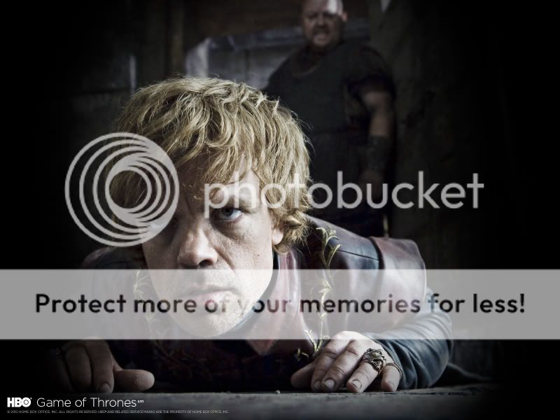
ThreeZero Game of Thrones!
- Thread starter Darklord Dave
- Start date

Help Support Collector Freaks Forum:
This site may earn a commission from merchant affiliate
links, including eBay, Amazon, and others.
Its a steal IMO.
Tyrion is looking great!
Tyrion is looking great!
Ce Ilhuicamina
Super Freak
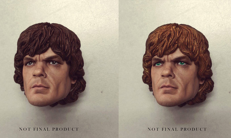
Awesome prototype! The fact that this is not the final product makes me excited. 
agen_kolar
Super Freak
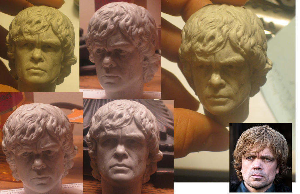
Being that it says it's not the final product, I hope they do some improvements. It's not bad, but this one is better.

- Joined
- Sep 16, 2011
- Messages
- 655
- Reaction score
- 34
This is looking good so far. The brow and eyes need a little work, but I'm on board.

$14.99
DC Comics, 12-Inch Superman Action Figure, Collectible Kids Toys for Boys and Girls
Bopster USA Inc
Yodasodabo
Super Freak
Darklord Dave
Super Freak
- Joined
- Sep 3, 2005
- Messages
- 19,026
- Reaction score
- 81
The Walking Dead pets don't include a portrait likeness (or arms) - and their costumes are incredibly simplistic especially compared to GoT costumes. So I wouldn't count on the $130 price point for GoT.
TurdFerguson
Super Freak
Must have.......
chilipep66
Super Freak
a good start, tons of work to be done. hair color obviously, but also just a little bit of an overall softening of Dinklage's features give this a cartoony look
Lejuan
Super Freak
I'm not impressed with this at all, at least not from this angle. I'd like to see more pics 'cause just about every detail but the nose looks slightly off to me. The chin is too deep, the jowls too full and the brow too heavy and the eyelids the wrong shape. The whole face looks stretched. The sculpt agen_kolar posted looks better imo, though not from every angle.
danielfoez
Freakzoid
I'm not impressed with this at all, at least not from this angle. I'd like to see more pics 'cause just about every detail but the nose looks slightly off to me. The chin is too deep, the jowls too full and the brow too heavy and the eyelids the wrong shape. The whole face looks stretched. The sculpt agen_kolar posted looks better imo, though not from every angle.
I think the main problem can be fixed with a more accurate paint up, but the sculpt is good, IMO!
Lejuan
Super Freak
I think the main problem can be fixed with a more accurate paint up, but the sculpt is good, IMO!
Shows how much I know, that looks heaps better. Still needs to lose some length off the chin though I think.
SurlyJ
Super Freak
I agree. Sculpt is damn good. Eyes, grow, nose, mouth, chin, cheeks, all great.
I'm not impressed with this at all, at least not from this angle. I'd like to see more pics 'cause just about every detail but the nose looks slightly off to me. The chin is too deep, the jowls too full and the brow too heavy and the eyelids the wrong shape. The whole face looks stretched. The sculpt agen_kolar posted looks better imo, though not from every angle.
You sure?..
 .. It's not perfect (eg. hair color probably too dark) but I'm seeing his awesomeness, Peter Dinklage all over that head sculpt.
Sold! I think the sculpt looks pretty terrific so far!
(But yeah, he does need a more accurate paint job.)
(But yeah, he does need a more accurate paint job.)
dominishin
Super Freak
Why do toy companies do the extremely furrowed look for everything!
Tyrion should have much more relaxed eyebrows.
Tyrion should have much more relaxed eyebrows.
I'm not impressed with this at all, at least not from this angle. I'd like to see more pics 'cause just about every detail but the nose looks slightly off to me. The chin is too deep, the jowls too full and the brow too heavy and the eyelids the wrong shape. The whole face looks stretched. The sculpt agen_kolar posted looks better imo, though not from every angle.
You're a complete buzzkill LJ :nana
Similar threads
- Replies
- 0
- Views
- 297
- Replies
- 3
- Views
- 1K
- Replies
- 8
- Views
- 1K
- Replies
- 0
- Views
- 599
- Replies
- 4
- Views
- 1K


