Some fun pictures
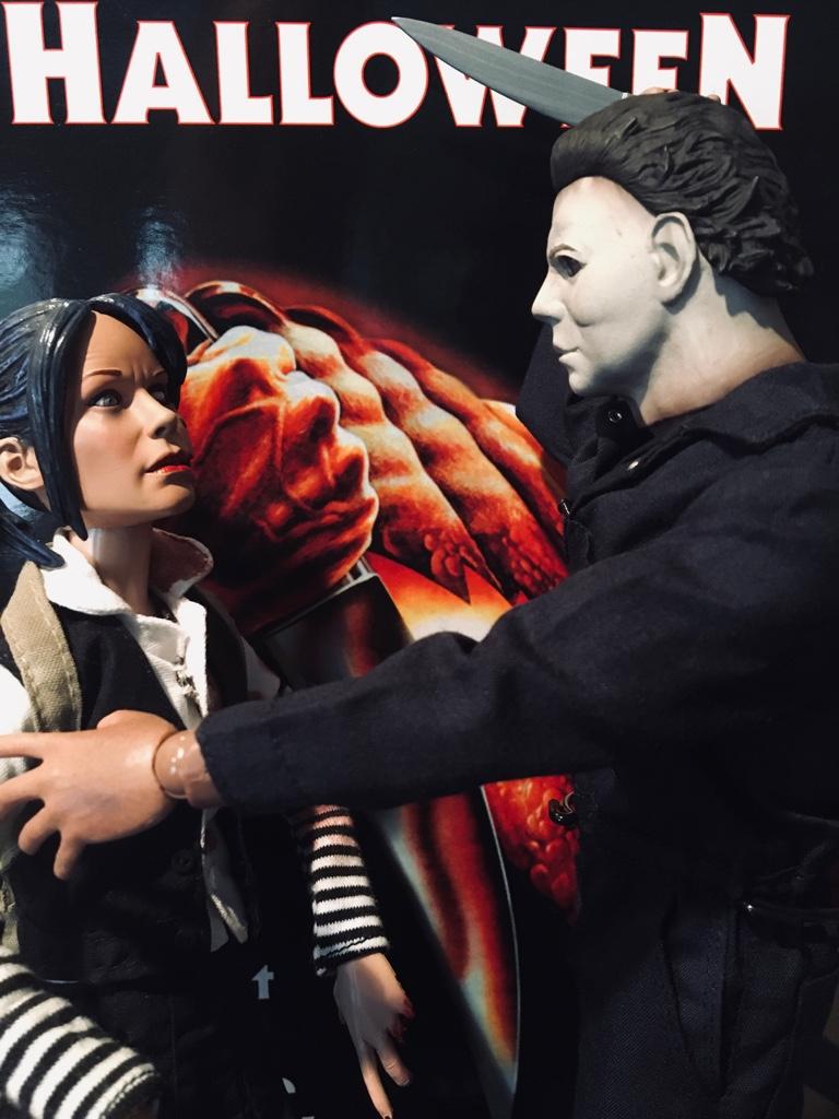
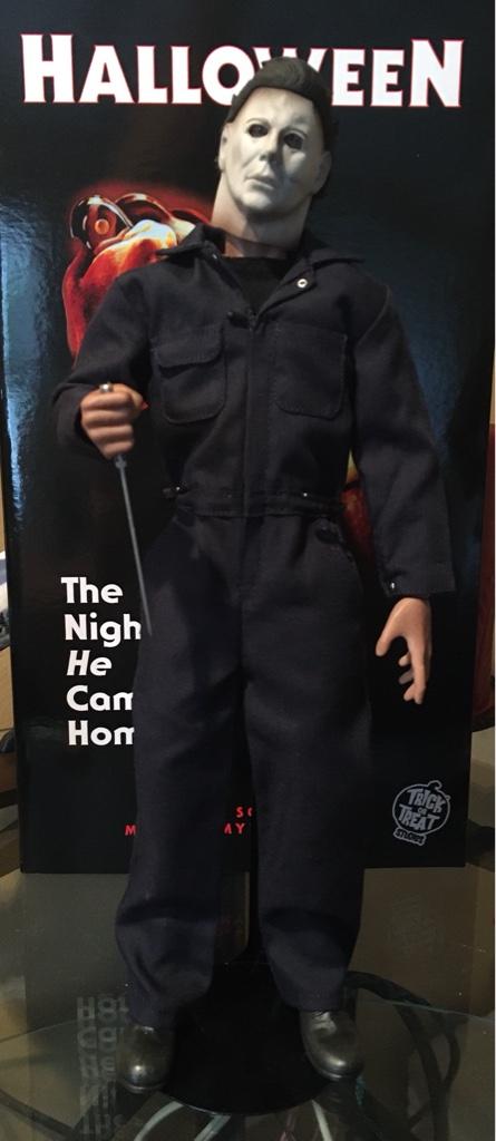
Sent from my iPhone using Tapatalk
Awesome pics!

Some fun pictures


Sent from my iPhone using Tapatalk
Lets be real here. There's a reason they shot the mask like they did in the movie as these behind the scenes pictures show.
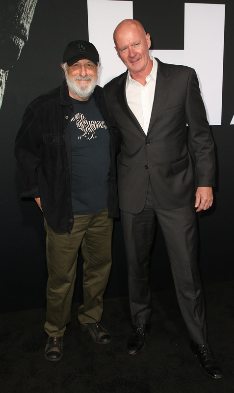

Personally , I think it?s more an example of Bad lighting in the shots where you see the eyes well.
Normal lighting gives this figure and the mask the soulless eyes look. It?s only when the lighting is directly in the face that it seems off.
Much the way some people hold a figure under direct light and use an iPhone held super close to show how a figure looks......
Sent from my iPhone using Tapatalk
As for the light on the original 1978 mask, I get the point, but it seems to me there's a flash on the second picture you used. At least there's direct light on the mask. And in any of those pictures, the mask itself doesn't look like the TOTS HS at all.
With the TOTS HS, even without direct light on the figure, it just doesn't look good in natural light, whether the light comes from the sides, above...
What I appreciate with some custom HS, is that whatever the light, they look like what you see on screen. If you use a proper cinematic lighting setup, they look even better.
Nice shots Xipotec and perfect behind-the-scenes examples of what I was saying Popcorn. If we took Nick Castle in broad daylight and scrutinized him standing still in a static pose, its just an entirely different perspective. All of these figures are quite impressive with mood lighting. And I have to add a great bargain for a licensed product at this quality. TOTS made a smart move bringing them home at this price point.
It's really crazy to think about how cool the mask looks in the movie when you see photos like that and realize how crucial lighting and angles are to making the mask everything we've come to love.
Hold on. Didn't you just say a couple pages back you were shocked how bad the Mad bug sculpt looked in natural light?