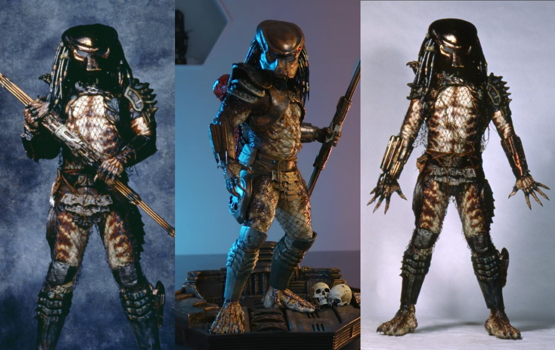
Furyan
Super Freak
Finally. Welp I'm in for this guy too. No way I can just get the JH and not get this companion piece. Will be great to have this franchise finally checked off my most wanted statues checklist.


I'm sure when they update with now photos and videos is gonna look much better.

. . . Am I really alone in thinking this thing just doesn't look right? . . .


 I think you're right also, he is a little stocky in general. More so than the JH imo which looks okay to me.
Somehow I buy the chunkiness on the JH, but for whatever reason, it doesn't work for me here. Could also be because we're used to seeing the CH in more relaxed, fully-upright poses from all the promotional photos.They've made him too chunky overall - like he's been overinflated. Same problem they had with the Jungle Hunter.
Good idea. I'd have also liked for them to straighten the legs a bit. This 1/3 would've been a great opportunity to recreate the distinctive knock-kneed stance he has in the promo shots. That would've really fired the "holy crap, it's Predator 2" neurons.I really think that they could improve this existing pose immensely by simply twisting his entire position on the base clockwise slightly so that he's pointing more forward, and then twisting the head so that it's looking more straight. This would unclutter that area and show off the lines of that wonderful armour more."


Pre order starts tomorrow.. what's everyone's price predictions? I reckon standard $2300 and DX at $2700
"Lieutenant! Praying for reasonable prices from an unreasonable company is my specialty.""How many times do I have to tell you? You don't know what you're dealing with".
.
"Lieutenant! Praying for reasonable prices from an unreasonable company is my specialty."
I'm guessing slightly less than the Jungle Hunter.......I have a feeling this will be the exact same price as Jungle Hunter.
But they're throwing in trophy skulls to pad the accessory count.I'm guessing slightly less than the Jungle Hunter.......
It should be slightly less, but i have a feeling it won’t be lol.I'm guessing slightly less than the Jungle Hunter.......