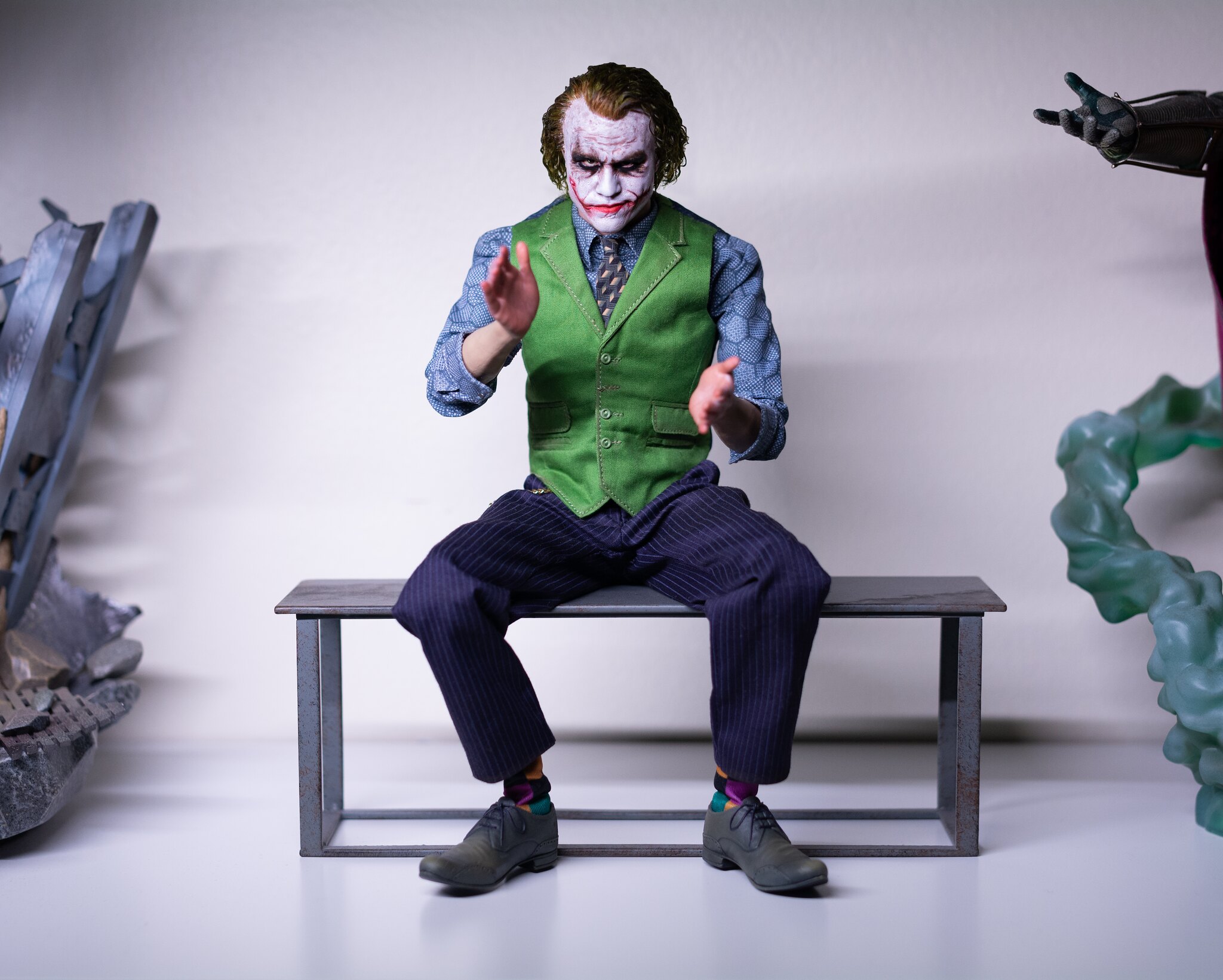
Doesn't need to be trimmed at all. Just slick it back and tilt his chin down. Lean his body forward a bit as well. Don't be afraid to use a lot of water. You want to make sure that the ends of the hair, the part that is close to his shoulders, is pulled back and pressed closer to the sculpt. Having it be forward and outwards away from the sculpt is what makes a lot of these photos of the sculpt look bigger than it is. That's what I did with mine and he's been displayed like this since on my shelf.
Don't think they really dropped the ball at all. It's a great looking alternative set. Just requires some finesse and futzing which comes with the territory of rooted hair. Be mindful of how you have his shoulder and arms posed as well. There's a reason I have his elbows pointed outwards and his shoulders pressed up and out. Gives his chest and overall upper portion of his body a wider look to counter any bigness his head might display.
That's my photo and agreed! This isn't even anything specifically tied to INART either.
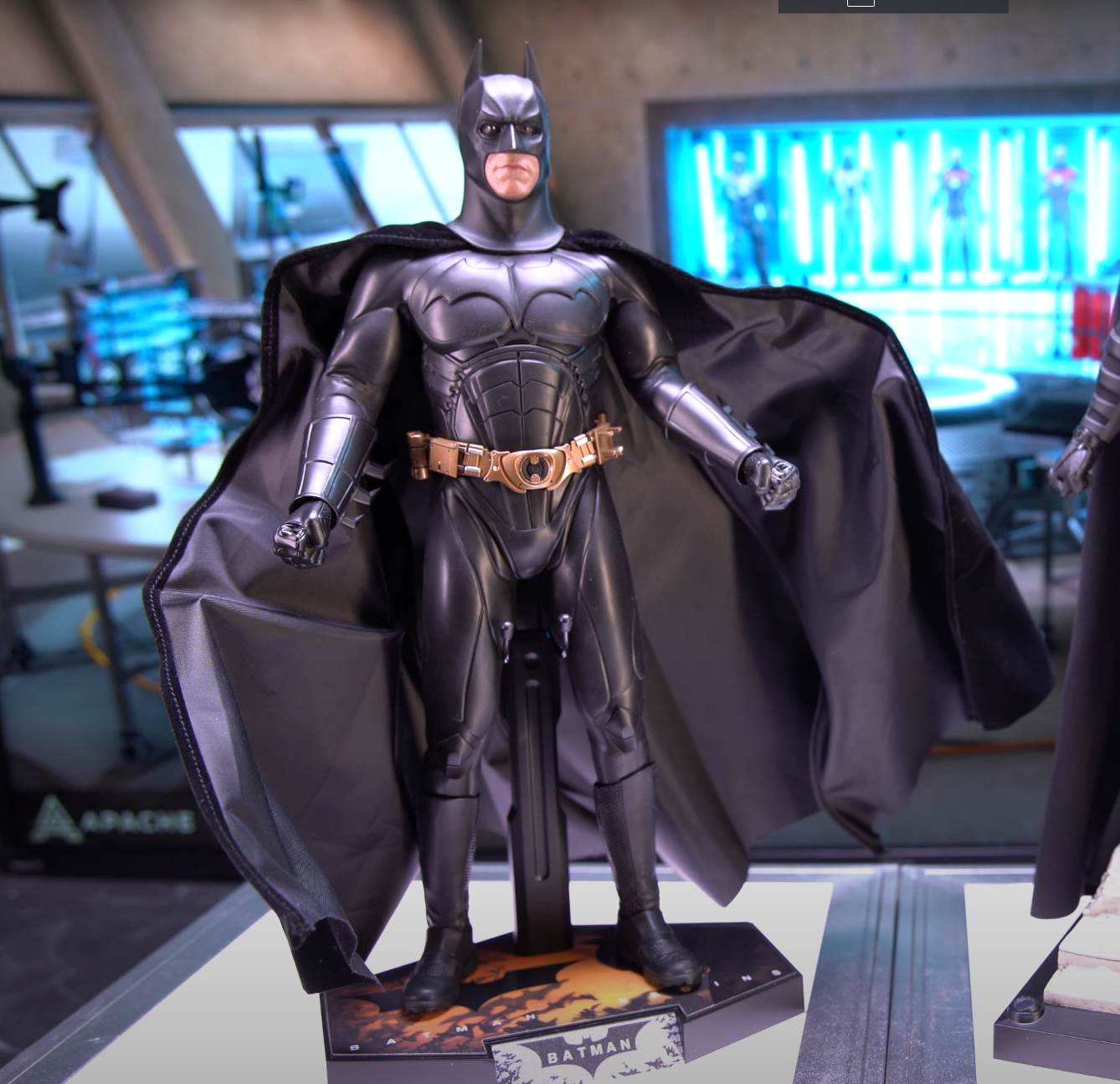
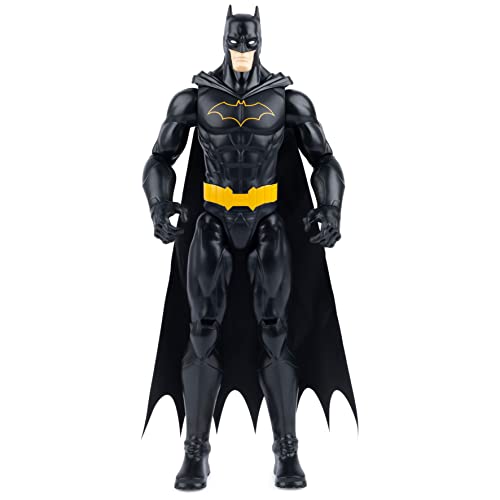
People have been poorly posing, futzing and displaying their figures for almost 20 years now. You have people popping their figures straight out of the box and just displaying them like this:
Not saying you need to be a professional or anything in these things but damn, put some tender love and care to the figure when putting it on display. We spend too much money on these figures for them to looking so awkward. Look at references, try to copy some poses and make them look more natural.


