Asmus Toys : Aragorn thread

Collector Freaks Forum

Help Support Collector Freaks Forum:

This site may earn a commission from merchant affiliate links, including eBay, Amazon, and others.
Thank you,

We are here to do this with a good intention,
its quite alright to reject it. It will be the only way for us to know if the product is going on the right track.

Actually I am sure it is us who also have to thank you. From the first day on I was astonished about the fact how you listened to your (potential) customers. From my perspective it would be unfair to just say "that's bad", you should also read in the same amount the things that you do right. I will always easily say the thigns that I enjoy about this line, and the same way I was now writing that the Aragorn sculpt needs quite some work.

Keep your work up and I am sure that also Aragorn will turn out quite good!

EDIT: The different angles make it already look a bit better. I mean in my eyes some parts are clearly showing Aragorn, but yet I can not put my fingers on the parts that are just making the sculpt look of. Or at least I don't know how to describe it.
 
View attachment 126805

Here is another 2 angles. Please let us know more!

I hate to say the likeness is still not there. I can't quite put my finger on it but there's something about the eyes that still looks off. The smirk-like expression of his mouth is also holding back the likeness and feels a bit too out of character.

Finally the nose is still WAY too small. Just compare the figure to the two pictures below - the nose should be sculpted a lot wider.

attachment.php

attachment.php

Your right. the nose is way to small. I think if they can lower the forehead a bit, along with the bigger nose and fixed eyes the sculpt will be very close.

On the bright side, I thought they actually did a really good job with the beard
 
I really like everything below the eyes. Yes, the forehead is still too tall, but for me the biggest issue is that either the eyes are too close together or the head is too wide in the middle making it look like the eyes are too close together.

But I have to say, Asmus ... THANK YOU SO MUCH FOR LISTENING! You rock. Hard. :rock
 
I just quick made a little something with paint, and actually the position of mouth, nose, eyes and hairline (includes size of forehead) are in a matter of height in the right position.

Beeing pointed out by wesker, the nose size really is making a big difference, it is letting the whole head look different I believe.

I also first thought the head was too wide, but the quick framing in paint make it looks like beeing more or less accurate. Also here the nose size might matter.

22222.jpg
 
I just quick made a little something with paint, and actually the position of mouth, nose, eyes and hairline (includes size of forehead) are in a matter of height in the right position.

Beeing pointed out by wesker, the nose size really is making a big difference, it is letting the whole head look different I believe.

I also first thought the head was too wide, but the quick framing in paint make it looks like beeing more or less accurate. Also here the nose size might matter.

View attachment 126807

Wow. great job. Thats crazy to see how the forehead really isn't off by much. Your totally right that the nose is too small. the eyes need a little bit of work to me too. wow though, totally thought It was the forehead not the nose. Hopefully asmus picked up on it too.
 
I also think ... and this may sound kind of crazy, but cut me a break, it's almost 4:30 in the morning and I'm a little sleepy :lol ... that one of the things throwing off the likeness is that the irises of his eyes are painted too big. Viggo has slightly beady eyes. It's a microscopic detail, and has nothing to do with the sculpt, but I think it makes a difference.
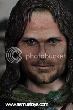
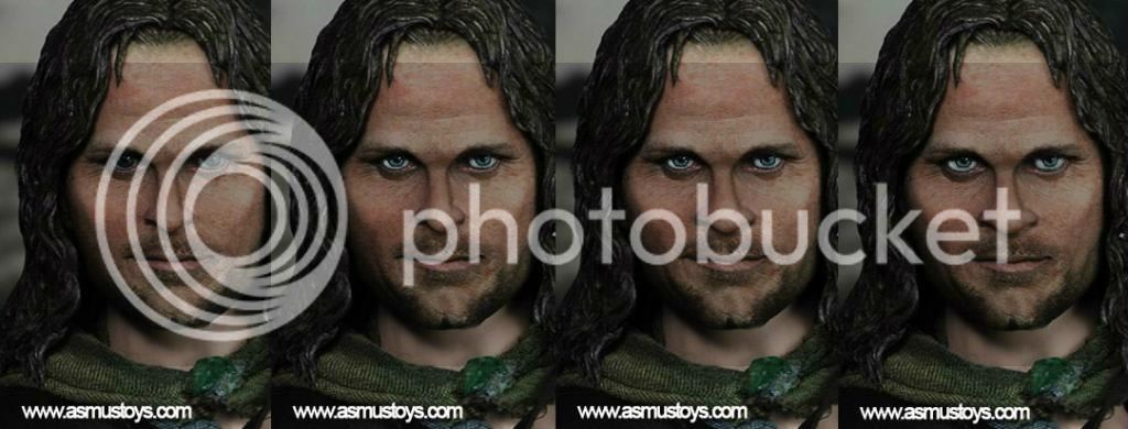
All right, I'm going to bed now!
 
Honestly I think the sculpt needs to be redone from scratch.
There is just too much work to be done on this one to make it actually looks like Viggo.

ATM it looks like he has some kind of deformation disease or he had bad surgery.
 
I think the eyes are too close together for one. The nose is too small. The bridge of the nose needs to be thicker and the area where the nostrils are needs to be wider. Make the nose longer as well to make the area above the upper lip smaller. I think the whole face may be too wide but it seems like in the molding process the faces have narrowed some so that may take care of itself. Face is a little soft as well. Needs to be a little more gaunt.
 
Last edited:
View attachment 126805

Here is another 2 angles. Please let us know more!

I really like the amount of feedback gathering that ASMUS is prepared to do and their communication of wip pieces is fantastic. Unfortunately this sculpt is really far off and getting further away. Trying to fix a dud sculpt is taking a lot of time, a total restart would be quicker and probably get a better outcome for them.
 
Just saw this on facebook.

Still doesn't looks that good :-(

There is def improvment but not enough.

Eowyn is so spot on.

10420017_10152182918876968_889640372591809598_n_zpsede0cba1.jpg

The cheekbones are too thick and far from the eyes. ..I think that's giving him that smashed face look....
 
Main problems for me in order of importance (and reverse order of modifications needs of the actual sculpt):
1) Irides size and color (pic 2)
2) nostrils size (pic 3)
3) overall eyes size (pic 4)
Aracombo_zpscd0d8239.jpg


Come on Asmus, you must nail this one for the sake of the all line!
 
I wonder how many different sculptors they have working for them? IMO as of now they nailed Eowyn. Guritz looks pretty spot on as well. Gandalf was almost perfect in prototype stage but lost a little in production it seems. Gothmog could have been better IMO. Aragorn right now is pretty far off. From what has been shown whoever did Eowyn should do Aragorn. If they are the same person then I'm clueless.
 
Believe it or not the original sculpt was better than this sculpt at the jaw line chin area. Even the cheek bones I think were better. This sculpt the hair and forehead is much better. Both sculpts suffered in the eye and nose area.
 
Last edited:
Instead of trying to fix this sculpt, I honestly think the best thing to do is to get a different sculptor to start it from scratch.
I personally think this last one, looks to have been modified way too many times and it shows.
Just my 2 cents...
 
Back
Top