You are using an out of date browser. It may not display this or other websites correctly.
You should upgrade or use an alternative browser.
You should upgrade or use an alternative browser.
BATFLECK
- Thread starter ptassler
- Start date

Help Support Collector Freaks Forum:
This site may earn a commission from merchant affiliate
links, including eBay, Amazon, and others.
DeadbeatPad
Freakalicious
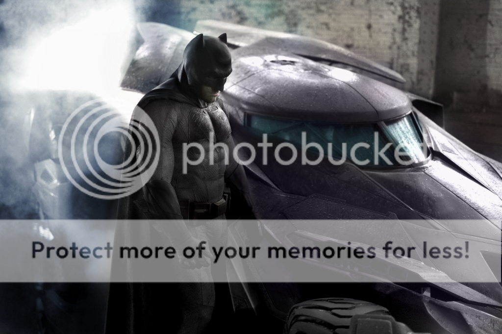
Every time I look at this, I have a different opinion. Sometimes I think "meeeeh", others I'm more "ooo, broody."
Things I'm not sure about:
1) I'm sorry to say it, but... the ears. I know, I know, I'm one of the *them*. Sorry. Just concerned it might look a bit Adam Westy, but we'll see.
2) The 'muscles'. I feel like that overt bulking around the stomach area kind of has the counterintuitive effect of making him look a little bit portly around the middle, but that may just be me.
3) I'm also not 100% that I like the big emblem, but I appreciate that they probably felt they needed to go with a look that hadn't been on film yet.
Of course, the photo is black and white, so we also don't know for sure what the colours are going to be like. I saw this edit on Facebook (seemingly by a guy on the Toy HQ page called Alan Milne) and - despite my prior feelings that film suits would always be best in black, or very, very dark grey (a la Lego Movie), seeing this suit with a more classic comic book colour palette does help things pop in my opinion. Especially the belt. There was another edit which kept things a bit greyer and didn't add the gold, but I think this one works best:

amos brearly
Super Freak
i like the look of batman. cowl is very 'jim lee-hush' stylized and the bat symbol very miller both of which im cool with.
the car remains to be seen, after the millitary vehicle he drove for nolan i was hoping for a real batmobile this time. jury is out on that one.
the car remains to be seen, after the millitary vehicle he drove for nolan i was hoping for a real batmobile this time. jury is out on that one.
DeadbeatPad
Freakalicious
Oh, also - does it look like we're back to a cowl with an unmoveable head? If so, I'm not so sure I like that idea.
banthafett
Super Freak
I rather have an unmovable head, than a tactical bobble head batman.
Sachiel
Super Freak
- Joined
- Dec 19, 2005
- Messages
- 11,682
- Reaction score
- 864
i was hoping for a real batmobile this time.
That's funny considering how many times the Batmobile has been redesigned over the past 75 years.

$39.01
$47.89
Marvel Legends Series Deadpool, Deadpool & Wolverine Collectible 6 Inch Action Figure for Adults Ages 14 and Up
Bakchoi Enterprises
toylion
Super Freak
toylion
Super Freak
Jackhepburn
Super Freak
toylion
Super Freak
Centurion
Super Freak
I'm more interested in what that Batmobile looks like.
RJMacReady16
Super Freak
I lean toward the Neal Adams symbol and horns....
But I'll be damned. This is possibly the coolest movie batsuit yet. And if I can say that knowing that Affleck's wearing it....it must be good.
Well played, Snyder. Well played...
But I'll be damned. This is possibly the coolest movie batsuit yet. And if I can say that knowing that Affleck's wearing it....it must be good.
Well played, Snyder. Well played...
Kamandi
Super Freak
A fiber Batsuit at long last and people are looking at the ears? We're getting an interpretation based on the the classic suit instead of rubber or hard panels.
I think some people have gotten too used to stuff like Simon Bisley:

I think some people have gotten too used to stuff like Simon Bisley:

batfan08
Super Freak
I really don't know where the "long ears" people come from. Even TAS Batman's ears weren't that long.
ExMem-LarjaThwei
Super Freak
- Joined
- Jul 12, 2010
- Messages
- 10,762
- Reaction score
- 18
Still too short.A fiber Batsuit at long last and people are looking at the ears? We're getting an interpretation based on the the classic suit instead of rubber or hard panels.
I think some people have gotten too used to stuff like Simon Bisley:
https://i.imgur.com/UXHxfSn.jpg
I really don't know where the "long ears" people come from. Even TAS Batman's ears weren't that long.
Neither do I and realistically, they don't work for a stealthy and ninja-esque character like Batman. He'll whack his head on anything he tries to crouch under cause they add 6+ inches to the top of his head.
The short ones are the way to go.
ExMem-LarjaThwei
Super Freak
- Joined
- Jul 12, 2010
- Messages
- 10,762
- Reaction score
- 18
"realistically"
ChronoBreak
Super Freak
- Joined
- Apr 22, 2009
- Messages
- 389
- Reaction score
- 0
Similar threads
- Replies
- 6
- Views
- 1K
- Replies
- 5
- Views
- 1K
Latest posts
-
Worldbox X Onetoys OT019 Man Of War (God of War Kratos)
- Latest: Maximusplatimus
-
InArt: The Lord of the Rings - Frodo and Sam
- Latest: ObiGlennKenobi
-
-
-


