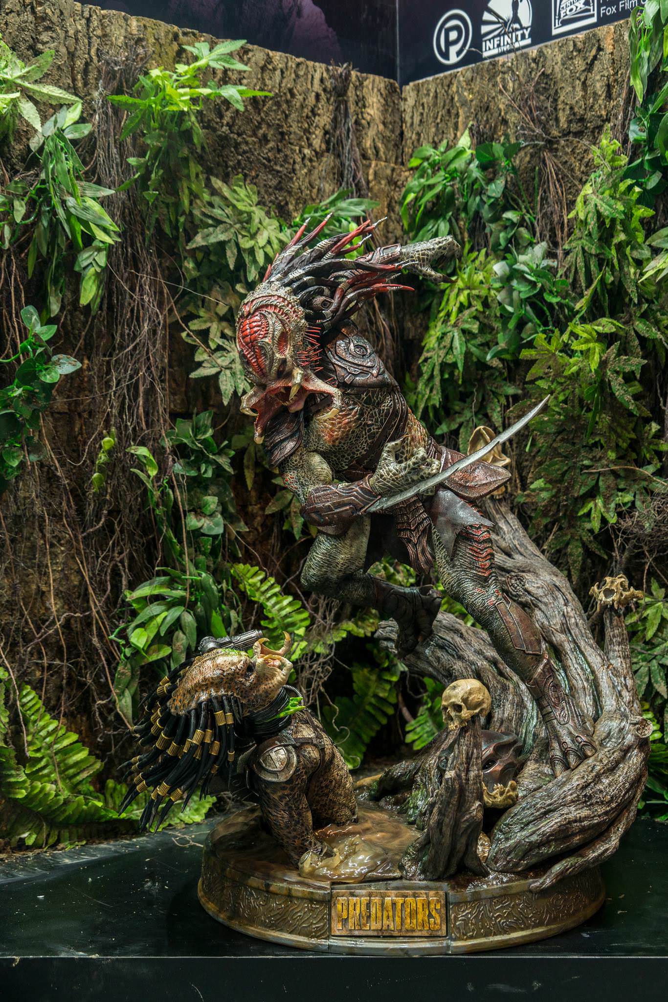
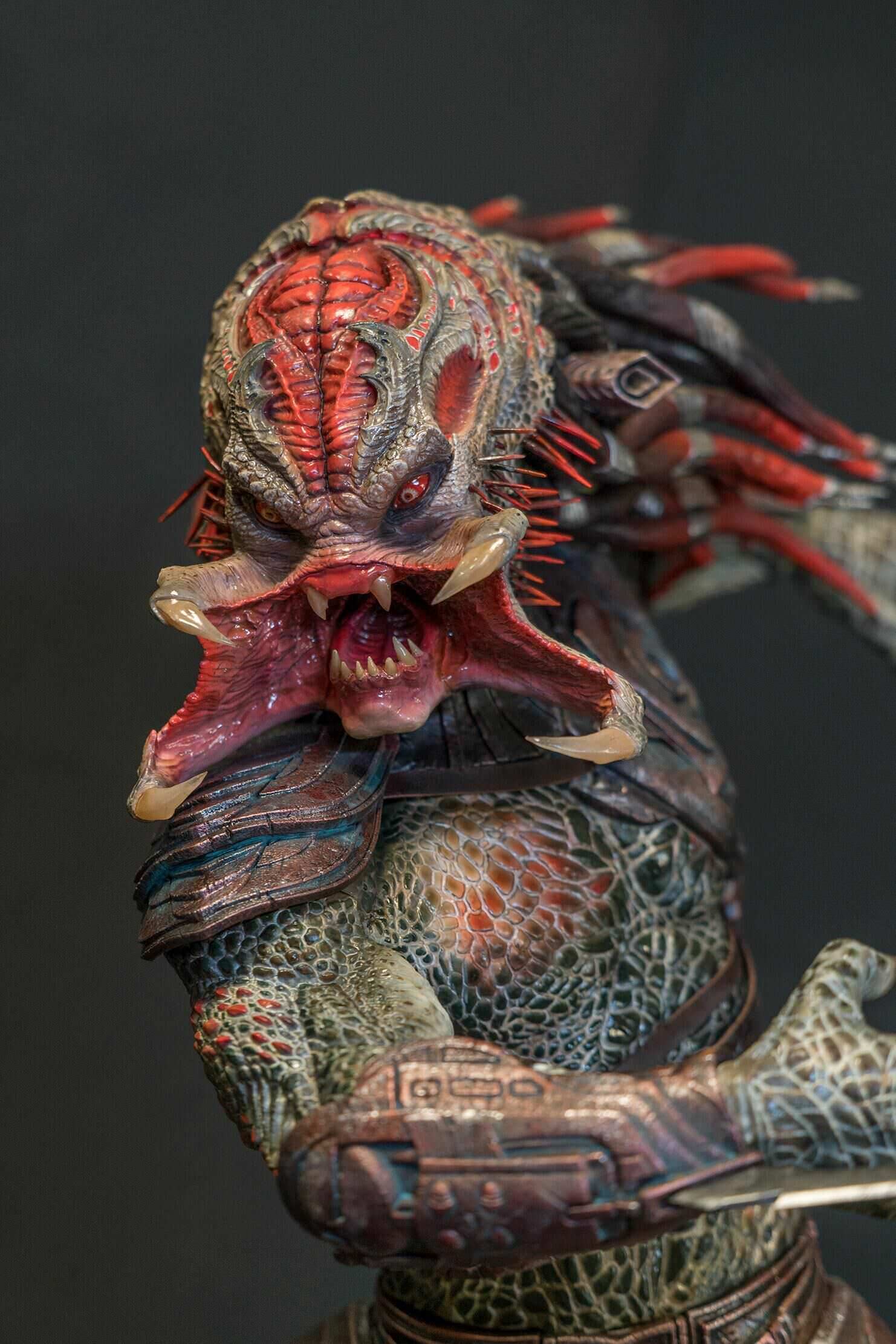
Berserker Predator - Infinity studio

Collector Freaks Forum

Help Support Collector Freaks Forum:

This site may earn a commission from merchant affiliate links, including eBay, Amazon, and others.

Python

Super Freak
Joined
Mar 30, 2009
Messages
8,812
Reaction score
492
Location
United Kingdom
This could be interesting. Hoping for a masked option however as he looks much better with it on..
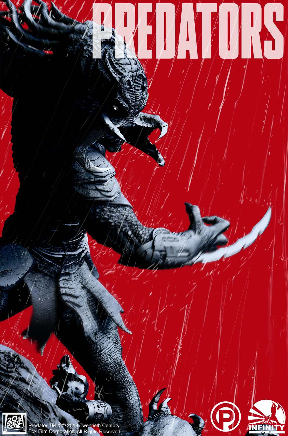

lXXp7Nr.jpg
 
Not sure yet as they didn't say. This looks to be more of a diorama, so presumably it won't be a huge scale, but who knows...
 
1/4 apparently! Not sure I'll actually buy this one, but it does look good. Some of the detail work is crazy! Still hoping for a masked COH, Beserker looks great with his mask on...


h15zTXZ.jpg


IFG3SjU.jpg
 
This has got leaning and falling over red flags all over it. It's really good statue of a bad predator design unfortunately...
 
This has got leaning and falling over red flags all over it. It's really good statue of a bad predator design unfortunately...
Agree. An option to display Berserker with his helmet on would be nice. Otherwise the original design really pulls the whole thing down.
 
It has got a very strong forward lean, that aspect is not only a leaning issue, but detriment to it's over all appearance imo. It looks a bit unnatural. If straightening him up a little is an option, they may want to consider it. It does look good otherwise, but yeah, his unmasked head has always been a poor design, this would look much better masked.
 
Not interested with or without mask.

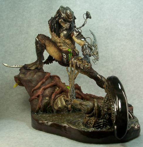
The ONLY Berserker I've bought was Narin's - THAT was perfect.

Agree with the rest of you:
  • The lean on this was a bad choice - dynamic but not done right. Same reason I don't like the "morris-dancing" Sadshow Wolf.
  • Unless it's 1:6 or 1:5 scale there's a real risk of FURTHER lean over time even with inner scaffolding rods.

These folks are incredibly talented, but it's tough to make something special from a bad Predator design.


.
 
I love the Berserker Predator. Sometimes he takes top place as my favorite design depending on what mood im in. But this again, as well as the older sideshow statue is something im not digging. The Sideshow one looked like he was about to face plant into the ground after tripping over a log. And this one looks like he is defying gravity, hes about to fall crotch first into Classics face. Fantastic detail and concept, but he doesnt always need to be in extreme anime poses. He was a slow methodical brute, he spent alot of time walking around.
 
Agreed on the garage kit comment, the classic predator ruins it imo, it doesn’t look right popping out of the base like that, they done a great job on berserker though, detail is brilliant
 
Do I take it that a couple of you guys don't like Garage Kits? - or just don't like shabby ones? :lol

Garage Kits got me into this hobby and form the largest part of my collection. For the most part, they are way better sculpts than the mass-produced stuff.

Although I'm not buying this, it's more impressive than a lot of other companies shabby Alien or Predator pre-paints :)


.
 
I love garage kits! :lol, I still make the odd one but some of them have bad art direction and design (as I’m sure you’re aware), the classic sticking out of the base screams bad garage kit! �:lol
 
Back
Top