You are using an out of date browser. It may not display this or other websites correctly.
You should upgrade or use an alternative browser.
You should upgrade or use an alternative browser.
Premium Format Christopher Reeve Superman the Movie Premium Format Figure
- Thread starter Darklord Dave
- Start date

Help Support Collector Freaks Forum:
This site may earn a commission from merchant affiliate
links, including eBay, Amazon, and others.
Irvy
Super Freak
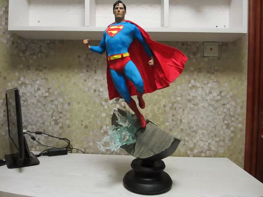
Dat pose [emoji38]
GeneralZodLives
Super Freak
I still like it.
Spidey976
Super Freak
He looks weird somehow
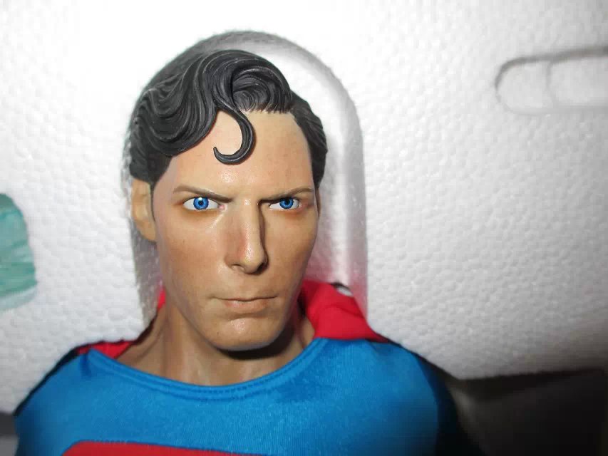
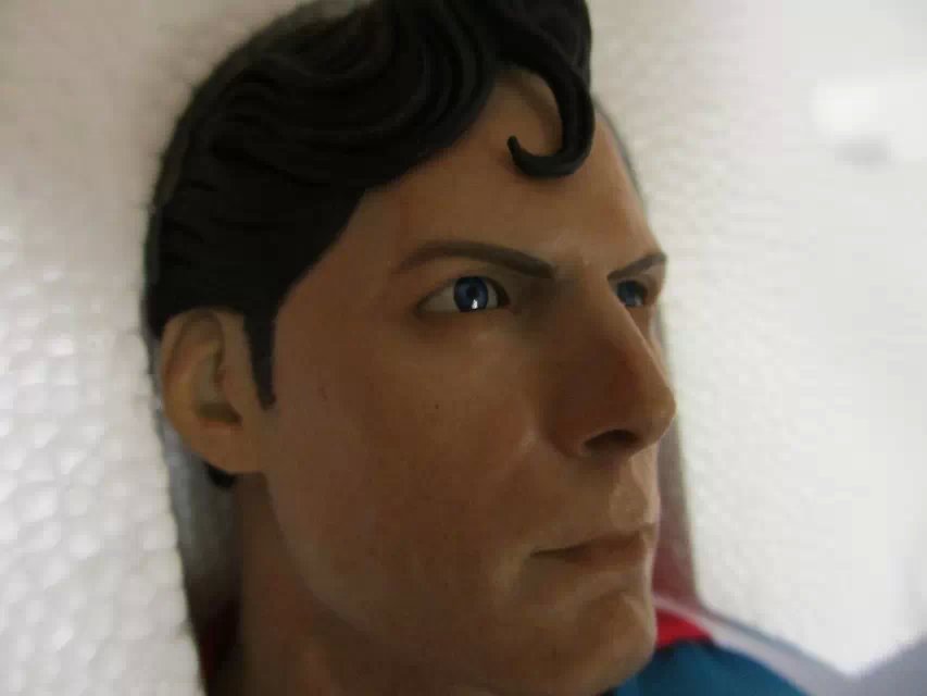
From the pics above the head looks way to big for the rest of the sculpt, and after looking at the more pictures link I can honestly say that the "S" shield looks like it was stitched in by a 5 year old. They actually messed up the iconic shape of the shield getting it in there. Every corner is blunted and the boarder is inconsistent.... and no it wasn't like that in the movies
From the link above
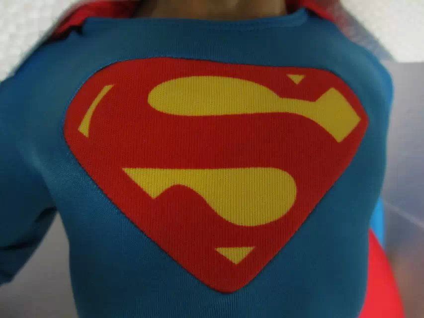
I defended this piece really hard before, but damn it let me down
Last edited:

$14.99
DC Comics, 12-Inch Superman Action Figure, Collectible Kids Toys for Boys and Girls
Bopster USA Inc
GeneralZodLives
Super Freak
I didn't even see the link to more pics. That "S" looks hideous--no excuse for that. I'll be pissed if mine shows up like that.
ascello
Super Freak
- Joined
- Nov 16, 2010
- Messages
- 466
- Reaction score
- 8
This would have been nice to pair with the Keaton Batman PF but I don't think it's in that league. The pose, the disproportionate head, the stitching around the shield, etc. make this look like a cheap action figure from Toys R Us...such a shame...
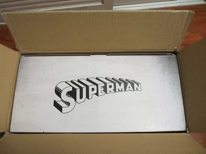
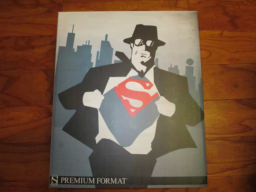
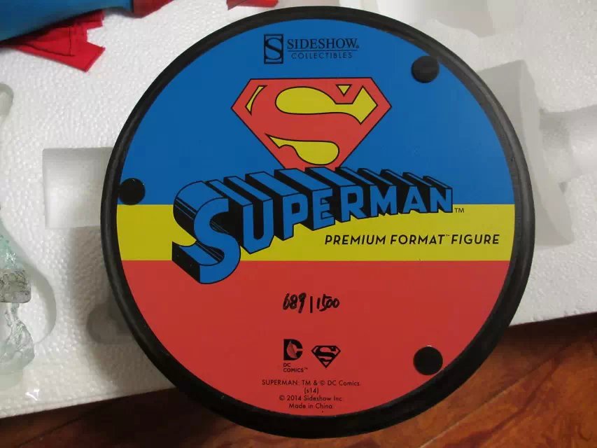
It's not a good sign when the most notable part of this PF is the artbox which everyone seems to like...
It's not a good sign when the most notable part of this PF is the artbox which everyone seems to like...
BurningRage
Super Freak
Grail
Grail
Yea, grail for how bad they can F up a classic. Didn't think it could get worse, but that S is beyond belief.
SammyG
Super Freak
From the pics above the head looks way to big for the rest of the sculpt, and after looking at the more pictures link I can honestly say that the "S" shield looks like it was stitched in by a 5 year old. They actually messed up the iconic shape of the shield getting it in there. Every corner is blunted and the boarder is inconsistent.... and no it wasn't like that in the movies
I defended this piece really hard before, but damn it let me down
What a shame. Really. How can you mess up the shield that defines this piece? As a few have said, I'm going to be on the phone right away if mine shows up like that. However, aside from the shield (if you can overlook that momentarily), the rest of the piece looks pretty true to the prototype. I'm still looking forward to seeing it in person as I hope the upper-body-lower-body discrepancies are only artifacts of the camera lens.
the rest of the piece looks pretty true to the prototype.
That is not really a compliment

Spidey976
Super Freak
This would have been nice to pair with the Keaton Batman PF but I don't think it's in that league. The pose, the disproportionate head, the stitching around the shield, etc. make this look like a cheap action figure from Toys R Us...such a shame...
It's not a good sign when the most notable part of this PF is the artbox which everyone seems to like...
What a shame. Really. How can you mess up the shield that defines this piece? As a few have said, I'm going to be on the phone right away if mine shows up like that. However, aside from the shield (if you can overlook that momentarily), the rest of the piece looks pretty true to the prototype. I'm still looking forward to seeing it in person as I hope the upper-body-lower-body discrepancies are only artifacts of the camera lens.
I am sorry guys I rarely crap all over a piece, but there is no way this is worth more than the comic book PF IMHO. The head proportions are truly off in my opinion based on distant shots in the same link which should negate the camera lense effect. That plus the shield kills this for me.
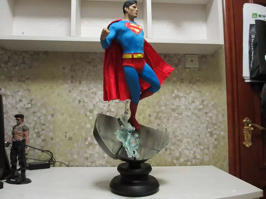
I will also point out that the only thing holding this to the waterfall appears to be the SMALLEST foot peg EVER. You can see it here.
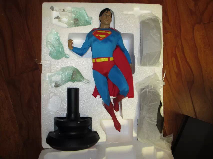
There are going to be a lot of these suckers pop right off and go down. Damn they messed up the design on this one ... BIGTIME.
Uncle Bingo
Love that Joker
- Joined
- Jan 14, 2014
- Messages
- 1,957
- Reaction score
- 345
His head looks enormous. The pose looks as awkward as I thought it would. The box art looks good though lol.
HeubertMichael
Super Freak
From the pics above the head looks way to big for the rest of the sculpt, and after looking at the more pictures link I can honestly say that the "S" shield looks like it was stitched in by a 5 year old. They actually messed up the iconic shape of the shield getting it in there. Every corner is blunted and the boarder is inconsistent.... and no it wasn't like that in the movies
From the link above

I defended this piece really hard before, but damn it let me down
I can't believe this. Someone actually thought that this lazy approach of having the S-shield on the chest can work? It's stupidly lazy that actually made it harder for them to make perfect. Cut the emblem shape on the chest of the blue suit and stitch the screen-printed S-shield from under the suit? Are the SSC factory workers trying to start a rebellion by screwing the customers?
Unacceptable. Sideshow doesn't care. They just want this PF off of their system now.
dan350zr
Super Freak
Looks pretty good form this angle 
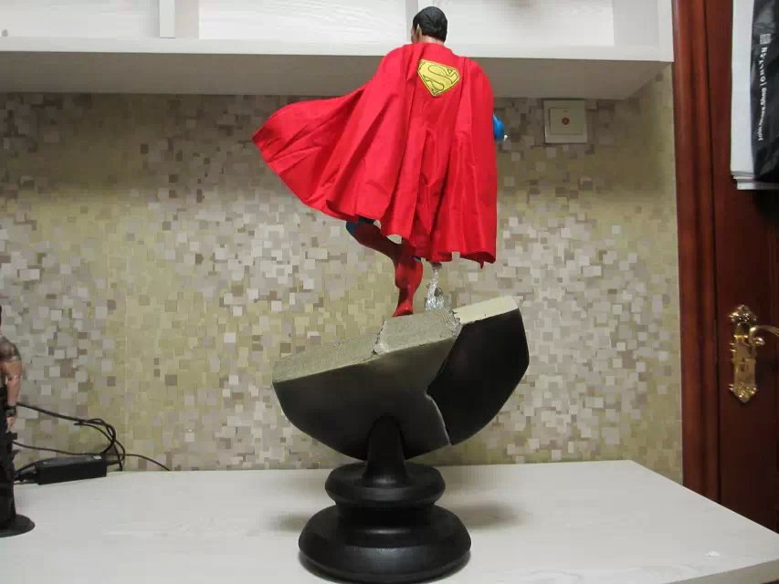

Similar threads
- Replies
- 0
- Views
- 437
- Replies
- 0
- Views
- 160
- Replies
- 0
- Views
- 401
- Replies
- 0
- Views
- 231
Latest posts
-
-
InArt: The Lord of the Rings - Aragorn 1:6
- Latest: Brett Banner
-
JazzInc: Batman '66 - Catwoman (Julie Newmar) 1/6 Action Figure
- Latest: KingGrayskull


