You are using an out of date browser. It may not display this or other websites correctly.
You should upgrade or use an alternative browser.
You should upgrade or use an alternative browser.
Dune 2020
- Thread starter The Chaver
- Start date

Help Support Collector Freaks Forum:
This site may earn a commission from merchant affiliate
links, including eBay, Amazon, and others.
screamingmetal
Super Freak
I liked the trailer, but yeah the aesthetic of this feels a bit mundane.
The Lynch version felt very otherworldly and distant in the future, the trailer lacks that feeling. Hopefully they're holding some of the more amazing scenes and unusual stuff back to surprise us in the theater.
The Lynch version felt very otherworldly and distant in the future, the trailer lacks that feeling. Hopefully they're holding some of the more amazing scenes and unusual stuff back to surprise us in the theater.
That's... not exactly what's happening. You're kinda close, but not really. But this is a proto-teaser, so I suppose there'll be more story elements in the following trailers.I'm not familiar with the novel or the story, so I'm the demographic this film has to appeal to if they want a hit. This is what I got from the trailer. The young Tim Burton guy is royalty and the son of a powerful man/king. The king wants to conquer a desert planet, but the natives will fight back.The young Tim Burton has the power to see the future when he sleeps and he sees a young woman and he likes her. When he and his father go to conquer desert planet, he sees the woman from his dream and he helps her and her people against his father's approval. Oh, and the planet has a giant worm problem. As a layman, that's all I got from the trailer.
Pretty much, yeah. It just comes off as them wanting to make a "serious" movie, so there can be no colour and everything must be in whispers.Yeah this was my reaction too. It didn't help that this was so, so hyped - I had read in quite a few places that insiders were simply blown away by clips they had seen.
I actually came away from this teaser trailer feeling like there was more visually memorable/powerful moments in Lynch's version - even the sand worms (which I KNEW they'd hold back for the last 30 seconds of this trailer...) I missed the scary/quirky weirdness and FUN of Sting, the floating fat Baron, the weird spice slug inside the moving glass cabinet etc. and also visually that twist of steam punk.
I get this is more of a teaser of the world and look with little story/character detail, but the monochrome/brutalist look combines with cold cerebral tone to create a blandness and boring vibe, less fantastical Space Opera wonder that you want more of.
I'm almost kind of worried about this movie now.
It's just fanart from DeviantArt. It's generic, but so is this "polygon/hexagon/brutalism" aesthetic we're getting. There's no reason they couldn't put more thought into it.I think LOTR did that very well. What I'm seeing in the picture above...a matter of personal taste, but it looks generic to me. Over-designed, organic Giger-Lite.
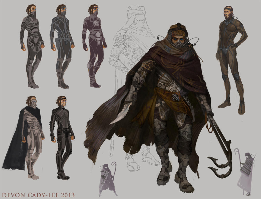
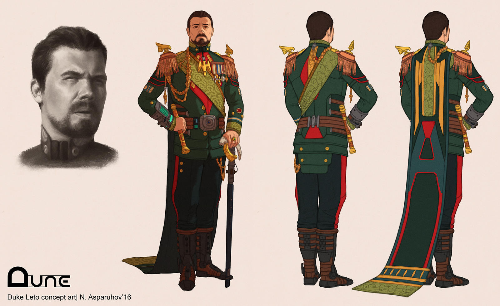
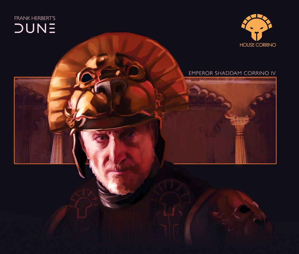
I'll make a couple of Billion Dollaridoos and then make my own DUNE (not DUNC) with Colour & Costumes! Now I just have to make a couple of Billion Dollaridoos...
Lynch made an interesting and pretty to look at film. It wasn't a proper adaptation, but it did have its own charm and unique identity. This is all coming off as some generic show I'd find on Sy-Fy.Where we agree is that Lynch did a good job, although it's been years since I've seen it. I would also dig an Art Deco influence.
Even the MCU is better than the ST. I'll give them one thing though. They mostly had good cinematography. Even Rian the Hack had some beautiful shots in there.I'm going out on a limb and saying this will be better than the whole ST.
Despite the fact it will be slow as molasses and 3 hours long AND an unfinished 1st half.
- Joined
- Apr 19, 2013
- Messages
- 10,978
- Reaction score
- 4,929
I'm going out on a limb and saying this will be better than the whole ST.
Despite the fact it will be slow as molasses and 3 hours long AND an unfinished 1st half.
After getting periodically drawn into more pointless commentary on that failed narrative, I've decided to bleach the ST from my mind. A little ashamed I let it take up what time it has.

Fandom is a cruel mistress.
Sometimes, especially in film, simple is the better design choice.
If you are not spot on with everything, you run the risk of looking campy... or worse, a big Vegas drag show.
That said, I do agree that there could be more color. But we haven't seen everything yet.
If you are not spot on with everything, you run the risk of looking campy... or worse, a big Vegas drag show.
That said, I do agree that there could be more color. But we haven't seen everything yet.
- Joined
- Apr 19, 2013
- Messages
- 10,978
- Reaction score
- 4,929
Sometimes, especially in film, simple is the better design choice.
If you are not spot on with everything, you run the risk of looking campy... or worse, a big Vegas drag show.
That said, I do agree that there could be more color. But we haven't seen everything yet.
I'll take 'boring' and minimalist instead of over-designed with useless flourish most of the time, provided the story and acting are on point.
I'm aware that baroque costumes and sets are not by definition over-designed, but as Wor says above ...
*Edit: Game of Thrones, HBO's Rome, Lord of the Rings ... were all very well done IMO. Rome had historic precedent and sources. GoT and LOTR still draw from real-world historical sources before adding the fantasy elements, with the added advantage of being able to take from various historical periods.
While there's no reason you can't borrow from many time periods for a far-future depiction of humanity, I think it's inherently more difficult because the technology they use is generally unprecedented and can be hard to integrate -- things like spacecraft need to read as high technology which can be at odds with the decorative arts, for instance.
There should be no reason a production with enough resources behind it can't get it mostly right, but at the end of the day it's the director's vision and Villeneuve's visual language appears to be consistent, like it or not.
Last edited:

$67.50
Marvel Legends Series Venom, Marvel Comics Collectible Action Figure 6” - Exclusive
Package Outbound

$33.35
Marvel 60th Anniversary Captain America DS-086 D-Stage Previews Exclusive Statue
Green Bargain
Jmek
Super Freak
Well I thought the trailer looks like Dune, and kind of echoes Lynch's version in terms of aesthetics anyhoo.
I really never liked Lynch's Dune. I remember how disappointed I was walking out of the theater.
Paul: Is there a connection? Under his breath: Is there a connection? Paul's mind: Is there a connection? Paul's mother: Does he realize there's a connection? Paul's dog: Even I smell a connection.
Paul: Is there a connection? Under his breath: Is there a connection? Paul's mind: Is there a connection? Paul's mother: Does he realize there's a connection? Paul's dog: Even I smell a connection.
- Joined
- Apr 19, 2013
- Messages
- 10,978
- Reaction score
- 4,929
I really never liked Lynch's Dune. I remember how disappointed I was walking out of the theater.
Paul: Is there a connection? Under his breath: Is there a connection? Paul's mind: Is there a connection? Paul's mother: Does he realize there's a connection? Paul's dog: Even I smell a connection.
I remember liking the visuals. The script was a bit of a ... departure.
Jmek
Super Freak
I love Lynch's Dune, it's totally gonzo man!
Otomofan
Super Freak
- Joined
- Nov 8, 2009
- Messages
- 5,255
- Reaction score
- 4,124
Never read the books....tried to sit through Lynch's version a few times but never made it.
But I'm a HUGE fan of Jodorowsky's Dune...one of my favorite docs of all time. Which is why I thought it was snarky as hell for them to put Pink Floyd in the trailer.
It looks like something I might check out for free, but there doesn't seem to be anything compelling enough to see it on the big screen. Even Tenet and Top Gun 2 had trailers that made you want to see the spectacle all big, in IMAX. This just looks like the same-sy vaguely general sci fi look we've been seeing for 20 years.
And the lead actor is a little sissy boy. I wanted to give him such a slap in Woody Allen's latest movie.
Hope people like it though and it performs better than 2049 or else Denis's name career might be over.
One thing's for sure: it's got more giant sand butt hole than ROTJ and Tremors combined.
- Joined
- Apr 19, 2013
- Messages
- 10,978
- Reaction score
- 4,929
[...]
Great video. Just going by what I'm seeing on my screen with that clip, I see where some of you are coming from. The 2020 film (so far) appears desaturated and flat in a specifically digital way.
The issue is maybe less about geometry and more about light, texture and colour.
I saw BR 2049 once in a theatre and didn't feel compelled to watch it again. I do remember thinking the whole film was shot in shadow with a bunch of muddy bass and feedback mixed into the soundtrack to make it a somewhat dull experience.
And while there are design choices I like in the 2020 version of the film, there are moments where it feels like 20,000 years in the future, everyone shops at Uniqlo.
I'll wait to see more, but points acknowledged from the earlier conversation.
abake
Rex Tremendae Majestatis
That's a cool video! Shows how beautiful and unique the look of Lynch's version was.
Pretty startling, that comparison.
- Joined
- Apr 19, 2013
- Messages
- 10,978
- Reaction score
- 4,929
Pretty startling, that comparison.
There are about a dozen scenes that are shot-for-shot. Like he used Lynch?s film for storyboarding. [emoji2955]
Sent from my iPhone using Tapatalk
I imagine similar scenes would be shot in similar ways -- like a talking scene having close ups, war scene having epic wide shots, etc. I saw this more as the trailer company literally using Lynch's Dune as a template for their new trailer cut. Lazy.
The Clown Prince of Crime
Super Freak
Honestly, the original looks better in that video, with the exception of the body shield effect. That looks awful in the original.

- Joined
- Apr 19, 2013
- Messages
- 10,978
- Reaction score
- 4,929
I imagine similar scenes would be shot in similar ways -- like a talking scene having close ups, war scene having epic wide shots, etc. I saw this more as the trailer company literally using Lynch's Dune as a template for their new trailer cut. Lazy.
Yes to all, but it still makes this cynical fan suspicious.

Similar threads
- Replies
- 0
- Views
- 1K
- Replies
- 42
- Views
- 4K
- Replies
- 0
- Views
- 252


