- Joined
- Sep 20, 2012
- Messages
- 12,643
- Reaction score
- 4,678
He’s so dramatic.

He’s so dramatic.
Not sure about those colors, I guess these are supposed to be painted? Yet that looks terrific...This ^ if more command chairs are forthcoming, this set definitely needs the dual Captain/XO command layout.
Or at least (since it's essentially the same chair twice), an option to buy it as a single chair, plus separately a connecting center console. Then if you want the whole set, just get a second chair which also connects on the other side.
Looks like 3DTrekker added the Voyager bridge command seating and console.
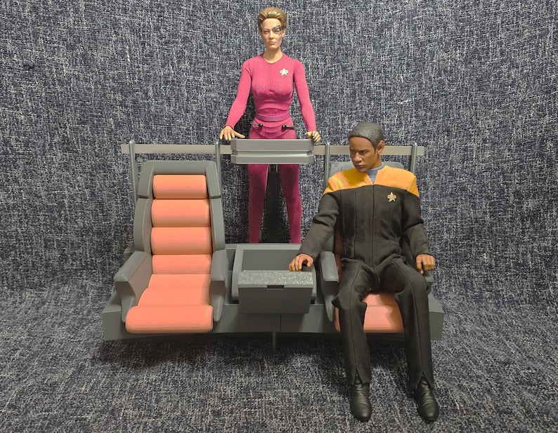
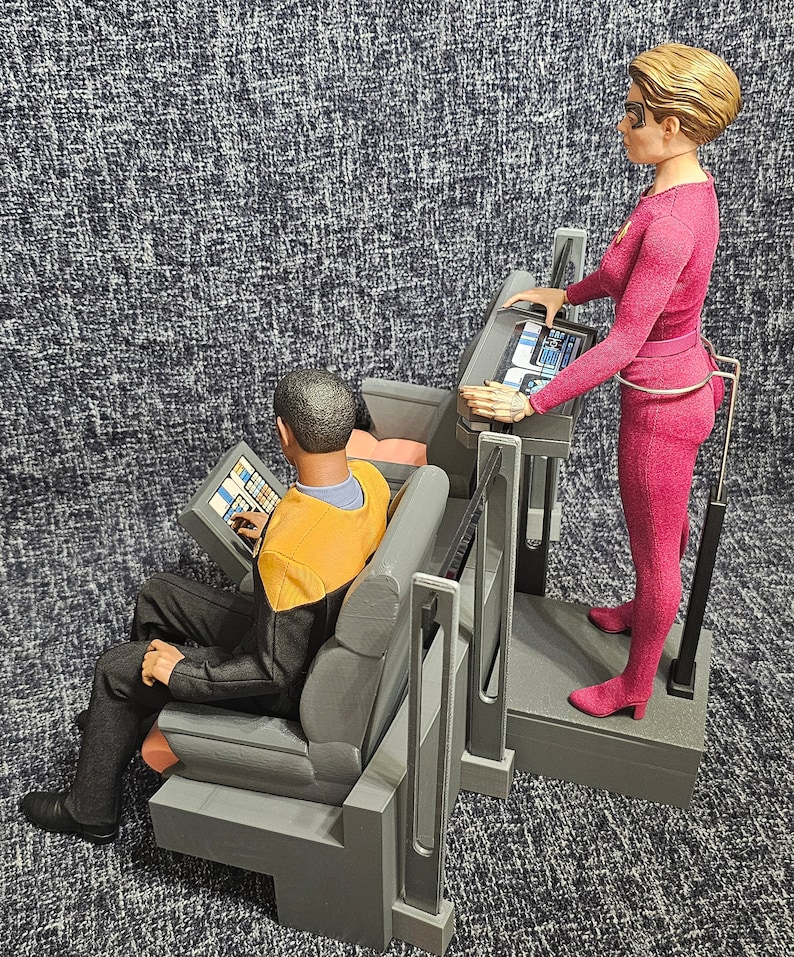
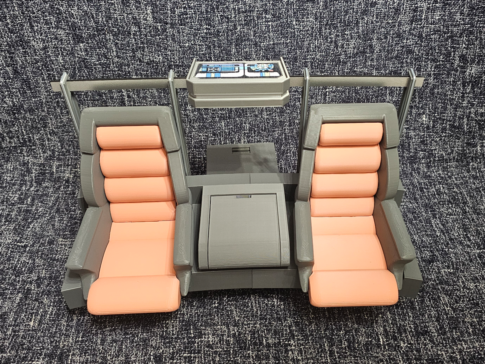
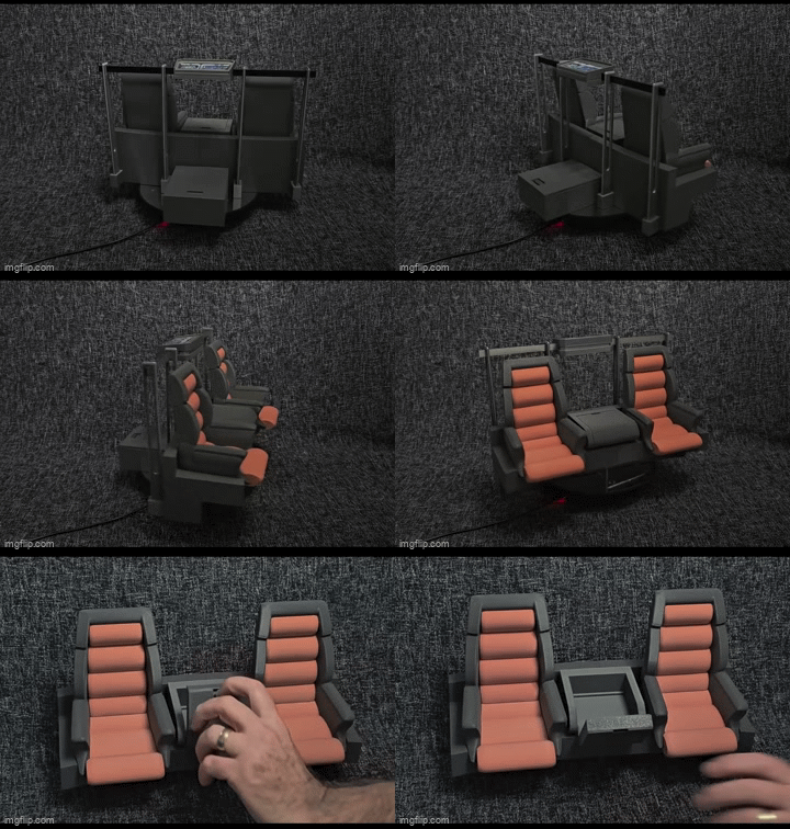


I don’t know if he will. Nanjin has gone after 3rd parties making unlicensed Trek stuff that he intended on making. However 3d Trekker also made a TMP/TWOK Captain’s chair so maybe he will.I wouldn’t be surprised if 3DTrekker beat EXO-6 to market with a Borg Alcove, he seems to be adding new products every couple of weeks. I don’t recall seeing the Voyager setup two weeks ago.
https://www.collectorfreaks.com/threads/3dtrekker-dioramas-and-props.250465/
Could also use a blue LED strip under the frame.Not sure about those colors, I guess these are supposed to be painted? Yet that looks terrific...

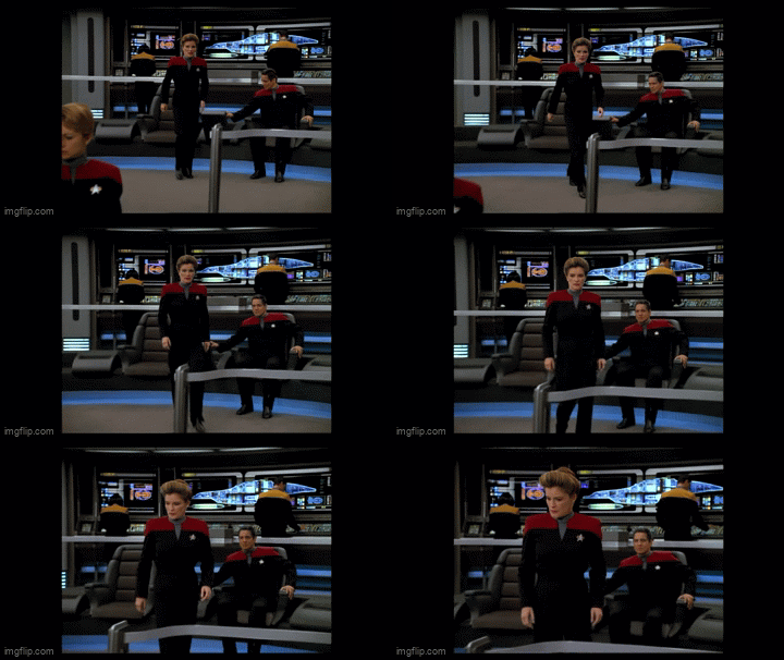
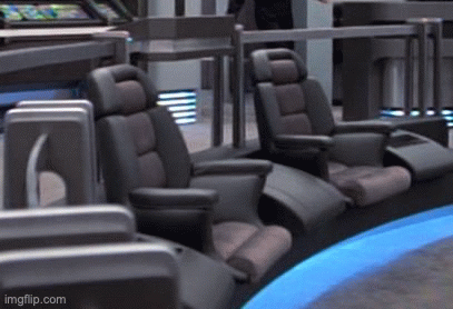

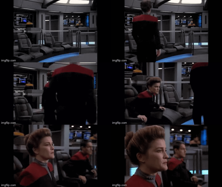
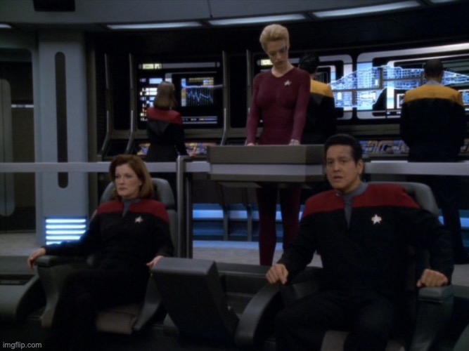
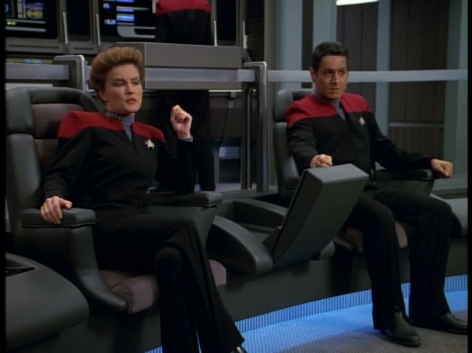
Well the whole "new" premise was they were two crews at odds, forced to share a ship and bridge to survive.Am I the only one who was annoyed at Voyager's bridge setup? The first time we had a female captain, and it's also the first bridge where the captain and XO are given equal spots on the bridge? I don't usually care about stuff like that, but even at 15 I thought it seemed like a very weird choice.


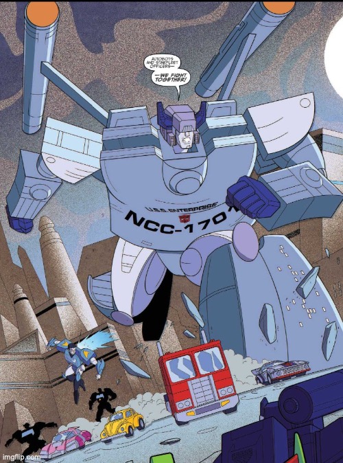
?It's like the original Transformers vs the over designed modern movie Micheal Bay ones.
View attachment 689949
Oh no I went off topic a bit... oh well...
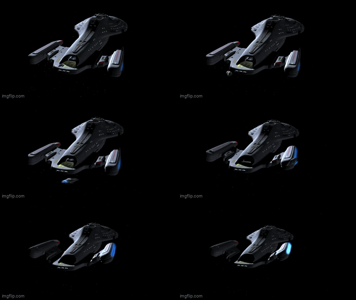
If only...... that ship had all kinds of weird experimental things ...moving warp engines,

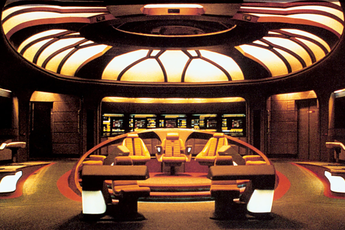
The D bridge looks incredible at any angle. It would be a marvel to see a 1/6 representation of it, but not sure how practical it would be given the space needed.Honestly the bridges just got worse after the D.
Original and D are the best. Just ask a kid who likes trek to draw them. Simple is better. The layout for the D was perfect. The colors contrasted and weren't just loads of greys. It was well lit. Voyager's bridge, the Defiant, DS9 Ops you kind of never get to know 100% despite watching the shows 100 times.
It's like the original Transformers vs the over designed modern movie Micheal Bay ones.
View attachment 689949
One of those is more iconic, has CLEAR and legible details, and if a kid draw the one on the right it would just be a mess of scribbles.
Same idea for bridges. Simple is better. All bridges after D were over designed and had too much going on.
Oh no I went off topic a bit... oh well...

Well the whole "new" premise was they were two crews at odds, forced to share a ship and bridge to survive.
Yet Chakotay was quickly downgraded from Captain of the ValJean to Janeway's accessory anyway.
Same could be argued it was a first for Native (central) American, yet having to share the spot, but not complaining about that.
Show was fueled with diversity casting, yet eventually the PC just eat their own.
Yeah it always seemed ironic to me that DS9 did a far better job exploring the Maquis than the show they were actually created for did.It was a mess of conflicting desires. Throw it to the DQ so we can have "fresh" stories, then use repackaged TNG scripts. Spend two years setting up the Maquis on DS9 and TNG, then mostly forget about it after the first episode. Get a Native American character, then hire a famous fraudster to be the Native "consultant". It was so, so weird. I wonder what could have been, if they hadn't been so schizophrenic in their presentation of the product.