Frank Miller appreciation thread

Collector Freaks Forum

Help Support Collector Freaks Forum:

This site may earn a commission from merchant affiliate links, including eBay, Amazon, and others.
The ‘variant’ game has been done to death and can only sink the comic book business into a deeper abyss that it is already in… yikes.
 
Just got this in…classic Miller from 1983
 

Attachments

  • 7E1FD700-4381-4BDA-AF27-1E5D15190FFB.jpeg
    7E1FD700-4381-4BDA-AF27-1E5D15190FFB.jpeg
    2 MB
Some more new variant covers by Frank. Surprising to see him doing work for Marvel again after all these years, but I'm not complaining.

Blade FM.jpg
Moon Knight FM.jpg


They also took an old Daredevil/Spider-Man piece from 1981 and recolored it for another variant:

marvel-team-up-portfolio-set-one-spider-man-versus-daredevil.jpg
Marvel Age FM Hidden Gem.jpg
 
Frank was trending on twitter the last few days as people gathered to complain about how lousy that new Wolverine cover is.

Clearly, they haven't been paying attention to his career over the last 20 years.

Frank must have seen the recent interest as an opportunity to post a new drawing of Marv in support of the writers' strike. His habit of making sure his male characters have more prominent genitals continues.

writers strike (1).jpg
 
This is an appericiation thread so i don't know how appropriate to complain, but that latest Wolverine drawing of Miller on Wolverine & Ghost Rider Cover... I couldn't help it but i laugh out laud when i saw it for the first time and i wasn't laughing with Miller. That thing is ridiculous.
 
No, you're not wrong.

Frank's output the last several years is baffling. Is he doing these lazy, hasty cartoons because he just doesn't give a **** anymore, or does he have some kind of debilitating condition that won't allow him to draw like he used to?

If I had to guess, it's a little of both.

The last time it seems like he put any effort into anything was 300 and then the last Sin City book, which came out well over 20 years ago. Since then, his work has gotten worse and worse.

He's only finished three projects in the last two decades; Dark Knight Strikes Again, Holy Terror, and Xerxes. They were bad. Xerxes was probably the worst. It made no sense and the artwork was a mess. I think the maligned Holy Terror might actually be the best of the three, cause he seemed to at least be trying for the most part, til he got bored and then just ended the story abruptly.

These days he makes insane amounts of money by churning out these doodles, not unlike Picasso and Dali paying for their expensive meals by drawing on napkins in their later life.

I've tried to chronicle all the "later era" Miller work as I can in this thread, and I honestly think there have only been two pieces that look to me like any effort was put into them, or that they resemble Miller of old.

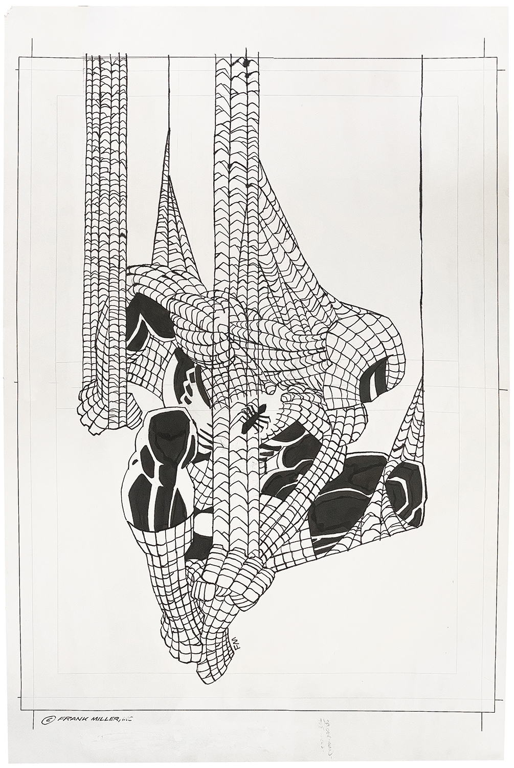
The first one is this Spider-Man commission he did for comics artist Ron Lim. It's still very sloppy, but at least it's reminiscent of his drawings in the mid-90s.

FM-Ink-Spider-Man-commission.jpg


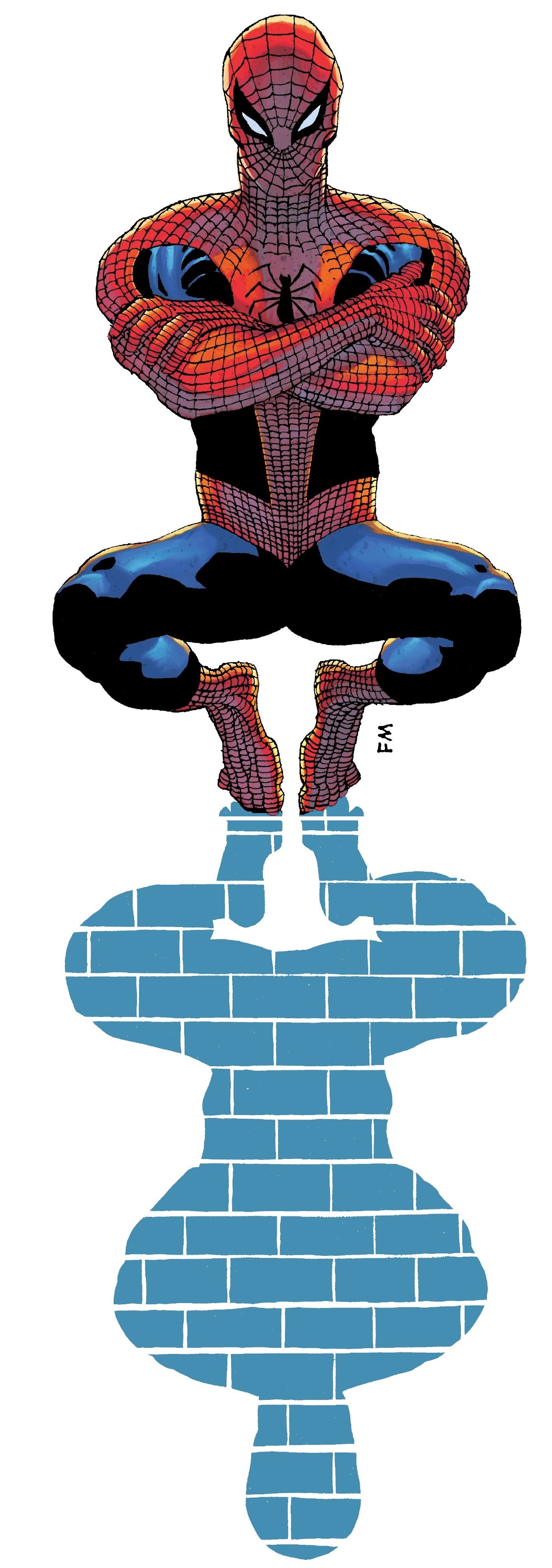
I think it looks similar to how he drew Spidey for the cover of his hardcover collection. I like how he draws Spidey's individual toes. I don't think I've ever seen anyone else do that.

Untitled.jpg


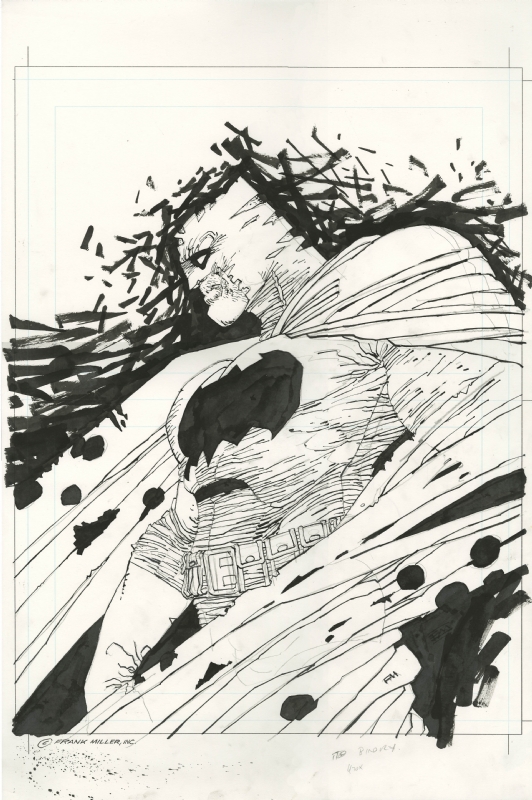
The other recent piece that I can think can stand up with Frank's older work is a really cool Batman commission he did about 5-10 years back.

Batman-A1-FM-Ink.jpg


It's got plenty of detail and lines, and it looks like he really took his time with it.

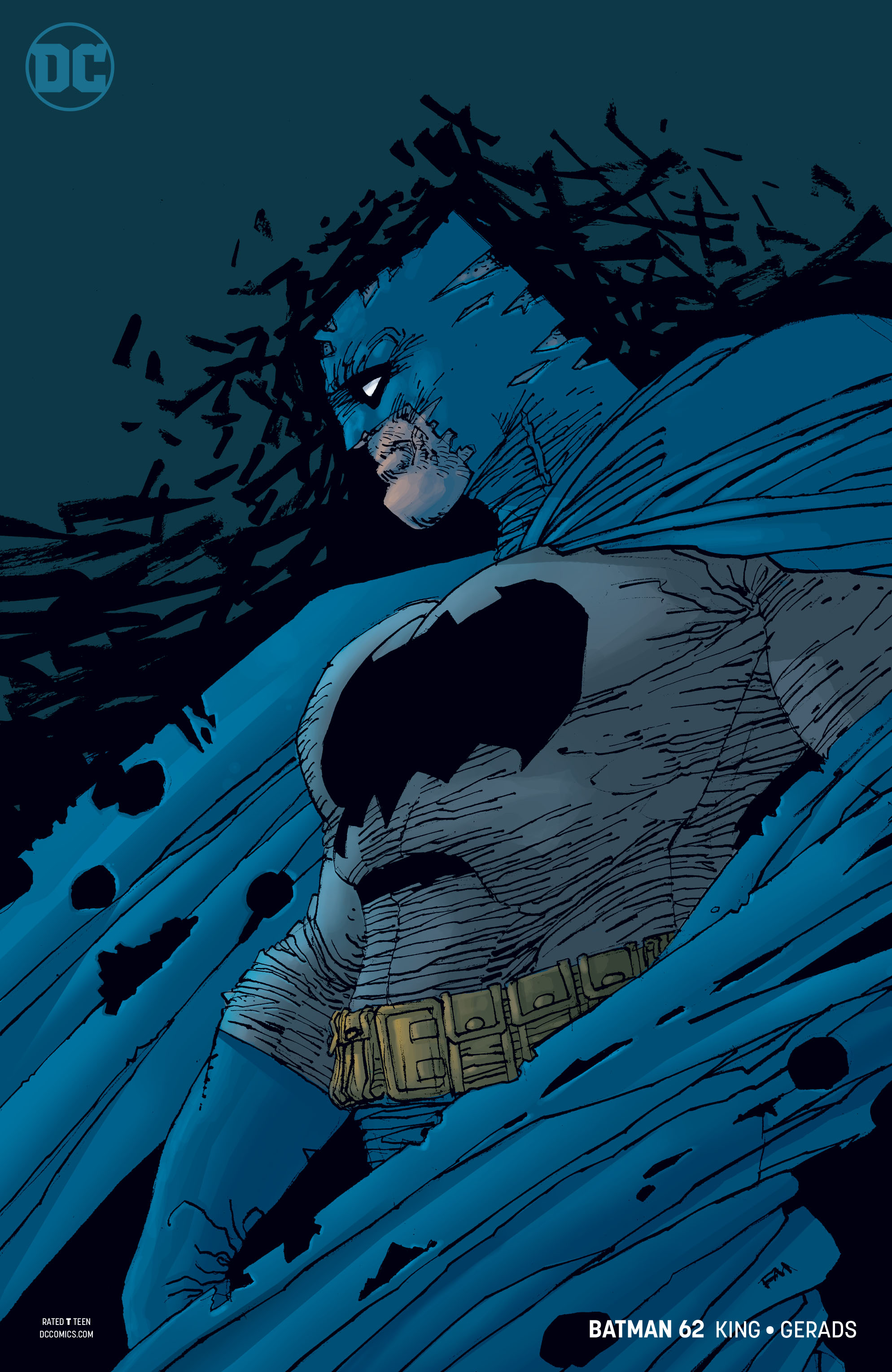
DC eventually used it as a variant cover, but like all his recent stuff, the shiny computer coloring didn't look fantastic. Nobody will ever be able to match what Lynn Varley did with color on his stuff. Still, this is probably the best cover he's done in 20 years.

Batman-62-cover.jpg


I think these two images are excellent, but I understand if others look at these and think they're lousy compared to his work in the 80s and 90s.

I can't really defend the stuff he's churning out these days. I really wish I knew what the reasoning behind it is.
 
His latest Daredevil piece, now in color.

I don't think this one will "break" twitter the way the Wolverine one did.

new DD cover.jpg
 
This new variant cover is so interesting to me.

Here's how Frank has drawn Cap through the years:

1984

Captain America 80s pinup.jpg


2001:

RCO011_1665507700.jpg


And 2023:

Captain America.jpg


It's a lot like the evolution of his Daredevil covers through the years. It shows where his style was at, almost a generic Marvel house-style at the beginning, and then it evolved into his own completely unique thing by the mid 80s, he had his unmistakable signature style in the 90s....and now it's just devolved into "lazy cartoons."


Classic run in the early 80s:

Daredevil 164.jpg
Daredevil 175.jpg
Daredevil 188.jpg


He came back for a cover a few years later, 1985. You can see the style he was using from Ronin and Dark Knight here.

Daredevil 219.jpg


About a decade later, he did this cover as a promo for "Man Without Fear." This was right around the time that Sin City was taking off, and you can definitely see that style here.

Daredevil 220.2.jpg


In 2001, he drew the covers for the reprints of his Daredevil work. At this point, he was in full-on Sin City style. Unfortunately, he also did Dark Knight Strikes Back around this same time.

Daredevil 220.4.jpg
Daredevil 220.5.jpg
Daredevil 220.6.jpg


And that brings us to present day, with his first Daredevil cover in over 20 years. It's like his Sin City style, but sloppier and lazier.

Daredevil 220.7.jpg
 
Back
Top