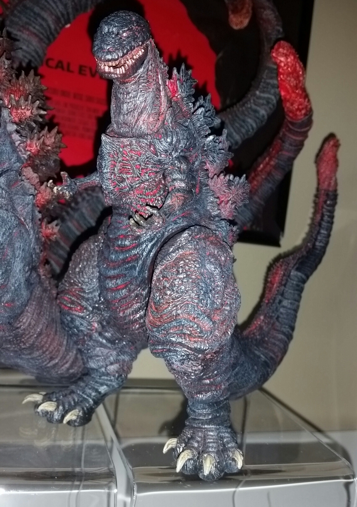
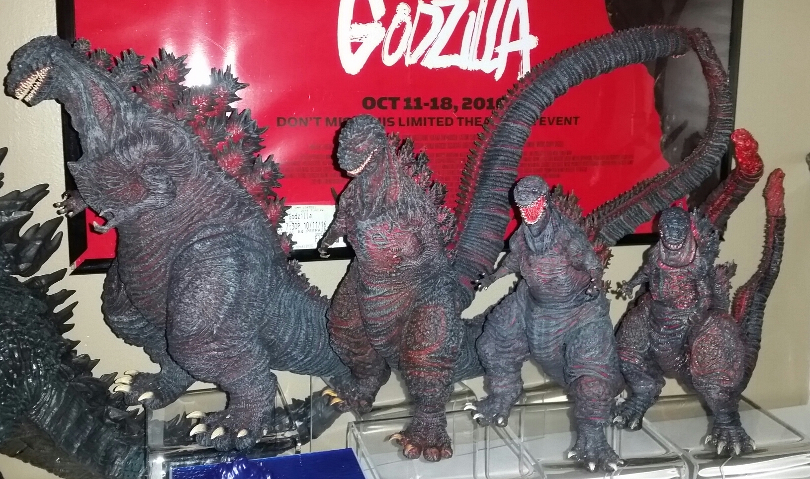
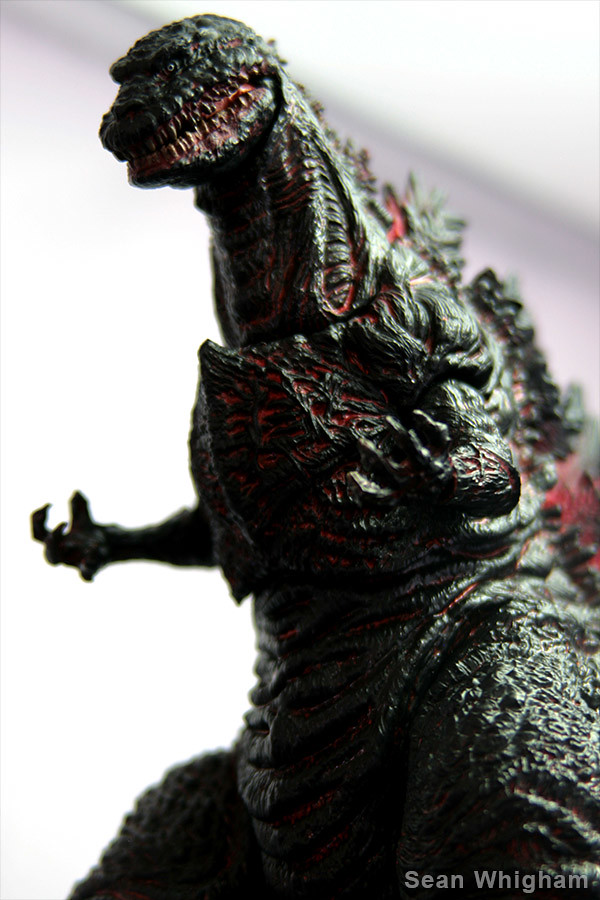
So first, here's a before and after shot of my heat modified Shin head, hard to see any difference since the lighting is so different, but before I worked on it, the mouth was pretty straight at the opening, but after I worked on it, now it has more of that curve like the movie.

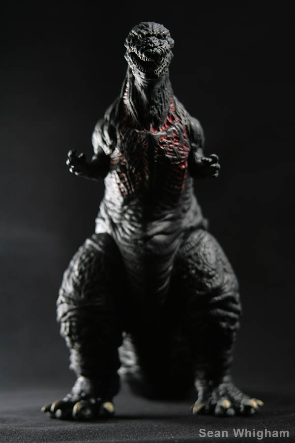
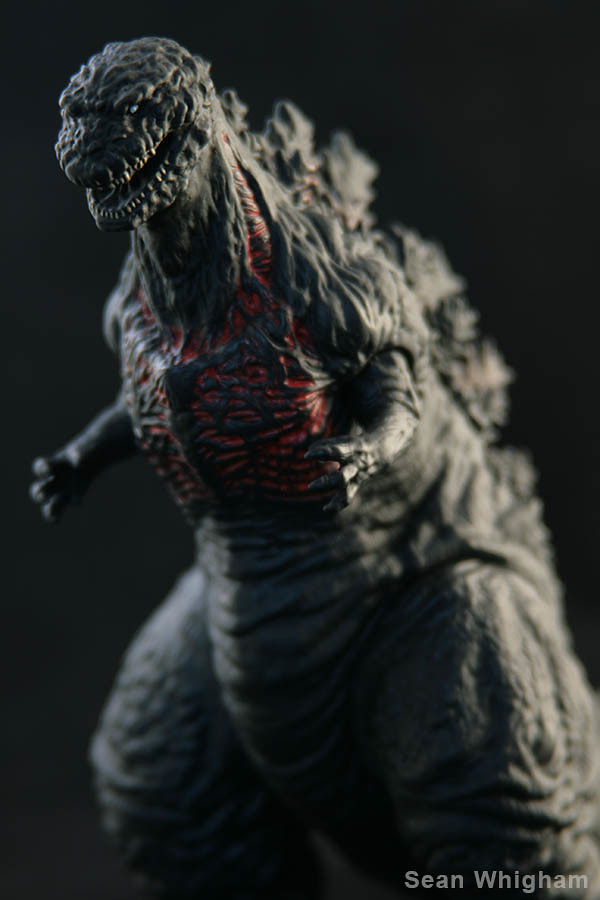
This next image is to illustrate the point I've been trying to make. If you popped the head off NECA's figure and just compared it to Shin's head, it's not really too long or off in the sculpt, it seems too long and looks off because of how it's positioned in relation to the neck. The images below are the poster in profile, the original head just heat treated, then I photoshopped the head further back showing how it attaches too far forward on the neck, and finally I tilted the head, don't think the actual figure could achieve that pose, and laid an outline of the actual shin on top to show how all the pieces basically fit and that NECA really did a pretty good job on the sculpt and it's the articulation causing a lot of the "off" look of the head. I've also linked the high resolution version of the image below the smaller image posted here.
https://c1.staticflickr.com/5/4159/34391326482_b9bd7db0e0_o.jpg
And finally, just the fully photosphopped image right next to the poster image.











 Doubt I'll keep it.


