I don't really know what to feel about this piece. I was really excited about it, but seeing this finished product, I'm a somewhat disappointed and partly concerned.
My concern is mainly the typical: Will the finished production piece by Sideshow be anywhere close to what we see here, on these photos? I'm seeing a potential nightmare in the makes, right here. The details of the Regular head (and the EX for that matter) seem very fine. I'm finding it very hard to believe that Sideshow will be able to deliver anything that comes near this paint application. I'm fearing for a flat and dull paint application on the production piece.
The Pose:
The pose is very nice. The awkward positioning of her legs contribute to the manifold personality of this character. Her childish, yet, kinky/wacky behaviour and expression. It looks very good, and it's good to see how they've managed to somewhat capture the look of the art by Stanley Lau.
The Face(s):
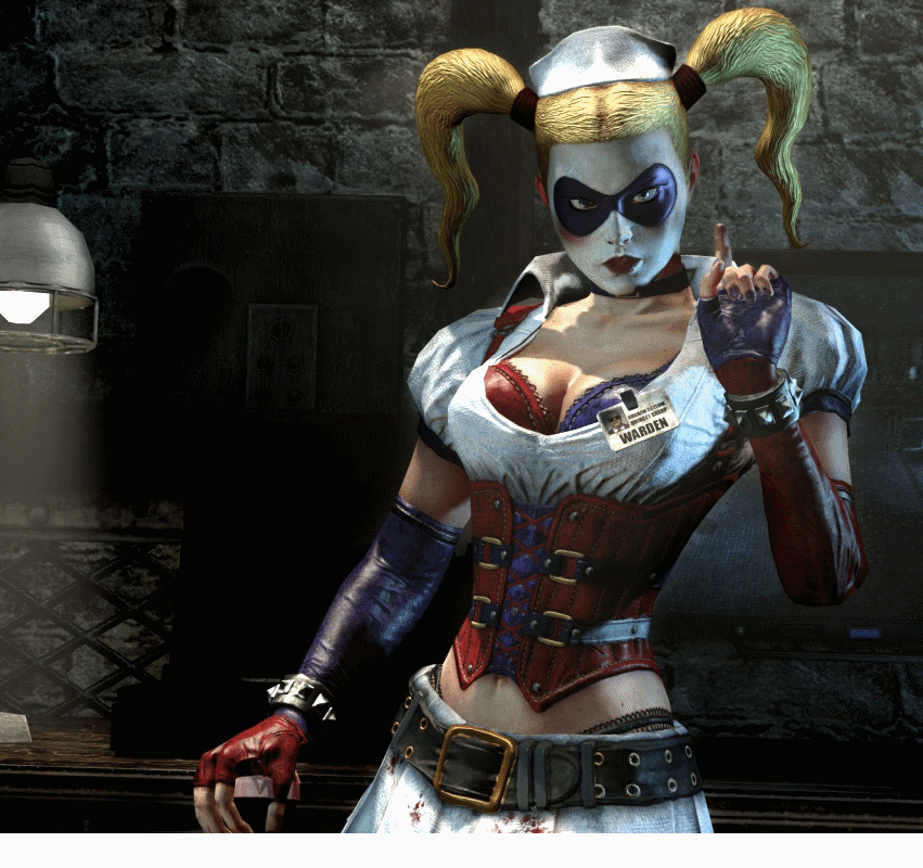
I prefer the Regular one. It has the iconic white make-up, and the mischievous sparkle in her eyes. The smile is almost scary in its exaggerated size, and it's almost uncomfortable. Very well executed. Once again, it's true to the artwork by Stanley Lau.
Her face is round, which adds to the childish look of her, and makes her look very iconic with her white make-up.
I don't particularly like the EX head. I love the idea of her pointing her tongue, but why is she looking angry? She should look wacky or crazy. Instead, she looks like she just walked into a smelly bathroom and still, she is sticking her tongue out? I find these to be two contradicting expressions, and it doesn't work very well, and it de-values the EX for me. They should've maintained the wacky/smiling look. They could have kept her mask on, as well, for the EX.
It's not possible to see the hair on the front of her head, which makes me concerned about how it looks around the seams. Obviously, it is two pieces put together, but how well is it executed? I have seen examples of the forehead hair-section being attached in a very basic and not very convincing way. Oh well, the paint application looks very nice, though. Again, this raises a challenge for the production department.
The Outfit:
This is a traditional Premium Format look, with mixed media. Honestly, I was hoping for a fully sculpted piece. Why? Because a full body-suit made of fabrics can look very awkward if not executed 100% correctly. We've seen numerous times in the past. Just off the top of my head is the Baroness, which, in my opinion looked rather awful. On the other hand, countless of fully sculpted female characters have looked extremely nice. For some reason, sculptors often excel at making wonderful female bodies. I guess this is because most sculptors are a bunch of male nerds like the rest of us (sorry, girls, but we do make up the majority here). Off the top of my head: Rogue PF, Spider-woman PF.
It's always exciting with a fabric outfit, but it is also very difficult, and it can be dirtied, worn down etc. There are many downsides to this, but for me, the tight fit is at risk, and that concerns me with this piece particularly.
Still, it looks perfect on the pictures. If they manage to pull this off, then it will hands-down be an extremely impressive feat.
So, basically, I have decided to skip this girl. I had planned to get her. I love the character, but this piece didn't drop my jaw to the ground as I had hoped it would. I'm going to wait for the Catwoman PF. I hope Sideshow manages to blow me away with that one. I might get this one down the road, but I doubt it right now.


 what?? When did this happen? Cool so she did have a eye mask!
  thanks bro!


 Still getting her, I will see how the weekend goes as to if I want the EX, ah never mind that brat grows on you, I will get the EX, Nuff Said

