Darkavatar
Super Freak
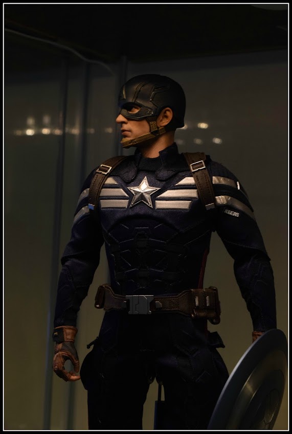
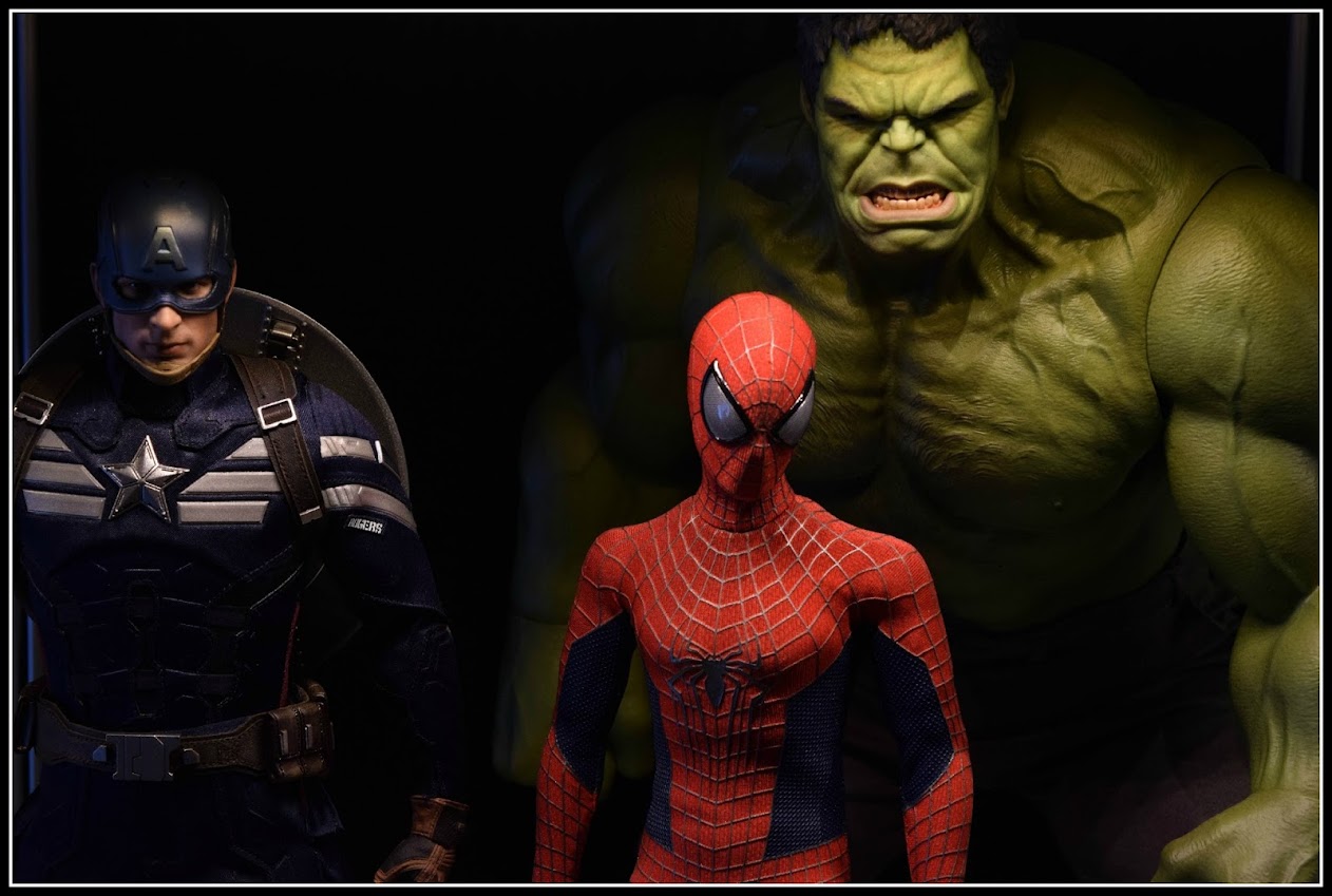
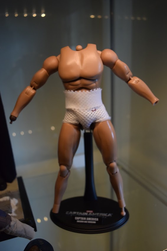
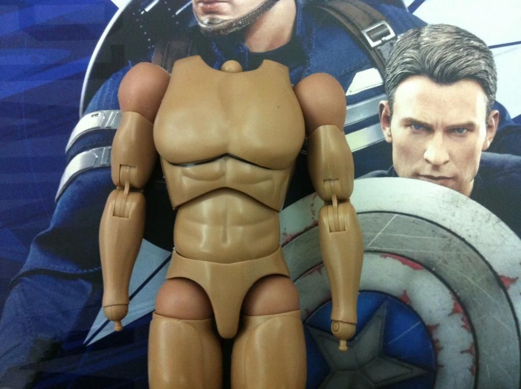
I may be wrong but to me Cap's body looks better proportioned with the Rogers head on in Clipperking's video. Something about the helmeted head makes the body look just a bit small...maybe the helmet head is wider or something? Regardless, I was always going to display this with the Rogers head anyway. As for the extra body, I'll use that for a kitbash down the line--or maybe to give my eventual Michael Myers figure (once someone offers a great Myers head for sale) a tall, imposing buff body.
I agree too that the arms could have been a bit more buff to complete the look in that Evans photo.

I think that is the main reason why he appears so skinny.
Not sure what I'l do about the "fat suit". I don't care that much about articulation and I tend to leave my figures in museum poses. Also I have bad luck whenever I remove outfits from Hot Toys figures, or even partially remove them--inevitably, a belt, strap, or button breaks on me. Besides, you would assume Rogers has a couple of protective layers on under his Strike suit when he goes into battle, right? And if the fat suit is adding bulk to the top of the arms that's a good thing to me, so I'll just keep it as is.
Yeah it does add bulk to the arms but it adds more bulk to the body, which makes his arms look skinny. I was thinking if there was a way to remove the torso part of the fat suit and try to keep the shoulder parts of the fat suit. That way he would look slim in the torso but would still have big arms. Oh and BTW I am the say way I would pose my Cap in a museum pose to. I am willing to sacrifice articulation for accuracy.


I also love this shield, it has a great texture to it, feels battle damaged

Great pics Stealth but man does he look way too skinny, glad you are happy with him though.
Last edited:


