Hot Toys Wonder Woman (WB 100)

Collector Freaks Forum

Help Support Collector Freaks Forum:

This site may earn a commission from merchant affiliate links, including eBay, Amazon, and others.
Awesome, even more excited now! All I plan to do is pull out the curls a little bit. A lot of people are criticizing this, but I think it's intentional by Hot Toys to allow people to pull them out to where they want them to be.

Also, him leaving that one curl awkwardly up front was bothering me so much during that video.

Which, good lord, he complains about his videos taking hours to make but he could cut them down to 1/4 the time without all the yammering on and on he does. He's the equivalent of the people who put their life story before telling you their recipe for grilled cheese, of the 1/6 world.

Also, for a guy who puts a thousand figures in museum standing poses in cabinets, I don't understand how his Golden Armor head sculpt looks like he manhandled it through the washing machine.
He's gotta be roughing up the hair to make it look worse on video. Sure, Hot Toys' synthetic hair is pretty bad, but it's possible to tame it with a little product and some brushing. There's no way he was displaying his Golden Armor Wonder Woman like that.
 

I’m honestly shocked they bothered to scale up the head to look right on this body. Good on them.

IMG_5918.jpeg
 
there is a one minor issue I have and it's the hairline on the forehead area, just looks a bit odd.
But other than that, she looks amazing, and given the opportunity I would buy one.
I agree, the hairline is a little odd. Some have more glue marks than others, its nowhere near as tidy as say, my Inart Joker, but she will more than do until they eventually get round to her.
 
Its ironic the hairline is an issue given that's the biggest change they did in comparison to their previous WW releases. I think someone pointed that out.
 
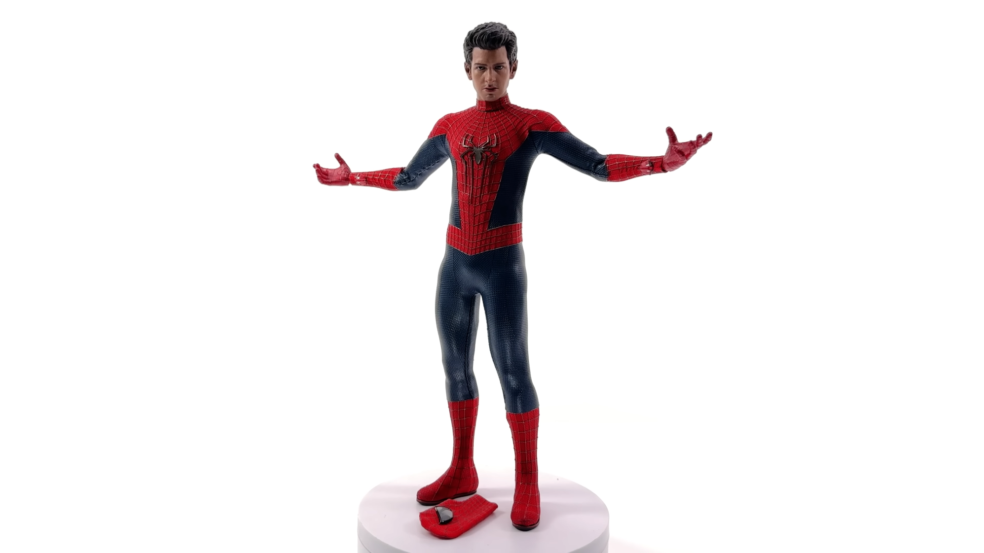
Justin needs his figure review license revoked. It's incredible how poorly he's able to show a figure off.
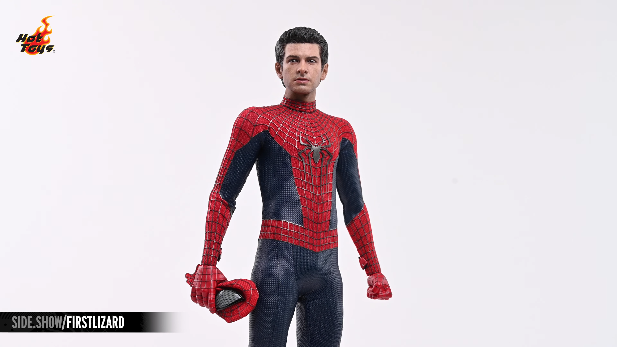
Sideshow's first look videos started out rough but surpassed Justin's videos long ago in terms of lighting and image quality; Justin needs to stop shooting reviews with a cellphone and step up to a real camera if he wants to compete.
 
Sideshow's first look videos started out rough but surpassed Justin's videos long ago in terms of lighting and image quality; Justin needs to stop shooting reviews with a cellphone and step up to a real camera if he wants to compete.
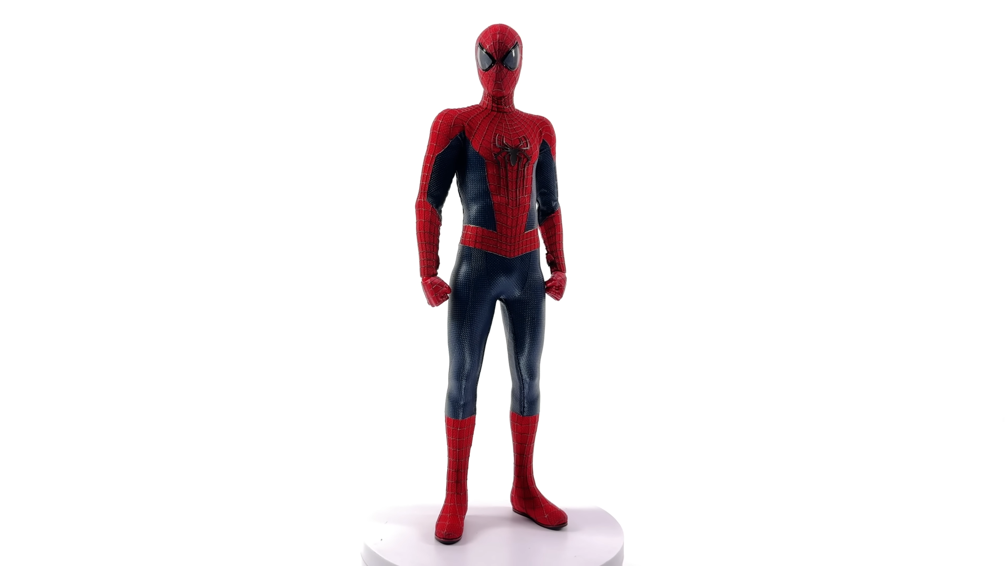
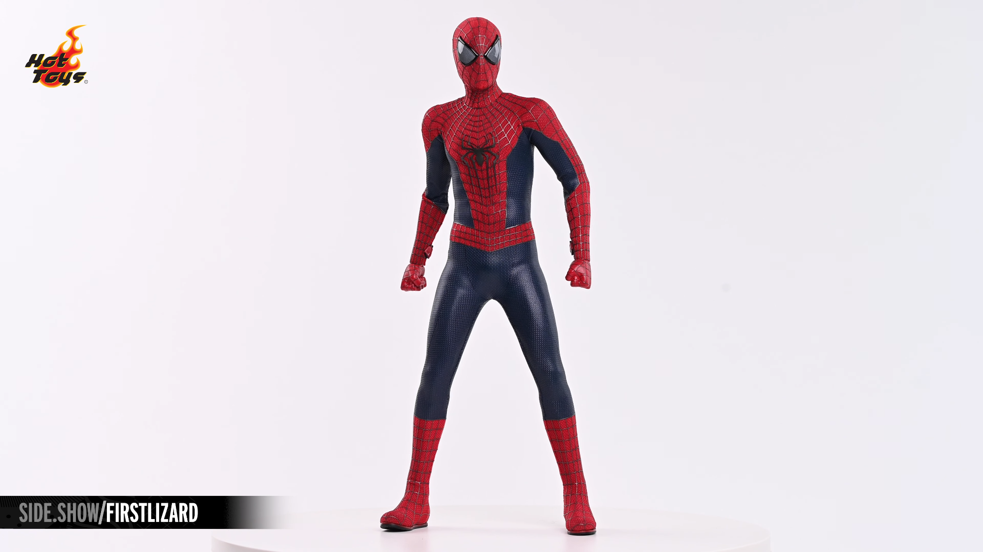
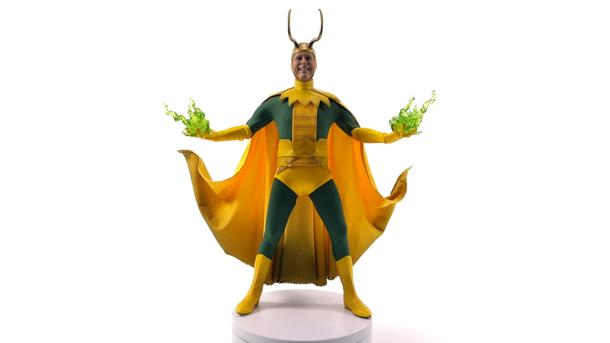
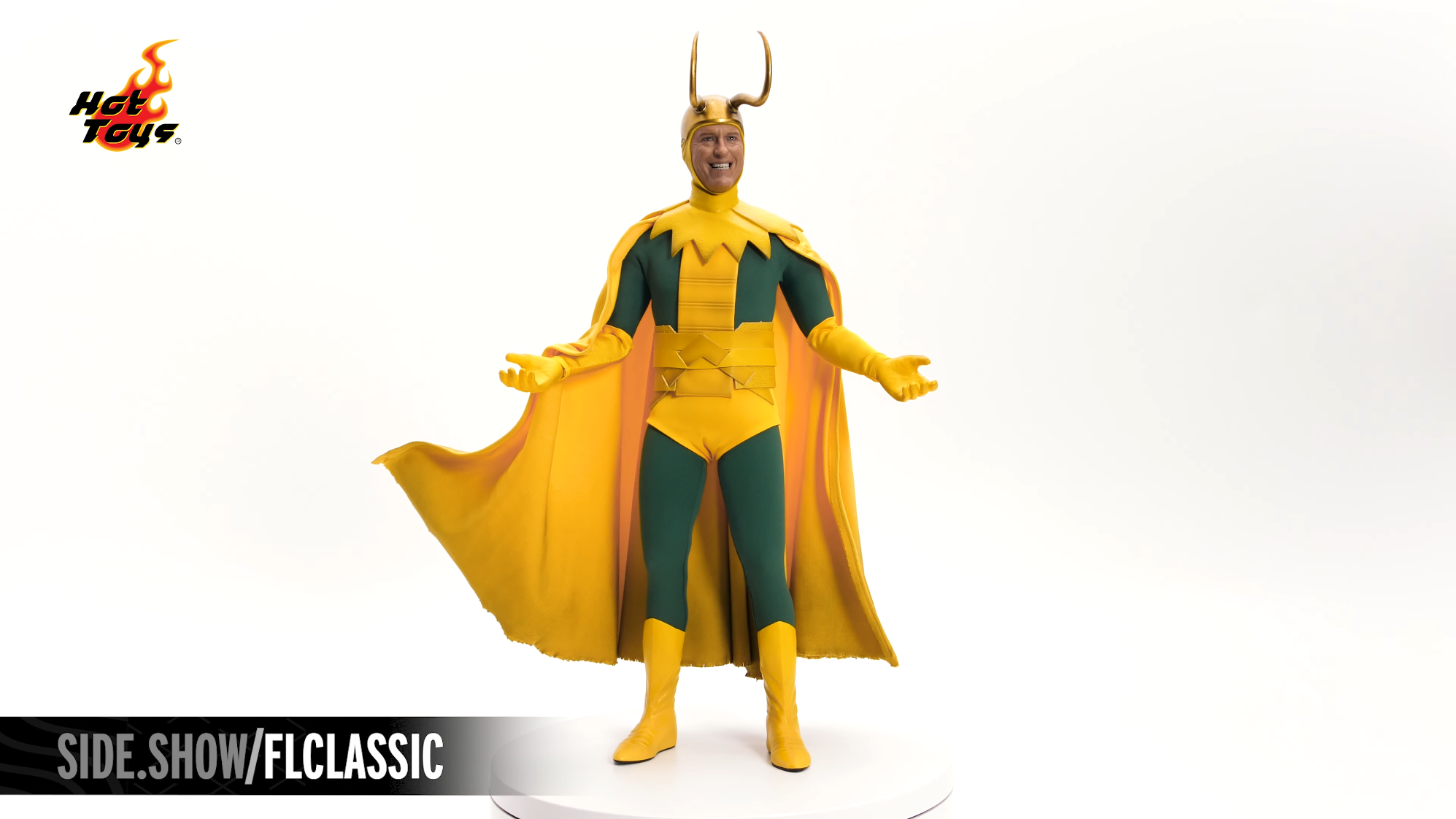
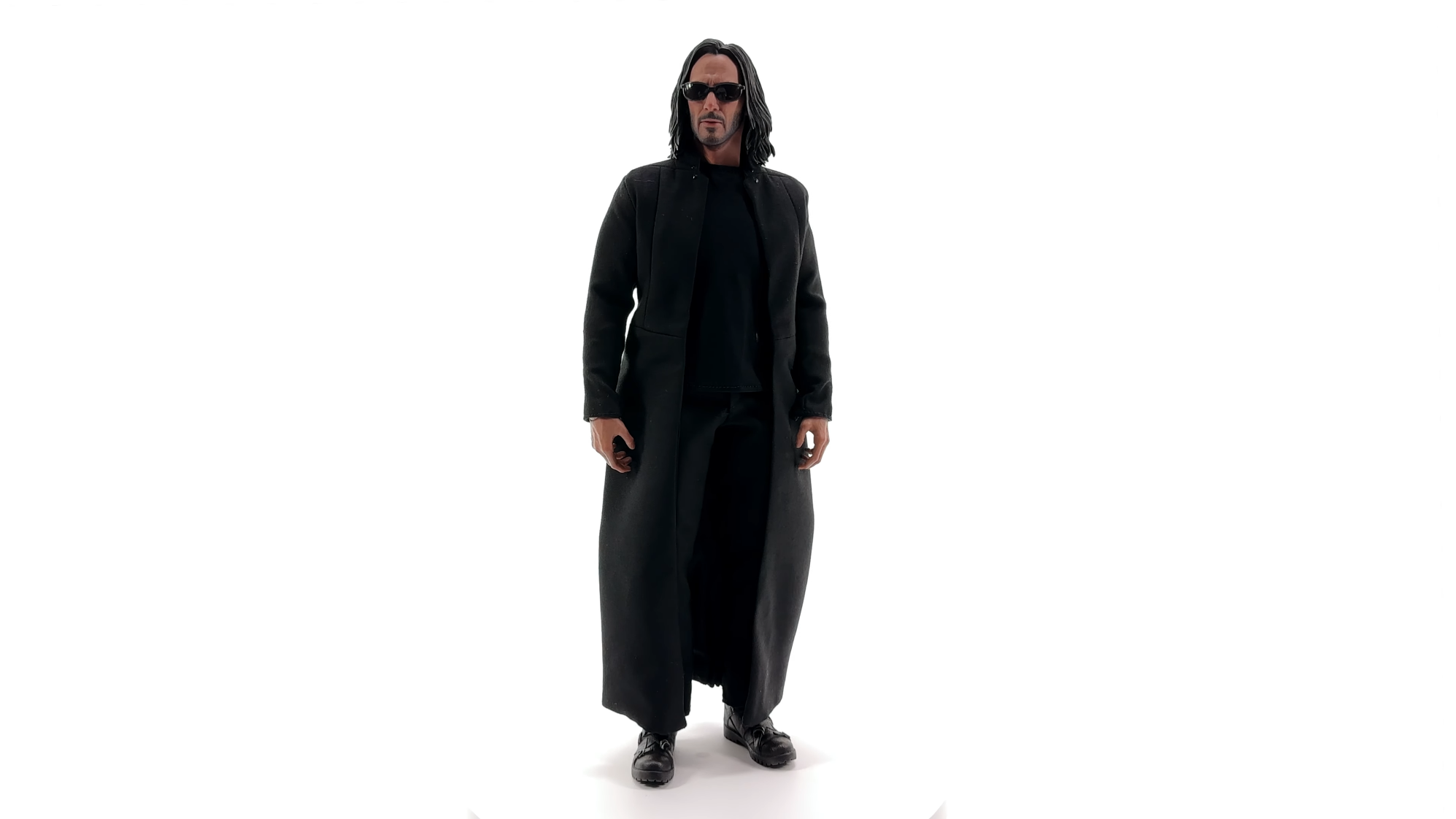
His terrible lighting setup is the bigger crime than the camera, although that's certainly making things look worse on top of it all. He just lights the far left and right side of the figure with ****** LED wires, leaving the frontal area in complete darkness. It's just terrible.

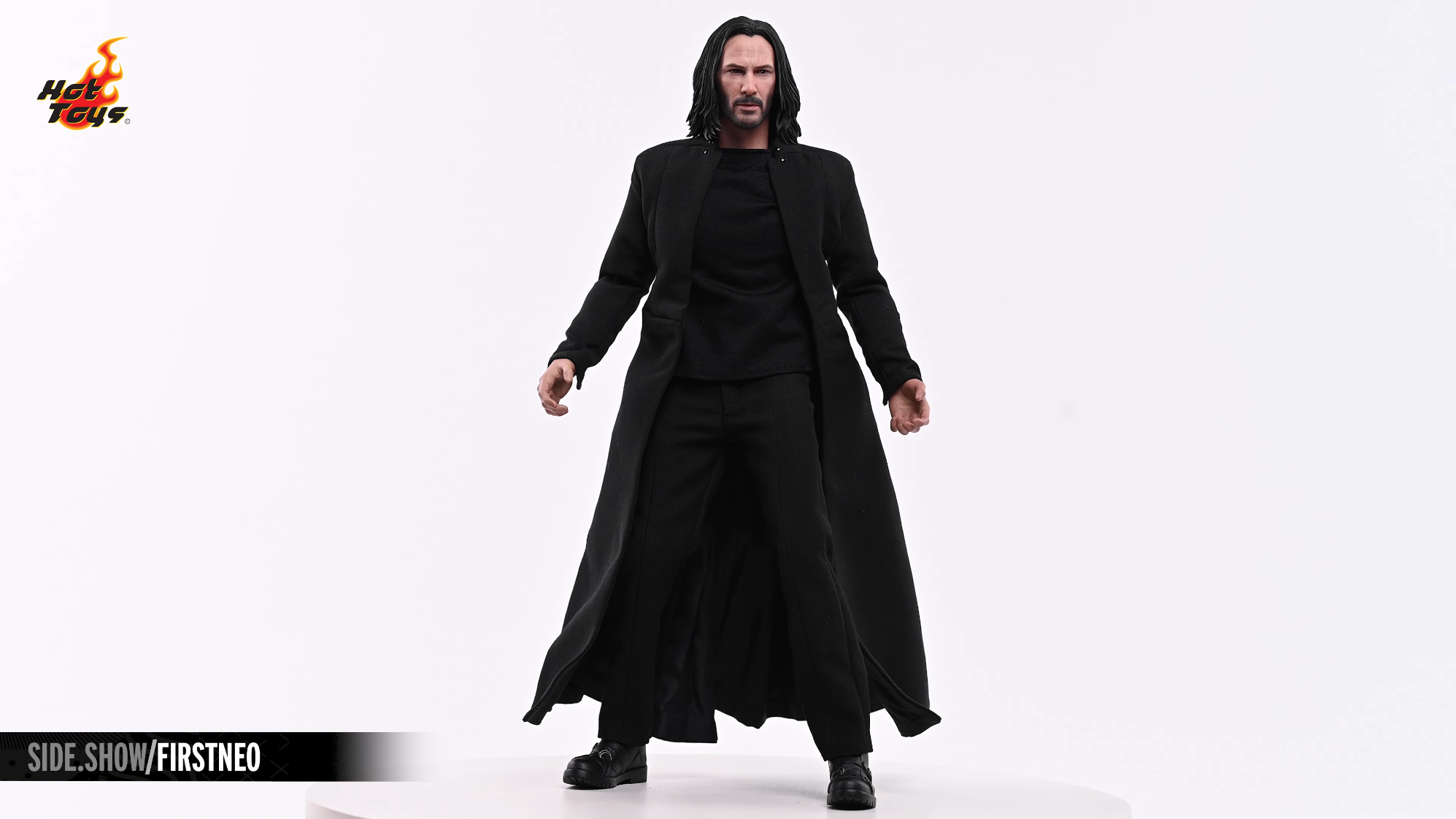
Adding a simple central main keylight to the figures would makes his videos look so much better. Just compare it to Sideshow, who does use a keylight in their reviews and you can see what a difference it makes in presentation. They just have a better understanding on how to light their videos. It's crazy to me that Justin's videos became as popular as they did. Such a terrible presentation all around from top to bottom.

vSkbFSG.png
Wa86Yhk.png
kcggHRC.png
v0oz6KK.png


wXeJopY.png
4XgAsIW.png
q0AOt8m.png
6y6LMMp.png
 
Last edited:
His terrible lighting setup is the bigger crime than the camera, although that's certainly making things look worse on top of it all. He just lights the far left and right side of the figure with ****** LED wires, leaving the frontal area in complete darkness. It's just terrible.

Adding a simple central main keylight to the figures would makes his videos look so much better. Just compare it to Sideshow, who does use a keylight in their reviews and you can see what a difference it makes in presentation. They just have a such a better understanding on how to light their videos. It's crazy to me that Justin's videos became as popular as they did. Such a terrible video presentation all around from top to bottom.

vSkbFSG.png
Wa86Yhk.png
kcggHRC.png
v0oz6KK.png


wXeJopY.png
4XgAsIW.png
q0AOt8m.png
6y6LMMp.png
I think all of these lighting set ups and bland white backgrounds look ugly 🤷‍♂️
 
I think all of these lighting set ups and bland white backgrounds look ugly 🤷‍♂️
I'm not saying they're the most amazing cut throat looking setup around. Just a comparison to show how bad Justin's setup is for what is an incredibly basic setup in lighting and video presentation.

Doing a 1 color background + 1 keylight + 2 rimlights is lighting 101 for photograph/video and yet Justin is unable to do even that. Add in his low quality video camera and it's just baffling all around.
 
His terrible lighting setup is the bigger crime than the camera, although that's certainly making things look worse on top of it all. He just lights the far left and right side of the figure with ****** LED wires, leaving the frontal area in complete darkness. It's just terrible.

Adding a simple central main keylight to the figures would makes his videos look so much better. Just compare it to Sideshow, who does use a keylight in their reviews and you can see what a difference it makes in presentation. They just have a such a better understanding on how to light their videos. It's crazy to me that Justin's videos became as popular as they did. Such a terrible presentation all around from top to bottom.

vSkbFSG.png
Wa86Yhk.png
kcggHRC.png
v0oz6KK.png


wXeJopY.png
4XgAsIW.png
q0AOt8m.png
6y6LMMp.png
Yup, good eye. Justin’s lightbox reviews were the best on YouTube for a time, but he hasn’t improved his game while others have.

The Sideshow videos look great. By comparison, Justin’s look like the figure’s identity must be concealed as part of the witness protection program.
 
Back
Top