InArt: 1/6 Superman (Cavill)

Collector Freaks Forum

Help Support Collector Freaks Forum:

This site may earn a commission from merchant affiliate links, including eBay, Amazon, and others.
Ok, so that's why it translates to some kind of shinny rubber or something and not fabric then.

Thanks.
Yes, on the movie suits fabric part is barely visible as rubber texture covers it. On InArt figure texture is larger because of the scale,so more fabric is visible, that’s why it doesn’t look as rubbery as in the movie. Hot toys gives more or less rubbery look. I truly wonder how hot toys suit looks on InArt body. Hope someone tries that.
 
I'm curious if the 1/12 scale manniple Superman is using the same fabric InArt used because I have that figure and it looks very similar.

20240615_141808_1_1.jpg
 
Hot Toys have mastered the vinyl plastic they use for tons of figures. They use it on figures that aren’t even supposed to have that material, like MoM Scarlet Witch. In the film, her outfit is fabric but Hot Toys gave her the rubbery vinyl.

Edit: I’m sure Hot Toys will easily nail the material/outfit aesthetic with their 2.0. Certain details will be more accurate like the correct placement of the deltoid glyph and the piping on his sides, even the compact pattern throughout the suit, etc. But imo, that’s where it'll stop for things they’ll be better at than INART’s.
 
Last edited:
So the metal or plastic “buckles” (as the manual refers to them) for the capes just pop in and out of slots on the body? The buckles for the drape cape seem very firmly fitted into those slots. I’m a bit anxious about potentially breaking the buckles off by tugging at them too hard to get them out. 😬 with my $400 figure here.

Edit: Nm. Just pinching of the fabric and some gentle side to side movement of the leads did the trick.
 
Last edited:
SST’s Routhman was modded with HT Justice league Batman body. The stock was just…awful.

Still need to get longer ankle pegs for him, but this is what he would look like with Cavillman and BA.

View attachment 737772
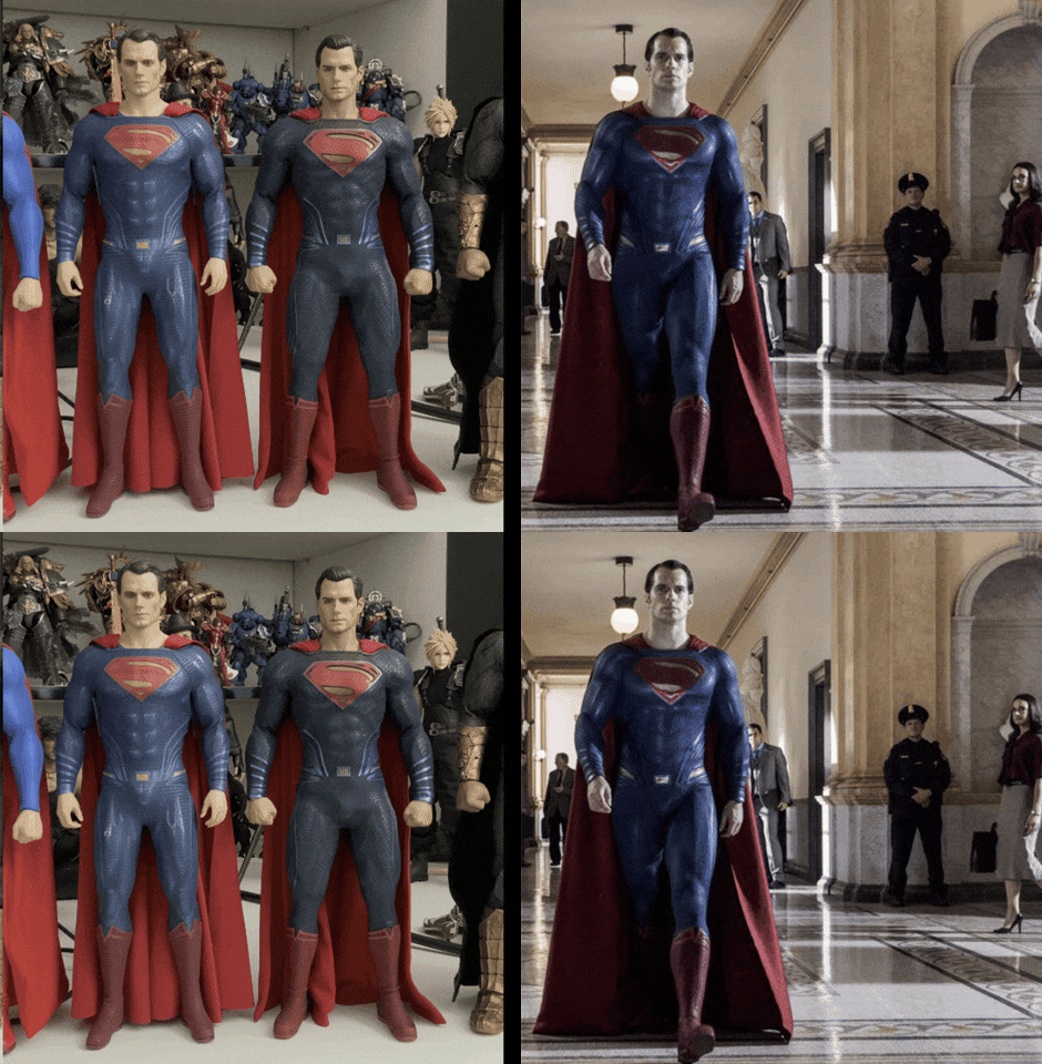
Quite like the proportions there when compared. Looks pretty spot on. I think the waist can use a touch of padding on the sides to have it be a smoother transition to the lat muscles but overall, it looks great.

giphy.gif
 
Quite like the proportions there when compared. Looks pretty spot on. I think the waist can use a touch of padding on the sides to have it be a smoother transition to the lat muscles but overall, it looks great.

giphy.gif
At first this GIF made it look quite accurate but the more I look at it the further away it gets.
 
So after hot toys joker who is afraid the next hot toys superman will be better than this?
Considering also the batman... Current score: Hot toys 2 - 0 Inart
I’ll give Hot Toys the win with their Joker but definitely can’t say their The Batman definitively beats InArt.

The best I could be convinced of is a draw since both have pros and cons.
 
I think we’re so accustomed to Hot Toys and their toyish and huge proportions. I’d rather how INART did it vs a roided out body.
💯 this.
Even though the new HT Joker is really great, his head is still oversized.
It really strikes me with InArt Battinson, a lot of people say his head is too small, but I feel like it’s a symptom of being too used to seeing how giant the HT figure’s dome is.
 
So after hot toys joker who is afraid the next hot toys superman will be better than this?
Considering also the batman... Current score: Hot toys 2 - 0 Inart
I’ll give Hot Toys the win with their Joker but definitely can’t say their The Batman definitively beats InArt.

The best I could be convinced of is a draw since both have pros and cons.
It’s funny how we all have different perspectives.

I’d say INART definitely won the Battinson battle.

Ledger Joker to me is a draw, given both have pros and cons.

Pennywise isn’t a fair head-to-head comparison but INART's is the one to have, imo.

So I’d say it’s 2-0-1 in favor of INART. W, L, D.
 
Quite like the proportions there when compared. Looks pretty spot on. I think the waist can use a touch of padding on the sides to have it be a smoother transition to the lat muscles but overall, it looks great.

giphy.gif

I appreciate this!

If I have time, I wanna do a video ‘review’ and see if I can replicate that walking pose. In your gif, aside from arm and leg placement due to movement, it illustrates how close InArt got with the body proportions. And when compared with HT figures:

IMG_3894.jpeg


IMG_3891.jpeg


IMG_3939.jpeg


IMG_3940.jpeg


We’ve been conditioned to think the slightly exaggerated silhouettes on our figures match what we see on the screen.

I know I’m late to the party on this, but I wish HT didn’t go with the stupid rubberized material for BA’s suit. Effin restricts articulation…as ALWAYS.
 
I'm loving this figure. The body and proportions are great in person. I think this is InArt's best body so far as well.

Both sculpts, paint apps, both capes are great, the amount of accessories for a figure that doesn't really have much to pair with. I'm not seeing all the hate this figure has received.

Maybe all the bad talk it was receiving lowered my expectations, and that's why my view of it seems so high. Plus having this in hand in only 13 months from going up for preorder (compared to the 28 months for The Batman when it arrives Monday)
 
No matter how many pics of this guy I've seen his shoulder width are a bit narrow for the size of his head.
 
No matter how many pics of this guy I've seen his shoulder width are a bit narrow for the size of his head.
I can't exactly tell what specifically it is, but I can confidently say the overall proportions aren't right, sadly.

I don't even have the figure in hand and it's plainly obvious it's got an incorrect, undersized body base. It projects a figure that has little presence. And it's Superman.
 
Back
Top